

How to Create a Timeline Filter in Excel

In Excel, using the timeline filter can display data by time period more efficiently, which is more convenient than using the filter button. The Timeline is a dynamic filtering option that allows you to quickly display data for a single date, month, quarter, or year.
Step 1: Convert data to pivot table
First, convert the original Excel data into a pivot table. Select any cell in the data table (formatted or not) and click PivotTable on the Insert tab of the ribbon.


Related: How to Create Pivot Tables in Microsoft Excel
Don't be intimidated by the pivot table! We will teach you basic skills that you can master in minutes.
In the dialog box, make sure the entire data range (including the title) is selected, and then select New Worksheet or Existing Worksheet as needed. I'm more inclined to create pivot tables in new worksheets, which makes it better to use its tools and features. After the selection is complete, click "OK".

In the Pivot Table Fields pane, select the fields you want the Pivot Table to display. In my case, I want to see the month and total sales, so I checked these two fields.

Excel automatically places the Month field in the Row box and the Total Sales field in the Value box.

In the above figure, Excel also adds year and quarter to the Row box of the PivotTable. This means that my pivot table has been compressed to the maximum unit of time (in this case, year), and I can click on the "" and "-" symbols to expand and shrink the pivot table to show and hide the data for the quarter and month.

However, since I want the Pivot Table to always display monthly data in full, I will click the down arrow next to each other in the Pivot Table Fields pane and then click Remove Field, leaving only the original Month field in the Row box. Removing these fields helps the timeline work more efficiently and can be re-added directly through the timeline once it is ready.

Now my pivot table shows each month and the corresponding total sales.

Step 2: Insert the timeline filter
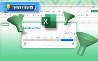
The next step is to add a timeline associated with this data. Select any cell in the Pivot Table, open the Insert tab on the ribbon, and click Timeline.

In the dialog box that appears, select Month (or any time period in the table), and click OK.

Now adjust the position and size of the timeline in the spreadsheet so that it is neatly located near the Pivot Table. In my case, I inserted some extra rows above the table and moved the timeline to the top of the worksheet.

Step 3: Set the format of the timeline filter
In addition to adjusting the size and position of the timeline, you can also format it to make it more beautiful. After selecting the timeline, Excel adds the Timeline tab to the ribbon. There, you can select the labels to display by selecting and unchecking the options in the Show group, or selecting a different design in the Timeline Style group.

Although the preset timeline style cannot be reset, the style can be copied and formatted. To do this, right-click the selected style and click Copy.

Then, in the Modify Timeline Style dialog box, rename the new style in the Name field, and then click Format.

Now browse the Fonts, Borders, and Fill tabs to apply your own design to the timeline, click OK twice when you are done to close both dialogs and save the new style.

Finally, select the timeline and click on the new timeline style you just created to apply its formatting.
Going a step further: Add Pivot Chart
The last step to getting the most out of the timeline is to add a pivot chart that will be updated based on the time you selected in the timeline. Select any cell in the Pivot Table and click Pivot Chart on the Insert tab of the ribbon.

Now, in the Insert Chart dialog box, select the Chart Type in the menu on the left and the Chart in the selector area on the right. In my case, I chose a simple clustered column chart. Then, click OK.

Related: 10 Most Used Excel Charts and What to Do
Choose the best way to visualize your data.

Resize the chart position and size, double-click the chart title to change the name, and then click the ' ' button to select the label you want to display.

Related: How to Format Charts in Excel
Excel provides (too many) tools to make your charts more beautiful.

Now, select a time period on the timeline and view the Pivot Table and Pivot Chart to display the relevant data.
Another way to quickly filter data in an Excel table is to add an Excel Data Slicer, which is a series of buttons representing different categories or values in the data. The added benefit of using slicers is that they don't require you to convert your data into pivot tables - they work as well as regular Excel tables.
The above is the detailed content of How to Create a Timeline Filter in Excel. For more information, please follow other related articles on the PHP Chinese website!

Hot AI Tools

Undresser.AI Undress
AI-powered app for creating realistic nude photos

AI Clothes Remover
Online AI tool for removing clothes from photos.

Undress AI Tool
Undress images for free

Clothoff.io
AI clothes remover

Video Face Swap
Swap faces in any video effortlessly with our completely free AI face swap tool!

Hot Article
Hot Tools

Notepad++7.3.1
Easy-to-use and free code editor

SublimeText3 Chinese version
Chinese version, very easy to use

Zend Studio 13.0.1
Powerful PHP integrated development environment

Dreamweaver CS6
Visual web development tools

SublimeText3 Mac version
God-level code editing software (SublimeText3)
Hot Topics


 How to Create a Timeline Filter in Excel
Apr 03, 2025 am 03:51 AM
How to Create a Timeline Filter in Excel
Apr 03, 2025 am 03:51 AM
In Excel, using the timeline filter can display data by time period more efficiently, which is more convenient than using the filter button. The Timeline is a dynamic filtering option that allows you to quickly display data for a single date, month, quarter, or year. Step 1: Convert data to pivot table First, convert the original Excel data into a pivot table. Select any cell in the data table (formatted or not) and click PivotTable on the Insert tab of the ribbon. Related: How to Create Pivot Tables in Microsoft Excel Don't be intimidated by the pivot table! We will teach you basic skills that you can master in minutes. Related Articles In the dialog box, make sure the entire data range is selected (
 You Need to Know What the Hash Sign Does in Excel Formulas
Apr 08, 2025 am 12:55 AM
You Need to Know What the Hash Sign Does in Excel Formulas
Apr 08, 2025 am 12:55 AM
Excel Overflow Range Operator (#) enables formulas to be automatically adjusted to accommodate changes in overflow range size. This feature is only available for Microsoft 365 Excel for Windows or Mac. Common functions such as UNIQUE, COUNTIF, and SORTBY can be used in conjunction with overflow range operators to generate dynamic sortable lists. The pound sign (#) in the Excel formula is also called the overflow range operator, which instructs the program to consider all results in the overflow range. Therefore, even if the overflow range increases or decreases, the formula containing # will automatically reflect this change. How to list and sort unique values in Microsoft Excel
 Use the PERCENTOF Function to Simplify Percentage Calculations in Excel
Mar 27, 2025 am 03:03 AM
Use the PERCENTOF Function to Simplify Percentage Calculations in Excel
Mar 27, 2025 am 03:03 AM
Excel's PERCENTOF function: Easily calculate the proportion of data subsets Excel's PERCENTOF function can quickly calculate the proportion of data subsets in the entire data set, avoiding the hassle of creating complex formulas. PERCENTOF function syntax The PERCENTOF function has two parameters: =PERCENTOF(a,b) in: a (required) is a subset of data that forms part of the entire data set; b (required) is the entire dataset. In other words, the PERCENTOF function calculates the percentage of the subset a to the total dataset b. Calculate the proportion of individual values using PERCENTOF The easiest way to use the PERCENTOF function is to calculate the single
 If You Don't Rename Tables in Excel, Today's the Day to Start
Apr 15, 2025 am 12:58 AM
If You Don't Rename Tables in Excel, Today's the Day to Start
Apr 15, 2025 am 12:58 AM
Quick link Why should tables be named in Excel How to name a table in Excel Excel table naming rules and techniques By default, tables in Excel are named Table1, Table2, Table3, and so on. However, you don't have to stick to these tags. In fact, it would be better if you don't! In this quick guide, I will explain why you should always rename tables in Excel and show you how to do this. Why should tables be named in Excel While it may take some time to develop the habit of naming tables in Excel (if you don't usually do this), the following reasons illustrate today
 How to Format a Spilled Array in Excel
Apr 10, 2025 pm 12:01 PM
How to Format a Spilled Array in Excel
Apr 10, 2025 pm 12:01 PM
Use formula conditional formatting to handle overflow arrays in Excel Direct formatting of overflow arrays in Excel can cause problems, especially when the data shape or size changes. Formula-based conditional formatting rules allow automatic formatting to be adjusted when data parameters change. Adding a dollar sign ($) before a column reference applies a rule to all rows in the data. In Excel, you can apply direct formatting to the values or background of a cell to make the spreadsheet easier to read. However, when an Excel formula returns a set of values (called overflow arrays), applying direct formatting will cause problems if the size or shape of the data changes. Suppose you have this spreadsheet with overflow results from the PIVOTBY formula,

 How to Use Excel's AGGREGATE Function to Refine Calculations
Apr 12, 2025 am 12:54 AM
How to Use Excel's AGGREGATE Function to Refine Calculations
Apr 12, 2025 am 12:54 AM
Quick Links The AGGREGATE Syntax
 Excel MATCH function with formula examples
Apr 15, 2025 am 11:21 AM
Excel MATCH function with formula examples
Apr 15, 2025 am 11:21 AM
This tutorial explains how to use MATCH function in Excel with formula examples. It also shows how to improve your lookup formulas by a making dynamic formula with VLOOKUP and MATCH. In Microsoft Excel, there are many different lookup/ref
