


 收藏
收藏


 天蓬老师
天蓬老师批改状态:合格
老师批语:移动页面, 需要面向视口编程, 就是面向可视区域, 课上教了如何使用vh / vw这样的相对单位 , 为什么不使用呢?

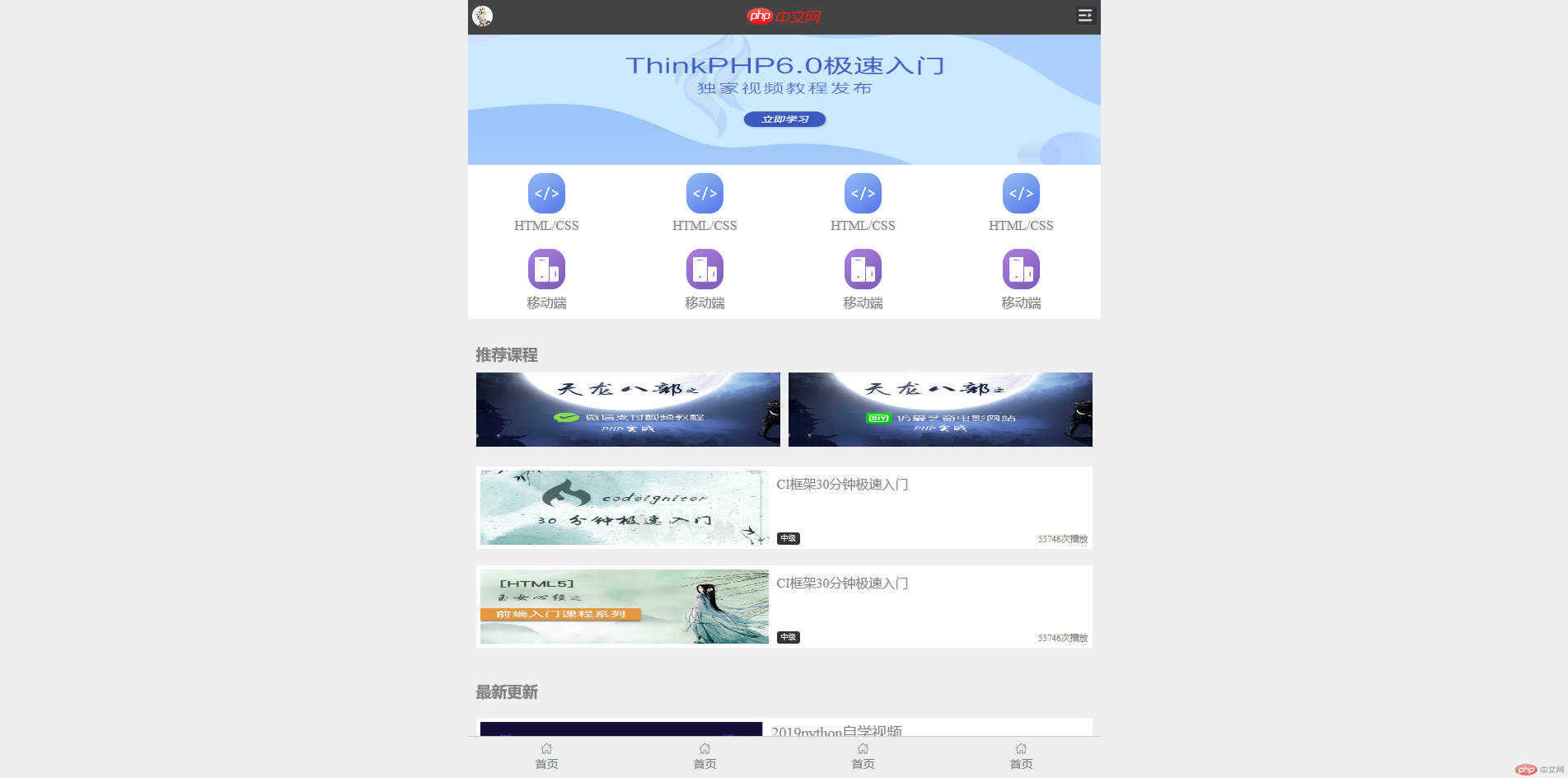
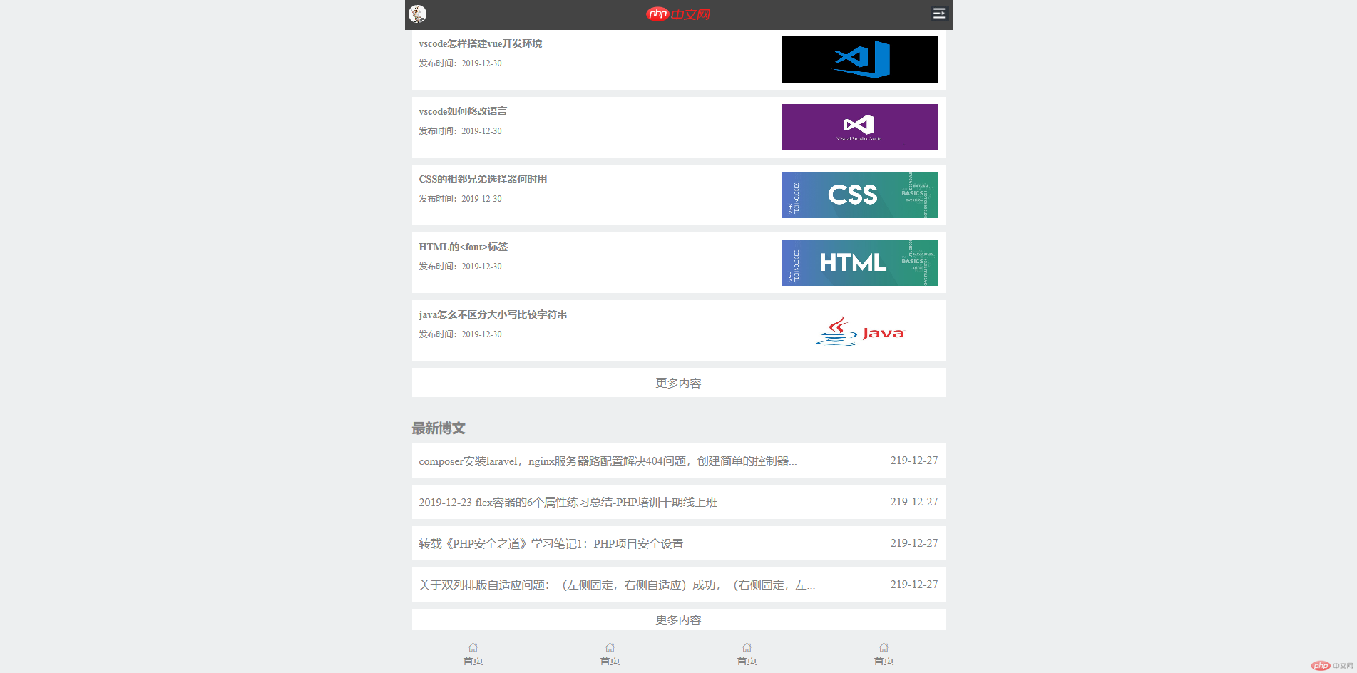
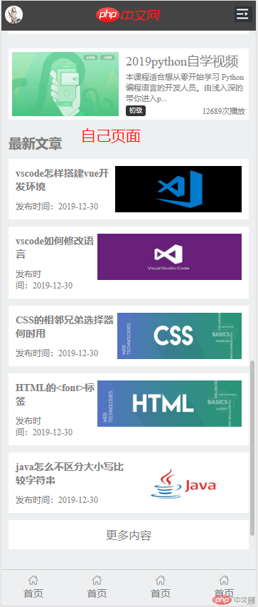
<!DOCTYPE html><html lang="en"><head> <meta charset="UTF-8"> <link rel="stylesheet" href="static/font/iconfont.css"> <link rel="stylesheet" href="m.php.cn.css"> <title>php中文网手机端练习</title></head><body><div class="header"> <a href=""><img src="static/images/user-pic.jpeg" alt=""></a> <a href=""><img src="static/images/logo.png" alt=""></a> <a href=""><img src="static/images/user-nav.jpg" alt=""></a></div><div class="banner"> <img src="static/images/banner.jpg" alt=""></div><div class="nav"> <ul> <li> <a href=""> <img src="static/images/html.png" alt=""> <span>HTML/CSS</span> </a> </li> <li> <a href=""> <img src="static/images/html.png" alt=""> <span>HTML/CSS</span> </a> </li> <li> <a href=""> <img src="static/images/html.png" alt=""> <span>HTML/CSS</span> </a> </li> <li> <a href=""> <img src="static/images/html.png" alt=""> <span>HTML/CSS</span> </a> </li> </ul> <ul> <li> <a href=""> <img src="static/images/app.png" alt=""> <span>移动端</span> </a> </li> <li> <a href=""> <img src="static/images/app.png" alt=""> <span>移动端</span> </a> </li> <li> <a href=""> <img src="static/images/app.png" alt=""> <span>移动端</span> </a> </li> <li> <a href=""> <img src="static/images/app.png" alt=""> <span>移动端</span> </a> </li> </ul></div><div class="main"> <h3>推荐课程</h3> <div class="recommend"> <section> <a href=""><img src="static/images/tjkc1.jpg" alt=""></a> <a href=""><img src="static/images/tjkc2.jpg" alt=""></a> </section> <section> <div> <a href=""><img src="static/images/tjkc3.jpg" alt=""></a> <span> <a href="">CI框架30分钟极速入门</a> <span><i>中级</i>55746次播放</span> </span> </div> <div> <a href=""><img src="static/images/tjkc4.jpg" alt=""></a> <span> <a href="">CI框架30分钟极速入门</a> <span><i>中级</i>55746次播放</span> </span> </div> </section> </div></div><div class="replace"> <h3>最新更新</h3> <section> <div> <a href=""><img src="static/images/replace1.jpg" alt=""></a> <span> <a href="">2019python自学视频</a> <span>本课程适合想从零开始学习 Python 编程语言的开发人员。由浅入深的带你进入p...</span> <span><i>初级</i>12689次播放</span> </span> </div> </section> <section> <div> <a href=""><img src="static/images/replace2.png" alt=""></a> <span> <a href="">2019python自学视频</a> <span>本课程适合想从零开始学习 Python 编程语言的开发人员。由浅入深的带你进入p...</span> <span><i>初级</i>12689次播放</span> </span> </div> </section> <section> <div> <a href=""><img src="static/images/replace3.jpg" alt=""></a> <span> <a href="">2019python自学视频</a> <span>本课程适合想从零开始学习 Python 编程语言的开发人员。由浅入深的带你进入p...</span> <span><i>初级</i>12689次播放</span> </span> </div> </section> <section> <div> <a href=""><img src="static/images/replace4.png" alt=""></a> <span> <a href="">2019python自学视频</a> <span>本课程适合想从零开始学习 Python 编程语言的开发人员。由浅入深的带你进入p...</span> <span><i>初级</i>12689次播放</span> </span> </div> </section> <section> <div> <a href=""><img src="static/images/replace5.jpg" alt=""></a> <span> <a href="">2019python自学视频</a> <span>本课程适合想从零开始学习 Python 编程语言的开发人员。由浅入深的带你进入p...</span> <span><i>初级</i>12689次播放</span> </span> </div> </section> <section> <div> <a href=""><img src="static/images/replace6.png" alt=""></a> <span> <a href="">2019python自学视频</a> <span>本课程适合想从零开始学习 Python 编程语言的开发人员。由浅入深的带你进入p...</span> <span><i>初级</i>12689次播放</span> </span> </div> </section></div><article> <h3>最新文章</h3> <div> <a href=""> <span> <span>vscode怎样搭建vue开发环境</span> <span>发布时间:2019-12-30</span> </span> <img src="static/images/article1.jpg" alt=""> </a> </div> <div> <a href=""> <span> <span>vscode如何修改语言</span> <span>发布时间:2019-12-30</span> </span> <img src="static/images/article2.jpg" alt=""> </a> </div> <div> <a href=""> <span> <span>CSS的相邻兄弟选择器何时用</span> <span>发布时间:2019-12-30</span> </span> <img src="static/images/article3.jpg" alt=""> </a> </div> <div> <a href=""> <span> <span>HTML的<font>标签</span> <span>发布时间:2019-12-30</span> </span> <img src="static/images/article4.jpg" alt=""> </a> </div> <div> <a href=""> <span> <span>java怎么不区分大小写比较字符串</span> <span>发布时间:2019-12-30</span> </span> <img src="static/images/article5.jpg" alt=""> </a> </div> <div> <a href=""> <span>更多内容</span> </a> </div></article><div class="bowen"> <h3>最新博文</h3> <div> <span>composer安装laravel,nginx服务器路配置解决404问题,创建简单的控制器...</span> <span>219-12-27</span> </div> <div> <span>2019-12-23 flex容器的6个属性练习总结-PHP培训十期线上班</span> <span>219-12-27</span> </div> <div> <span>转载《PHP安全之道》学习笔记1:PHP项目安全设置</span> <span>219-12-27</span> </div> <div> <span>关于双列排版自适应问题:(左侧固定,右侧自适应)成功,(右侧固定,左...</span> <span>219-12-27</span> </div> <div> <span>更多内容</span> </div></div><footer> <section> <a href=""> <i class="iconfont icon-shouyeshouye"></i> <span>首页</span> </a> </section> <section> <a href=""> <i class="iconfont icon-shouyeshouye"></i> <span>首页</span> </a> </section> <section> <a href=""> <i class="iconfont icon-shouyeshouye"></i> <span>首页</span> </a> </section> <section> <a href=""> <i class="iconfont icon-shouyeshouye"></i> <span>首页</span> </a> </section></footer></body></html>
* { margin: 0; padding: 0;}a { text-decoration: none; color: gray;}li { list-style: none;}body { min-width: 320px; max-width: 768px; margin: 0 auto; background-color: #edeff0; overflow-y: initial; position: relative; overflow-x: hidden; -webkit-tap-highlight-color: transparent; color: gray;}img { width: 100%;}/*头部*/.header { position: fixed; top: 0; height: 42px; width: 100%; background-color: #444444; color: #888888; min-width: 320px; max-width: 768px; display: flex; justify-content: space-between; align-items: center;}.header >a:first-of-type > img { width: 25px; border-radius: 12px; margin-left: 5px;}.header > a:last-of-type > img { width: 25px; margin-right: 5px;}.header > a > img { width: 94px;}/*轮播图*/.banner{ display: flex; height: 200px;}/*导航*/.nav { background-color: #fff; display: flex; flex-flow: column nowrap;}.nav img { width: 45px; height: 49px;}.nav ul{ display: flex; flex-flow: row nowrap;}.nav ul li { flex: 1;}.nav ul li a { display: flex; flex-flow: column wrap; align-items: center; margin: 10px;}.nav ul li a span { margin-top: 5px;}/*推荐课程*/.main { margin-top: 20px; display: flex; flex-flow: column nowrap; padding: 10px;}.main > h3 { margin-bottom: 10px;}.main > .recommend > section:first-child { display: flex;}.main > .recommend > section:first-child > a { flex: 1; margin-bottom: 20px;}.main > .recommend > section:first-child > a:first-child { margin-right: 5px;}.main > .recommend > section:first-child > a:last-child { margin-left: 5px;}.main > .recommend > section:first-child > a > img { height: 90px;}/*推荐列表*/.main > .recommend > section:last-of-type { display: flex; flex-flow: column;}.main > .recommend > section:last-of-type > div { background-color: #fff; padding: 5px; display: flex; flex-flow: row nowrap; margin-bottom: 20px;}.main > .recommend > section:last-of-type > div > a { width: 350px;}.main > .recommend > section:last-of-type > div img { display: block; height: 90px;}.main > .recommend > section:last-of-type > div > span { flex: 1; display: flex; flex-flow: column; justify-content: space-between; margin-top: 5px; padding-left: 10px;}.main > .recommend > section:last-of-type > div > span i { font-style: normal; background-color: #333333; color: white; border-radius: 3px; padding: 0 5px; font-size: smaller;}.main > .recommend > section:last-of-type > div > span > span { margin-top: 40px; display: flex; font-size: 11px; justify-content: space-between;}/*最新更新*/.replace { padding: 10px;}.replace > section { display: flex; flex-flow: column; margin-top: 20px;}.replace > section > div { background-color: #fff; padding: 5px; display: flex; flex-flow: row nowrap;}.replace > section > div > a { width: 350px;}.replace > section > div img { display: block; height: 90px;}.replace > section > div > span { display: flex; flex-flow: column; margin-left: 10px; justify-content: space-between;}.replace > section > div > span > a { font-size: 18px;}.replace > section > div > span > span { font-size: 11px;}.replace > section > div > span > span:last-child { display: flex; justify-content: space-between;}.replace > section >div > span > span > i { font-style: normal; background-color: #333333; color: white; border-radius: 3px; padding: 0 5px; font-size: smaller;}/*最新文章*/article { padding: 10px;}article > div { background-color: #fff; padding: 10px; margin: 10px 0px;}article > div > a { display: flex;}article > div > a > img { width: 219px; height: 65px; margin-left: auto;}article > div > a > span { display: flex; flex-flow: column nowrap;}article > div > a > span > span:first-child { font-weight: bolder; font-size: 14px;}article > div > a > span > span:last-child { font-size: 12px; margin-top: 10px;}article > div:last-child { display: flex; justify-content: center;}/*最新博文*/.bowen { padding: 10px; display: flex; flex-flow: column;}.bowen > div { background-color: #fff; height: 48px; margin-top: 10px; padding: 10px; box-sizing: border-box; display: flex; align-items: center; justify-content: space-between;}.bowen > div:last-child{ height: 30px; justify-content: center; margin-bottom: 50px;}/*尾部*/footer { width: 100%; min-width: 320px; max-width: 768px; height: 50px; background-color: #edeff0; border-top: 1px solid #ccc; display: flex; flex-flow: row nowrap; justify-content: space-around; position: fixed; bottom: 0;}footer > section > a { padding: 5px; display: flex; flex-flow: column nowrap; align-items: center;}footer > section > a > span { font-size: 14px;}footer > section > a i { font-size: 16px;}终于抽出时间终于完成了27号的作业,嘻嘻,28号的视频还没有看…在制作页面中遇到了一些小问题
在body设置min-width和max-width的情况下,header和footer只设置width:100%属性时如下图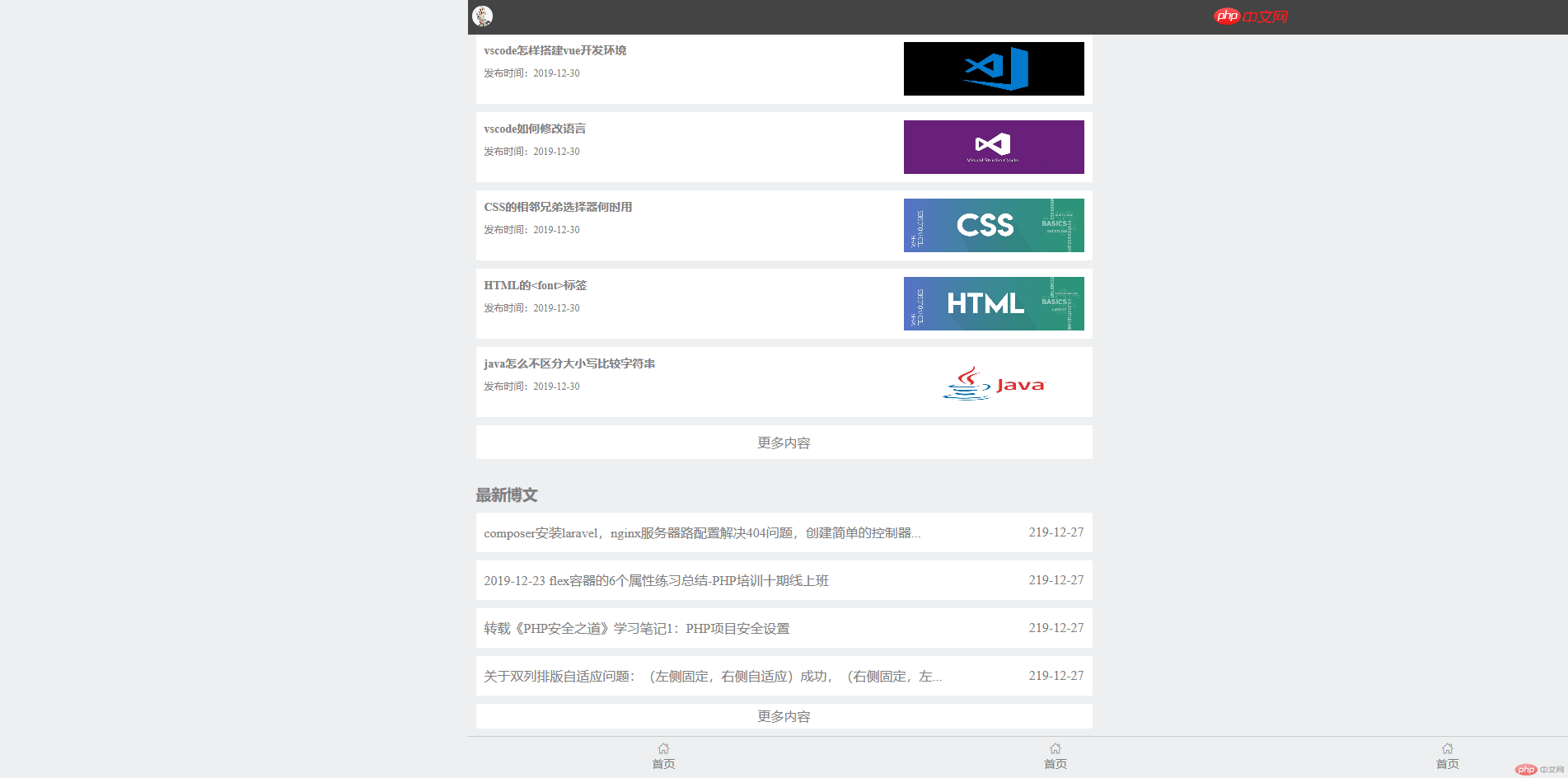
不知道是不是因为header和footer是固定定位的原因?ps:其他版块都正常。header和footer也需要加上min-width和max-width属性才正常显示。
在屏幕缩小后推荐课程版块两张图片最开始没有跟着缩小,其他版块图片正常自动缩小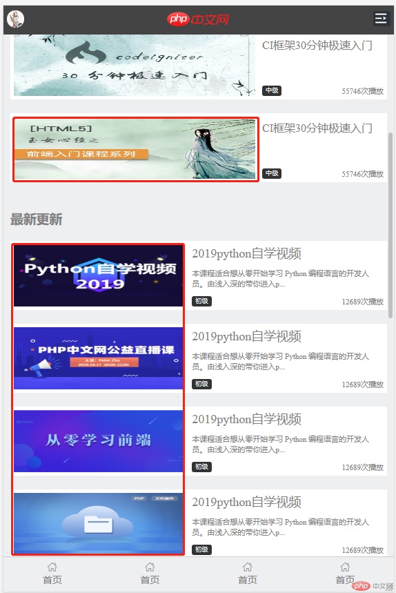
我在看m.php.cn首页在缩小时这个版块是一直整齐缩小,而我的缩小到一定程度左边开始不齐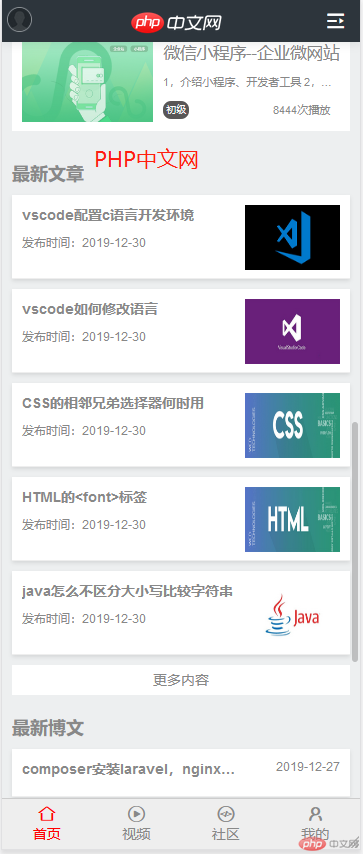

Copyright 2014-2025 https://www.php.cn/ All Rights Reserved | php.cn | 湘ICP备2023035733号


