


 收藏
收藏


 天蓬老师
天蓬老师批改状态:合格
老师批语:教科书级的作业, 推荐所有学员学习

flex: 弹性布局
flex兼容性不要担心
块元素的垂直居中
元素在容器中 自动伸缩,适应容器大小的变化,特别适合移动端布局
只有二级: 父级和子级
父元素叫: flex容器(container)
子元素叫: flex项目(item) 或 flex元素
flex是一维布局,项目要么水平排列, 要么垂直排列,任何时间都只能沿着一个方向排列
flex项目的排列方向, 称为主轴, 排列方式有二种, 所以主轴也有二种: 水平/行轴,垂直/纵轴
与主轴对应的轴,称为交叉轴, 副轴, 侧轴
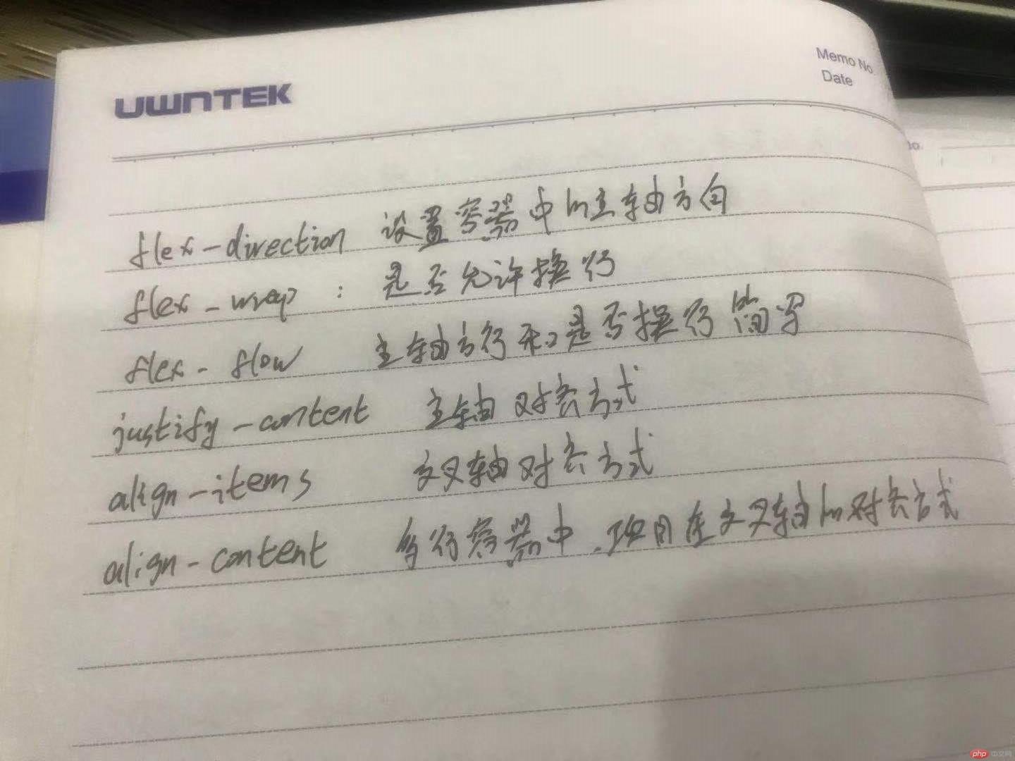
flex-direction: 设置容器中的主轴方向
flex-direction: row;       /*按行方向延伸*/
flex-direction: column;    /*按列方向延伸*/
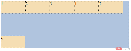
flex-wrap: 是否允许创建多行容器, 一行排不下, 是否允许换行显示
flex-wrap: nowrap;   /*不允许换行*/
flex-wrap: wrap;     /*允许换行*/
flex-flow: 是上面二个属性的简写
flex-flow: /*主轴方向 是否换行显示;
flex-flow: row wrap;    /*按行方向延伸且允许换行
justify-content: 设置容器中的项目在主轴上的对齐方式
justify-content: flex-start;   /*向起始线对齐*/
justify-content: flex-end;     /*向终止线对齐*/
justify-content: center;       /*居中对齐*/
justify-content: 可以分配主轴上剩余空间
justify-content: space-between;  /*两端对齐
justify-content: space-around;   /*分散对齐
justify-content: space-evenly;   /*平均对齐
align-items: 项目在交叉轴上的排列方式
align-items: flex-start;  /*顶部对齐*/
align-items: flex-end;    /*底部对齐*/
align-items: center;      /*垂直居中对齐*/
align-content: 设置项目在多行容器交叉轴上的对齐方式
align-content: space-between;  /*上下对齐*/
align-content: space-around;   /*分散对齐*/
align-content: space-evenly;   /*平均对齐*/
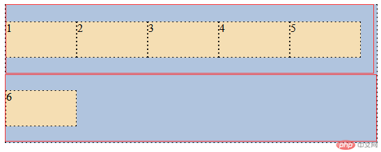
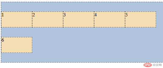
HTML页面
<!doctype html>
<html lang="en">
<head>
 <meta charset="UTF-8">
 <title>flex练习</title>
 <style>
     .container {
         border: 1px dashed;
         box-sizing: border-box;
         background-color: lightsteelblue;
     }
     .item {
         width: 100px;
         height: 50px;
         border: 1px dashed;
         background-color: wheat;
     }
 </style>
</head>
<body>
<div class="container">
 <div class="item">1</div>
 <div class="item">2</div>
 <div class="item">3</div>
 <div class="item">4</div>
 <div class="item">5</div>
 <div class="item">6</div>
</div>
</body>
</html>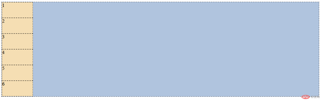
转为flex容器(默认为按行排列)
.container {
         /*转为弹性盒子,flex容器*/
         display: flex;
         /*默认flex-direction: row排列*/
     }
flex-direction: column(按列方向排列)
.container {
         /*转为弹性盒子,flex容器*/
         display: flex;
         flex-direction:column;
     }
flex-wrap: 是否允许换行
.container {
         /*转为弹性盒子,flex容器*/
         display: flex;
         flex-wrap: nowrap; /*不设置此属性时也默认为不允许换行*/
     }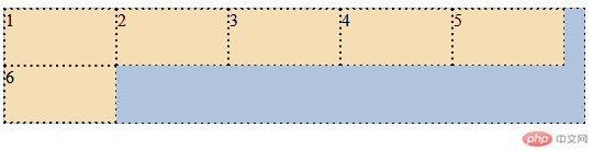
.container {
         /*转为弹性盒子,flex容器*/
         display: flex;
         flex-wrap:wrap;  /*允许换行*/
     }
flex-flow:主轴方向 是否允许换行
.container {
         /*转为弹性盒子,flex容器*/
         display: flex;
         /*按行方向排序,允许换行*/
         flex-flow: row wrap;
     }
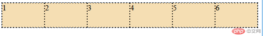
justify-content: 设置容器中的项目在主轴上的对齐方式
.container {
/*转为弹性盒子,flex容器*/
display: flex;
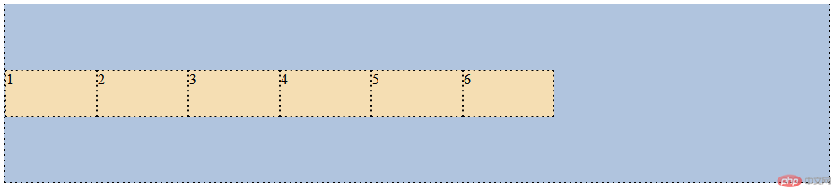
/*居中对齐*/
justify-content: center;
}
.container {
/*转为弹性盒子,flex容器*/
display: flex;
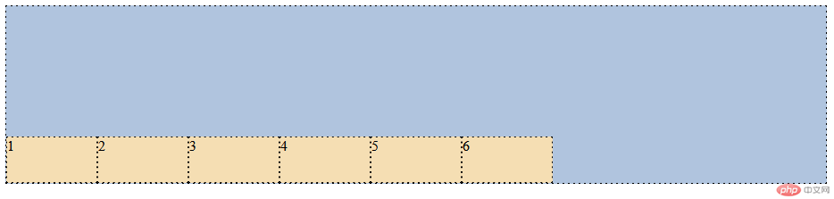
/*向终止线对齐*/
justify-content: flex-end;
}
.container {
/*转为弹性盒子,flex容器*/
display: flex;
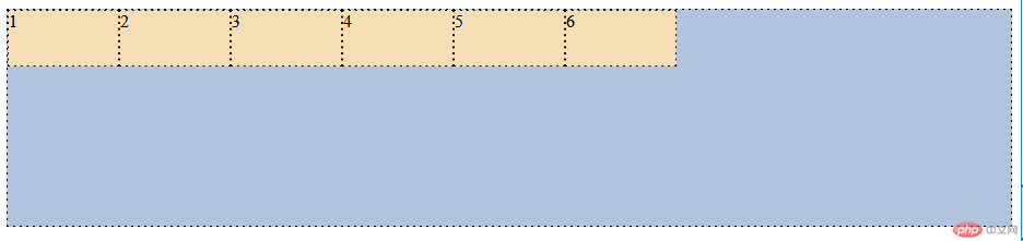
/*flex容器默认为起始线对齐*/
justify-content: flex-start;
}
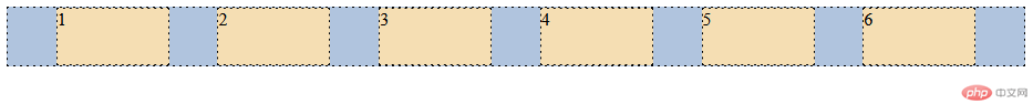
justify-content: 可以分配主轴上剩余空间
.container {
         /*转为弹性盒子,flex容器*/
         display: flex;
         /*平均对齐*/
         justify-content: space-evenly;
     }
.container {
         /*转为弹性盒子,flex容器*/
         display: flex;
         /*分散对齐*/
         justify-content: space-around;
     }
.container {
         /*转为弹性盒子,flex容器*/
         display: flex;
         /*两端对齐*/
         justify-content: space-between;
     }
align-items: 项目在交叉轴上的排列方式
.container {
         /*转为弹性盒子,flex容器*/
         display: flex;
         height: 200px;
         /*垂直居中对齐*/
         align-items: center;
     }
.container {
         /*转为弹性盒子,flex容器*/
         display: flex;
         height: 200px;
         /*底部对齐*/
         align-items: flex-end;
     }
.container {
         /*转为弹性盒子,flex容器*/
         display: flex;
         height: 200px;
         /*flex默认为顶部对齐*/
         align-items: flex-start;
     }
align-content: 设置项目在多行容器交叉轴上的对齐方式
.container {
         /*转为弹性盒子,flex容器*/
         display: flex;
         height: 200px;
         /*允许换行*/
         flex-wrap: wrap;
         /*平均对齐*/
         align-content: space-evenly;
     }
.container {
         /*转为弹性盒子,flex容器*/
         display: flex;
         height: 200px;
         /*允许换行*/
         flex-wrap: wrap;
         /*两端对齐*/
         align-content: space-around;
     }
.container {
         /*转为弹性盒子,flex容器*/
         display: flex;
         height: 200px;
         /*允许换行*/
         flex-wrap: wrap;
         /*两端对齐*/
         align-content: space-between;
     }

Copyright 2014-2025 https://www.php.cn/ All Rights Reserved | php.cn | 湘ICP备2023035733号


