


 收藏
收藏


 天蓬老师
天蓬老师批改状态:合格
老师批语:不知是否理解了flex, 其实只要明白flex就是想办法让元素在容器中在自适应 , 这才是它的目标就可以了
<!DOCTYPE html><html lang="en"><head><meta charset="UTF-8" /><meta name="viewport" content="width=device-width, initial-scale=1.0" /><title>基于浮动的三列布局</title><style>header,footer,aside,main {background-color: #dedede;}header,footer {height: 50px;}aside,main {min-height: 600px;}.wrap {width: 1000px;border: 1px solid #000000;overflow: hidden;margin: 10px auto;}aside {width: 200px;float: left;}main {width: 790px;float: right;}</style></head><body><header>页眉</header><div class="wrap"><aside>侧边栏</aside><main>主题内容</main></div><header>页尾</header></body></html>
运行图: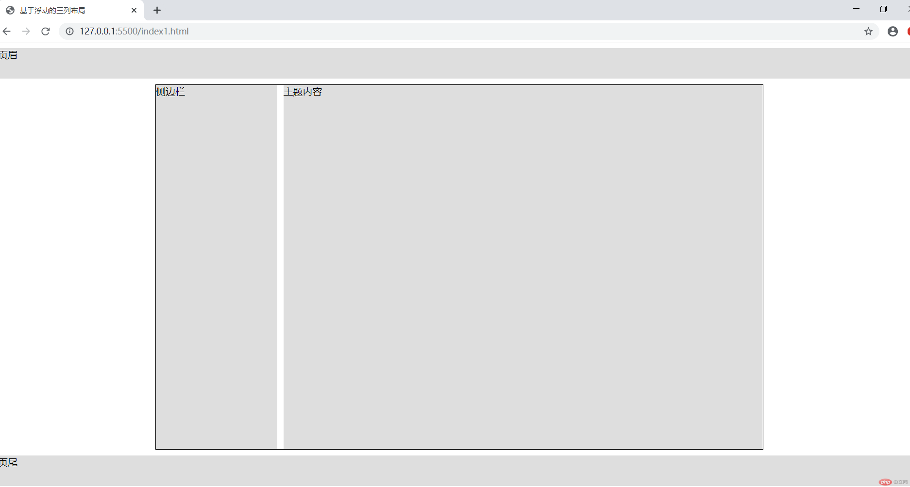
2.定位布局
<style>header,footer,aside,main {background-color: #dedede;}header,footer {height: 50px;}aside,main {min-height: 600px;}.wrap {width: 1000px;border: 1px solid #000000;margin: 10px auto;/* 设置定位父级 */position: relative;min-height: 600px;}aside {width: 200px;position: absolute;/* 代码简化 *//* left: 0;top: 0; */min-height: inherit;}main {width: 790px;float: right;position: absolute;right: 0;/* 代码简化 *//* top: 0; */min-height: inherit;}
运行图: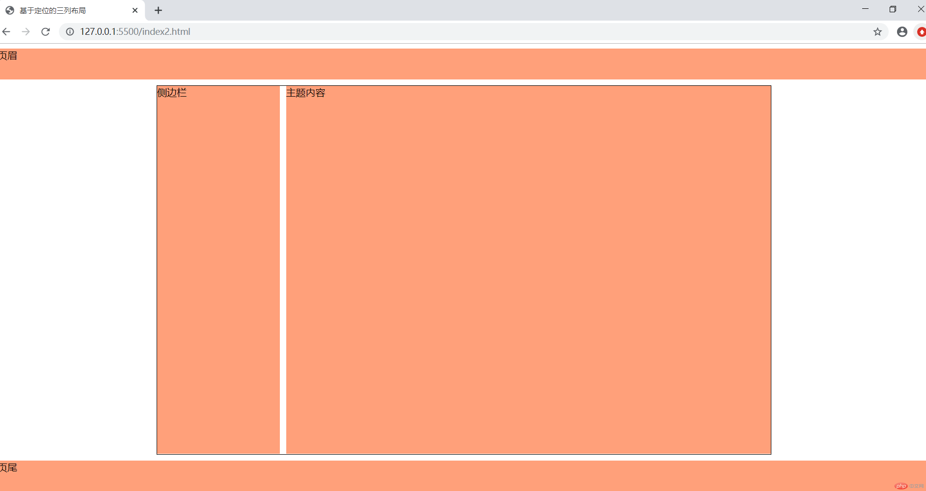
<div>投入真金白银抢先布局 新能源车发展的底气来自这些“硬核”支撑12年过去了,邓承浩还记得2008年北京奥运会时,自己第一次在新闻中见到长安新能源车的场景。尽管目前新能源汽车市场仍处于恢复发展期,这位1986年出生的青年工程师依然坚信自己的判断:在建设汽车强国的征程中,新能源汽车将扮演愈来越重要的角色。今年以来,刺激汽车消费、助力产业升级早已成为社会各界关注的热门话题。在今年全国两会第二场“部长通道”中,工业和信息化部部长苗圩专门回答了关于新能源汽车发展的提问。他开出从供给侧、需求侧和使用侧三管齐下的药方,为新能源汽车发展“添柴加火”。</div>
<style>* {padding: 0;margin: 0;box-sizing: border-box;}/* html {font-size: 18px;color: #555555;} */:root {font-size: 18px;color: #555555;}div {border: 1px solid #000;padding: 1rem;width: 60rem;margin: 30px auto;column-count: 3;column-width: auto;/* rem 字体宽度 *//* column-rule-style: solid;column-rule-width: 1px;column-rule-color: gray; *//* 样式 */column-rule: 1px solid lightgreen;}</style>
运行图: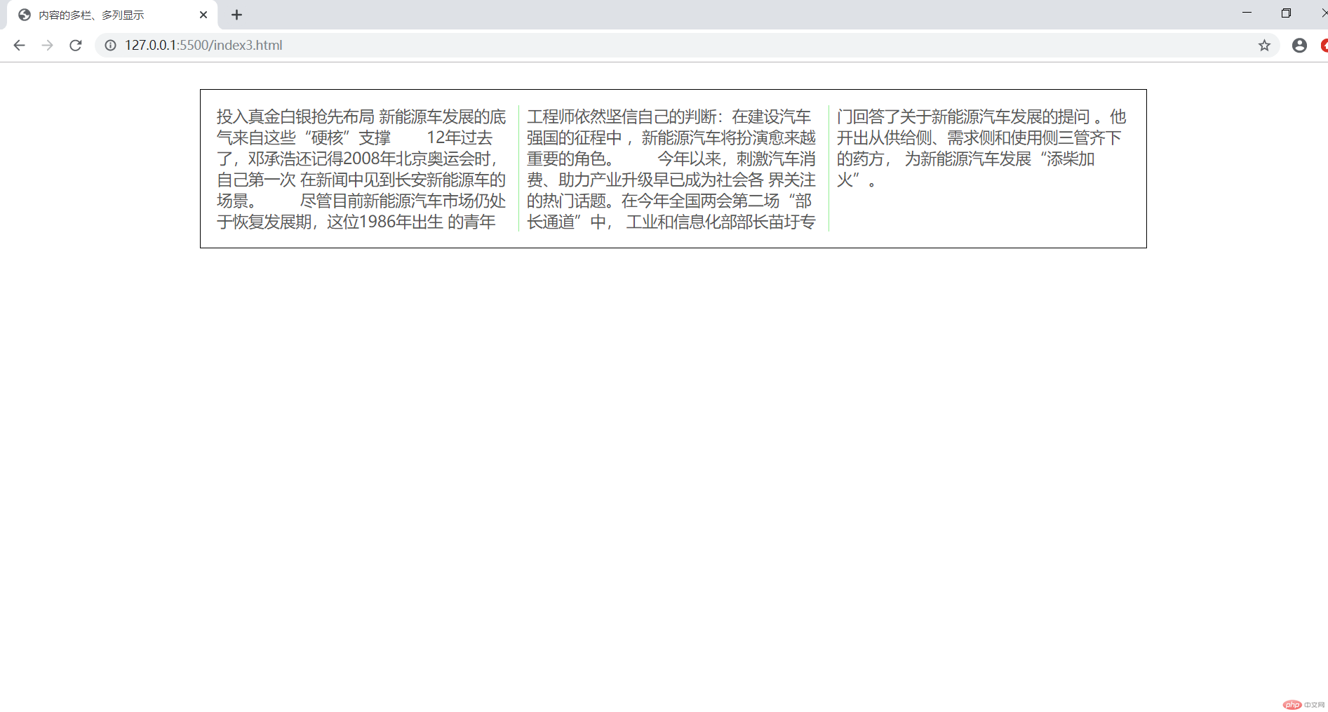

.container {width: 300px;/* 将容器转为弹性盒子 */display: flex;}
运行图: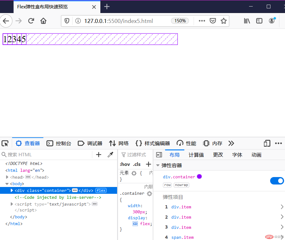
.container > .item {/* 弹性盒子的子元素为弹性项目,支持任何元素,类型变为行内块 *//*flex: auto;*/width: 50px;}
运行图: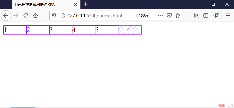
.container {/* 换行显示 */flex-wrap: wrap;}
运行图:
<!DOCTYPE html><html lang="en"><head><meta charset="UTF-8" /><meta name="viewport" content="width=device-width, initial-scale=1.0" /><title>弹性盒子单行容器的项目对齐方式</title></head><style>.container {width: 300px;display: flex;/* 控制所有项目在主轴上的对齐方式设置容器中的剩余空间在项目之间的分配方案*//* 1.在整体项目的两边进行分配 *//* 左对齐 */justify-content: flex-start;/* 右对齐 */justify-content: flex-end;/* 居中 */justify-content: center;/* 在各个项目之间进行分配 *//* 两端对齐 首尾元素不参与,其余项目左右分配剩余空间*/justify-content: space-between;/* 分散对齐 所有项目两端分配剩余空间,并且相等 */justify-content: space-around;/* 平均分配 */justify-content: space-evenly;}.container > .item {width: 60px;}</style><body><div class="container"><div class="item">1</div><div class="item">2</div><div class="item">3</div><div class="item">3</div></div></body></html>
左对齐-运行图:
右对齐-运行图: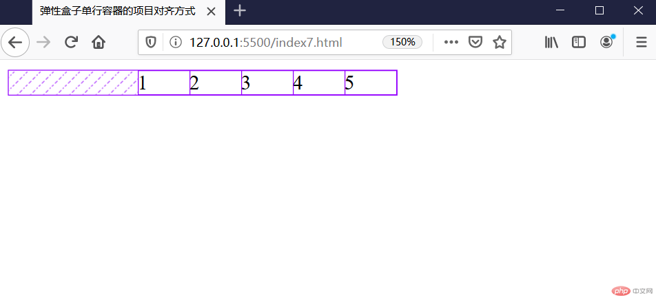
居中-运行图: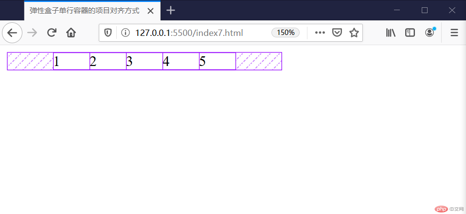
两端对齐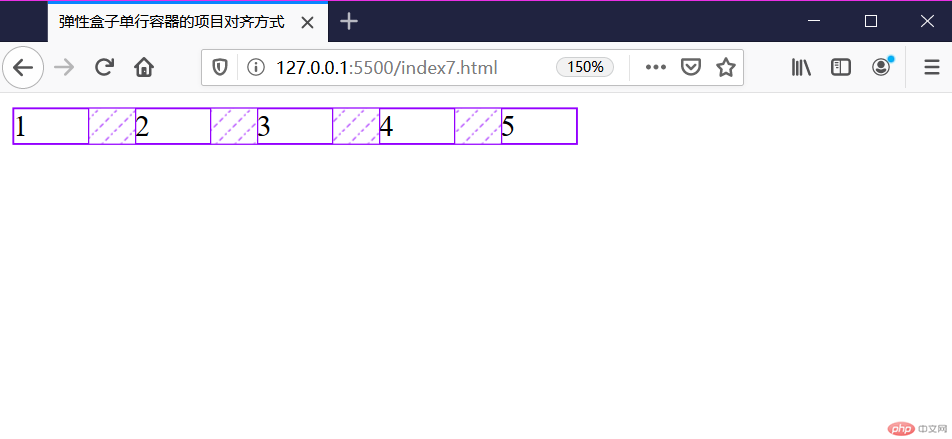
分散对齐
平均分配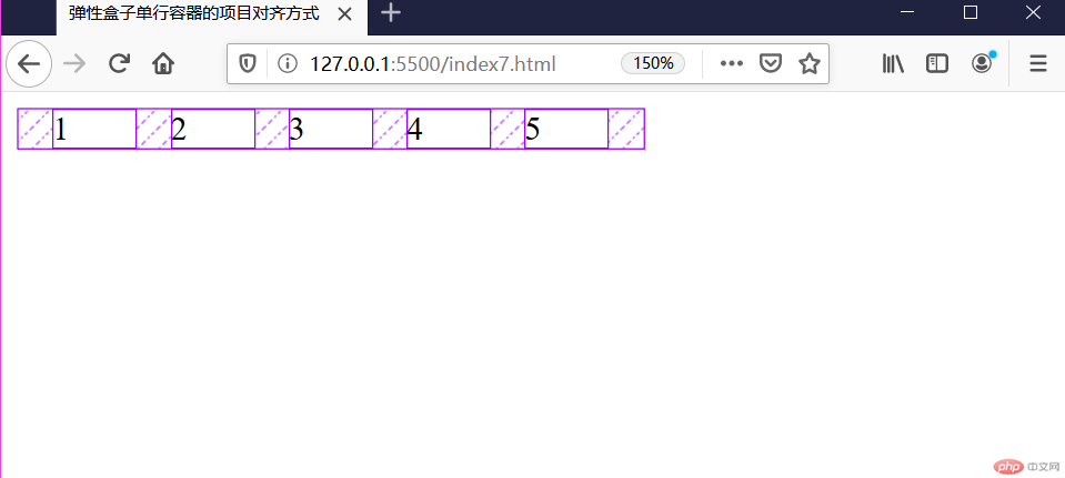
设置为多行容器
flex-wrap: wrap;
<!DOCTYPE html><html lang="en"><head><meta charset="UTF-8" /><meta name="viewport" content="width=device-width, initial-scale=1.0" /><title>多行容器的对齐方式</title></head><style>.container {width: 300px;display: flex;/* 设置为多行容器 */flex-wrap: wrap;height: 150px;/* 多行容器排列 *//* stretch为默认值 */align-content: stretch;/* 1.在整体项目的两边进行分配 */align-content: flex-start;align-content: flex-end;align-content: center;/* 项目之间 */align-content: space-between;/* 分散对齐 所有项目两端分配剩余空间,并且相等 */align-content: space-around;/* 平均分配 */align-content: space-evenly;}.container > .item {width: 60px;}</style><body><div class="container"><div class="item">1</div><div class="item">2</div><div class="item">3</div><div class="item">4</div><div class="item">5</div><div class="item">6</div><div class="item">7</div><div class="item">8</div></div></body></html>
默认值:stretch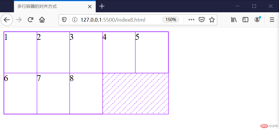
上对齐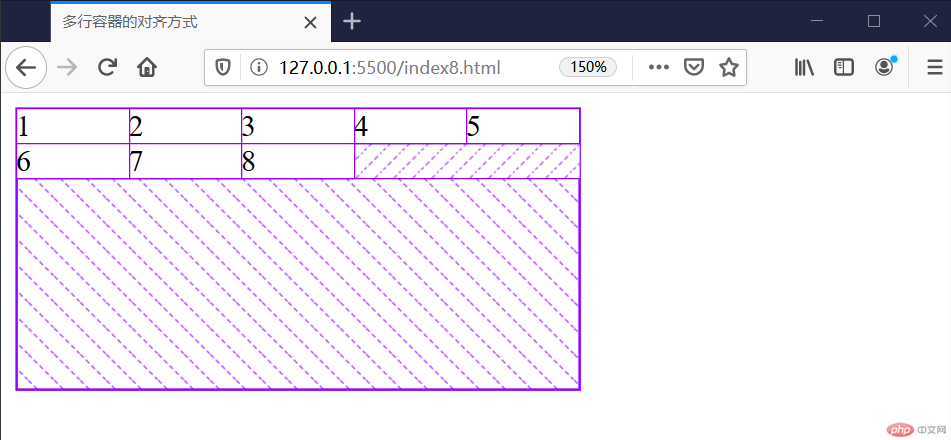
下对齐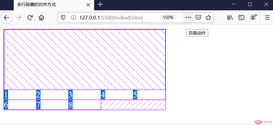
居中
两端对齐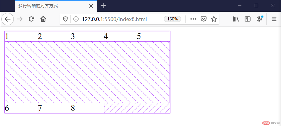
分散对齐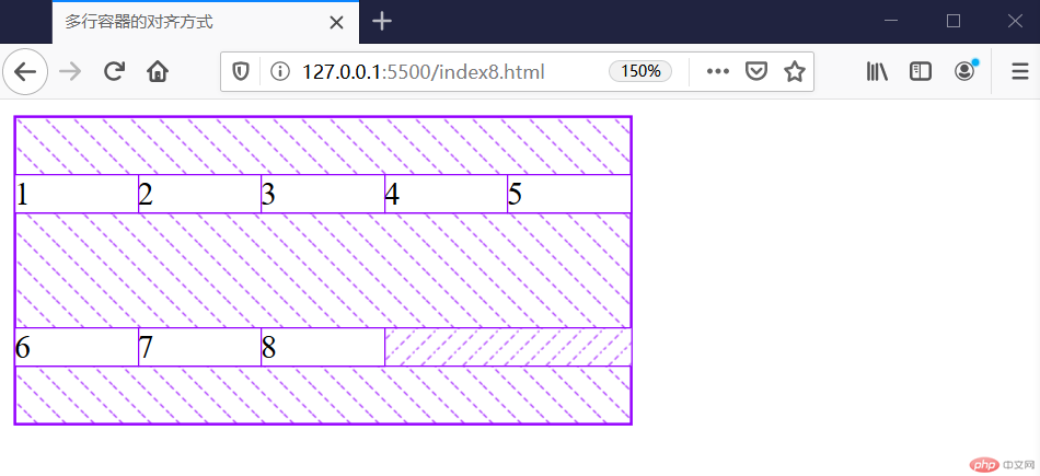
平均分配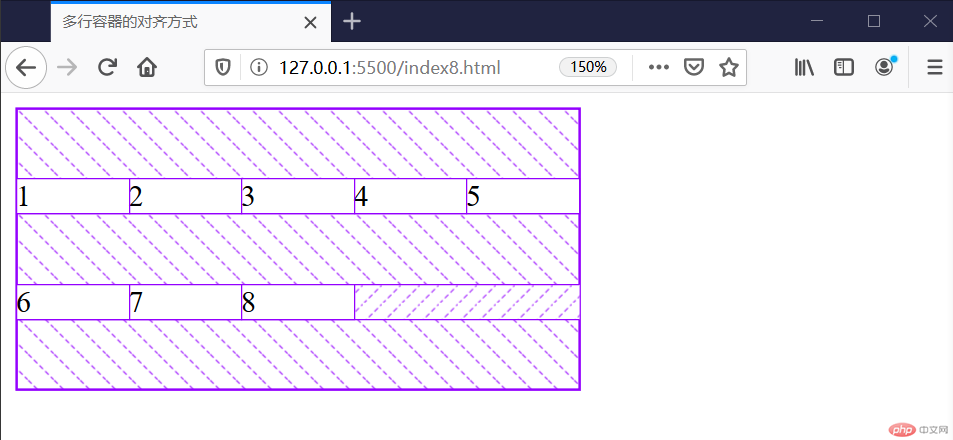
<!DOCTYPE html><html lang="en"><head><meta charset="UTF-8" /><meta name="viewport" content="width=device-width, initial-scale=1.0" /><title>主轴为垂直方向</title><style>.container {width: 300px;height: 150px;display: flex;/* 控制主轴方向,默认为行 */flex-direction: column;/* 1.在整体项目的两边进行分配 */justify-content: flex-start;justify-content: flex-end;justify-content: center;/* 项目之间 */justify-content: space-between;/* 分散对齐 所有项目两端分配剩余空间,并且相等 */justify-content: space-around;/* 平均分配 */justify-content: space-evenly;}</style></head><body><div class="container"><div class="item">1</div><div class="item">2</div><div class="item">3</div></div></body></html>
上对齐-运行图: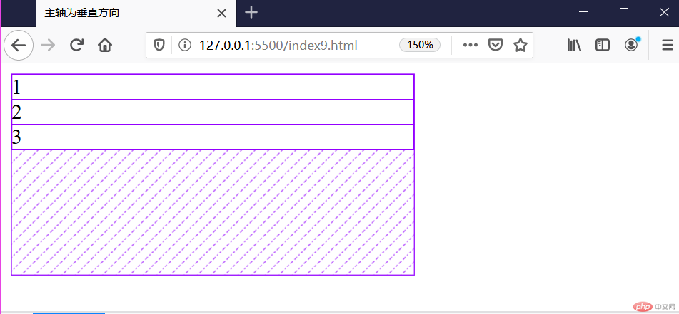
下对齐-运行图: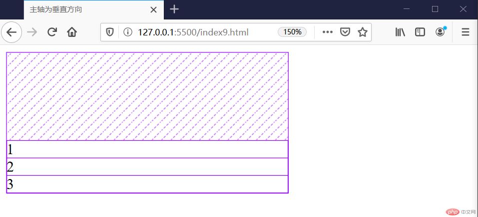
居中-运行图:
两端对齐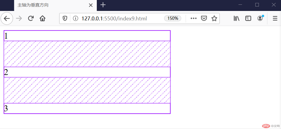
分散对齐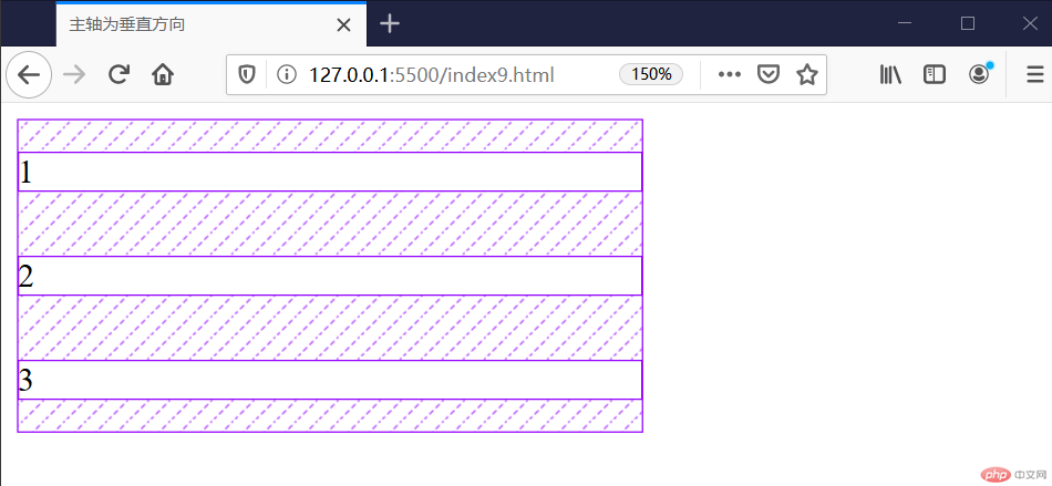
平均分配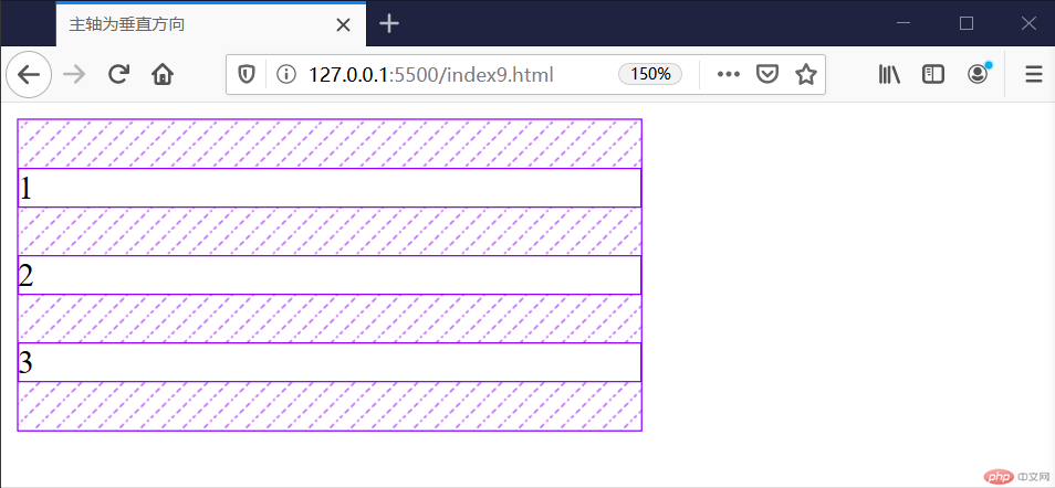
当主轴为行,项目默认在交叉轴上自动伸缩
<!DOCTYPE html><html lang="en"><head><meta charset="UTF-8" /><meta name="viewport" content="width=device-width, initial-scale=1.0" /><title>项目在交叉抽上的排列</title><style>.container {width: 300px;height: 150px;display: flex;/* 项目在交叉轴上是自动伸缩的 */align-items: stretch;align-items: flex-start;align-items: flex-end;align-items: center;}.container > .item {width: 60px;}</style></head><body><div class="container"><div class="item">1</div><div class="item">2</div><div class="item">3</div></div></body></html>
默认值:strench
上对齐: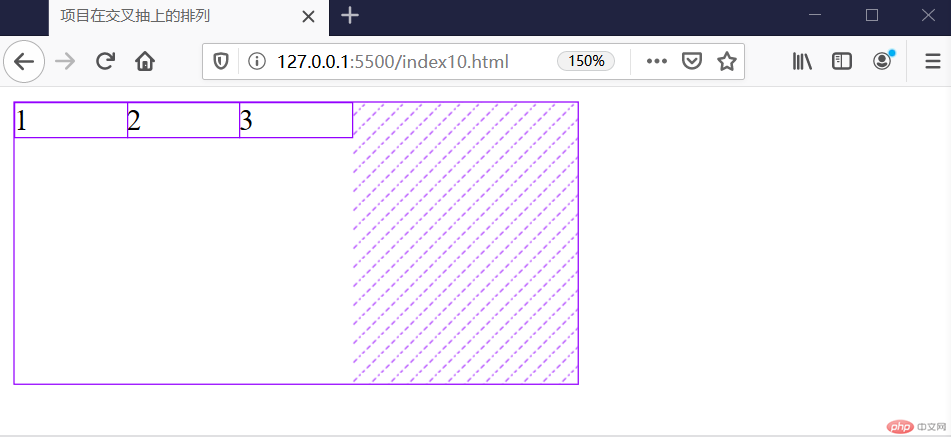
下对齐: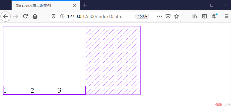
居中: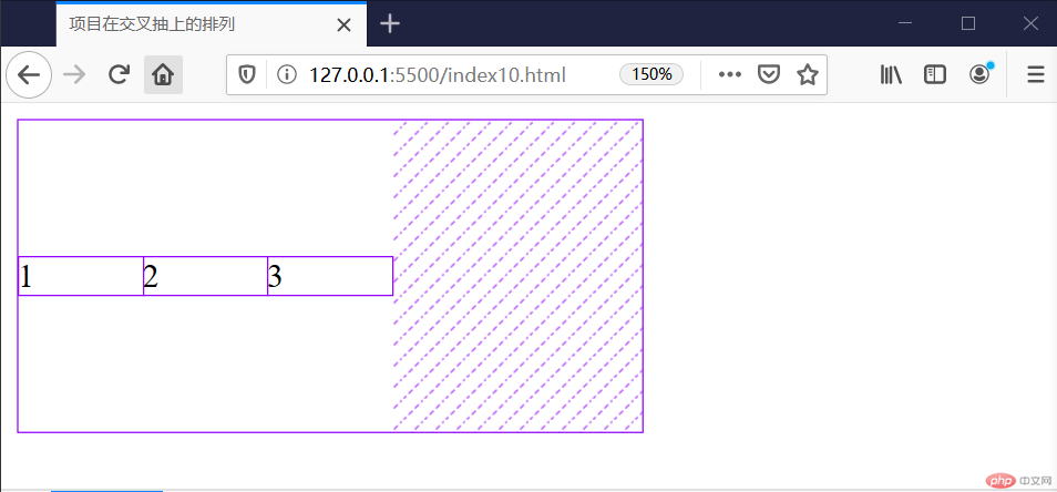
flex-direction: row;
 flex-wrap: nowrap;
等同于简写
flex-flow: row nowrap;
<!DOCTYPE html><html lang="en"><head><meta charset="UTF-8" /><meta name="viewport" content="width=device-width, initial-scale=1.0" /><title>实战:导航</title><style>* {padding: 0;margin: 0;box-sizing: border-box;}:root {font-size: 20px;}a {text-decoration: none;color: #ccc;}nav,footer {height: 50px;background-color: #333;padding: 0 50px;display: flex;}nav a,footer {height: inherit;line-height: 50px;padding: 0 15px;}nav a:hover {background-color: lime;color: white;}nav a:last-of-type {margin-left: auto;}.container {width: 900px;display: flex;margin: 10px auto;}.container > aside {width: 300px;background-color: mediumpurple;height: 600px;}.container > main {width: 780px;background-color: mediumspringgreen;}</style></head><body><nav><a href="">首页</a><a href="">教学视频</a><a href="">社区问答</a><a href="">登录/注册</a></nav><div class="container"><aside>左边</aside><main>中间</main><aside>右边</aside></div><footer>www.php.cn</footer></body></html>
运行图: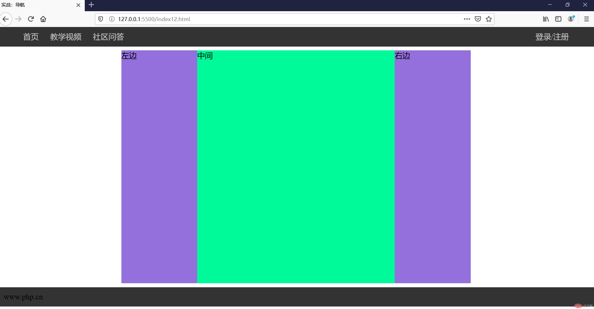
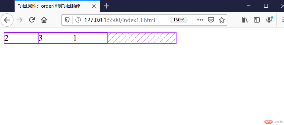
<style>.container {width: 300px;display: flex;}.container > .item {width: 60px;}.container > .item:first-of-type {order: 3;}</style>
运行图:
案列:
<!DOCTYPE html><html lang="en"><head><meta charset="UTF-8" /><meta name="viewport" content="width=device-width, initial-scale=1.0" /><title>order小案例</title></head><style>.container {width: 300px;display: flex;flex-direction: column;}.container > .item {border: 1px solid #000000;padding: 10px;display: flex;position: relative;}.container > .item > div {display: flex;}</style><body><div class="container"><div class="item">1<div><button onclick="up(this)">up</button><button onclick="down(this)">down</button></div></div><div class="item">2<div><button onclick="up(this)">up</button><button onclick="down(this)">down</button></div></div><div class="item">3<div><button onclick="up(this)">up</button><button onclick="down(this)">down</button></div></div></div></body><script>let up = (ele) => (ele.offsetParent.style.order -= 1);let down = (ele) => (ele.offsetParent.style.order += 1);</script></html>
运行图:

Copyright 2014-2025 https://www.php.cn/ All Rights Reserved | php.cn | 湘ICP备2023035733号


