


 收藏
收藏


 天蓬老师
天蓬老师批改状态:合格
老师批语:写得有意思 , 不错
1.元素浮动之后从文档流中脱离出来(会释放它原来在文档流中占据的空间)
2.后面的元素会自动填充它出让出来的空间大小
3.浮动元素只会影响到它后面的元素布局,对前面没有影响
4.行内元素用于最终内容的载体, 不能充当容器/当父级,不能设置或设置了宽高也是无效的。例如a、p元素等
5.任何元素,一旦浮动都自动转为块级元素
高度坍塌:
父元素在文档流中高度默认是被子元素撑开的,当子元素脱离文档流以后,将无法撑起父元素的高度,从而导致父元素的高度塌陷
运行图: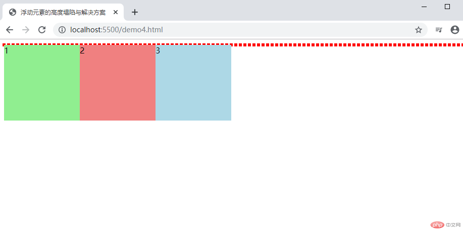
解决方案:
1.给父元素也添加一个高度
CSS代码:
.container {height: 150px;}
运行结果图: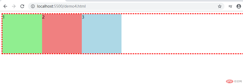
2.把父元素也浮动起来
CSS代码:
.container {float: left;}
运行结果图: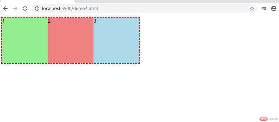
3.添加一个专用元素用于清浮动
CSS代码:
.clear {width: 100px;height: 100px;background-color: brown;clear: both;
运行结果图: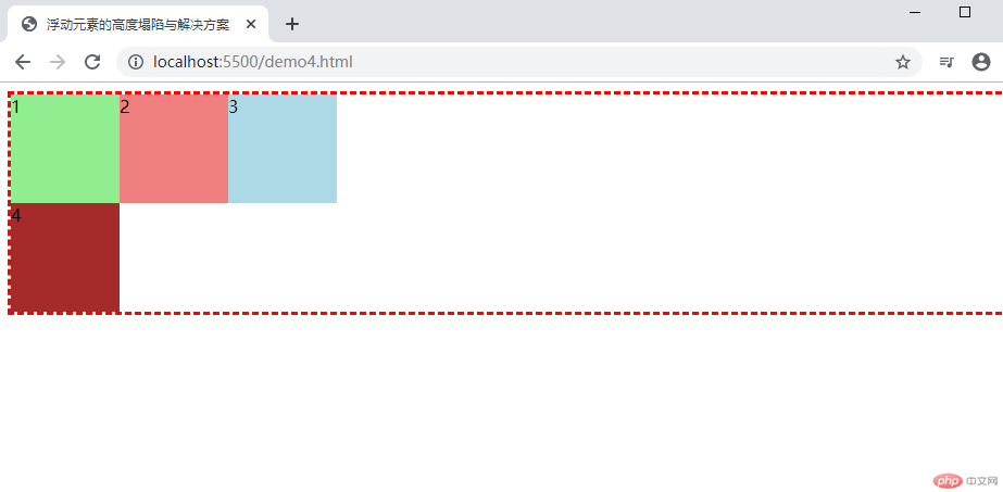
4.通过添加一个伪元素来解决
CSS代码:
.container::after {content: "伪元素";display: block;clear: both;
运行结果图: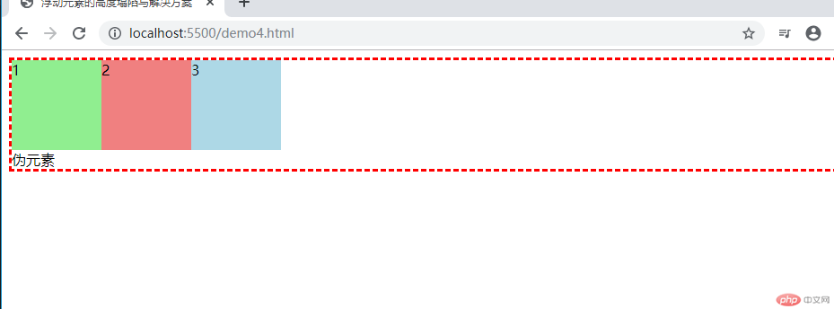
5.块级格式化上下文
CSS代码:
.container {overflow: scroll;/* 默认值:overflow: auto; */}
运行结果图: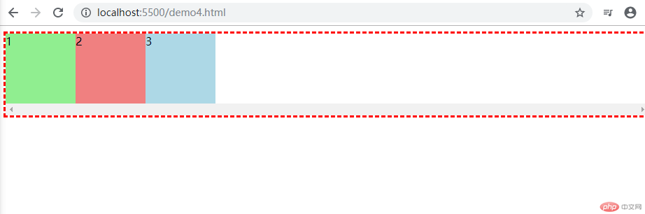
1.定位
代码如下:
<!DOCTYPE html><html lang="en"><head><meta charset="UTF-8" /><meta name="viewport" content="width=device-width, initial-scale=1.0" /><title>布局实例: 使用绝对定位来完成一个通用三列布局</title><style>/* 初始化 */* {margin: 0;padding: 0;/* 固定块级元素宽高,避免边框、内边距增长而增长 */box-sizing: border-box;}li {list-style: none;}a {text-decoration: none;color: whitesmoke;}/* 页眉与页脚 */.header,.footer {height: 40px;width: 100%;background-color: black;color: whitesmoke;margin: auto;}/* 页眉与页脚的内容区 */.content {width: 100%;}.content ul li {float: left;line-height: 40px;padding: 0 15px;}.content ul li:hover {background-color: coral;}/* 页脚样式 */.content p {text-align: right;line-height: 40px;}/* 主体用定位 */.container {width: 960px;margin: 10px auto;/* background-color: #ccc; */min-height: 600px;/* 转为定位元素,做为定位父级 */position: relative;}.container > .left {width: 20%;background-color: gray;min-height: 600px;position: absolute;top: 0;left: 0;}.container > .right {width: 20%;background-color: red;min-height: 600px;position: absolute;top: 0;right: 0;}.container > .main {background-color: limegreen;min-height: 600px;width: 58%;position: absolute;top: 0;left: 21%;}</style></head><body><!-- 页眉 --><div class="header"><!-- 内容区: 水平居中 --><div class="content"><ul><li><a href="">导航栏</a></li><li><a href="">模块一</a></li><li><a href="">模块二</a></li><li><a href="">模块三</a></li><li><a href="">模块四</a></li><li><a href="">模块五</a></li></ul></div></div><!-- 主体 --><div class="container"><div class="left">左侧边栏</div><div class="main">内容区</div><div class="right">右侧边栏</div></div><!-- 页脚 --><div class="footer"><div class="content"><p>底部:欢迎来到PHP世界</p></div></div></body></html>
结果图: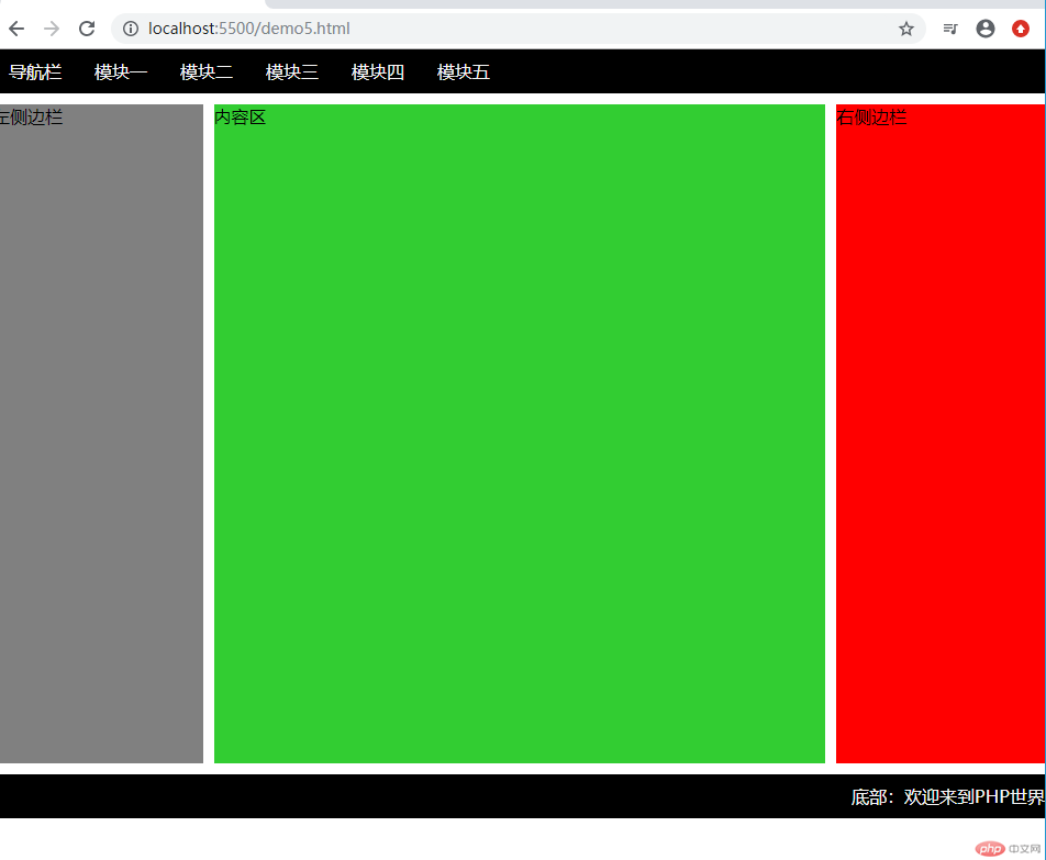
2.浮动
部分css代码:
.container {width: 100%;margin: 10px auto;/* background-color: #ccc; */min-height: 600px;/* 防止浮动元素的高度塌陷 */overflow: auto;}.container > .left {width: 20%;background-color: wheat;min-height: 600px;float: left;}.container > .right {width: 20%;background-color: wheat;min-height: 600px;float: right;}.container > .main {background-color: lightgreen;min-height: 600px;width: 58%;float: left;margin-left: 1%;}
结果图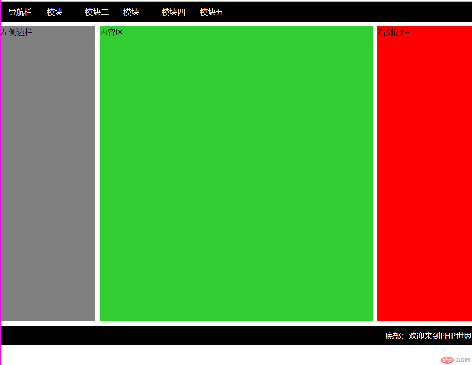

Copyright 2014-2025 https://www.php.cn/ All Rights Reserved | php.cn | 湘ICP备2023035733号


