


 收藏
收藏


 天蓬老师
天蓬老师批改状态:合格
老师批语:其实前二个案例就是用到了BFC, 感兴趣可以了解一下

<!DOCTYPE html><html lang="en"><head><meta charset="UTF-8" /><meta name="viewport" content="width=device-width, initial-scale=1.0" /><title>基于浮动的二列布局</title><style>/* 设置页眉,页脚,边栏和内容区域的背景色 */header,footer,aside,main {background-color: #dedede;}/* 设置设置页脚、页眉的固定高度 */header,footer {height: 50px;}/* 设置边栏和内容的最小高度 */aside,main {min-height: 700px;}.wrap {/* 设置主体容器的宽度 */width: 1000px;/* 设置主体容器的边框样式 */border: 1px solid #000;/* BFC清除浮动的影响 */overflow: hidden;/* 主体容器的上下外边距 和左右居中*/margin: 10px auto;}aside {/* 边栏宽度 */width: 200px;/*向左浮动 */float: left;}main {/* 内容区的宽度 */width: 790px;/* 向右浮动 */float: right;}</style></head><body><header>页眉</header><div class="wrap"><aside>边栏</aside><main>内容区</main></div><footer>页脚</footer></body></html>
效果图:
<!DOCTYPE html><html lang="en"><head><meta charset="UTF-8" /><meta name="viewport" content="width=device-width, initial-scale=1.0" /><title>基于定位的二列布局</title><style>/* 设置设置页脚、页眉的固定高度 */header,footer,aside,main {background-color: #dedede;}/* 设置边栏和内容的最小高度 */header,footer {height: 50px;}aside,main {min-height: 700px;}.wrap {/* 设置主体容器的宽度 */width: 1000px;/* 设置主体容器的边框样式 */border: 1px solid #000;/* 设置主体容器的最小高度 */min-height: 700px;/* 主体容器的上下外边距和左右居中 */margin: 10px auto;/* 设置相对定位,给子元素提供绝对定位的参照物 */position: relative;/* 默认属性可省略 */left: 0;}aside {/* 边栏宽度 */width: 200px;/* 最小高度继承父容器 */min-height: inherit;/* 绝对定位 */position: absolute;}main {/* 内容区的宽度 */width: 790px;/* 最小高度继承父容器 */min-height: inherit;/* 绝对定位 */position: absolute;/* 定位属性 */right: 0;}</style></head><body><header>页眉</header><div class="wrap"><aside>侧边栏</aside><main>主体内容区</main></div><footer>页脚</footer></body></html>
效果图: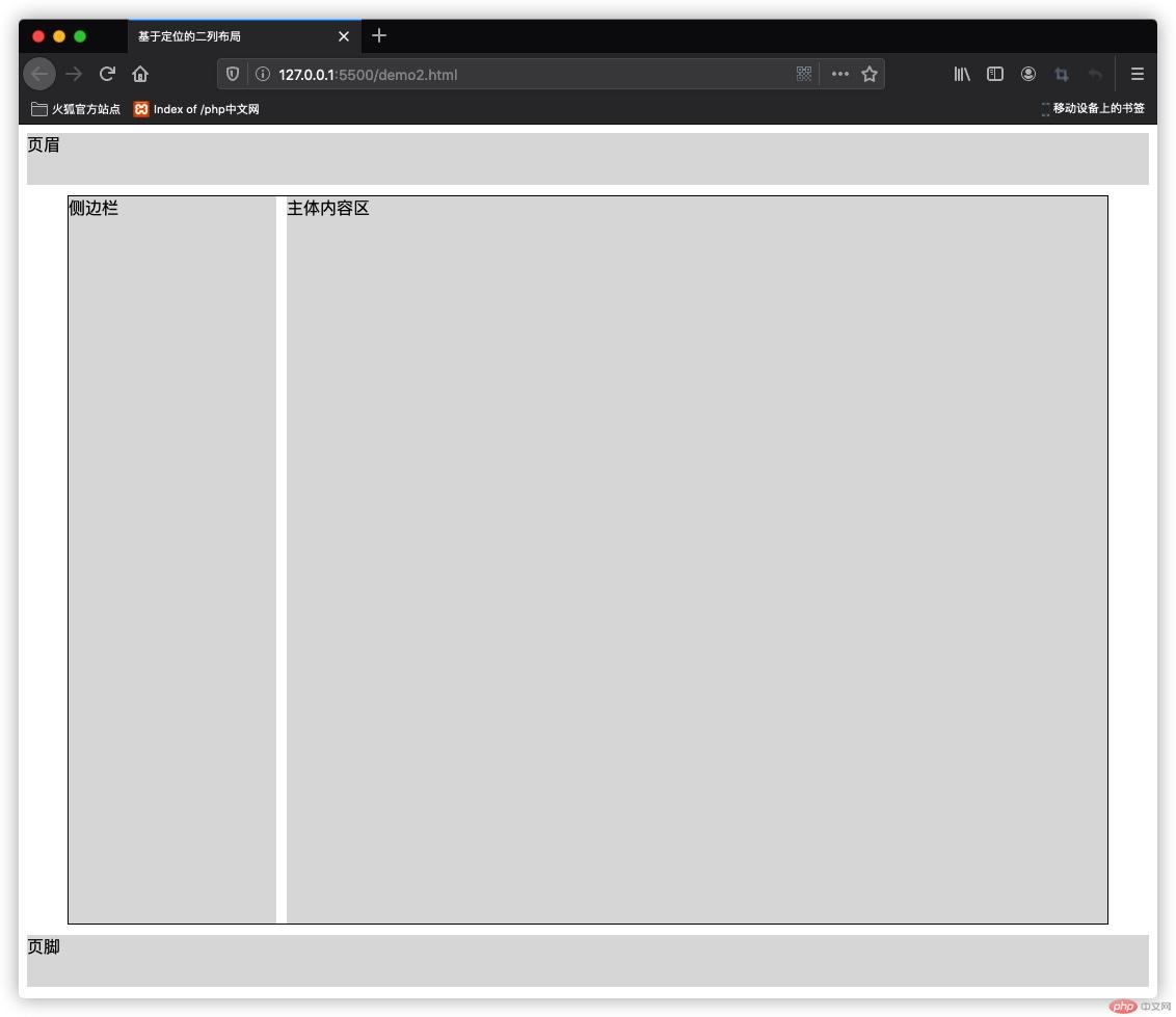
<!DOCTYPE html><html lang="en"><head><meta charset="UTF-8" /><meta name="viewport" content="width=device-width, initial-scale=1.0" /><title>内容的多栏/列显示</title><style>/* 初始化 */* {/* 内边距清零 */padding: 0;/* 外边距清零 */margin: 0;/* 盒模型的内减模式 */box-sizing: border-box;}/* 设置html更元素的字体大小和颜色 */:root {font-size: 16px;color: #555;}div {/* 容器的边框样式 */border: 1px solid #000;/* 容器的内边距,rem为根元素字体单位 */padding: 1rem;/* 宽度 */width: 60rem;/* 容器的左右外边距和水平居中显示 */margin: 30px auto;}div {/*分栏显示列数和列宽设置多个以css属性覆盖规则显示*/column-count: 3; /* 分栏列数*//* 分栏的列宽*/columns: 10rem;/*column-rule-style:分栏线的粗细column-rule-width:分栏线的宽度column-rule-color:分栏线的颜色*//* 多属性的简写 */column-rule: 10px solid #eee;}</style></head><body><div>6月11日以来,北京连续出现新增疫情,应急响应等级调整至二级,疫情防控形势严峻复杂。不少此前计划小长假外出的人们被迫放弃了计划。端午大家还愿意出门吗?哪些出游方式是主流?飞猪报告显示,今年端午除京津冀地区外,全国各地周边游需求较高,整体出游人次已恢复到去年六成,京津冀地区约恢复到去年四成左右。由于假期天数短,整体出游积极性不及五一。携程发布的《端午小长假旅游市场展望报告》指出,除北京等特殊地区外,端午小长假期间人们的出行、休闲需求依然存在,旅游市场的复苏基本面仍在。但相比前一阶段,人们的出行决策显然更加谨慎。其中,上海、广州、深圳、成都、杭州、重庆、南京、西安在最热出发地与最热目的地中皆名列前茅。三亚—上海、成都—上海、上海—重庆、上海—三亚、上海—成都是端午期间最热门的航线。火车票的预定数据显示,深圳—广州、上海—杭州、上海—南京、深圳—长沙、深圳—汕头、重庆—成都的预定热度排名最前。此外,飞猪报告显示,端午出游积极的前十大城市分别为:上海、杭州、南京、广州、长沙、深圳、成都、三亚、重庆、厦门。热门景区方面,携程报告显示,上海迪士尼度假区、珠海长隆海洋王国、中华恐龙园、上海海昌海洋公园、茶卡盐湖等高品质景区,是今年端午小长假期间游客们喜爱的热门景区。</div></body></html>

<style>.container {width: 300px;/* 如果这个容器中的内容要使用flexBox布局, 第一步就是必须将这个容器转为弹性盒子 *//* 弹性容器 */display: flex;}.container > .item {/* 一旦将父元素转为弹性容器,内部的“子元素”就会自动成为: 弹性项目 *//* 不管这个项目标签之前是什么类型,统统转为“行内块” *//* 行内:全部在一排显示 *//* 块: 可以设置宽和高 *//* flex: auto; */width: 60px;height: 60px;}</style><body><div class="container"><div class="item">1</div><span class="item">2</span><a class="item">3</a><a class="item">4</a></div></body>

属性:flex-wrap
flex-wrap: nowrap;(默认)
2.flex-wrap: nowrap;

属性:jsutify-content(项目属性)
1.justify-content: flex-start

2.justify-conetn: flex-end;

3.justify-content:center

4.justify-content: space-between;

5.justify-content: space-around;

6.justify-content: space-evenly;

属性: align-content(项目属性)
1.align-content: stretch;

align-content: flex-start;
align-content: flex-end
align-content: center;
5.align-content: space-between;

6.align-content: space-around;
align-content: space-evenly;
属性:align-items(项目属性)
1.align-items: stretch(默认属性)

align-items: flex-start;
3.align-items: flex-end;
align-items: center;
属性: flex-flow
flex-direction和flex-wrap属性的简写方式
.box{flex-flow: column wrap;}/*等同于*/.box{flex-direction: column;flex-wrap: wrap;}

<style>/* 初始化操作 */* {padding: 0;margin: 0;box-sizing: border-box;}/* 去除a标签的样式 */a {text-decoration: none;color: #ccc;}/* 导航栏的高度、背景]内边距 */nav {height: 40px;background-color: #333;padding: 0 50px;/* 声明flex容器 */display: flex;}/* a链接的高度、行高和内边距 */nav a {height: inherit;line-height: 40px;padding: 0 15px;}/* 最后一个a标签的位置 */nav a:last-child {/* auto最大限度的占用多余空间 */margin-left: auto;}/* 鼠标悬浮时a链接的样式 */nav a:hover {background-color: #444;color: white;}</style><body><nav><a href="">LOGO</a><a href="">首页</a><a href="">博客</a><a href="">学院</a><a href="">下载</a><a href="">论坛</a><a href="">登录/注册</a></nav></body>

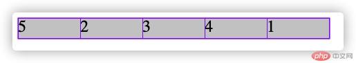
属性: order(项目属性)
<style>/* 项目的共同样式 */.item {width: 60px;background-color: #ccc;}.wrap {width: 300px;/* 声明容器 */display: flex;}.item:first-child{/* 降低排序优先级 */order: 5;}.item:last-child{/* 提示排序优先级 */order: -1;}</style><body><div class="wrap"><div class="item">1</div><div class="item">2</div><div class="item">3</div><div class="item">4</div><div class="item">5</div></div></body>
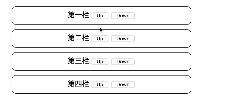
<style>/* 项目的共同样式 */.item {width: 400px;height: 40px;/* 行高 */line-height: 40px;margin: 5px 0;/* 边框 */border: 1px solid;text-align: center;/* 圆角 */border-radius: 10px;/* 给js提供定位父级 */position: relative;}.container {/* 声明flex容器 */display: flex;/* 主轴方向和不换行 */flex-flow: column nowrap;/* 项目在交叉轴上居中显示 */align-items: center;}</style><body><div class="container"><div class="item">第一栏<button onclick="up(this)">Up</button><button onclick="down(this)">Down</button></div><div class="item">第二栏<button onclick="up(this)">Up</button><button onclick="down(this)">Down</button></div><div class="item">第三栏<button onclick="up(this)">Up</button><button onclick="down(this)">Down</button></div><div class="item">第四栏<button onclick="up(this)">Up</button><button onclick="down(this)">Down</button></div></div></body><script>//offsetParent 获取定位父级let up = (ele) => (ele.offsetParent.style.order -= 1);let down = (ele) => (ele.offsetParent.style.order += 1);</script>

Copyright 2014-2025 https://www.php.cn/ All Rights Reserved | php.cn | 湘ICP备2023035733号


