


 收藏
收藏


 WJ
WJ批改状态:合格
老师批语:整体看上去写的很不错,继续加油!

通过对生活中的盒子和网页中单个模块内部结构的分析,可以发现它们的结构是非常相似的。
由内到外分别是:外边距、边框、内边距、内容区。
盒模型是用来布局网页的重要容器。
网页页面中的元素都可以看成是一个盒子,占据一定的页面空间
| 属性 | 含义 |
|---|---|
margin |
外边距 |
border |
边框 |
padding |
内边距(内填充) |
width |
宽度 |
height |
高度 |
box-sizing |
自定义盒模型宽和高的规范 |
backgroumd-clip |
背景的延伸 |
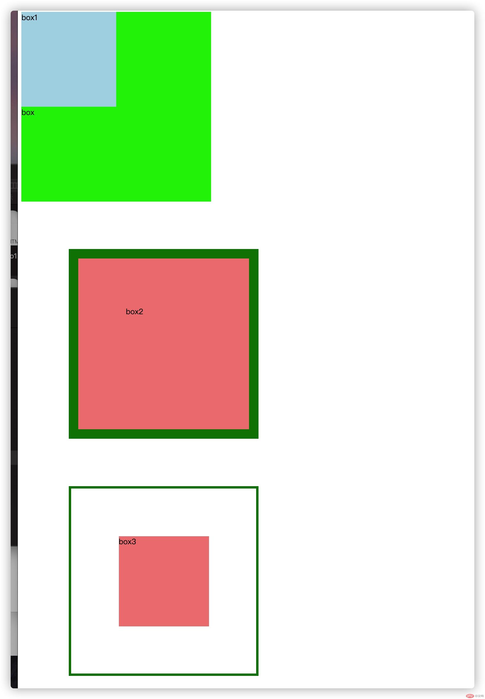
<body><div class="box">box<div class="box1">box1</div></div><div class="box2">box2</div><div class="box3">box3</div></body><style>div.box {padding-top: 0;width: 400px;height: 400px;background-color: #00f000;}.box1 {width: 200px;height: 200px;margin-top: px;background-color: lightblue;}.box2 {padding: 100px;margin: 100px;width: 400px;border: 20px solid green;height: 400px;background-color: lightcoral;box-sizing: border-box;}.box3 {padding: 100px;margin: 100px;width: 400px;border: 5px solid green;height: 400px;background-color: lightcoral;background-clip: content-box;box-sizing: border-box;}</style>
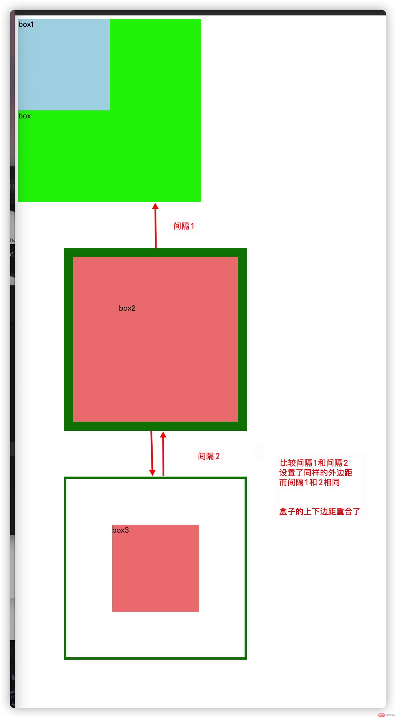
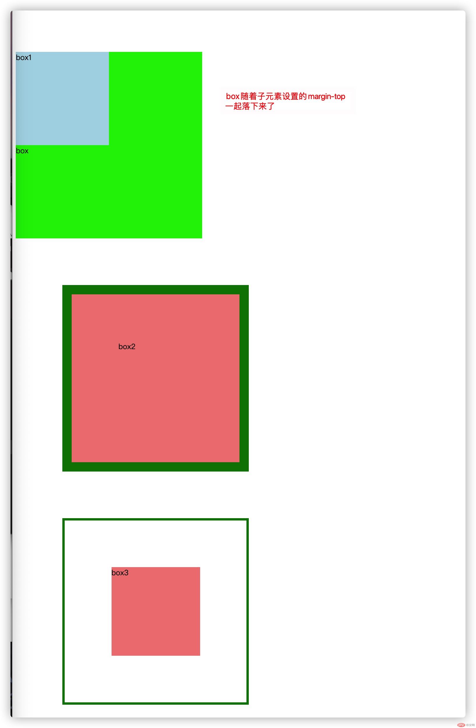
<body><div class="box">box<div class="box1">box1</div></div><div class="box2">box2</div><div class="box3">box3</div></body><style>div.box {padding-top: 0;width: 400px;height: 400px;background-color: #00f000;}.box1 {width: 200px;height: 200px;margin-top: 100px;background-color: lightblue;}.box2 {padding: 100px;margin: 100px;width: 400px;border: 20px solid green;height: 400px;background-color: lightcoral;box-sizing: border-box;}.box3 {padding: 100px;margin: 100px;width: 400px;border: 5px solid green;height: 400px;background-color: lightcoral;background-clip: content-box;box-sizing: border-box;}</style>
<body><div class="box"><div class="box1"></div></div><div class="box2"></div><div class="box3"></div></body><style>div.box {padding-top: 0;padding:100px;width: 400px;height: 400px;background-color: #00f000;}.box1 {width: 200px;height: 200px;margin-top: px;background-color: lightblue;}.box2 {padding: 100px;margin: 100px;width: 400px;border: 20px solid green;height: 400px;background-color: lightcoral;box-sizing: border-box;}.box3 {padding: 100px;margin: 100px;width: 400px;border: 5px solid green;height: 400px;background-color: lightcoral;background-clip: content-box;box-sizing: border-box;}</style>
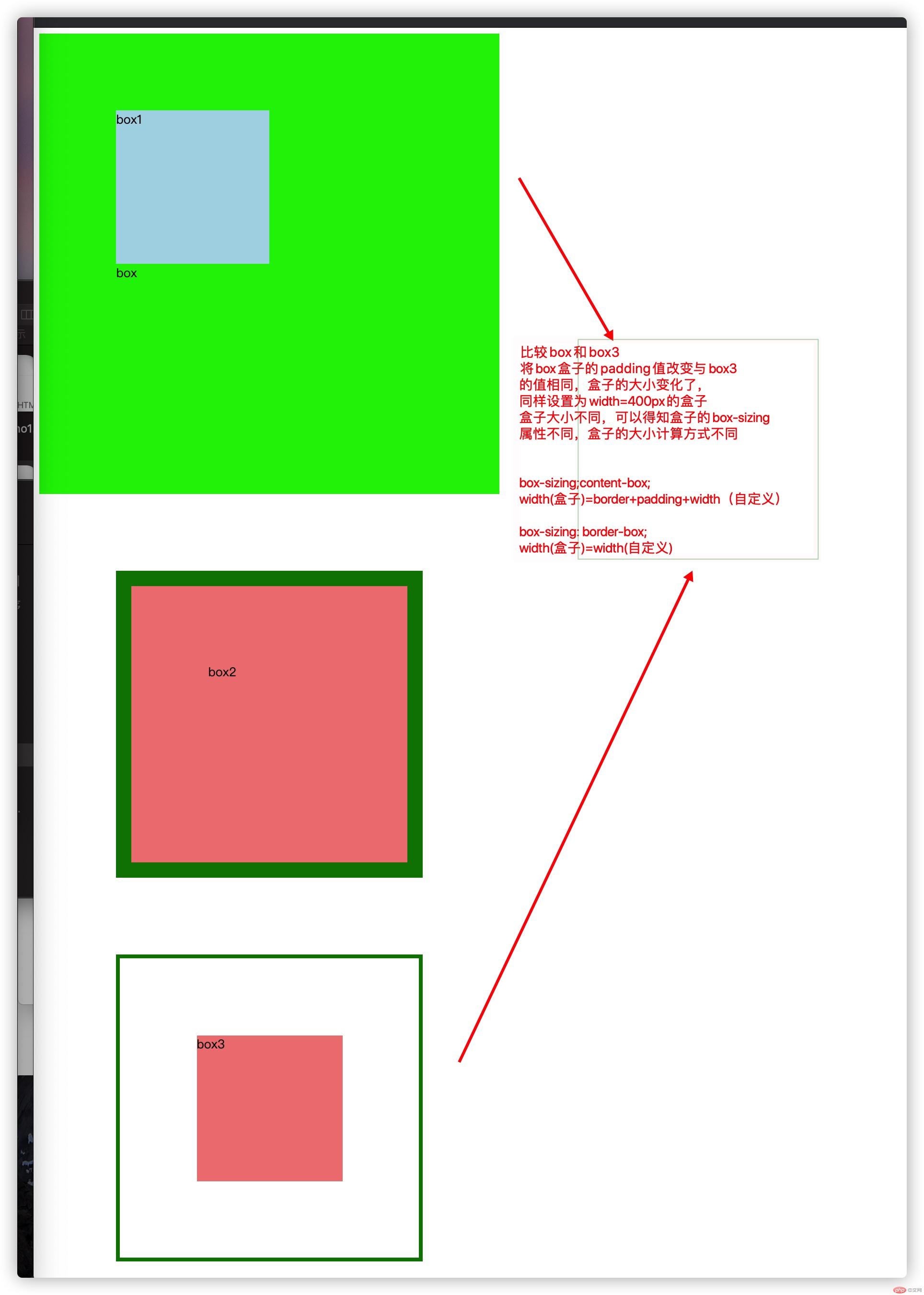
图片文字有些错误
box-sizing;content-box;width(盒子视口)=border+padding+width(自定义)height(盒子视口)=border+padding+height(自定义)width(盒子)=border+padding+width(自定义)+marginheight(盒子)=border+padding+height(自定义)+marginbox-sizing: border-box;width(盒子视口)=width(自定义)height(盒子视口)=height(自定义)width(盒子)=width(自定义)+marginheight(盒子)=height(自定义)+margin
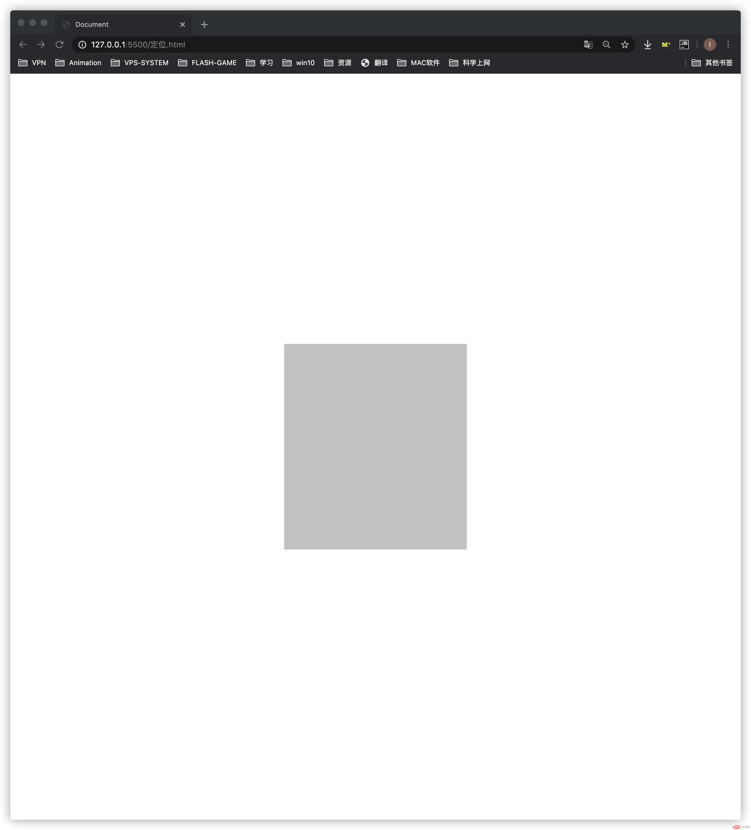
margin-left:auto;与margin-right:auto;可以轻易的设置水平居中。
因为在垂直方向上,块级元素不会自动扩充,它的外部尺寸没有自动充满父元素,也没有剩余空间可说。所以margin-top:auto;与margin-bottom:auto 无法使其垂直居中。
可以简写margin:auto;
解决方法:
添加定位属性
<style>.box {width: 400px;height: 450px;background-color: #ccc;/*简写margin属性*/margin: auto;/*添加定位属性*/position: absolute;left: 0;right: 0;top: 0;bottom: 0;}</style>
了解了盒模型的构成和属性
外边距的特殊用法(使块级元素居中)

Copyright 2014-2025 https://www.php.cn/ All Rights Reserved | php.cn | 湘ICP备2023035733号


