

bootstrap responsive layout navigation effect
All resources on this site are contributed by netizens or reprinted by major download sites. Please check the integrity of the software yourself! All resources on this site are for learning reference only. Please do not use them for commercial purposes. Otherwise, you will be responsible for all consequences! If there is any infringement, please contact us to delete it. Contact information: admin@php.cn
Related Article
 Responsive layout and bootstrap (example)_html/css_WEB-ITnose
24 Jun 2016
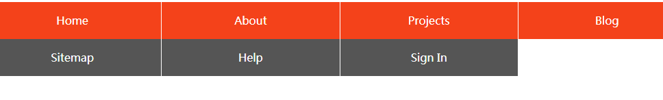
Responsive layout and bootstrap (example)
Bootstrap, navigation bar click effect repair (repair)_html/css_WEB-ITnose
24 Jun 2016
Bootstrap, navigation bar click effect repair (supplement)
 How to Create a Responsive Navigation Sidebar Drawer in Bootstrap?
15 Nov 2024
Creating a Responsive Navigation Sidebar Drawer in BootstrapTo achieve a responsive "drawer" sidebar like the one on MUICSS, Bootstrap indeed...
 Bootstrap Deep Dive: Responsive Design & Advanced Layout Techniques
10 Apr 2025
Bootstrap implements responsive design through grid systems and media queries, making the website adapted to different devices. 1. Use a predefined class (such as col-sm-6) to define the column width. 2. The grid system is based on 12 columns, and it is necessary to note that the sum does not exceed 12. 3. Use breakpoints (such as sm, md, lg) to define the layout under different screen sizes.
 How to Create a Fixed Sidebar Navigation in a Fluid Twitter Bootstrap 2.0 Layout?
08 Nov 2024
Creating a Fixed Sidebar Navigation in Fluid Twitter Bootstrap 2.0In a fluid Bootstrap 2.0 layout, maintaining a fixed sidebar navigation while...
 How Do Media Queries in Twitter Bootstrap 3 Control Responsive Layout Adjustments?
21 Dec 2024
Responsive Layout Adjustments with Media Queries in Twitter Bootstrap 3Media queries are a great way to control the styling of a website based on...
 How to implement responsive layout of Bootstrap lists?
07 Apr 2025
Understand Bootstrap's grid system and flexibly use column classes to control the layout of list items under different screen sizes. Use col-md-4, col-sm-6 and other classes to set the number of columns of the list item under a specific screen size to achieve responsive effects. For situations where the list items have a lot of content or the layout is complex, use CSS styles or media queries for more fine control to ensure that the page is displayed clearly. Make full use of Bootstrap's responsive tool classes, such as d-none d-md-block, to control the display and hiding of elements under different screen sizes, and improve layout flexibility.
 How Can I Customize Bootstrap CSS Effectively While Maintaining Easy Updates?
21 Dec 2024
Customizing Bootstrap CSS Template: Best PracticesCustomizing Bootstrap can empower developers to enhance their websites'...
 Why Isn't My Bootstrap 3 Sticky Footer Sticking?
08 Dec 2024
Mastering the Twitter Bootstrap 3 Sticky FooterQuestion:Despite utilizing the Twitter Bootstrap 3 starter template, the sticky footer refuses to...


Hot Tools
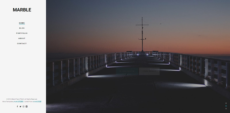
Bootstrap video website template
Bootstrap video website template is a movie website template download based on HTML5+CSS3.
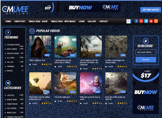
Fashion trend waterfall flow layout responsive website bootstrap template
Fashion trend waterfall flow layout responsive website bootstrap template free download

Literary and concise VI design company corporate responsive official website
Literary and simple VI design company corporate responsive official website template free download
FLOIX Industrial Designer Studio official website template
FLOIX industrial designer studio official website template free download