

Use javascript for responsive development
This article mainly introduces the use of rem in javascript for responsive development. Now I share it with you and give you a reference.
The computer version of the mall was finished last night, and today I am rushing to make the mobile version. When it comes to the mobile website, the first thing that comes to mind is to adapt to the width of different mobile phone screens to ensure that it can be displayed normally on different mobile phones. For users, when I was doing this type of website before, I introduced bootstrap without any thought. But after completing the previous project, I found that although bootstrap is good, I rarely use the various styles in it. I use it most for layout. When the website is finally uploaded, you will find that even after compression, it will take up a lot of space. A large part, so this time I want to use native writing and responsive development (I still know a little bit about it now). At present, I understand
1. Percentage method:
As the name suggests, the margin, padding, width, height, etc. of the page elements are calculated using %. What does the hundred in the percentage in CSS refer to? It refers to the parent element. All percentages are like this. If the width of the child element is 50%, then the width of the parent element is 100, the padding-left of the child element is 50%, the width of the parent element is 100, and the margin-top of the child element is 20%, then the height of the parent element is 100. Therefore, the default width of the body is the screen width (referring to the browser width in PC). The descendant elements can be positioned according to percentages (or specified sizes). This is only suitable for pages with simple layouts. It is difficult to implement complex pages.
2. Media query:
This is given in css3. The problem we want to solve is to adapt to the mobile phone screen. This media query is precisely to solve this problem. However, the function of media query is to set different css styles for different media. The "media" here includes page size, device screen size, etc. The most commonly used form is
phone:@media screen and (max -width: 767px) {/Mobile style/}
pad:@media screen and (max-width: 991px)and(min-width:768) {/Tablet style/}
pc:@media screen and (min-width: 992px){/Computer style/}
...(You can also set more nodes)
If you use media query To ensure that each pixel has a corresponding adaptation effect, obviously you need to set a smaller width range;
3. There is also the unit rem of css3:
rem is to use the font-size value of the root node html as the base size of the entire page. For example, So how can 1rem=10px; be adapted? Then you need to use js to get the width of the window (width of the browser window) $(window).width() when the page is loaded; when developing mobile pages, we generally set the maximum width to 640px, because 640px can guarantee When displayed on the widest mobile phone to date, both ends of the web page just fit the screen. Let me give you a small example.
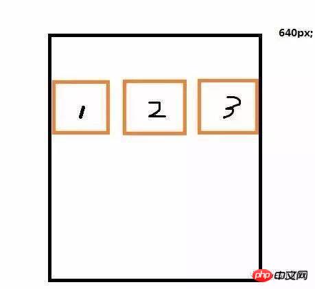
Screen zoom-in and zoom-out. The three p's are also in the same row.
html
<p class="container">
  <p class="box">1</p>
  <p class="box">2</p>
  <p class="box">3</p>
</p>
css
<style>
  html{font-size: 20px;}
  .container{
    max-width: 640px;
    border:1px solid red;
    margin:0 auto;
    overflow: hidden;
    box-sizing: border-box;
  }
  .box{
    float: left;
    width:10.6rem;
    //我这里设置html的font-size:20px;最大
宽为640px,即相当于640/20=32rem;一行有3个p,所以每个p宽10.6rem

你也可以像论坛里面讲的那样设置html的font-size:62.5%;因为浏览器默认像素16px;乘以62.5%之后为整数10px;方便计算

    height:10.6rem;
    border:1px solid #000;
    box-sizing: border-box;
  }
</style>js
<script>
window.onresize = window.onload = function () {
var w = $(window).width();
if(w<640){
var size = 20*w/640;//640的时候
对应html的font-size为20,那么宽度为w是对应
的font-size可这么求
$('html').css('fontSize',size+'px');
}
}
</script>Note that there is a small pit here. When you take this small demo to Google Chrome for verification, you will find that the first three p's will shrink as your browser window shrinks. When zooming out, it will stop moving after reaching a certain value. The reason is that Google Chrome supports the minimum font-size of HTML by default is 10px; if it is less than this value, it will not be smaller. This is the problem I encountered at the time. I searched online for almost two hours and demonstrated over and over again but still couldn't figure it out. Finally I found such a non-human reason.
The above is what I compiled for everyone. I hope it will be helpful to everyone in the future.
Related articles:
How to use vue-meta to manage header tags
Some common problems with Nuxt.js (detailed tutorial)
React Native related cross-domain resource error issues
Install the latest version of npm in nodejs (detailed tutorial)
How to implement function debounce in js (detailed tutorial)
How to mark the record scroll position in vue-scroller
The above is the detailed content of Use javascript for responsive development. For more information, please follow other related articles on the PHP Chinese website!

Hot AI Tools

Undresser.AI Undress
AI-powered app for creating realistic nude photos

AI Clothes Remover
Online AI tool for removing clothes from photos.

Undress AI Tool
Undress images for free

Clothoff.io
AI clothes remover

Video Face Swap
Swap faces in any video effortlessly with our completely free AI face swap tool!

Hot Article
Hot Tools

Notepad++7.3.1
Easy-to-use and free code editor

SublimeText3 Chinese version
Chinese version, very easy to use

Zend Studio 13.0.1
Powerful PHP integrated development environment

Dreamweaver CS6
Visual web development tools

SublimeText3 Mac version
God-level code editing software (SublimeText3)
Hot Topics


 Recommended: Excellent JS open source face detection and recognition project
Apr 03, 2024 am 11:55 AM
Recommended: Excellent JS open source face detection and recognition project
Apr 03, 2024 am 11:55 AM
Face detection and recognition technology is already a relatively mature and widely used technology. Currently, the most widely used Internet application language is JS. Implementing face detection and recognition on the Web front-end has advantages and disadvantages compared to back-end face recognition. Advantages include reducing network interaction and real-time recognition, which greatly shortens user waiting time and improves user experience; disadvantages include: being limited by model size, the accuracy is also limited. How to use js to implement face detection on the web? In order to implement face recognition on the Web, you need to be familiar with related programming languages and technologies, such as JavaScript, HTML, CSS, WebRTC, etc. At the same time, you also need to master relevant computer vision and artificial intelligence technologies. It is worth noting that due to the design of the Web side
 Essential tools for stock analysis: Learn the steps to draw candle charts with PHP and JS
Dec 17, 2023 pm 06:55 PM
Essential tools for stock analysis: Learn the steps to draw candle charts with PHP and JS
Dec 17, 2023 pm 06:55 PM
Essential tools for stock analysis: Learn the steps to draw candle charts in PHP and JS. Specific code examples are required. With the rapid development of the Internet and technology, stock trading has become one of the important ways for many investors. Stock analysis is an important part of investor decision-making, and candle charts are widely used in technical analysis. Learning how to draw candle charts using PHP and JS will provide investors with more intuitive information to help them make better decisions. A candlestick chart is a technical chart that displays stock prices in the form of candlesticks. It shows the stock price
 PHP and JS Development Tips: Master the Method of Drawing Stock Candle Charts
Dec 18, 2023 pm 03:39 PM
PHP and JS Development Tips: Master the Method of Drawing Stock Candle Charts
Dec 18, 2023 pm 03:39 PM
With the rapid development of Internet finance, stock investment has become the choice of more and more people. In stock trading, candle charts are a commonly used technical analysis method. It can show the changing trend of stock prices and help investors make more accurate decisions. This article will introduce the development skills of PHP and JS, lead readers to understand how to draw stock candle charts, and provide specific code examples. 1. Understanding Stock Candle Charts Before introducing how to draw stock candle charts, we first need to understand what a candle chart is. Candlestick charts were developed by the Japanese
 The relationship between js and vue
Mar 11, 2024 pm 05:21 PM
The relationship between js and vue
Mar 11, 2024 pm 05:21 PM
The relationship between js and vue: 1. JS as the cornerstone of Web development; 2. The rise of Vue.js as a front-end framework; 3. The complementary relationship between JS and Vue; 4. The practical application of JS and Vue.
 What is REM (full name REMME)?
Feb 21, 2024 pm 05:00 PM
What is REM (full name REMME)?
Feb 21, 2024 pm 05:00 PM
What coin is REMME? REMME is a cryptocurrency based on blockchain technology dedicated to providing highly secure and decentralized network security and identity verification solutions. The project aims to use distributed encryption technology to enhance and simplify the user authentication process, thereby improving security and efficiency. The innovation of REMME is that it uses the immutability and transparency of the blockchain to provide users with a more reliable identity verification method. By storing authentication information on the blockchain, REMME eliminates the single point of failure of centralized authentication systems and reduces the risk of data theft or tampering. This blockchain-based authentication method is not only more secure and reliable, but also provides users with the background of REMME. In the current digital era, the network
 The evolution and application of CSS layout units: from pixels to relative units based on the font size of the root element
Jan 05, 2024 pm 05:41 PM
The evolution and application of CSS layout units: from pixels to relative units based on the font size of the root element
Jan 05, 2024 pm 05:41 PM
From px to rem: The evolution and application of CSS layout units Introduction: In front-end development, we often need to use CSS to implement page layout. Over the past few years, CSS layout units have evolved and developed. Initially we used pixels (px) as the unit to set the size and position of elements. However, with the rise of responsive design and the popularity of mobile devices, pixel units have gradually exposed some problems. In order to solve these problems, the new unit rem came into being and was gradually widely used in CSS layout. one
 Unit Selection Guide for Responsive Layout Design
Jan 27, 2024 am 08:26 AM
Unit Selection Guide for Responsive Layout Design
Jan 27, 2024 am 08:26 AM
With the popularity of mobile devices and the development of technology, responsive layout has become one of the essential skills for designers. Responsive layout is designed to provide the best user experience for screens of different sizes, allowing web pages to automatically adjust their layout on different devices to ensure the readability and usability of content. Choosing the right units is one of the key steps in responsive layout design. This article will introduce some commonly used units and provide suggestions for selecting units. Pixel (px): Pixel is the smallest unit on the screen. It is an absolute unit and does not automatically change as the screen size changes.
 Explore the best responsive layout frameworks: the competition is fierce!
Feb 19, 2024 pm 05:19 PM
Explore the best responsive layout frameworks: the competition is fierce!
Feb 19, 2024 pm 05:19 PM
Responsive layout framework competition: who is the best choice? With the popularity and diversification of mobile devices, responsive layout of web pages has become more and more important. In order to cater to the different devices and screen sizes of users, it is essential to adopt a responsive layout framework when designing and developing web pages. However, with so many framework options out there, we can’t help but ask: which one is the best choice? The following will be a comparative evaluation of three popular responsive layout frameworks, namely Bootstrap, Foundation and Tailwind.
