

Examples of six CSS three-column layout methods

In this article, we mainly share with you six examples of CSS three-column layout methods. When it comes to layout, we must first think of positioning. When others ask me, what are the values of CSS positioning and what do they mean? Uh... scratch your head.gif, it's time to return to the essence and look at the definition.
Positioning
position has six attribute values: static, relative, absolute, fixed, sticky and inherit.
static (default): The element box is generated normally. Block-level elements create a rectangular box as part of the document flow; inline elements create one or more line boxes that are placed within the parent element.
relative: The element box is offset relative to its previous position in the normal document flow, and the original position is still occupied. When offset occurs, other elements may be covered.
absolute: The element box no longer occupies the document position and is offset relative to the containing block (the so-called containing block is the element whose position of the nearest outer element is not static).
fixed: The element box no longer occupies the document flow position and is positioned relative to the viewport.
sticky: css3 new attribute value, sticky positioning, equivalent to a mixture of relative and fixed. Initially it will be treated as relative, which is offset relative to the original position; once it exceeds a certain threshold, it will be treated as fixed positioning, which is positioned relative to the viewport.
Three-column layout
Three-column layout, one of which is adaptive in width, is one of the most commonly used on the PC side. After completing the three-column layout, the other routines are the same.
Method 1: Floating layout
Disadvantages: The html structure is incorrect. When the width of the included area is less than the sum of the left and right boxes, the right border will be squeezed out
<style>
    .tree-columns-layout.float .left {
        float: left;
        width: 300px;
        background-color: #a00;
    }

    .tree-columns-layout.float .right {
        float: right;
        width: 300px;
        background-color: #0aa;
    }

    .tree-columns-layout.float .center {
        /* left: 300px;
        right: 300px; */
        margin: 0 300px;
        background-color: #aa0;
        overflow: auto;
    }
</style>
<section class="tree-columns-layout float">
    <article class="left">
        <h1>我是浮动布局左框</h1>
    </article>
    <article class="right">
        <h1>我是浮动布局右框</h1>
    </article>
    <article class="center">
        <h1>我是浮动布局中间框</h1>
    </article>
</section>Method 2: Positioning layout
Disadvantages: The parent is required to have non-static positioning. If not, the left and right frames are easily offset
<style>
    .tree-columns-layout.position {
        position: relative;
    }

    .tree-columns-layout.position .left {
        position: absolute;
        left: 0;
        top: 0;
        width: 300px;
        background-color: #a00;
    }

    .tree-columns-layout.position .right {
        position: absolute;
        right: 0;
        top: 0;
        width: 300px;
        background-color: #0aa;
    }

    .tree-columns-layout.position .center {
        margin: 0 300px;
        background-color: #aa0;
        overflow: auto;
    }
</style>
<section class="tree-columns-layout position">
    <article class="left">
        <h1>我是浮动定位左框</h1>
    </article>
    <article class="center">
        <h1>我是浮动定位中间框</h1>
    </article>
    <article class="right">
        <h1>我是浮动定位右框</h1>
    </article>
</section>Method 3: Table layout
Disadvantages: No disadvantages , fear table
<style>
    .tree-columns-layout.table {
        display: table;
        width: 100%;
    }

    .tree-columns-layout.table > article {
        display: table-cell;
    }

    .tree-columns-layout.table .left {
        width: 300px;
        background-color: #a00;
    }

    .tree-columns-layout.table .center {
        background-color: #aa0;
    }

    .tree-columns-layout.table .right {
        width: 300px;
        background-color: #0aa;
    }

</style>
<section class="tree-columns-layout table">
    <article class="left">
        <h1>我是表格布局左框</h1>
    </article>
    <article class="center">
        <h1>我是表格布局中间框</h1>
    </article>
    <article class="right">
        <h1>我是表格布局右框</h1>
    </article>
</section>Method 4: flex elastic layout
Disadvantages: compatibility
<style>
    .tree-columns-layout.flex {
        display: flex;
    }

    .tree-columns-layout.flex .left {
        width: 300px;
        flex-shrink: 0; /* 不缩小 */
        background-color: #a00;
    }

    .tree-columns-layout.flex .center {
        flex-grow: 1; /* 增大 */
        background-color: #aa0;
    }

    .tree-columns-layout.flex .right {
        flex-shrink: 0; /* 不缩小 */
        width: 300px;
        background-color: #0aa;
    }
</style>
<section class="tree-columns-layout flex">
    <article class="left">
        <h1>我是flex弹性布局左框</h1>
    </article>
    <article class="center">
        <h1>我是flex弹性布局中间框</h1>
    </article>
    <article class="right">
        <h1>我是flex弹性布局右框</h1>
    </article>
</section>Method 5: grid grid layout
Disadvantages: compatibility Firefox 52, Safari 10.1, Chrome 57, Opera 44
<style>
    .tree-columns-layout.grid {
        display: grid;
        grid-template-columns: 300px 1fr 300px;
    }

    .tree-columns-layout.grid .left {
        background-color: #a00;
    }

    .tree-columns-layout.grid .center {
        background-color: #aa0;
    }

    .tree-columns-layout.grid .right {
        background-color: #0aa;
    }
</style>
<section class="tree-columns-layout grid">
    <article class="left">
        <h1>我是grid栅格布局左框</h1>
    </article>
    <article class="center">
        <h1>我是grid栅格布局中间框</h1>
    </article>
    <article class="right">
        <h1>我是grid栅格布局右框</h1>
    </article>
</section>Method 6: Holy Grail Layout
Disadvantages: Need to add an extra layer of tags, the html order is wrong, and it occupies the margin attribute of the layout box
<style>
    .tree-columns-layout.cup:after {
        clear: both;
        content: "";
        display: table;
    }

    .tree-columns-layout.cup .center {
        width: 100%;
        float: left;
    }

    .tree-columns-layout.cup .center > p {
        margin: 0 300px;
        overflow: auto;
        background-color: #aa0;
    }

    .tree-columns-layout.cup .left {
        width: 300px;
        float: left;
        margin-left: -100%;
        background-color: #a00;
    }

    .tree-columns-layout.cup .right {
        width: 300px;
        float: left;
        margin-left: -300px;
        background-color: #0aa;
    }
</style>
<section class="tree-columns-layout cup">
    <article class="center">
        <p>
            <h1>我是圣杯布局中间框</h1>
        </p>
    </article>
    <article class="left">
        <h1>我是圣杯布局左框</h1>
    </article>
    <article class="right">
        <h1>我是圣杯布局右框</h1>
    </article>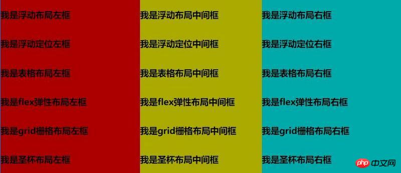
</section>Achieved effect:
Related recommendations:
How to realize the classic three-column layout of CSS
The height is known, the left and right widths are fixed, 5 ways to realize the three-column layout
Summary of usage of three-column layout
The above is the detailed content of Examples of six CSS three-column layout methods. For more information, please follow other related articles on the PHP Chinese website!

Hot AI Tools

Undresser.AI Undress
AI-powered app for creating realistic nude photos

AI Clothes Remover
Online AI tool for removing clothes from photos.

Undress AI Tool
Undress images for free

Clothoff.io
AI clothes remover

Video Face Swap
Swap faces in any video effortlessly with our completely free AI face swap tool!

Hot Article
Hot Tools

Notepad++7.3.1
Easy-to-use and free code editor

SublimeText3 Chinese version
Chinese version, very easy to use

Zend Studio 13.0.1
Powerful PHP integrated development environment

Dreamweaver CS6
Visual web development tools

SublimeText3 Mac version
God-level code editing software (SublimeText3)
Hot Topics


 How to use bootstrap in vue
Apr 07, 2025 pm 11:33 PM
How to use bootstrap in vue
Apr 07, 2025 pm 11:33 PM
Using Bootstrap in Vue.js is divided into five steps: Install Bootstrap. Import Bootstrap in main.js. Use the Bootstrap component directly in the template. Optional: Custom style. Optional: Use plug-ins.
 The Roles of HTML, CSS, and JavaScript: Core Responsibilities
Apr 08, 2025 pm 07:05 PM
The Roles of HTML, CSS, and JavaScript: Core Responsibilities
Apr 08, 2025 pm 07:05 PM
HTML defines the web structure, CSS is responsible for style and layout, and JavaScript gives dynamic interaction. The three perform their duties in web development and jointly build a colorful website.
 How to write split lines on bootstrap
Apr 07, 2025 pm 03:12 PM
How to write split lines on bootstrap
Apr 07, 2025 pm 03:12 PM
There are two ways to create a Bootstrap split line: using the tag, which creates a horizontal split line. Use the CSS border property to create custom style split lines.
 Understanding HTML, CSS, and JavaScript: A Beginner's Guide
Apr 12, 2025 am 12:02 AM
Understanding HTML, CSS, and JavaScript: A Beginner's Guide
Apr 12, 2025 am 12:02 AM
WebdevelopmentreliesonHTML,CSS,andJavaScript:1)HTMLstructurescontent,2)CSSstylesit,and3)JavaScriptaddsinteractivity,formingthebasisofmodernwebexperiences.
 How to insert pictures on bootstrap
Apr 07, 2025 pm 03:30 PM
How to insert pictures on bootstrap
Apr 07, 2025 pm 03:30 PM
There are several ways to insert images in Bootstrap: insert images directly, using the HTML img tag. With the Bootstrap image component, you can provide responsive images and more styles. Set the image size, use the img-fluid class to make the image adaptable. Set the border, using the img-bordered class. Set the rounded corners and use the img-rounded class. Set the shadow, use the shadow class. Resize and position the image, using CSS style. Using the background image, use the background-image CSS property.
 How to set up the framework for bootstrap
Apr 07, 2025 pm 03:27 PM
How to set up the framework for bootstrap
Apr 07, 2025 pm 03:27 PM
To set up the Bootstrap framework, you need to follow these steps: 1. Reference the Bootstrap file via CDN; 2. Download and host the file on your own server; 3. Include the Bootstrap file in HTML; 4. Compile Sass/Less as needed; 5. Import a custom file (optional). Once setup is complete, you can use Bootstrap's grid systems, components, and styles to create responsive websites and applications.
 How to use bootstrap button
Apr 07, 2025 pm 03:09 PM
How to use bootstrap button
Apr 07, 2025 pm 03:09 PM
How to use the Bootstrap button? Introduce Bootstrap CSS to create button elements and add Bootstrap button class to add button text
 How to resize bootstrap
Apr 07, 2025 pm 03:18 PM
How to resize bootstrap
Apr 07, 2025 pm 03:18 PM
To adjust the size of elements in Bootstrap, you can use the dimension class, which includes: adjusting width: .col-, .w-, .mw-adjust height: .h-, .min-h-, .max-h-
