
 Web Front-end
CSS Tutorial
The height is known and the left and right widths are fixed. 5 ways to implement a three-column layout
Web Front-end
CSS Tutorial
The height is known and the left and right widths are fixed. 5 ways to implement a three-column layout
The height is known and the left and right widths are fixed. 5 ways to implement a three-column layout
As the saying goes, a good memory is not as good as a bad writing. The same is true for writing code. If you don’t write down something you have read, it will not stay in your mind for long. So after working for so long, I slowly uploaded the previously recorded knowledge, firstly for sharing, and secondly for a better summary! Okay, without further ado, let’s get to the point.
First method: float
<style>
    *{
        padding:0;
        margin:0;
    }
    .big div{
        height:100px;
    }
    .big .left{
        width:300px;
        float:left;
        background:red;
    }
    .big .right{
        width:300px;
        float:right;
        background:yellow;
    }
    .big .center{
        background:blue;
    }
</style>
<body>
<div class="big">
    <div class="left">

    </div>
    <div class="right">

    </div>
    <div class="center">
        浮动解决方案
    </div>
</div>
The first solution is basically It’s not difficult at all, and you should use it a lot every day!
The second method: absolute positioning
<span style="color: #008080"> <style><br/> .position{<br/> margin-top:10px;<br/> }<br/> .position>div{<br/> position:absolute;<br/> height:100px;<br/> }<br/> .position .left{<br/> left:0;<br/> width:300px;<br/> background:red;<br/> }<br/> .position .right{<br/> right:0;<br/> width:300px;<br/> background:yellow;<br/> }<br/> .position .center{<br/> left:300px;<br/> right:300px;<br/> background:blue;<br/> }<br/></style><br/><body><br/><div class="position"><br/> <div class="left"><br/> <br/> </div><br/> <div class="right"><br/> <br/> </div><br/> <div class="center"><br/> 绝对定位方案2<br/> </div><br/></div><br/></body></span><span style="color: #0000ff"></span>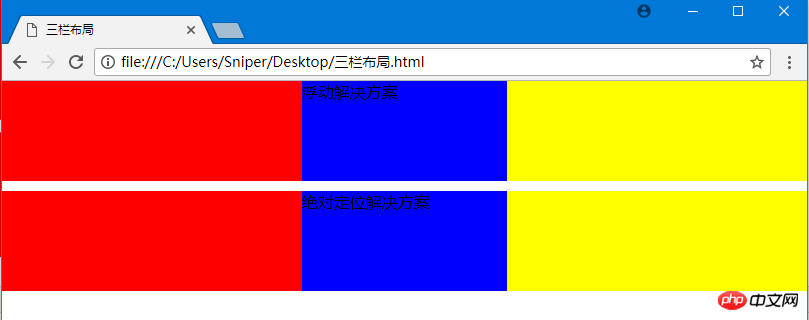
The second method is also easy to achieve the effect.
The third method: flexbox
<style>
 .flex{
        margin-top:120px;
        display:flex;
    }
    .flex>p{
        height:100px;
    }
    .flex .left{
        width:300px;
        background:red;
    }
    .flex .center{
        flex:1;
        background:blue;
    }
    .flex .right{
        width:300px;
        background:yellow;
    }</style><body><p class="flex">
    <p class="left">

    </p>
    <p class="center">
        flex方案    </p>
    <p class="right">

    </p></p></body>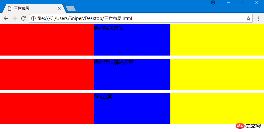
## The fourth method: table layout
<span style="color: #0000ff"><</span><span style="color: #800000">style</span><span style="color: #0000ff">></span><span style="background-color: #f5f5f5; color: #800000">.table</span><span style="background-color: #f5f5f5; color: #000000">{</span><span style="background-color: #f5f5f5; color: #ff0000">
        margin-top</span><span style="background-color: #f5f5f5; color: #000000">:</span><span style="background-color: #f5f5f5; color: #0000ff">10px</span><span style="background-color: #f5f5f5; color: #000000">;</span><span style="background-color: #f5f5f5; color: #ff0000">
        width</span><span style="background-color: #f5f5f5; color: #000000">:</span><span style="background-color: #f5f5f5; color: #0000ff">100%</span><span style="background-color: #f5f5f5; color: #000000">;</span><span style="background-color: #f5f5f5; color: #ff0000">
        display</span><span style="background-color: #f5f5f5; color: #000000">:</span><span style="background-color: #f5f5f5; color: #0000ff">table</span><span style="background-color: #f5f5f5; color: #000000">;</span><span style="background-color: #f5f5f5; color: #ff0000">
        height</span><span style="background-color: #f5f5f5; color: #000000">:</span><span style="background-color: #f5f5f5; color: #0000ff">100px</span><span style="background-color: #f5f5f5; color: #000000">;</span>
    <span style="background-color: #f5f5f5; color: #000000">}</span><span style="background-color: #f5f5f5; color: #800000">
    .table>p</span><span style="background-color: #f5f5f5; color: #000000">{</span><span style="background-color: #f5f5f5; color: #ff0000">
        display</span><span style="background-color: #f5f5f5; color: #000000">:</span><span style="background-color: #f5f5f5; color: #0000ff">table-cell</span><span style="background-color: #f5f5f5; color: #000000">;</span>
    <span style="background-color: #f5f5f5; color: #000000">}</span><span style="background-color: #f5f5f5; color: #800000">
     .table .left</span><span style="background-color: #f5f5f5; color: #000000">{</span><span style="background-color: #f5f5f5; color: #ff0000">
        width</span><span style="background-color: #f5f5f5; color: #000000">:</span><span style="background-color: #f5f5f5; color: #0000ff">300px</span><span style="background-color: #f5f5f5; color: #000000">;</span><span style="background-color: #f5f5f5; color: #ff0000">
        background</span><span style="background-color: #f5f5f5; color: #000000">:</span><span style="background-color: #f5f5f5; color: #0000ff">red</span><span style="background-color: #f5f5f5; color: #000000">;</span>
    <span style="background-color: #f5f5f5; color: #000000">}</span><span style="background-color: #f5f5f5; color: #800000">
    .table .center</span><span style="background-color: #f5f5f5; color: #000000">{</span><span style="background-color: #f5f5f5; color: #ff0000">
        background</span><span style="background-color: #f5f5f5; color: #000000">:</span><span style="background-color: #f5f5f5; color: #0000ff">blue</span><span style="background-color: #f5f5f5; color: #000000">;</span>
    <span style="background-color: #f5f5f5; color: #000000">}</span><span style="background-color: #f5f5f5; color: #800000">
    .table .right</span><span style="background-color: #f5f5f5; color: #000000">{</span><span style="background-color: #f5f5f5; color: #ff0000">
        width</span><span style="background-color: #f5f5f5; color: #000000">:</span><span style="background-color: #f5f5f5; color: #0000ff">300px</span><span style="background-color: #f5f5f5; color: #000000">;</span><span style="background-color: #f5f5f5; color: #ff0000">
        background</span><span style="background-color: #f5f5f5; color: #000000">:</span><span style="background-color: #f5f5f5; color: #0000ff">yellow</span><span style="background-color: #f5f5f5; color: #000000">;</span>
    <span style="background-color: #f5f5f5; color: #000000">}</span><span style="color: #0000ff"></</span><span style="color: #800000">style</span><span style="color: #0000ff">></span><br/><br/><span style="color: #0000ff"><</span><span style="color: #800000">body</span><span style="color: #0000ff">></span><span style="color: #0000ff"><</span><span style="color: #800000">p </span><span style="color: #ff0000">class</span><span style="color: #0000ff">="table"</span><span style="color: #0000ff">></span>
    <span style="color: #0000ff"><</span><span style="color: #800000">p </span><span style="color: #ff0000">class</span><span style="color: #0000ff">="left"</span><span style="color: #0000ff">></span>

    <span style="color: #0000ff"></</span><span style="color: #800000">p</span><span style="color: #0000ff">></span>
    <span style="color: #0000ff"><</span><span style="color: #800000">p </span><span style="color: #ff0000">class</span><span style="color: #0000ff">="center"</span><span style="color: #0000ff">></span><span style="color: #000000">
        table方案    </span><span style="color: #0000ff"></</span><span style="color: #800000">p</span><span style="color: #0000ff">></span>
    <span style="color: #0000ff"><</span><span style="color: #800000">p </span><span style="color: #ff0000">class</span><span style="color: #0000ff">="right"</span><span style="color: #0000ff">></span>

    <span style="color: #0000ff"></</span><span style="color: #800000">p</span><span style="color: #0000ff">></span><span style="color: #0000ff"></</span><span style="color: #800000">p</span><span style="color: #0000ff">></span><span style="color: #0000ff"></</span><span style="color: #800000">body</span><span style="color: #0000ff">></span>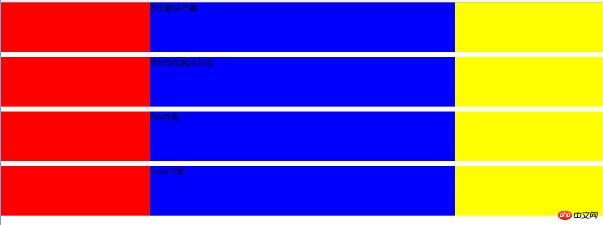
The fifth method: grid layout grid
<style>
  .grid{
        margin-top:10px;
        display:grid;
        width:100%;
        grid-template-rows:100px;
        grid-template-columns: 300px auto 300px;
    }
    .grid .left{
        background:red;
    }
    .grid .center{
        background:blue;
    }
    .grid .right{
        background:yellow;
    }</style><body><p class="grid">
    <p class="left">

    </p>
    <p class="center">
        grid方案    </p>
    <p class="right">

</p></p></body> ##The grid layout method is also implemented, CSS3 grid layout It is somewhat similar to bootstrap's grid layout, which uses a grid to divide the blocks occupied by elements.
The question is not over, we continue to discuss. Which of the five solutions is better? The author has always believed that technology is not good or bad, it all depends on where you use it.
Personally think the advantages and disadvantages of the five methods:
1. Floating: good compatibility. If there are clear requirements for compatibility, floating should meet the needs, but you must deal with the surrounding environment. The relationship between elements, because if you don’t pay attention to floating, it may cause problems such as confusing page layout. However, there are many ways to solve the side effects caused by floating, which we will not discuss here.
2. Absolute positioning: simple and direct, but it will cause the parent element to break away from the normal document flow and the child elements will also break away.
3.flex: It seems to be perfect at present, but now there are more or less compatibility issues with slightly more perfect technologies. The same style is not supported by IE8! (IE!)
4. Table layout: Although there is no big problem with the table layout, it will be very cumbersome when we want to refine the structure. At the same time, the height of the three cells in the table layout will be the same. Changes are also not conducive to our layout.
5. Grid layout: The code is beautiful and concise, but it still has compatibility issues. But the future is bright!
The above is the detailed content of The height is known and the left and right widths are fixed. 5 ways to implement a three-column layout. For more information, please follow other related articles on the PHP Chinese website!

Hot AI Tools

Undresser.AI Undress
AI-powered app for creating realistic nude photos

AI Clothes Remover
Online AI tool for removing clothes from photos.

Undress AI Tool
Undress images for free

Clothoff.io
AI clothes remover

Video Face Swap
Swap faces in any video effortlessly with our completely free AI face swap tool!

Hot Article
Hot Tools

Notepad++7.3.1
Easy-to-use and free code editor

SublimeText3 Chinese version
Chinese version, very easy to use

Zend Studio 13.0.1
Powerful PHP integrated development environment

Dreamweaver CS6
Visual web development tools

SublimeText3 Mac version
God-level code editing software (SublimeText3)
Hot Topics


 How to distinguish left and right earphones rl How to wear left and right earphones
Feb 22, 2024 pm 05:10 PM
How to distinguish left and right earphones rl How to wear left and right earphones
Feb 22, 2024 pm 05:10 PM
L stands for left, worn on the left ear, and R stands for right, worn on the right ear. Analysis 1 Usually there are logos on the earphones. The English letters are abbreviated as L and R. L stands for left and is worn on the left ear. R stands for right and is worn on the right ear. The specific positions marked by R and L are not fixed and are based on the specific headphones. Some headphones will mark R in red. For headphones that come with a mobile phone, the side with the microphone and buttons is usually on the right side. Supplement: Types of Headphones 1 Headphones are a symbol of people’s portable audio. Headphones can be divided into two specifications: OMTP specifications are generally called national standards, and CTIA are generally called international standards. Earphones are classified according to their energy conversion methods, specifically: dynamic coil method, moving iron method, static method
 Convert VirtualBox fixed disk to dynamic disk and vice versa
Mar 25, 2024 am 09:36 AM
Convert VirtualBox fixed disk to dynamic disk and vice versa
Mar 25, 2024 am 09:36 AM
When creating a virtual machine, you will be asked to select a disk type, you can select fixed disk or dynamic disk. What if you choose fixed disks and later realize you need dynamic disks, or vice versa? Good! You can convert one to the other. In this post, we will see how to convert VirtualBox fixed disk to dynamic disk and vice versa. A dynamic disk is a virtual hard disk that initially has a small size and grows in size as you store data in the virtual machine. Dynamic disks are very efficient at saving storage space because they only take up as much host storage space as needed. However, as disk capacity expands, your computer's performance may be slightly affected. Fixed disks and dynamic disks are commonly used in virtual machines
 How to set a computer lock screen wallpaper that will not change
Jan 17, 2024 pm 03:24 PM
How to set a computer lock screen wallpaper that will not change
Jan 17, 2024 pm 03:24 PM
Generally speaking, the desktop background pattern of a computer can be adjusted by the user. However, for some Windows 10 users, they want to be able to fix the desktop background image on their computer, but they don’t know how to set it. In fact, it is very simple and easy to operate. How to fix the computer lock screen wallpaper without changing it 1. Right-click the picture you want to set and select Set as background picture 2. Win+R to open and run, then enter "gpedit.msc" 3. Expand to: User Configuration - Management Templates - Control Panel - Personalization 4. Click Personalization, and then select "Prevent changes to desktop background" 5. Select Enabled 6. Then open settings and enter the background. When you see these small words, it means that it has been set up.
 How to keep the widgets panel always visible in Windows 11
Aug 13, 2023 pm 07:13 PM
How to keep the widgets panel always visible in Windows 11
Aug 13, 2023 pm 07:13 PM
How to always show widget board when opening in Windows 11? Well, you can start by downloading and installing the latest Windows updates. In the latest update patch for the Insider Program, Microsoft revealed that users in the Development and Canary channels will be able to pin the widget board open so it is always visible at a glance. How to Always Show Widgets Board Open in Windows 11 According to Microsoft, to pin a board to open, just click on the pushpin icon in the upper right corner of the board. Once your board is pinned open, the widget board will no longer ignore closing. While the board is pinned, you can still close it by opening the widget board via the Widgets button on the taskbar. when widget
 Power consumption testing and evaluation (rx588 power consumption testing and evaluation)
Dec 31, 2023 pm 09:38 PM
Power consumption testing and evaluation (rx588 power consumption testing and evaluation)
Dec 31, 2023 pm 09:38 PM
The power consumption of rx588 is about 250W. Watching movies on the rx580 consumes power, but not much. Many videos require hardware to decode. A graphics card will be used more or less. The platform power consumption of xfx Crimson and Dylan Demon + 7700K single card is about 380w, 7700k is counted as 100w, and other devices together are up to 30w, that is, the power consumption of rx588 is about 250w, and the power consumption of the dual-card machine is 630w to 650w , more than 700w is enough, but the load of the power supply is too high at this time, which affects the life. Calculated based on the load of 60% to 80%, the ideal power supply rated power is 850 to 1000w. It depends on what kind of CPU is used and whether it is overclocked. . Does h61 motherboard support 588 graphics card? H61 motherboard itself is
 How to pin computer notes to the desktop
Feb 15, 2024 pm 04:00 PM
How to pin computer notes to the desktop
Feb 15, 2024 pm 04:00 PM
The Windows 10 operating system is pre-embedded with a convenient note function so that valued users can write temporary notes or messages as they wish. Suppose you want to use this as a tool to quickly and easily find and use sticky notes, or you want to pin this practical small program in the center of a large screen for easy reference. You can realize the above wishes in just a few simple steps: How to pin sticky notes on your computer On the desktop 1. Click Start and then click the sticky note here. 2. After opening the sticky note, you can directly enter the corresponding content here, and you can also click the plus sign above to add a brand new content. 3. If you want to use a third party If you have a note-taking software, you can enter the settings of the corresponding software to operate.
 Why front-end fixed positioning can produce dynamic effects analysis
Feb 02, 2024 pm 12:09 PM
Why front-end fixed positioning can produce dynamic effects analysis
Feb 02, 2024 pm 12:09 PM
Front-end fixed positioning is a common CSS property that can fix an element at a specific position on the page and not change its position as the page scrolls. Unlike ordinary positioning, the position of fixed positioning on the page is relative to the viewport, not relative to the parent element. The effect of this fixed positioning is all the more attractive precisely because of its dynamic nature. The main reasons why fixed positioning produces dynamic effects are as follows: Scroll effect: When the page scrolls, fixedly positioned elements will not scroll with the page, but remain in a fixed position. this
 How to solve the problem that the win11 start menu cannot be fixed
Jan 06, 2024 pm 08:09 PM
How to solve the problem that the win11 start menu cannot be fixed
Jan 06, 2024 pm 08:09 PM
Many friends like to open the software directly in the start menu, which requires directly pinning the application to it. However, they found that they cannot be pinned to the start menu in win11. This may be because we did it incorrectly. Let’s take a look at the correct method below. Method. What to do if the win11 start menu cannot be fixed 1. First, we click the search button in the taskbar below. 2. After opening it, search for the application you want to pin at the top, and when you find it, click "Pin to Start Screen" on the right. 3. Wait for the system to display the icon to pin prompt. 4. After completion, you will find that the selected program has been pinned to the start menu.
