

How to make an organization chart using wps

How to use WPS to create a professional organizational chart? This question bothers many people. PHP editor Xiaoxin has compiled detailed operation steps for this purpose, and will guide you to easily draw a clear organizational structure chart, helping you to efficiently sort out organizational structure information and improve work efficiency.
The first method: As shown in Figure 1, click [Insert]-[Picture]--[Organization Chart] command on the format toolbar,
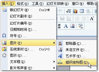
Figure 1
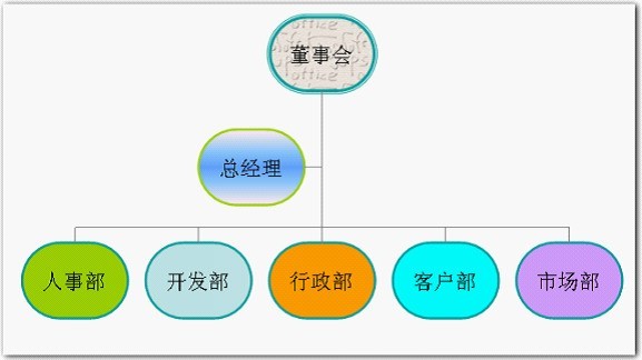
Click to open an organization chart, and you can use the commands in the toolbar of [Organization Chart] to modify and create an organization chart to illustrate hierarchical relationships.
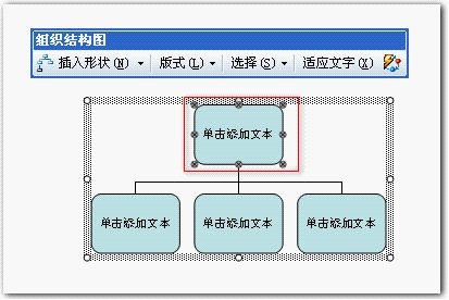
Figure 2
The second method is to call up the [Image Library] dialog box by clicking the [Insert] - [Picture] command on the format toolbar. box, select [Organizational Chart], click the [OK] button, and call up the content shown in Figure 2.
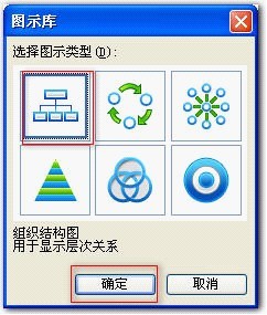
Figure 3
The third method is to click the [Picture] command button in the drawing toolbar

, Bring up the [Image Library] dialog box, select [Organizational Chart], and click the [OK] button to bring up the content shown in Figure 2.
Eight size handles will appear around the organization chart, and the drawing area can be set by dragging the size adjustment command.
Select the first shape, click the drop-down button on the right side of [Insert Shape], three items will appear:
[Colleague] - Place the shape next to the selected shape and Connect to the same parent shape.
【Subordinate】—Place the new shape on the next layer and connect it to the selected shape.
[Assistant]—Use the elbow connector to place the new shape below the selected shape.
Select the [Subordinate] command to add a subordinate below it, as shown in Figure 4 and Figure 5:
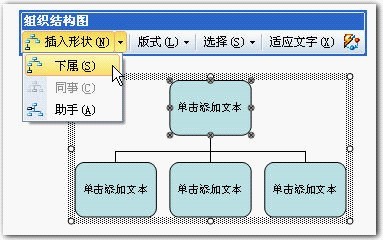
Figure 4
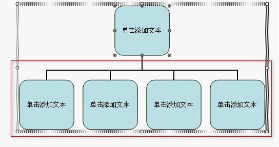
Figure 5
Click the drop-down button on the right side of [Insert Shape] and select the [Assistant] command to add an assistant shape between the graphic and the graphic below, such as As shown in Figure 6:
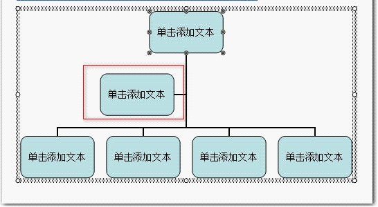
Figure 6
Select any of the graphics in the lower part, click the drop-down button on the right side of [Insert Shape], and select [Colleague] command, you can add a colleague shape in the middle of the graphic below, as shown in Figure 7:
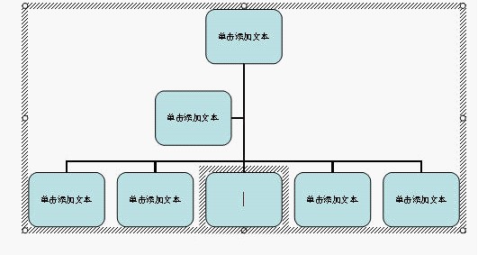
Figure 7
Select a shape to add text, click [Single Click Add Text] and type in the text. The effect after adding the text is as shown in Figure 8.
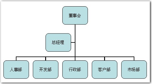
Figure 8
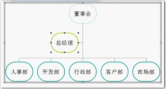
While keeping part of the content selected, click the drop-down button on the right side of [Form] on the [Organization Chart] toolbar, and the Four contents: [Standard], [Both Side Suspension], [Left Suspension], [Right Suspension], [Standard] mode is shown in Figure 7.
Click the [Hanging on Both Sides] command, as shown in Figure 9.
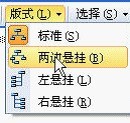
Figure 9
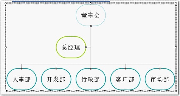
The set [Hanging on Both Sides] mode is shown in Figure 10. If the font size changes, click the [Adapt Text] command on the [Organization Chart] toolbar to make the text adapt to the changes in the graphics to achieve better results:
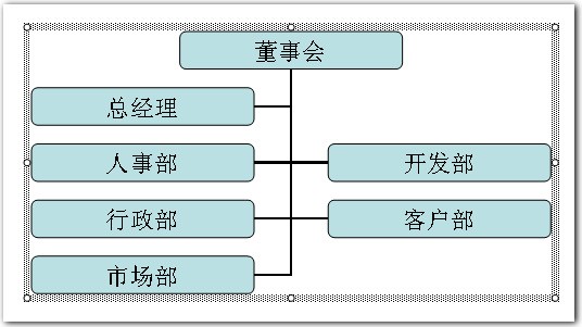
Figure 10
Similarly set the [left hanging] mode effect as shown in Figure 11:
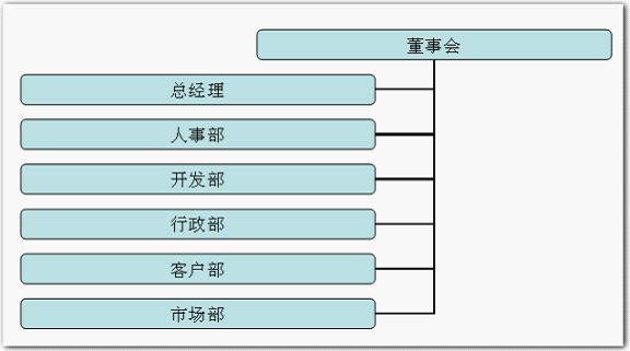
Figure 11
Similarly set the [right hanging] mode effect as shown in Figure 11 Shown in 12:
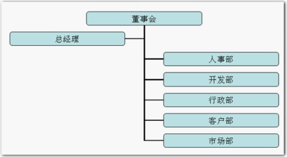
Figure 12
The organization chart in the default format drawn using this method is somewhat simple and needs to be beautified. Users can use [Auto Apply Format] Beautify the organizational chart.
While keeping some of the content selected, click the [AutoFormat] button on the far right side of the [Organization Chart] toolbar

, open the [Icon Style Library] window, in which 17 selectable icon styles appear. [Default] is the default item. All shown in the above figure are [Default] styles. .
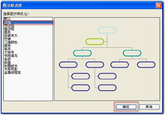
Figure 13
Select the [Border] style, a preview window will appear on the right, and you can see the style that will appear, as shown in Figure 13, click on it [OK] button, as shown in the figure:
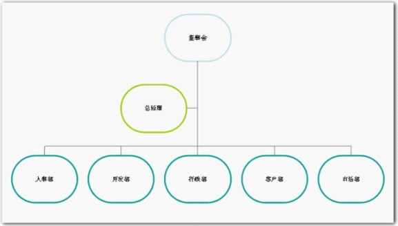
Figure 14
seems to be too small, click [Adapt to Text] on the [Organization Chart] toolbar command to adapt the text to the changes in the graphics, and the displayed text effect will be much better:
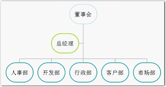
Figure 15
While keeping part of the content selected, click [Organize In the drop-down button to the right of [Select] on the Structure Diagram toolbar, four items appear: [Level], [Branch], [All Assistants], [All Connections], and select [Branch] as shown in Figure 16 .
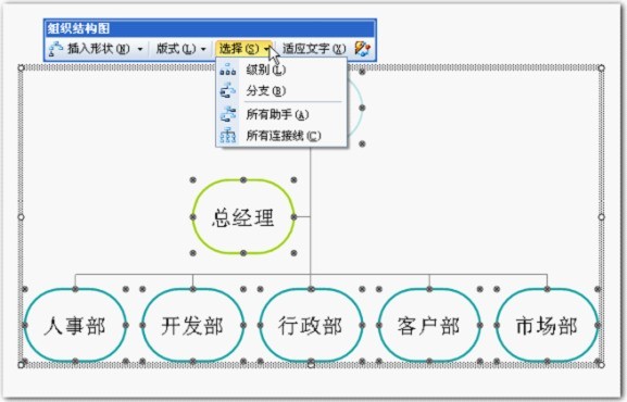
Figure 16
Similarly select the other options and the corresponding content will be displayed.
【All assistants】
Picture 17
【All connections】
Picture 18
Select the first graphic [Board of Directors]. Generally, you need to click twice to select it. As shown in the figure with eight control points, right-click and select the [Set Autograph Format] command in the shortcut menu,
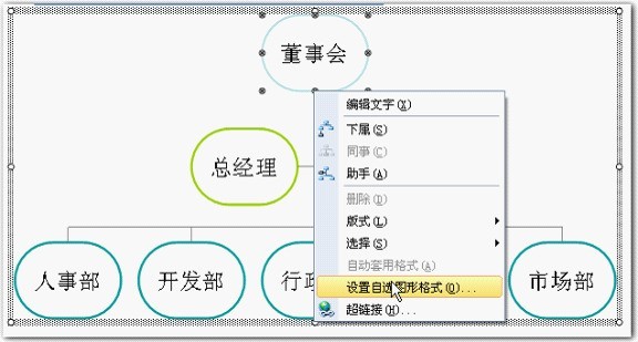
Figure 19
In the opened [Set Object Format] window, you can set fills and lines, etc. You can use changes in color fills to create different fill effects, such as gradients, Text, patterns, pictures, etc. can be used to fill in. Since it is not the focus of this article, no details will be given.
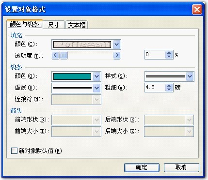
Figure 20
After selecting the fill and line styles. Click the [OK] button to complete the board settings.
Similarly, other content can be set. An effect of the following settings is shown in Figure 21. Of course, as long as you design carefully, you will definitely design more and better organizational chart effects.
Picture 21
The above is the detailed content of How to make an organization chart using wps. For more information, please follow other related articles on the PHP Chinese website!

Hot AI Tools

Undresser.AI Undress
AI-powered app for creating realistic nude photos

AI Clothes Remover
Online AI tool for removing clothes from photos.

Undress AI Tool
Undress images for free

Clothoff.io
AI clothes remover

Video Face Swap
Swap faces in any video effortlessly with our completely free AI face swap tool!

Hot Article
Hot Tools

Notepad++7.3.1
Easy-to-use and free code editor

SublimeText3 Chinese version
Chinese version, very easy to use

Zend Studio 13.0.1
Powerful PHP integrated development environment

Dreamweaver CS6
Visual web development tools

SublimeText3 Mac version
God-level code editing software (SublimeText3)
Hot Topics


 How to Create a Timeline Filter in Excel
Apr 03, 2025 am 03:51 AM
How to Create a Timeline Filter in Excel
Apr 03, 2025 am 03:51 AM
In Excel, using the timeline filter can display data by time period more efficiently, which is more convenient than using the filter button. The Timeline is a dynamic filtering option that allows you to quickly display data for a single date, month, quarter, or year. Step 1: Convert data to pivot table First, convert the original Excel data into a pivot table. Select any cell in the data table (formatted or not) and click PivotTable on the Insert tab of the ribbon. Related: How to Create Pivot Tables in Microsoft Excel Don't be intimidated by the pivot table! We will teach you basic skills that you can master in minutes. Related Articles In the dialog box, make sure the entire data range is selected (
 If You Don't Rename Tables in Excel, Today's the Day to Start
Apr 15, 2025 am 12:58 AM
If You Don't Rename Tables in Excel, Today's the Day to Start
Apr 15, 2025 am 12:58 AM
Quick link Why should tables be named in Excel How to name a table in Excel Excel table naming rules and techniques By default, tables in Excel are named Table1, Table2, Table3, and so on. However, you don't have to stick to these tags. In fact, it would be better if you don't! In this quick guide, I will explain why you should always rename tables in Excel and show you how to do this. Why should tables be named in Excel While it may take some time to develop the habit of naming tables in Excel (if you don't usually do this), the following reasons illustrate today
 You Need to Know What the Hash Sign Does in Excel Formulas
Apr 08, 2025 am 12:55 AM
You Need to Know What the Hash Sign Does in Excel Formulas
Apr 08, 2025 am 12:55 AM
Excel Overflow Range Operator (#) enables formulas to be automatically adjusted to accommodate changes in overflow range size. This feature is only available for Microsoft 365 Excel for Windows or Mac. Common functions such as UNIQUE, COUNTIF, and SORTBY can be used in conjunction with overflow range operators to generate dynamic sortable lists. The pound sign (#) in the Excel formula is also called the overflow range operator, which instructs the program to consider all results in the overflow range. Therefore, even if the overflow range increases or decreases, the formula containing # will automatically reflect this change. How to list and sort unique values in Microsoft Excel
 How to Format a Spilled Array in Excel
Apr 10, 2025 pm 12:01 PM
How to Format a Spilled Array in Excel
Apr 10, 2025 pm 12:01 PM
Use formula conditional formatting to handle overflow arrays in Excel Direct formatting of overflow arrays in Excel can cause problems, especially when the data shape or size changes. Formula-based conditional formatting rules allow automatic formatting to be adjusted when data parameters change. Adding a dollar sign ($) before a column reference applies a rule to all rows in the data. In Excel, you can apply direct formatting to the values or background of a cell to make the spreadsheet easier to read. However, when an Excel formula returns a set of values (called overflow arrays), applying direct formatting will cause problems if the size or shape of the data changes. Suppose you have this spreadsheet with overflow results from the PIVOTBY formula,
 How to change Excel table styles and remove table formatting
Apr 19, 2025 am 11:45 AM
How to change Excel table styles and remove table formatting
Apr 19, 2025 am 11:45 AM
This tutorial shows you how to quickly apply, modify, and remove Excel table styles while preserving all table functionalities. Want to make your Excel tables look exactly how you want? Read on! After creating an Excel table, the first step is usual

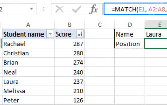 Excel MATCH function with formula examples
Apr 15, 2025 am 11:21 AM
Excel MATCH function with formula examples
Apr 15, 2025 am 11:21 AM
This tutorial explains how to use MATCH function in Excel with formula examples. It also shows how to improve your lookup formulas by a making dynamic formula with VLOOKUP and MATCH. In Microsoft Excel, there are many different lookup/ref
 How to Use Excel's AGGREGATE Function to Refine Calculations
Apr 12, 2025 am 12:54 AM
How to Use Excel's AGGREGATE Function to Refine Calculations
Apr 12, 2025 am 12:54 AM
Quick Links The AGGREGATE Syntax
