
 Mobile Tutorial
Mobile News
It is revealed that the iPhone 16 Plus blue material machine has arrived at the assembly line. 'Everyone who has seen it says it is ugly.'
Mobile Tutorial
Mobile News
It is revealed that the iPhone 16 Plus blue material machine has arrived at the assembly line. 'Everyone who has seen it says it is ugly.'
It is revealed that the iPhone 16 Plus blue material machine has arrived at the assembly line. 'Everyone who has seen it says it is ugly.'

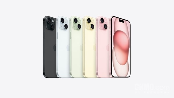
The iPhone 15 series released last year took a multi-color route, with multiple versions of back colors: blue, pink, yellow, green and black.
It is understood that this year’s iPhone 16 Plus is expected to continue this color matching idea.
According to bloggers, the new phone is available in at least two colors: green and blue, but its appearance is hard to describe. It is said that "everyone who has seen it says it is ugly."

On April 3, a digital blogger broke the news that the iPhone 16 Plus blue material machine has arrived at the assembly line. It is reported that the back of this color scheme is light blue with a hint of purple, and the lens module is dark and bright.
The blogger said that the new phone also has a green color scheme. “It doesn’t look good just looking at green, but after looking at the blue material machine, I found that green is not bad.”
I heard that people who came into contact with the iPhone 16 Plus feeder, that is, people who saw the machine, said it was ugly.


It is reported that the iPhone 16 Plus lens Deco adopts a dark style. Although the back cover and Deco are the same color, the Deco color is too Deep and very contrasting. Perhaps this is the reason why "everyone who has seen it says it is ugly".
In addition, previous spy photos of metal molds and molds showed that the arrangement of the rear camera modules of the iPhone 16 Plus was changed from a "bath heater" style to a vertical arrangement.
This year’s iPhone 16 series will still launch four models: iPhone 16, iPhone 16 Plus, iPhone 16 Pro and iPhone 16 Pro Max, among which iPhone 16 and 16 Plus models The model will be equipped with an A18 processor, and the screen size is expected to increase from 6.1 inches and 6.7 inches to 6.3 inches and 6.9 inches respectively.
In addition, all iPhone 16 series will support high brushing.
The above is the detailed content of It is revealed that the iPhone 16 Plus blue material machine has arrived at the assembly line. 'Everyone who has seen it says it is ugly.'. For more information, please follow other related articles on the PHP Chinese website!

Hot AI Tools

Undresser.AI Undress
AI-powered app for creating realistic nude photos

AI Clothes Remover
Online AI tool for removing clothes from photos.

Undress AI Tool
Undress images for free

Clothoff.io
AI clothes remover

Video Face Swap
Swap faces in any video effortlessly with our completely free AI face swap tool!

Hot Article
Hot Tools

Notepad++7.3.1
Easy-to-use and free code editor

SublimeText3 Chinese version
Chinese version, very easy to use

Zend Studio 13.0.1
Powerful PHP integrated development environment

Dreamweaver CS6
Visual web development tools

SublimeText3 Mac version
God-level code editing software (SublimeText3)
Hot Topics


 Do I need to use flexbox in the center of the Bootstrap picture?
Apr 07, 2025 am 09:06 AM
Do I need to use flexbox in the center of the Bootstrap picture?
Apr 07, 2025 am 09:06 AM
There are many ways to center Bootstrap pictures, and you don’t have to use Flexbox. If you only need to center horizontally, the text-center class is enough; if you need to center vertically or multiple elements, Flexbox or Grid is more suitable. Flexbox is less compatible and may increase complexity, while Grid is more powerful and has a higher learning cost. When choosing a method, you should weigh the pros and cons and choose the most suitable method according to your needs and preferences.
 How to calculate c-subscript 3 subscript 5 c-subscript 3 subscript 5 algorithm tutorial
Apr 03, 2025 pm 10:33 PM
How to calculate c-subscript 3 subscript 5 c-subscript 3 subscript 5 algorithm tutorial
Apr 03, 2025 pm 10:33 PM
The calculation of C35 is essentially combinatorial mathematics, representing the number of combinations selected from 3 of 5 elements. The calculation formula is C53 = 5! / (3! * 2!), which can be directly calculated by loops to improve efficiency and avoid overflow. In addition, understanding the nature of combinations and mastering efficient calculation methods is crucial to solving many problems in the fields of probability statistics, cryptography, algorithm design, etc.
 How to implement adaptive layout of Y-axis position in web annotation?
Apr 04, 2025 pm 11:30 PM
How to implement adaptive layout of Y-axis position in web annotation?
Apr 04, 2025 pm 11:30 PM
The Y-axis position adaptive algorithm for web annotation function This article will explore how to implement annotation functions similar to Word documents, especially how to deal with the interval between annotations...
 How to accurately realize the small label effect in the design draft on the mobile terminal?
Apr 04, 2025 pm 11:36 PM
How to accurately realize the small label effect in the design draft on the mobile terminal?
Apr 04, 2025 pm 11:36 PM
How to achieve the effect of small labels in the design draft on the mobile terminal? When designing mobile applications, it is common to find out how to accurately restore the small label effect in the design draft...
 How to elegantly solve the problem of too small spacing of Span tags after a line break?
Apr 05, 2025 pm 06:00 PM
How to elegantly solve the problem of too small spacing of Span tags after a line break?
Apr 05, 2025 pm 06:00 PM
How to elegantly handle the spacing of Span tags after a new line In web page layout, you often encounter the need to arrange multiple spans horizontally...
 Multi-party certification: iPhone 17 standard version will support high refresh rate! For the first time in history!
Apr 13, 2025 pm 11:15 PM
Multi-party certification: iPhone 17 standard version will support high refresh rate! For the first time in history!
Apr 13, 2025 pm 11:15 PM
Apple's iPhone 17 may usher in a major upgrade to cope with the impact of strong competitors such as Huawei and Xiaomi in China. According to the digital blogger @Digital Chat Station, the standard version of iPhone 17 is expected to be equipped with a high refresh rate screen for the first time, significantly improving the user experience. This move marks the fact that Apple has finally delegated high refresh rate technology to the standard version after five years. At present, the iPhone 16 is the only flagship phone with a 60Hz screen in the 6,000 yuan price range, and it seems a bit behind. Although the standard version of the iPhone 17 will have a high refresh rate screen, there are still differences compared to the Pro version, such as the bezel design still does not achieve the ultra-narrow bezel effect of the Pro version. What is more worth noting is that the iPhone 17 Pro series will adopt a brand new and more
 How to center images in containers for Bootstrap
Apr 07, 2025 am 09:12 AM
How to center images in containers for Bootstrap
Apr 07, 2025 am 09:12 AM
Overview: There are many ways to center images using Bootstrap. Basic method: Use the mx-auto class to center horizontally. Use the img-fluid class to adapt to the parent container. Use the d-block class to set the image to a block-level element (vertical centering). Advanced method: Flexbox layout: Use the justify-content-center and align-items-center properties. Grid layout: Use the place-items: center property. Best practice: Avoid unnecessary nesting and styles. Choose the best method for the project. Pay attention to the maintainability of the code and avoid sacrificing code quality to pursue the excitement
 How to make the height of adjacent columns in the Element UI automatically adapt to the content?
Apr 05, 2025 am 06:12 AM
How to make the height of adjacent columns in the Element UI automatically adapt to the content?
Apr 05, 2025 am 06:12 AM
How to make the height of adjacent columns of the same row automatically adapt to the content? In web design, we often encounter this problem: when there are many in a table or row...
