
 Software Tutorial
Office Software
Insert sectors with a common center but different and adjustable radii into PPT
Software Tutorial
Office Software
Insert sectors with a common center but different and adjustable radii into PPT
Insert sectors with a common center but different and adjustable radii into PPT

Insert a fan shape into ppt and the fan shapes share the center but the radius of the fan shapes are different and adjustable
Are you asking how to make it?
solution:
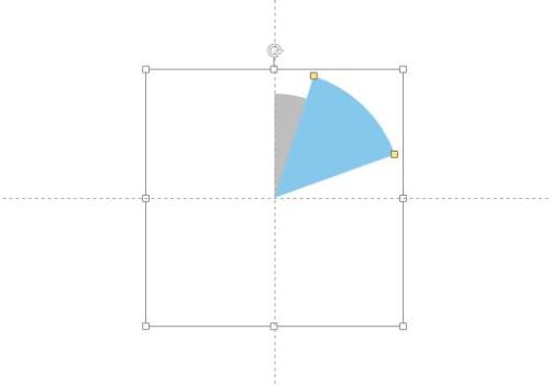
First, we need to use the "Sector" tool to draw a rough shape and set the desired color. In order to ensure that all sectors share a circle center, it is recommended to turn on [Reference Lines] under the [View] menu. As shown in the figure below, pay attention to the control points in the red line box, which are used to adjust the angle of the sector.

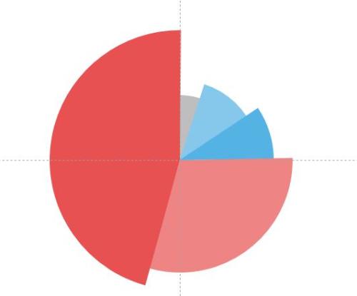
The second step is to copy the sector you just created, then paste and move it so that it aligns with the center of the circle. Next, hold down the [Ctrl+Shift] key combination and drag the control points at the four corners of the fan shape to enlarge it (holding down the key combination can keep the center position of the circle unchanged while making it larger in equal proportions). Then, change the shape of the fan and set the appropriate color. As shown in the figure below, it should be noted that the second sector will obscure part of the first sector.
Step3: Repeat the above steps to draw all sectors. As shown below:
Step4: Add a guide line and select the arrow end type as circular to complete the text addition. The renderings are as follows:

If you have any questions about the production process, you can leave a message. The following is the attachment of the chart for reference.
How to dynamically draw a circle in ppt
Is the software you use WPS or Powerpoint (version 03, 07 or 10)?
Take Powerpoint2003 as an example:
1. In the normal view, in the drawing toolbox, select [Ellipse] AutoShape, in the production area, hold down the Shit key, hold down the mouse and drag out a circle of appropriate size.
2. Right-click the circle and select [Set AutoShape Format] in the right-click shortcut menu. In the pop-up dialog box, set the [Color] column of the [Fill] item to [No Fill Color]. Set the color and thickness of the circle outline in the [Line] item. Final confirmation.
3. Right-click the circle, select [Custom Animation] in the right-click shortcut menu, and activate the custom animation pane on the right side of the view. Click [Add Effect]-[Enter]-[Other Effects]-[Wheel] in the pane, and then confirm.
4. In the custom animation pane, set the value of the [Radial] column to [1-spoke pattern], and then set the [Start] method and [Speed] speed.
OK, the dynamic circle drawing effect is completed.
※The Butt Kicking team will answer your question※. It is recommended that the questioner pay attention to two points: first, state the question clearly and completely, and second, indicate the name and version of the software you use, so as to solve the problem accurately and in a targeted manner.
The above is the detailed content of Insert sectors with a common center but different and adjustable radii into PPT. For more information, please follow other related articles on the PHP Chinese website!

Hot AI Tools

Undresser.AI Undress
AI-powered app for creating realistic nude photos

AI Clothes Remover
Online AI tool for removing clothes from photos.

Undress AI Tool
Undress images for free

Clothoff.io
AI clothes remover

Video Face Swap
Swap faces in any video effortlessly with our completely free AI face swap tool!

Hot Article
Hot Tools

Notepad++7.3.1
Easy-to-use and free code editor

SublimeText3 Chinese version
Chinese version, very easy to use

Zend Studio 13.0.1
Powerful PHP integrated development environment

Dreamweaver CS6
Visual web development tools

SublimeText3 Mac version
God-level code editing software (SublimeText3)
Hot Topics


 How to Create a Timeline Filter in Excel
Apr 03, 2025 am 03:51 AM
How to Create a Timeline Filter in Excel
Apr 03, 2025 am 03:51 AM
In Excel, using the timeline filter can display data by time period more efficiently, which is more convenient than using the filter button. The Timeline is a dynamic filtering option that allows you to quickly display data for a single date, month, quarter, or year. Step 1: Convert data to pivot table First, convert the original Excel data into a pivot table. Select any cell in the data table (formatted or not) and click PivotTable on the Insert tab of the ribbon. Related: How to Create Pivot Tables in Microsoft Excel Don't be intimidated by the pivot table! We will teach you basic skills that you can master in minutes. Related Articles In the dialog box, make sure the entire data range is selected (
 If You Don't Rename Tables in Excel, Today's the Day to Start
Apr 15, 2025 am 12:58 AM
If You Don't Rename Tables in Excel, Today's the Day to Start
Apr 15, 2025 am 12:58 AM
Quick link Why should tables be named in Excel How to name a table in Excel Excel table naming rules and techniques By default, tables in Excel are named Table1, Table2, Table3, and so on. However, you don't have to stick to these tags. In fact, it would be better if you don't! In this quick guide, I will explain why you should always rename tables in Excel and show you how to do this. Why should tables be named in Excel While it may take some time to develop the habit of naming tables in Excel (if you don't usually do this), the following reasons illustrate today
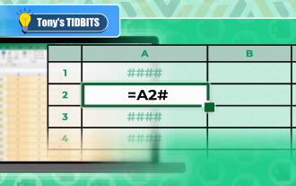 You Need to Know What the Hash Sign Does in Excel Formulas
Apr 08, 2025 am 12:55 AM
You Need to Know What the Hash Sign Does in Excel Formulas
Apr 08, 2025 am 12:55 AM
Excel Overflow Range Operator (#) enables formulas to be automatically adjusted to accommodate changes in overflow range size. This feature is only available for Microsoft 365 Excel for Windows or Mac. Common functions such as UNIQUE, COUNTIF, and SORTBY can be used in conjunction with overflow range operators to generate dynamic sortable lists. The pound sign (#) in the Excel formula is also called the overflow range operator, which instructs the program to consider all results in the overflow range. Therefore, even if the overflow range increases or decreases, the formula containing # will automatically reflect this change. How to list and sort unique values in Microsoft Excel
 How to Format a Spilled Array in Excel
Apr 10, 2025 pm 12:01 PM
How to Format a Spilled Array in Excel
Apr 10, 2025 pm 12:01 PM
Use formula conditional formatting to handle overflow arrays in Excel Direct formatting of overflow arrays in Excel can cause problems, especially when the data shape or size changes. Formula-based conditional formatting rules allow automatic formatting to be adjusted when data parameters change. Adding a dollar sign ($) before a column reference applies a rule to all rows in the data. In Excel, you can apply direct formatting to the values or background of a cell to make the spreadsheet easier to read. However, when an Excel formula returns a set of values (called overflow arrays), applying direct formatting will cause problems if the size or shape of the data changes. Suppose you have this spreadsheet with overflow results from the PIVOTBY formula,
 How to change Excel table styles and remove table formatting
Apr 19, 2025 am 11:45 AM
How to change Excel table styles and remove table formatting
Apr 19, 2025 am 11:45 AM
This tutorial shows you how to quickly apply, modify, and remove Excel table styles while preserving all table functionalities. Want to make your Excel tables look exactly how you want? Read on! After creating an Excel table, the first step is usual

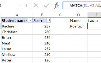 Excel MATCH function with formula examples
Apr 15, 2025 am 11:21 AM
Excel MATCH function with formula examples
Apr 15, 2025 am 11:21 AM
This tutorial explains how to use MATCH function in Excel with formula examples. It also shows how to improve your lookup formulas by a making dynamic formula with VLOOKUP and MATCH. In Microsoft Excel, there are many different lookup/ref
 How to Use Excel's AGGREGATE Function to Refine Calculations
Apr 12, 2025 am 12:54 AM
How to Use Excel's AGGREGATE Function to Refine Calculations
Apr 12, 2025 am 12:54 AM
Quick Links The AGGREGATE Syntax
