
 Web Front-end
CSS Tutorial
CSS Layout Tips: Best Practices for Implementing Circular Grid Icon Layout
Web Front-end
CSS Tutorial
CSS Layout Tips: Best Practices for Implementing Circular Grid Icon Layout
CSS Layout Tips: Best Practices for Implementing Circular Grid Icon Layout


CSS Layout Tips: Best Practices for Implementing Circular Grid Icon Layout
In modern web design, grid layout is a common and powerful layout technology. The circular grid icon layout is a more unique and interesting design choice. This article will introduce some best practices and specific code examples to help you implement a circular grid icon layout.
- <li>HTML structure
First, we need to set up a container element and place the icon in this container. We can use an unordered list (<ul></ul>) as a container, and list items (<li>) to place icons. For example:
<ul class="grid">
  <li></li>
  <li></li>
  <li></li>
  ...
</ul>
In the list item (<li>), we can add the content required for the icon, such as pictures, text, etc.
- <li>CSS Styles
Next, we need to set some CSS styles for the container and list items to achieve a circular grid icon layout.
First, we need to set some basic styles for the container:
.grid {
  display: flex;
  flex-wrap: wrap;
  justify-content: center;
  align-items: center;
  list-style-type: none;
  padding: 0;
  margin: 0;
}These styles use Flexbox layout so that the list items in the container can be automatically arranged in a grid form.
Then, we need to set some styles for the list items so that they appear circular:
.grid li {
  width: 100px;
  height: 100px;
  border-radius: 50%;
  margin: 10px;
  background-color: #ccc;
}These styles set the width, height, and rounded corner properties of the list items, and also set some spacing and background color.
- <li>Dynamic setting of icons
If we need to display a different icon in each list item, we can use pseudo elements (::before or ::after) to add the content of the icon.
.grid li::before {
  content: "";
  display: block;
  width: 50px;
  height: 50px;
  background-image: url(icon.png);
  background-size: cover;
  margin: 25px;
}This style will add an icon to the pseudo element of the list item. The size, style and position of the icon can be adjusted according to actual needs.
- <li>Implement responsive layout
In order to achieve responsive layout and display different numbers of icons under different screen sizes, we can combine media queries and CSS Grid layout to accomplish.
@media screen and (max-width: 768px) {
  .grid {
    grid-template-columns: repeat(2, 1fr);
  }
}

@media screen and (max-width: 480px) {
  .grid {
    grid-template-columns: 1fr;
  }
}In this example, when the screen width is less than 768 pixels, the container will be displayed in a 2-column grid layout. When the screen width is less than 480 pixels, the container will be displayed in a 1-column layout.
With these CSS styles and techniques, we can easily implement a circular grid icon layout. You can adjust and customize it according to your actual needs to achieve more complex and personalized effects. Hope this article is helpful to you!
The above is the detailed content of CSS Layout Tips: Best Practices for Implementing Circular Grid Icon Layout. For more information, please follow other related articles on the PHP Chinese website!

Hot AI Tools

Undresser.AI Undress
AI-powered app for creating realistic nude photos

AI Clothes Remover
Online AI tool for removing clothes from photos.

Undress AI Tool
Undress images for free

Clothoff.io
AI clothes remover

Video Face Swap
Swap faces in any video effortlessly with our completely free AI face swap tool!

Hot Article
Hot Tools

Notepad++7.3.1
Easy-to-use and free code editor

SublimeText3 Chinese version
Chinese version, very easy to use

Zend Studio 13.0.1
Powerful PHP integrated development environment

Dreamweaver CS6
Visual web development tools

SublimeText3 Mac version
God-level code editing software (SublimeText3)
Hot Topics


 How to make round pictures and text in ppt
Mar 26, 2024 am 10:23 AM
How to make round pictures and text in ppt
Mar 26, 2024 am 10:23 AM
First, draw a circle in PPT, then insert a text box and enter text content. Finally, set the fill and outline of the text box to None to complete the production of circular pictures and text.
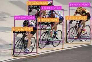 Multi-grid redundant bounding box annotation for accurate object detection
Jun 01, 2024 pm 09:46 PM
Multi-grid redundant bounding box annotation for accurate object detection
Jun 01, 2024 pm 09:46 PM
1. Introduction Currently, the leading object detectors are two-stage or single-stage networks based on the repurposed backbone classifier network of deep CNN. YOLOv3 is one such well-known state-of-the-art single-stage detector that receives an input image and divides it into an equal-sized grid matrix. Grid cells with target centers are responsible for detecting specific targets. What I’m sharing today is a new mathematical method that allocates multiple grids to each target to achieve accurate tight-fit bounding box prediction. The researchers also proposed an effective offline copy-paste data enhancement for target detection. The newly proposed method significantly outperforms some current state-of-the-art object detectors and promises better performance. 2. The background target detection network is designed to use
 How to make a round picture in ppt
Mar 25, 2024 pm 03:54 PM
How to make a round picture in ppt
Mar 25, 2024 pm 03:54 PM
How to make a circular picture in ppt: 1. Use the crop function; 2. Use the shape tool; 3. Use shortcut keys and control points to adjust.
 What is the area of the circular sector?
Aug 30, 2023 am 08:33 AM
What is the area of the circular sector?
Aug 30, 2023 am 08:33 AM
A circular sector, also known as a circular sector/sector of a circle, is a portion of a circle bounded by an arc between two radii. This area is bounded by two radii and an arc. To find the area inscribed, we need to find the angle between the two radii. The total area is equal to 360 degrees of angle. To find the area of an angle, we multiply the area by θ/360. This gives the area of the inscribed part. where θ is the angle (in degrees) between the two radii. The area of the circular sector = π*r*r*(θ/360). For example, the area of a circular sector with a radius of 5 and an angle of 60 degrees is 13.083. Area=(3.14*5*5)*(60/360)=13.03Example codeDemo#incl
 Questions frequently asked by front-end interviewers
Mar 19, 2024 pm 02:24 PM
Questions frequently asked by front-end interviewers
Mar 19, 2024 pm 02:24 PM
In front-end development interviews, common questions cover a wide range of topics, including HTML/CSS basics, JavaScript basics, frameworks and libraries, project experience, algorithms and data structures, performance optimization, cross-domain requests, front-end engineering, design patterns, and new technologies and trends. . Interviewer questions are designed to assess the candidate's technical skills, project experience, and understanding of industry trends. Therefore, candidates should be fully prepared in these areas to demonstrate their abilities and expertise.
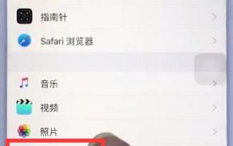 Steps to set up camera grid on iPhone
Mar 26, 2024 pm 07:21 PM
Steps to set up camera grid on iPhone
Mar 26, 2024 pm 07:21 PM
1. Open the desktop of your iPhone, find and click to enter [Settings], 2. Click to enter [Camera] on the settings page. 3. Click to turn on the switch on the right side of [Grid].
 The evolution and application of CSS layout units: from pixels to relative units based on the font size of the root element
Jan 05, 2024 pm 05:41 PM
The evolution and application of CSS layout units: from pixels to relative units based on the font size of the root element
Jan 05, 2024 pm 05:41 PM
From px to rem: The evolution and application of CSS layout units Introduction: In front-end development, we often need to use CSS to implement page layout. Over the past few years, CSS layout units have evolved and developed. Initially we used pixels (px) as the unit to set the size and position of elements. However, with the rise of responsive design and the popularity of mobile devices, pixel units have gradually exposed some problems. In order to solve these problems, the new unit rem came into being and was gradually widely used in CSS layout. one
 CSS Layout Tips: Best Practices for Implementing Circular Grid Icon Layout
Oct 20, 2023 am 10:46 AM
CSS Layout Tips: Best Practices for Implementing Circular Grid Icon Layout
Oct 20, 2023 am 10:46 AM
CSS Layout Tips: Best Practices for Implementing Circular Grid Icon Layout Grid layout is a common and powerful layout technique in modern web design. The circular grid icon layout is a more unique and interesting design choice. This article will introduce some best practices and specific code examples to help you implement a circular grid icon layout. HTML structure First, we need to set up a container element and place the icon in this container. We can use an unordered list (<ul>) as a container, and the list items (<l
