

How to select an avatar and crop it in Vue3

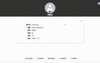
Final effect

Install VueCropper component
yarn add vue-cropper@next
The above installation value is for Vue3. If it is Vue2 or you want to use other methods to reference, please Visit its official npm address: official tutorial.
Referencing in components
It is also very simple to use. You only need to introduce the corresponding component and its style file. I do not reference it globally here, only introduce it in my component file
<script>
import { userInfoByRequest } from '../js/api'
import { VueCropper } from 'vue-cropper'
import 'vue-cropper/dist/index.css'
export default {
components: {
VueCropper
},
}Then use the <vue-cropper> tag to use it. It should be noted that it needs to be wrapped by an outer container and set a specified height for the outer container.
<el-dialog title="头像设置" v-model="showSetAvatarDialog">
            <div class="cropperBox">
                <vue-cropper ref="cropper" :canMoveBox="false" :img="avatarBase64" :fixedBox="true" :autoCrop="true"
                    autoCropWidth="200" autoCropHeight="200" outputType="png"></vue-cropper>
            </div>
            <div class="optionBtn">
                <el-button @click="rotateLeft"><i class="fa fa-rotate-left"></i>左旋转</el-button>
                <el-button @click="rotateRight"><i class="fa fa-rotate-right"></i>右旋转</el-button>
                <el-button @click="getPickAvatar" type="primary"><i class="fa fa-save"></i>保存</el-button>
            </div>
</el-dialog> Here I put it in a Dialog pop-up box. This pop-up box will pop up after selecting the picture.
For some of its properties, please refer to: Detailed description in the official tutorial. The meaning of the properties used above:
canMoveBox: Whether the screenshot box can be moved, the default is yes, I set it to false because I want the image to move and the screenshot box not to move.
img: Image source, which can be an image URL or base64 data.
fixedBox: It is not allowed to change the size of the screenshot box. It is allowed by default. Here I set it to true because I want a square with fixed length and width.
autoCrop: Whether to generate a screenshot box by default, set to true here
autoCropWidth: Automatically generate the default width of the screenshot box
autoCropHeight: The default height of the automatically generated screenshot frame
outputType: The format of the output image, here I set it to png format
Get the content of the image
Use the following method to get the content of the intercepted image using its built-in method
//获取base64格式的截图内容
this.$refs.cropper.getCropData(data => {
  // do something
  console.log(data)
})
//获取blob格式的截图内容
this.$refs.cropper.getCropBlob(data => {
  // do something
  console.log(data)
})For more other built-in methods, please refer to the detailed description in the official tutorial.
Customize uploaded pictures
The screenshot component is now available. Now we need to select an image, and then convert it to base64 through the front end and pop up the screenshot component for selection. Here we use the native input tag, type is file, but the native style is not what we want. In the demonstration, I clicked on a small camera icon and then selected the picture. The implementation process is as follows:
First add the hidden attribute to , hide it
Then when the camera icon is clicked, the event of clicking the input is implemented through js
Define the change event in the input tag, proceed The logic of converting images to base64
Then set the converted data to global variables
Complete code implementation
UserCenter .vue
<template>
<div class="userCenter">
<input id="avatarFile" type="file" hidden @change="selectFile" />
<header>
<div class="avatar">
<div class="back">
<el-tooltip content="返回">
<i @click="back" class="fa fa-arrow-left"></i>
</el-tooltip>
</div>
<div class="topInfo">
<el-avatar :size="120" :src="avatarBlob==null?(userInfo.avatar==null?defaultAvatar:userInfo.avatar):avatarBlob"></el-avatar>
<div class="setAvatar">
<el-tooltip content="修改头像">
<i @click="getFile" class="fa fa-camera"></i>
</el-tooltip>
</div>
<div class="username">{{userInfo.nickName}}</div>
</div>
</div>
</header>
<el-row justify="center">
<el-col :lg="12" :xl="12" :md="18" :sm="20" :xs="20">
<div class="userInfoBox">
<div class="headerOption">
<el-tooltip content="修改用户基本信息,涉及账号的修改请点击底栏的操作按钮">
<el-link @click="editUserInfo"><i class="fa fa-edit"></i></el-link>
</el-tooltip>
</div>
<ul>
<li>
<div class="userInfoTitle">用户名:</div>
<div class="userInfoValue">{{userInfo.username}}</div>
</li>
<li>
<div class="userInfoTitle">邮箱:</div>
<div class="userInfoValue">{{userInfo.email}}</div>
</li>
<li>
<div class="userInfoTitle">昵称:</div>
<div class="userInfoValue">{{userInfo.nickName}}</div>
</li>
<li>
<div class="userInfoTitle">性别:</div>
<div class="userInfoValue">{{userInfo.gender==3?'保密':(userInfo.gender==0?'男':'女')}}</div>
</li>
<li>
<div class="userInfoTitle">年龄:</div>
<div class="userInfoValue">{{userInfo.age}}</div>
</li>
<li>
<div class="userInfoTitle">生日:</div>
<div class="userInfoValue">{{userInfo.birthday}}</div>
</li>
</ul>
</div>
</el-col>
</el-row>
<div class="option">
<el-button class="optionBtn" size="large" round><i class="fa fa-user"></i>用户名修改</el-button>
<el-button class="optionBtn" size="large" round><i class="fa fa-lock"></i>修改密码</el-button>
<el-button class="optionBtn" size="large" round><i class="fa fa-envelope"></i>修改邮箱</el-button>
<el-button class="optionBtn" size="large" round><i class="fa fa-toggle-on"></i>激活邮箱</el-button>
<el-button class="optionBtn" size="large" round><i class="fa fa-power-off"></i>注销账号</el-button>
</div>
<el-dialog title="基本信息" v-model="showUserInfoDialog">
<el-form :model="userInfoForm">
<el-form-item label="昵称">
<el-input placeholder="请输入昵称" v-model="userInfoForm.nickName"></el-input>
</el-form-item>
<el-form-item label="性别">
<el-select v-model="userInfoForm.gender">
<el-option v-for="item in genders" :key="item.id" :label="item.genderName"
:value="item.genderCode"></el-option>
</el-select>
</el-form-item>
<el-form-item label="生日">
<el-date-picker v-model="userInfoForm.birthday" :locale="locale" placeholder="选择出生日期"
value-format="yyyy-MM-dd"></el-date-picker>
</el-form-item>
<div class="submitBtn" >
<el-button @click="showUserInfoDialog=false" type="info">取消</el-button>
<el-button type="primary">确定</el-button>
</div>
</el-form>
</el-dialog>
<el-dialog title="头像设置" v-model="showSetAvatarDialog">
<div class="cropperBox">
<vue-cropper ref="cropper" :canMoveBox="false" :img="avatarBase64" :fixedBox="true" :autoCrop="true"
autoCropWidth="200" autoCropHeight="200" outputType="png"></vue-cropper>
</div>
<div class="optionBtn">
<el-button @click="rotateLeft"><i class="fa fa-rotate-left"></i>左旋转</el-button>
<el-button @click="rotateRight"><i class="fa fa-rotate-right"></i>右旋转</el-button>
<el-button @click="getPickAvatar" type="primary"><i class="fa fa-save"></i>保存</el-button>
</div>
</el-dialog>
</div>
</template>
<script>
import { userInfoByRequest } from '../js/api'
import { VueCropper } from 'vue-cropper'
import 'vue-cropper/dist/index.css'
export default {
components: {
VueCropper
},
data() {
return {
userInfo: {},
defaultAvatar: 'https://cube.elemecdn.com/9/c2/f0ee8a3c7c9638a54940382568c9dpng.png',
userInfoForm: {},
genders: [
{
id: 1,
genderName: '男性',
genderCode: 0,
},
{
id: 2,
genderName: '女性',
genderCode: 1,
},
{
id: 3,
genderName: '保密',
genderCode: 3,
}
],
showUserInfoDialog: false,
showSetAvatarDialog: false,
avatarBase64:'',
avatarBlob: null
}
},
methods: {
back() {
this.$router.go(-1)
},
getUserInfo() {
userInfoByRequest().then(res => {
this.userInfo = res.data;
})
},
editUserInfo() {
this.userInfoForm.nickName = this.userInfo.nickName;
this.userInfoForm.gender = this.userInfo.gender;
this.userInfoForm.birthday = this.userInfo.birthday;
this.showUserInfoDialog = true;
},
getPickAvatar() {
this.$refs.cropper.getCropData(data => {
this.avatarBlob = data
})
this.showSetAvatarDialog = false;
},
rotateLeft() {
this.$refs.cropper.rotateLeft();
},
rotateRight() {
this.$refs.cropper.rotateRight();
},
getFile() {
let fileEle = document.getElementById('avatarFile')
fileEle.click()
},
selectFile(e) {
var file = e.target.files[0];
var filesize = file.size;
var filename = file.name;
var reader = new FileReader();
reader.readAsDataURL(file);
reader.onload = (e) => {
var imgcode = e.target.result;
this.avatarBase64 = imgcode
this.showSetAvatarDialog = true;
}
}
},
mounted() {
this.getUserInfo();
}
}
</script>
<style scoped>
.userCenter {
display: flex;
flex-direction: column;
justify-content: center;
}
.username {
color: #fff;
font-weight: bold;
font-size: 19px;
padding: 0 10px;
}
header {
text-align: center;
padding: 10px;
background-color: #333;
}
.topInfo {
animation: userInfoCard 2s;
-webkit-animation: userInfoCard 2s;
/* Safari and Chrome */
}
.back {
text-align: left;
color: #fff;
position: relative;
left: 10px;
}
.back>i {
cursor: pointer;
}
.userInfoBox {
box-shadow: 2px 3px 10px #D3d7d4;
margin-top: 20px;
padding: 20px;
background-color: #fff;
font-size: 16px;
text-align: center;
border-radius: 4px;
animation: userInfoCard 3s;
-webkit-animation: userInfoCard 3s;
/* Safari and Chrome */
}
.setAvatar {
position: relative;
top: -20px;
font-size: 14px;
color: #000;
margin: -10px;
}
.setAvatar>i {
cursor: pointer;
}
ul>li {
display: flex;
padding: 5px;
}
.userInfoTitle {
font-weight: bold;
width: 100px;
text-align: right;
padding-right: 10px;
}
.option {
width: 100%;
text-align: center;
position: fixed;
bottom: 20px;
border: 1px solid gainsboro;
padding: 10px;
}
.optionBtn {
font-weight: bold;
text-align: center;
margin-top: 10px;
}
.headerOption {
text-align: right;
}
@keyframes userInfoCard {
from {
opacity: 0;
}
to {
opacity: 1;
}
}
@-webkit-keyframes userInfoCard
/* Safari and Chrome */
{
from {
opacity: 0;
}
to {
opacity: 1;
}
}
.cropperBox {
width: 100%;
height: 300px;
}
</style>The above is the detailed content of How to select an avatar and crop it in Vue3. For more information, please follow other related articles on the PHP Chinese website!

Hot AI Tools

Undresser.AI Undress
AI-powered app for creating realistic nude photos

AI Clothes Remover
Online AI tool for removing clothes from photos.

Undress AI Tool
Undress images for free

Clothoff.io
AI clothes remover

Video Face Swap
Swap faces in any video effortlessly with our completely free AI face swap tool!

Hot Article
Hot Tools

Notepad++7.3.1
Easy-to-use and free code editor

SublimeText3 Chinese version
Chinese version, very easy to use

Zend Studio 13.0.1
Powerful PHP integrated development environment

Dreamweaver CS6
Visual web development tools

SublimeText3 Mac version
God-level code editing software (SublimeText3)
Hot Topics


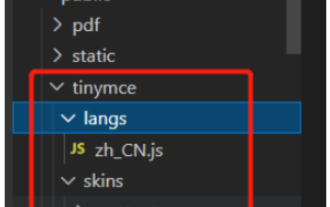 How to use tinymce in vue3 project
May 19, 2023 pm 08:40 PM
How to use tinymce in vue3 project
May 19, 2023 pm 08:40 PM
tinymce is a fully functional rich text editor plug-in, but introducing tinymce into vue is not as smooth as other Vue rich text plug-ins. tinymce itself is not suitable for Vue, and @tinymce/tinymce-vue needs to be introduced, and It is a foreign rich text plug-in and has not passed the Chinese version. You need to download the translation package from its official website (you may need to bypass the firewall). 1. Install related dependencies npminstalltinymce-Snpminstall@tinymce/tinymce-vue-S2. Download the Chinese package 3. Introduce the skin and Chinese package. Create a new tinymce folder in the project public folder and download the
 vue3+vite: How to solve the error when using require to dynamically import images in src
May 21, 2023 pm 03:16 PM
vue3+vite: How to solve the error when using require to dynamically import images in src
May 21, 2023 pm 03:16 PM
vue3+vite:src uses require to dynamically import images and error reports and solutions. vue3+vite dynamically imports multiple images. If vue3 is using typescript development, require will introduce image errors. requireisnotdefined cannot be used like vue2 such as imgUrl:require(' .../assets/test.png') is imported because typescript does not support require, so import is used. Here is how to solve it: use awaitimport
 How to refresh partial content of the page in Vue3
May 26, 2023 pm 05:31 PM
How to refresh partial content of the page in Vue3
May 26, 2023 pm 05:31 PM
To achieve partial refresh of the page, we only need to implement the re-rendering of the local component (dom). In Vue, the easiest way to achieve this effect is to use the v-if directive. In Vue2, in addition to using the v-if instruction to re-render the local dom, we can also create a new blank component. When we need to refresh the local page, jump to this blank component page, and then jump back in the beforeRouteEnter guard in the blank component. original page. As shown in the figure below, how to click the refresh button in Vue3.X to reload the DOM within the red box and display the corresponding loading status. Since the guard in the component in the scriptsetup syntax in Vue3.X only has o
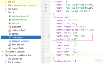 How Vue3 parses markdown and implements code highlighting
May 20, 2023 pm 04:16 PM
How Vue3 parses markdown and implements code highlighting
May 20, 2023 pm 04:16 PM
Vue implements the blog front-end and needs to implement markdown parsing. If there is code, it needs to implement code highlighting. There are many markdown parsing libraries for Vue, such as markdown-it, vue-markdown-loader, marked, vue-markdown, etc. These libraries are all very similar. Marked is used here, and highlight.js is used as the code highlighting library. The specific implementation steps are as follows: 1. Install dependent libraries. Open the command window under the vue project and enter the following command npminstallmarked-save//marked to convert markdown into htmlnpmins
 How to use vue3+ts+axios+pinia to achieve senseless refresh
May 25, 2023 pm 03:37 PM
How to use vue3+ts+axios+pinia to achieve senseless refresh
May 25, 2023 pm 03:37 PM
vue3+ts+axios+pinia realizes senseless refresh 1. First download aiXos and pinianpmipinia in the project--savenpminstallaxios--save2. Encapsulate axios request-----Download js-cookienpmiJS-cookie-s//Introduce aixosimporttype{AxiosRequestConfig ,AxiosResponse}from"axios";importaxiosfrom'axios';import{ElMess
 How to use Vue3 reusable components
May 20, 2023 pm 07:25 PM
How to use Vue3 reusable components
May 20, 2023 pm 07:25 PM
Preface Whether it is vue or react, when we encounter multiple repeated codes, we will think about how to reuse these codes instead of filling a file with a bunch of redundant codes. In fact, both vue and react can achieve reuse by extracting components, but if you encounter some small code fragments and you don’t want to extract another file, in comparison, react can be used in the same Declare the corresponding widget in the file, or implement it through renderfunction, such as: constDemo:FC=({msg})=>{returndemomsgis{msg}}constApp:FC=()=>{return(
 How to solve the problem that after the vue3 project is packaged and published to the server, the access page displays blank
May 17, 2023 am 08:19 AM
How to solve the problem that after the vue3 project is packaged and published to the server, the access page displays blank
May 17, 2023 am 08:19 AM
After the vue3 project is packaged and published to the server, the access page displays blank 1. The publicPath in the vue.config.js file is processed as follows: const{defineConfig}=require('@vue/cli-service') module.exports=defineConfig({publicPath :process.env.NODE_ENV==='production'?'./':'/&
 How to select an avatar and crop it in Vue3
May 29, 2023 am 10:22 AM
How to select an avatar and crop it in Vue3
May 29, 2023 am 10:22 AM
The final effect is to install the VueCropper component yarnaddvue-cropper@next. The above installation value is for Vue3. If it is Vue2 or you want to use other methods to reference, please visit its official npm address: official tutorial. It is also very simple to reference and use it in a component. You only need to introduce the corresponding component and its style file. I do not reference it globally here, but only introduce import{userInfoByRequest}from'../js/api' in my component file. import{VueCropper}from'vue-cropper&
