 Web Front-end
 CSS Tutorial
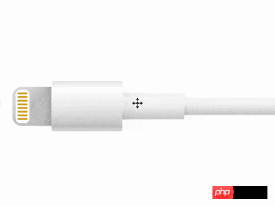
 An example of how to create a lightning connection line using CSS language
An example of how to create a lightning connection line using CSS language

Effect Preview
Press the "Click to Preview" button on the right to preview on the current page, and click on the link to preview in full screen.
https://codepen.io/comehope/pen/RBjdzZ
Interactive video
This video is interactive, you can pause the video at any time and edit the video code.
Please use chrome, safari, edge to open and watch.
https://scrimba.com/p/pEgDAM/cgkE6C6
Code Interpretation
Define dom, the container contains 2 elements, representing plugs and cables:
<p class="cable">
    <span class="head"></span>
    <span class="body"></span>
</p>Centered display:
body {
    margin: 0;
    height: 100vh;
    display: flex;
    align-items: center;
}Define container size:
.cable {
    display: flex;
    align-items: center;
    font-size: 10px;
    margin-left: 5em;
}Draw the outline of the plug:
.head {
    width: 8.5em;
    height: 8.5em;
    border-radius: 2em 0 0 2em;
}Draw the outline of the pins on the plug:
.head {
    position: relative;
}

.head::before {
    content: '';
    position: absolute;
    width: 3em;
    height: 7.3em;
    top: calc((8.5em - 7.3em) / 2);
    left: 0.7em;
    border-radius: 1em;
    box-sizing: border-box;
}Draw the outline of the hand-held part of the cable:
.body {
    width: 15.5em;
    height: 11em;
    border-radius: 0.5em;
}Draw the outline of the slightly thicker part of the cable:
.body {
    position: relative;
    display: flex;
    align-items: center;
}

.body::before {
    content: '';
    position: absolute;
    width: 13.5em;
    height: 6em;
    left: 15.5em;
}Draw the extension part of the cable:
.body::after {
    content: '';
    position: absolute;
    width: 100vh;
    height: 3.9em;
    left: calc(15.5em + 13.5em);
}Hide the parts outside the screen:
body {
    overflow: hidden;
}Next draw the details.
Paint the extension cord with gradient color:
.body::after {
    background:
        linear-gradient(
            white,
            hsl(0, 0%, 96%) 5%,
            hsl(0, 0%, 97%) 25%,
            hsl(0, 0%, 95%) 40%,
            hsl(0, 0%, 81%) 95%,
            white
        );
}Paint the thicker part of the cable with gradient color:
.body::before {
    background:
        linear-gradient(
            white,
            hsl(0, 0%, 96%) 5%,
            hsl(0, 0%, 98%) 20%,
            hsl(0, 0%, 95%) 50%,
            hsl(0, 0%, 81%) 95%,
            white
        );
}Paint the handheld part of the cable with gradient color:
.body {
    background:linear-gradient(
        hsl(0, 0%, 91%),
        white 15%,
        hsl(0, 0%, 93%) 50%,
        hsl(0, 0%, 87%) 70%,
        hsl(0, 0%, 79%) 90%,
        hsl(0, 0%, 84%),
        hsl(0, 0%, 86%)
    );
}Paint the plug with a gradient color:
.head {
    background:
        linear-gradient(
            -45deg,
            hsl(0, 0%, 75%),
            hsl(0, 0%, 79%),
            hsl(0, 0%, 78%),
            hsl(0, 0%, 87%) 80%
        );
}Draw the pins on the plug:
.head::before {
    background-color: white;
}

.head::after {
    content: '';
    position: absolute;
    box-sizing: border-box;
    width: 2.2em;
    height: 0.4em;
    color: goldenrod;
    background-color: currentColor;
    border-radius: 0.5em;
    left: 1.1em;
    top: 1.2em;
    box-shadow:
        0 0.8em 0,
        0 1.6em 0,
        0 2.4em 0,
        0 3.2em 0,
        0 4em 0,
        0 4.8em 0,
        0 5.6em 0;
} Next add a shadow to make the cable more three-dimensional.
Draw the shadow on the plug:
.head {
    background:
        linear-gradient(
            90deg,
            transparent 80%,
            rgba(0,0,0,12%)
        ),
        linear-gradient(
            -45deg,
            hsl(0, 0%, 75%),
            hsl(0, 0%, 79%),
            hsl(0, 0%, 78%),
            hsl(0, 0%, 87%) 80%
        );
}Draw the shadow on the handheld part of the cable:
.body::before {
    background:
        linear-gradient(
            45deg,
            rgba(0,0,0,4%) 10%,
            transparent 20%
        ),
        linear-gradient(
            90deg,
            rgba(0,0,0,4%),
            transparent 10%
        ),
        linear-gradient(
            white,
            hsl(0, 0%, 96%) 5%,
            hsl(0, 0%, 98%) 20%,
            hsl(0, 0%, 95%) 50%,
            hsl(0, 0%, 81%) 95%,
            white
        );
}Draw the shadow on the thicker part of the cable:
.body::after {
    background:
        linear-gradient(
            45deg,
            rgba(0,0,0,4%),
            transparent 4%
        ),
        linear-gradient(
            90deg,
            rgba(0,0,0,4%),
            transparent 2%
        ),
        linear-gradient(
            white,
            hsl(0, 0%, 96%) 5%,
            hsl(0, 0%, 97%) 25%,
            hsl(0, 0%, 95%) 40%,
            hsl(0, 0%, 81%) 95%,
            white
        );
}Finally, Add entrance animation to the screen
.cable {
    animation: show 5s linear infinite;
}

@keyframes show {
    0% {
        transform: translateX(100vw);
    }

    20%, 100% {
        transform: translateX(0);
    }
}You’re done!
Related articles:
Create a spindle divider using pure CSS3
How to create a simple five-pointed star graphic using pure CSS3
Related videos:
CSS animation practical skills video tutorial
The above is the detailed content of An example of how to create a lightning connection line using CSS language. For more information, please follow other related articles on the PHP Chinese website!

Hot AI Tools

Undresser.AI Undress
AI-powered app for creating realistic nude photos

AI Clothes Remover
Online AI tool for removing clothes from photos.

Undress AI Tool
Undress images for free

Clothoff.io
AI clothes remover

Video Face Swap
Swap faces in any video effortlessly with our completely free AI face swap tool!

Hot Article

Hot Tools

Notepad++7.3.1
Easy-to-use and free code editor

SublimeText3 Chinese version
Chinese version, very easy to use

Zend Studio 13.0.1
Powerful PHP integrated development environment

Dreamweaver CS6
Visual web development tools

SublimeText3 Mac version
God-level code editing software (SublimeText3)

Hot Topics
 How to use bootstrap in vue
Apr 07, 2025 pm 11:33 PM
Using Bootstrap in Vue.js is divided into five steps: Install Bootstrap. Import Bootstrap in main.js. Use the Bootstrap component directly in the template. Optional: Custom style. Optional: Use plug-ins.
 The Roles of HTML, CSS, and JavaScript: Core Responsibilities
Apr 08, 2025 pm 07:05 PM
HTML defines the web structure, CSS is responsible for style and layout, and JavaScript gives dynamic interaction. The three perform their duties in web development and jointly build a colorful website.
 Understanding HTML, CSS, and JavaScript: A Beginner's Guide
Apr 12, 2025 am 12:02 AM
WebdevelopmentreliesonHTML,CSS,andJavaScript:1)HTMLstructurescontent,2)CSSstylesit,and3)JavaScriptaddsinteractivity,formingthebasisofmodernwebexperiences.
 What Does H5 Refer To? Exploring the Context
Apr 12, 2025 am 12:03 AM
H5referstoHTML5,apivotaltechnologyinwebdevelopment.1)HTML5introducesnewelementsandAPIsforrich,dynamicwebapplications.2)Itsupportsmultimediawithoutplugins,enhancinguserexperienceacrossdevices.3)SemanticelementsimprovecontentstructureandSEO.4)H5'srespo
 Is h5 same as HTML5?
Apr 08, 2025 am 12:16 AM
"h5" and "HTML5" are the same in most cases, but they may have different meanings in certain specific scenarios. 1. "HTML5" is a W3C-defined standard that contains new tags and APIs. 2. "h5" is usually the abbreviation of HTML5, but in mobile development, it may refer to a framework based on HTML5. Understanding these differences helps to use these terms accurately in your project.
 Multi-party certification: iPhone 17 standard version will support high refresh rate! For the first time in history!
Apr 13, 2025 pm 11:15 PM
Apple's iPhone 17 may usher in a major upgrade to cope with the impact of strong competitors such as Huawei and Xiaomi in China. According to the digital blogger @Digital Chat Station, the standard version of iPhone 17 is expected to be equipped with a high refresh rate screen for the first time, significantly improving the user experience. This move marks the fact that Apple has finally delegated high refresh rate technology to the standard version after five years. At present, the iPhone 16 is the only flagship phone with a 60Hz screen in the 6,000 yuan price range, and it seems a bit behind. Although the standard version of the iPhone 17 will have a high refresh rate screen, there are still differences compared to the Pro version, such as the bezel design still does not achieve the ultra-narrow bezel effect of the Pro version. What is more worth noting is that the iPhone 17 Pro series will adopt a brand new and more
 HTML: The Structure, CSS: The Style, JavaScript: The Behavior
Apr 18, 2025 am 12:09 AM
The roles of HTML, CSS and JavaScript in web development are: 1. HTML defines the web page structure, 2. CSS controls the web page style, and 3. JavaScript adds dynamic behavior. Together, they build the framework, aesthetics and interactivity of modern websites.
 The Legacy of HTML5: Understanding H5 in the Present
Apr 10, 2025 am 09:28 AM
HTML5hassignificantlytransformedwebdevelopmentbyintroducingsemanticelements,enhancingmultimediasupport,andimprovingperformance.1)ItmadewebsitesmoreaccessibleandSEO-friendlywithsemanticelementslike,,and.2)HTML5introducednativeandtags,eliminatingthenee


