

CSS3 implements flexible box model application

As part of the CSS3 specification, the flexbox layout model can simplify the CSS code required to complete layout in many typical scenarios. The layout model also provides many useful features to meet common layout requirements, including arranging, aligning, resizing, and allocating white space for items in containers. The flexbox layout model can serve as a great tool in a web developer's toolbox.
1. cssClear floating. If the parent element does not set a height, the height of the parent element will be supported by the child elements by default. If the child element is set to float, it cannot expand the height of the parent element.
2. Using @media only screen to write styles for devices with different screen sizes is actually a very complicated matter. It is best to build the same page structure, and then set the display of the elements to affect it. Hide and show elements.
Once the page structure is formed, unless elements are dynamically added or deleted through js, through @media only screen we can only modify attributes but not add or delete elements.
max-width and min-width refer to the width of the entire window, including the width of the scroll bar.
3. The difference and usage of standard combination model, weird combination model, flexible box model.
4. Related properties and usage of bootstrap.
#The above are the knowledge points I have mastered today. Without further ado, let’s get to the point.
How to realize the automatic line wrapping of the following elements in the same row, and after the line wrapping, each row of elements still occupies the entire width of the parent element.
Please look at the following pictures: 
State 1 
State 2 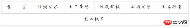
State 3 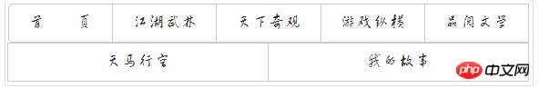
Status 4
The four pictures above are the state changes of the browser window from large to navigation bar.
My page is written with bootstrap. The above is the button group in bootstrap. It is displayed in the same row by default and the size of the button is expanded by the font
State 1 to State 2
The font and button sizes in state 1 are relatively large. I implemented this process through @media only screen in css.
State 2 to State 3
This is our focus.
How to realize automatic line wrapping of row elements?
If the same element has a fixed width, it will generally not wrap automatically.
If the same element is assigned a percentage value, there will always be a width value and no line wrapping will be implemented.
What if the width and height of the element are all supported by the content?
Set display:inline-block; 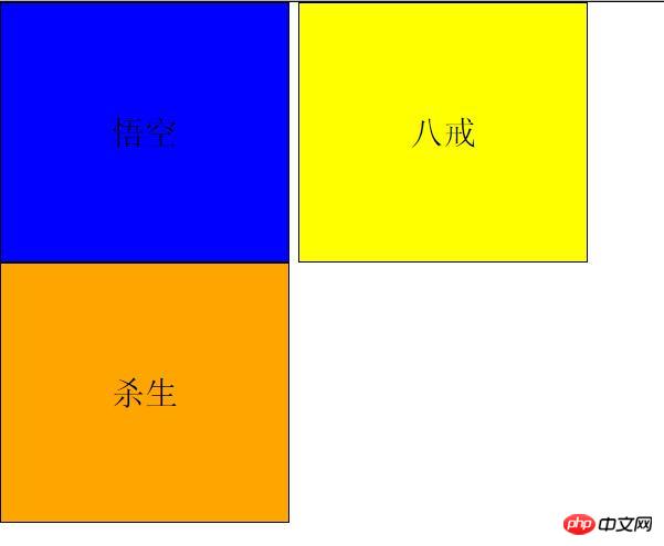
to the element
There will be a gap between the two elements of Wukong and Bajie. However, automatic line wrapping is implemented.
What if you add a floating effect to an element? 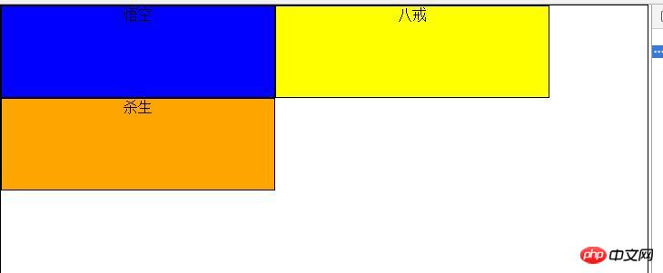
The floating effect is better than display:inline-block;.
However, although both of them achieve automatic line wrapping, the final effect is not what we want.
The effect we want is from state 2 to state 3. After the element is wrapped, the element will occupy the entire line, and the space vacated in the previous line will be filled by other elements.
The method I adopt is to use flexible box model
Add the following attributes to the parent element
 display: flex;//表示该元素为弹性盒模型元素。
flex-wrap: wrap;//表示遇到边界后会自动换行。
Add <br/> to all child elements
flex-grow: 1;//定义元素在整行中所占的比例,如果都为1,则同行所有的元素的宽度都相同。已换行的元素会 占据整行。如图状态3和状态4.
引入弹性盒布局模型的目的是提供一种更加有效的方式来对一个容器中的条目进行排列、 对齐和分配空白空间。即便容器中条目的尺寸未知或是动态变化的,弹性盒布局模型也能正常的工作。在该布局模型中,容器会根据布局的需要,调整其中包含的条 目的尺寸和顺序来最好地填充所有可用的空间。当容器的尺寸由于屏幕大小或窗口尺寸发生变化时,其中包含的条目也会被动态地调整。比如当容器尺寸变大时,其 中包含的条目会被拉伸以占满多余的空白空间;当容器尺寸变小时,条目会被缩小以防止超出容器的范围。弹性盒布局是与方向无关的。在传统的布局方式 中,block 布局是把块在垂直方向从上到下依次排列的;而 inline 布局则是在水平方向来排列。弹性盒布局并没有这样内在的方向限制,可以由开发人员自由操作。
相关盒模型文章:
The above is the detailed content of CSS3 implements flexible box model application. For more information, please follow other related articles on the PHP Chinese website!

Hot AI Tools

Undresser.AI Undress
AI-powered app for creating realistic nude photos

AI Clothes Remover
Online AI tool for removing clothes from photos.

Undress AI Tool
Undress images for free

Clothoff.io
AI clothes remover

Video Face Swap
Swap faces in any video effortlessly with our completely free AI face swap tool!

Hot Article
Hot Tools

Notepad++7.3.1
Easy-to-use and free code editor

SublimeText3 Chinese version
Chinese version, very easy to use

Zend Studio 13.0.1
Powerful PHP integrated development environment

Dreamweaver CS6
Visual web development tools

SublimeText3 Mac version
God-level code editing software (SublimeText3)
Hot Topics


 How to use bootstrap in vue
Apr 07, 2025 pm 11:33 PM
How to use bootstrap in vue
Apr 07, 2025 pm 11:33 PM
Using Bootstrap in Vue.js is divided into five steps: Install Bootstrap. Import Bootstrap in main.js. Use the Bootstrap component directly in the template. Optional: Custom style. Optional: Use plug-ins.
 The Roles of HTML, CSS, and JavaScript: Core Responsibilities
Apr 08, 2025 pm 07:05 PM
The Roles of HTML, CSS, and JavaScript: Core Responsibilities
Apr 08, 2025 pm 07:05 PM
HTML defines the web structure, CSS is responsible for style and layout, and JavaScript gives dynamic interaction. The three perform their duties in web development and jointly build a colorful website.
 Understanding HTML, CSS, and JavaScript: A Beginner's Guide
Apr 12, 2025 am 12:02 AM
Understanding HTML, CSS, and JavaScript: A Beginner's Guide
Apr 12, 2025 am 12:02 AM
WebdevelopmentreliesonHTML,CSS,andJavaScript:1)HTMLstructurescontent,2)CSSstylesit,and3)JavaScriptaddsinteractivity,formingthebasisofmodernwebexperiences.
 How to set up the framework for bootstrap
Apr 07, 2025 pm 03:27 PM
How to set up the framework for bootstrap
Apr 07, 2025 pm 03:27 PM
To set up the Bootstrap framework, you need to follow these steps: 1. Reference the Bootstrap file via CDN; 2. Download and host the file on your own server; 3. Include the Bootstrap file in HTML; 4. Compile Sass/Less as needed; 5. Import a custom file (optional). Once setup is complete, you can use Bootstrap's grid systems, components, and styles to create responsive websites and applications.
 How to write split lines on bootstrap
Apr 07, 2025 pm 03:12 PM
How to write split lines on bootstrap
Apr 07, 2025 pm 03:12 PM
There are two ways to create a Bootstrap split line: using the tag, which creates a horizontal split line. Use the CSS border property to create custom style split lines.
 How to insert pictures on bootstrap
Apr 07, 2025 pm 03:30 PM
How to insert pictures on bootstrap
Apr 07, 2025 pm 03:30 PM
There are several ways to insert images in Bootstrap: insert images directly, using the HTML img tag. With the Bootstrap image component, you can provide responsive images and more styles. Set the image size, use the img-fluid class to make the image adaptable. Set the border, using the img-bordered class. Set the rounded corners and use the img-rounded class. Set the shadow, use the shadow class. Resize and position the image, using CSS style. Using the background image, use the background-image CSS property.
 How to use bootstrap button
Apr 07, 2025 pm 03:09 PM
How to use bootstrap button
Apr 07, 2025 pm 03:09 PM
How to use the Bootstrap button? Introduce Bootstrap CSS to create button elements and add Bootstrap button class to add button text
 How to resize bootstrap
Apr 07, 2025 pm 03:18 PM
How to resize bootstrap
Apr 07, 2025 pm 03:18 PM
To adjust the size of elements in Bootstrap, you can use the dimension class, which includes: adjusting width: .col-, .w-, .mw-adjust height: .h-, .min-h-, .max-h-
