

Recommended 10 flexible box source codes (collection)
Add display: flex/inline-flex to the parent container. The attributes that can be used by the parent container are: 1.flex-direction: There are four attribute values that determine the direction of the main axis: row (default value): the main axis is the horizontal direction, the starting point At the left end. row-reverse: The main axis is horizontal and the starting point is at the right end. column: The main axis is vertical, and the starting point is at the upper edge. column-reverse: The main axis is vertical and the starting point is at the lower edge. 2.flex-wrap: If one axis line cannot be arranged, how to wrap it. There are 3 attribute values: nowrap (default): no line wrapping. When the parent container is not wide enough, each item will be squeezed appropriately. wrap: wrap, the first line is at the top of the parent container. wrap-reverse: wrap, the first line is at the bottom of the parent container. 3.flex-flow: The attribute is the abbreviation of the flex-direction attribute and the flex-wrap attribute. The default value is row nowrap. 4.justify-content: Defines the alignment of the item on the main axis. There are
1. Detailed introduction to the use of H5 flexible box layout (parent container attributes)

Introduction: This article introduces some properties of the html5 flexible box in detail, and uses examples to illustrate how to use the flexible box for layout.
2. Detailed explanation of the CSS flex-flow property of the Flexible flexible box model

Introduction: This article introduces the detailed explanation of the CSS flex-flow property of the Flexible flexible box model
3. The CSS flex- of the Flexible flexible box model direction attribute
Introduction: This article introduces the CSS flex-direction attribute of the Flexible flexible box model
4. Flexible Flexible Box Model CSS align-items attribute

Introduction: This article mainly introduces the CSS align-items property of the Flexible flexible box model
5. The CSS align-self property of the Flexible flexible box model
Introduction: This article mainly introduces the CSS align-self attribute of the Flexible elastic box model
6. Flexible Flexible Box Model CSS justify-content property
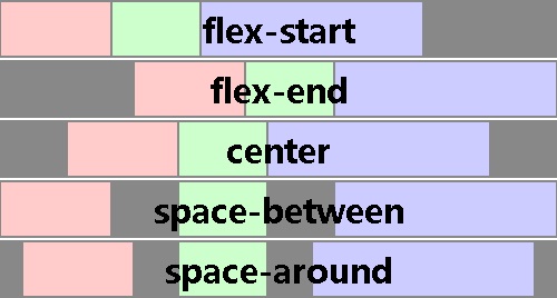
Introduction: This article mainly introduces the CSS justify-content property of the Flexible flexible box model
7. The CSS order property of the Flexible flexible box model

Introduction: This article mainly introduces the CSS order attribute of the Flexible elastic box model
##Introduction: 【CSS3】 CSS3: Flex Box
9. Flexible box layout in css3

Introduction: In CSS 3, the CSS Flexible Box module is a very important module, which is used to implement page layout processing in a very flexible way. Although other CSS style properties can be used to implement page layout processing, if you use the flexible box layout technology defined in the CSS Flexible Box module, the display mode of each local area in the page can be automatically adjusted according to the screen size or browser window size, that is, Very flexible layout handling. Although the CSS Flexible Box module has been announced for several years, the content defined in the module has undergone several major revisions since its initial release. The currently announced official version is ◦CSS
10. CSS Flexbox Flexbox Layout Detailed Explanation_html/css_WEB-ITnose
Introduction: Detailed explanation of CSS Flexbox Flexbox layout
[Related Q&A recommendations]:
The above is the detailed content of Recommended 10 flexible box source codes (collection). For more information, please follow other related articles on the PHP Chinese website!

Hot AI Tools

Undresser.AI Undress
AI-powered app for creating realistic nude photos

AI Clothes Remover
Online AI tool for removing clothes from photos.

Undress AI Tool
Undress images for free

Clothoff.io
AI clothes remover

Video Face Swap
Swap faces in any video effortlessly with our completely free AI face swap tool!

Hot Article
Hot Tools

Notepad++7.3.1
Easy-to-use and free code editor

SublimeText3 Chinese version
Chinese version, very easy to use

Zend Studio 13.0.1
Powerful PHP integrated development environment

Dreamweaver CS6
Visual web development tools

SublimeText3 Mac version
God-level code editing software (SublimeText3)
Hot Topics


 Is HTML easy to learn for beginners?
Apr 07, 2025 am 12:11 AM
Is HTML easy to learn for beginners?
Apr 07, 2025 am 12:11 AM
HTML is suitable for beginners because it is simple and easy to learn and can quickly see results. 1) The learning curve of HTML is smooth and easy to get started. 2) Just master the basic tags to start creating web pages. 3) High flexibility and can be used in combination with CSS and JavaScript. 4) Rich learning resources and modern tools support the learning process.
 The Roles of HTML, CSS, and JavaScript: Core Responsibilities
Apr 08, 2025 pm 07:05 PM
The Roles of HTML, CSS, and JavaScript: Core Responsibilities
Apr 08, 2025 pm 07:05 PM
HTML defines the web structure, CSS is responsible for style and layout, and JavaScript gives dynamic interaction. The three perform their duties in web development and jointly build a colorful website.
 What is an example of a starting tag in HTML?
Apr 06, 2025 am 12:04 AM
What is an example of a starting tag in HTML?
Apr 06, 2025 am 12:04 AM
AnexampleofastartingtaginHTMLis,whichbeginsaparagraph.StartingtagsareessentialinHTMLastheyinitiateelements,definetheirtypes,andarecrucialforstructuringwebpagesandconstructingtheDOM.
 Understanding HTML, CSS, and JavaScript: A Beginner's Guide
Apr 12, 2025 am 12:02 AM
Understanding HTML, CSS, and JavaScript: A Beginner's Guide
Apr 12, 2025 am 12:02 AM
WebdevelopmentreliesonHTML,CSS,andJavaScript:1)HTMLstructurescontent,2)CSSstylesit,and3)JavaScriptaddsinteractivity,formingthebasisofmodernwebexperiences.
 Gitee Pages static website deployment failed: How to troubleshoot and resolve single file 404 errors?
Apr 04, 2025 pm 11:54 PM
Gitee Pages static website deployment failed: How to troubleshoot and resolve single file 404 errors?
Apr 04, 2025 pm 11:54 PM
GiteePages static website deployment failed: 404 error troubleshooting and resolution when using Gitee...
 How to implement adaptive layout of Y-axis position in web annotation?
Apr 04, 2025 pm 11:30 PM
How to implement adaptive layout of Y-axis position in web annotation?
Apr 04, 2025 pm 11:30 PM
The Y-axis position adaptive algorithm for web annotation function This article will explore how to implement annotation functions similar to Word documents, especially how to deal with the interval between annotations...
 HTML, CSS, and JavaScript: Essential Tools for Web Developers
Apr 09, 2025 am 12:12 AM
HTML, CSS, and JavaScript: Essential Tools for Web Developers
Apr 09, 2025 am 12:12 AM
HTML, CSS and JavaScript are the three pillars of web development. 1. HTML defines the web page structure and uses tags such as, etc. 2. CSS controls the web page style, using selectors and attributes such as color, font-size, etc. 3. JavaScript realizes dynamic effects and interaction, through event monitoring and DOM operations.
 How to use CSS3 and JavaScript to achieve the effect of scattering and enlarging the surrounding pictures after clicking?
Apr 05, 2025 am 06:15 AM
How to use CSS3 and JavaScript to achieve the effect of scattering and enlarging the surrounding pictures after clicking?
Apr 05, 2025 am 06:15 AM
To achieve the effect of scattering and enlarging the surrounding images after clicking on the image, many web designs need to achieve an interactive effect: click on a certain image to make the surrounding...
