








用 resizeobserver 观察侧栏元素,在回调读取 entry.contentrect.width。窗口尺寸保持原样时,改变侧栏本身的宽度也会收到通知。
准备可以横向拖动的侧栏
保存为 index.html。读数放在侧栏外,避免写入结果反过来改变观察目标。
<!doctype html>
<html lang="zh-CN">
<meta charset="utf-8">
<style>
  .layout { display: flex; gap: 1rem; }
  #sidebar { flex: 0 0 auto; width: 220px; height: 120px;
    min-width: 140px; max-width: 460px; resize: horizontal;
    overflow: auto; border: 1px solid #888; }
</style>
<div class="layout">
  <aside id="sidebar">拖动侧栏右下角</aside>
  <main><output id="width">等待测量</output></main>
</div>
<script src="app.js" defer></script>
</html>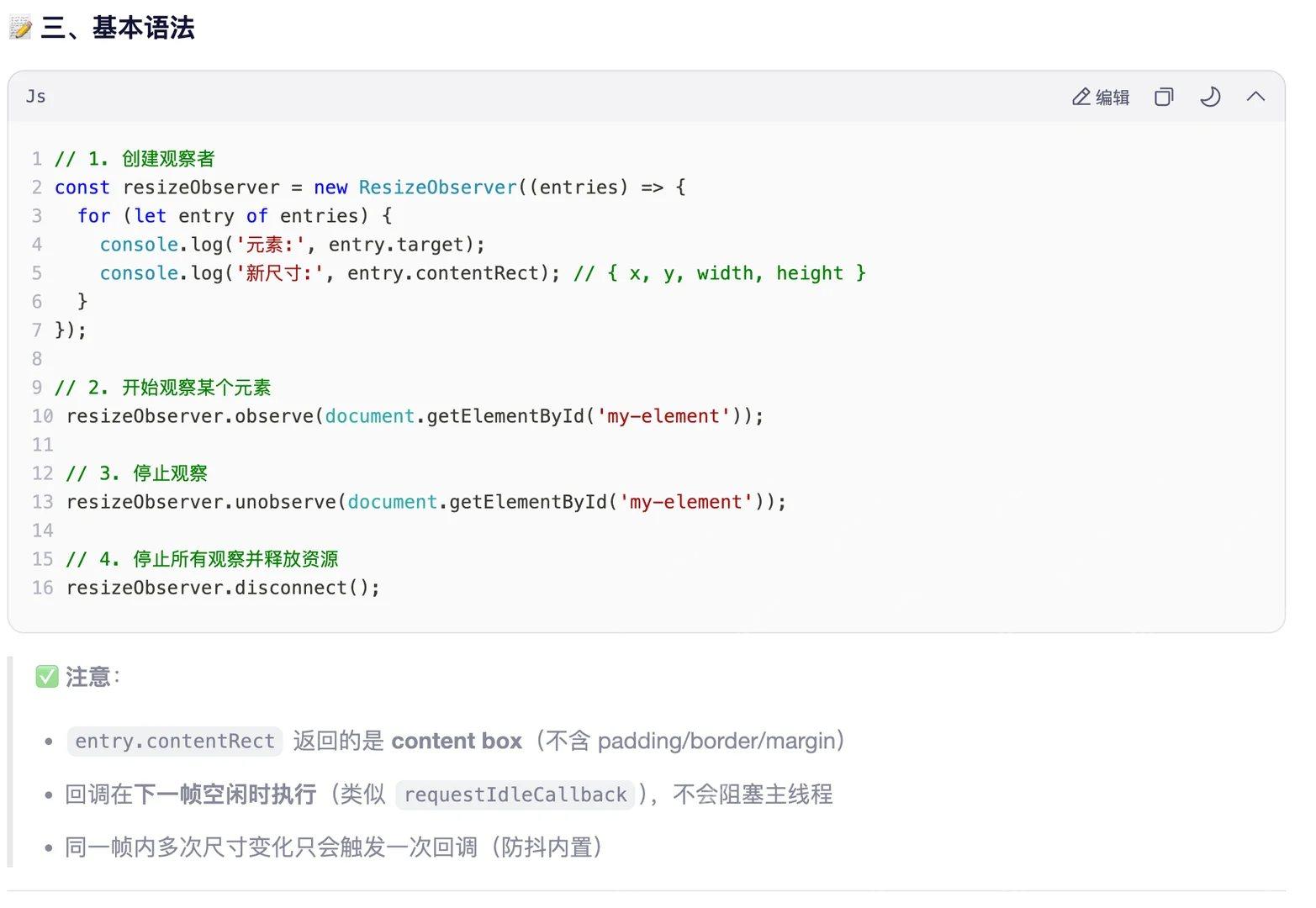
用桌面浏览器打开,可通过 resize 手柄改变侧栏宽度。
立即学习“Java免费学习笔记(深入)”;

Build Java agent transport gateways with Atmosphere
下载
使用Atmosphere构建通过WebSocket、SSE、gRPC、WebTransport、MCP、A2A和AG-UI流传输的JVM代理网关,并带有治理钩子。
监听内容区宽度并更新读数
将下面内容保存为 app.js。回调只改写外部输出区。
const sidebar = document.querySelector('#sidebar');
const output = document.querySelector('#width');
const observer = new ResizeObserver(([entry]) => {
  output.value = Math.round(entry.contentRect.width) + 'px';
});
observer.observe(sidebar);
首帧报告约 220px。改变侧栏宽度后数字随之更新。contentRect.width 是内容区宽度,边框不计入。
停止观察并用固定宽度复测
页面加载后,在浏览器控制台执行以下代码。
sidebar.style.width = '340px';
// 下一帧读数会变成 340px。
// 观察到更新后,再执行这两行:
observer.disconnect();
sidebar.style.width = '260px';
分两次执行,先确认输出为 340px,再断开监听并改成 260px。断开后保留最后一次报告的值。