







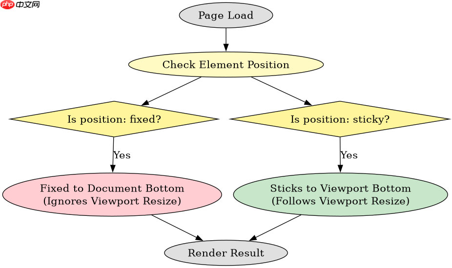
在移动端浏览器中,防止 fixed 底部按钮被软键盘顶起的最有效方法是使用 position: sticky 配合 bottom: 0。当用户点击输入框触发软键盘时,视口高度会缩小,sticky 元素会自动吸附到新的视口底部,而不会像 fixed 那样因为坐标基准不变而被挤出屏幕或遮挡内容。

为什么 fixed 定位在软键盘弹出时会失效?
这是因为移动浏览器在弹出软键盘时,通常会重新计算视口(Viewport)的高度。对于 position: fixed 元素,其定位参考的是初始包含块(通常是整个页面文档),而不是当前的可视窗口。因此,当软键盘占据屏幕下方空间时,fixed 按钮仍然停留在原始页面的底部坐标处,导致它被软键盘覆盖或视觉上“消失”在键盘下方。
<!DOCTYPE html>
<html lang="zh-CN">
<head>
    <meta charset="UTF-8">
    <meta name="viewport" content="width=device-width, initial-scale=1.0, maximum-scale=1.0, user-scalable=no">
    <title>Fixed vs Sticky Demo</title>
    <style>
        body {
            margin: 0;
            padding-bottom: 60px; /* 为按钮留出空间 */
            font-family: sans-serif;
        }
        .input-area {
            padding: 20px;
        }
        input {
            width: 100%;
            padding: 10px;
            box-sizing: border-box;
        }
        /* 传统的 Fixed 方案 */
        .fixed-btn {
            position: fixed;
            bottom: 0;
            left: 0;
            width: 100%;
            height: 50px;
            background-color: #007bff;
            color: white;
            display: flex;
            align-items: center;
            justify-content: center;
            z-index: 1000;
        }
        /* 推荐的 Sticky 方案 */
        .sticky-btn {
            position: sticky;
            bottom: 0;
            left: 0;
            width: 100%;
            height: 50px;
            background-color: #28a745;
            color: white;
            display: flex;
            align-items: center;
            justify-content: center;
            z-index: 1000;
        }
    </style>
</head>
<body>
    <div class="input-area">
        <p>向下滚动并点击输入框测试:</p><div class="aritcle_card flexRow">
                                                        <div class="artcardd flexRow">
                                                                <a class="aritcle_card_img" href="/xiazai/gongju/2905" title="CSS"><img
                                                                                src="https://img.php.cn/upload/manual/000/969/633/6af2b1226ad9e733.png" alt="CSS" ></a>
                                                                <div class="aritcle_card_info flexColumn">
                                                                        <a href="/xiazai/gongju/2905" title="CSS">CSS</a>
                                                                        <p>CSS 官方网站入口。访问 W3C 的 CSS 页面,查看 CSS 标准、学习资料与工作组动态;CSS 是 Web 标准,无需下载安装。</p>
                                                                </div>
                                                                <a href="/xiazai/gongju/2905" title="CSS" class="aritcle_card_btn flexRow flexcenter"><b></b><span>下载</span> </a>
                                                        </div>
                                                </div><p><span>立即学习</span>“<a href="https://pan.quark.cn/s/cb6835dc7db1" style="text-decoration: underline !important; color: blue; font-weight: bolder;" rel="nofollow" target="_blank">前端免费学习笔记(深入)</a>”;</p>
        <input type="text" placeholder="点击这里唤起软键盘">
        <br><br><br><br><br><br><br><br><br><br><br>
        <input type="text" placeholder="再试一次">
    </div>

    <!-- 测试 Fixed -->
    <button class="fixed-btn">Fixed Button (会被遮挡)</button>

    <!-- 测试 Sticky -->
    <button class="sticky-btn">Sticky Button (正常吸附)</button>
</body>
</html>
如何验证 Sticky 定位在不同滚动状态下的表现?
position: sticky 的行为依赖于用户的滚动位置。在页面顶部未滚动时,它表现为相对定位;当滚动到触底条件(bottom: 0)时,它才会变为固定定位。这种特性使得它在处理软键盘弹出时非常自然,因为它始终相对于当前可见的滚动容器进行定位。通过对比两种按钮在软键盘弹出后的视觉位置,可以确认 sticky 能够正确跟随视口变化。

如果必须使用 fixed,如何通过 JS 动态调整 bottom 值?
虽然 sticky 是首选方案,但在某些需要兼容极老版本浏览器或特定布局约束的场景下,开发者可能仍需要使用 fixed。此时可以通过监听 resize 事件或 visualViewport API 来动态计算软键盘的高度,并实时更新 fixed 元素的 bottom 属性。这种方法需要额外的 JavaScript 逻辑,且在不同浏览器中对软键盘高度的计算可能存在差异,因此不如 CSS 原生方案稳定。