

css3 3D Rubik's Cube animation (novice version)

.box{
    animation: cube_animation ease-in-out 6s infinite forwards;
    transform-style: preserve-3d;
    transform-origin: 90px 90px 90px;
}
.bside{
    width: 180px;
    height: 180px;
    position: absolute;
    transform: translatex(-90px) translatez(90px) rotatey(90deg);
}
.cside{
    width: 180px;
    height: 180px;
    position: absolute;
    transform: translatez(90px) translatey(90px) rotatex(90deg);
}
.eside{
    width: 180px;
    height: 180px;
    position: absolute;
    transform: translatez(90px) translatey(-90px) rotatex(90deg);
}
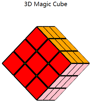
Share here the 3D Rubik’s Cube animation, which can be completed with html5+CSS3 ~ No pictures, no truth, here are the renderings first

The first step is very simple, which is to draw the structure of the Rubik's Cube. Everyone has played with the Rubik's Cube and knows that the Rubik's Cube is a cube with six sides. Here we first write a large div (class name box) as a container, which contains 6 faces of the Rubik's Cube, that is, 6 divs, and then I divide each face into 9 small divs, which are 9 small grids. The code is as follows, just take a look
        <!-- 魔方六面 -->
        <div class="box">
            <div class="aside"> <!--魔方第一个面,类名aside-->
                <div></div>  <!--第一个面里的每一个小格子-->
                <div></div>
                <div></div>
                <div></div>
                <div></div>
                <div></div>
                <div></div>
                <div></div>
                <div></div>
            </div>
            ...<!--魔方另外五个面代码和第一个面一样,此处省略-->
        </div>
The second step, with the structure of the Rubik's Cube, we start to color the Rubik's Cube. Let’s look at the code directly, it’s simple and crude~
<span style="color: #000000;">.aside{
    width: 180px;
    height: 180px;      /* 这里定义每个面长宽都是180px */
    position: absolute;    /* 设置绝对定位,方便后面控制每个面的位置*/
    transform: translatez(0px);  /*对这个面进行位置的移动*/
}
.aside div{
    width: 54px;
    height: 54px;
    border-radius: 4px;  /*设置圆角才能看到格子与格子间的小孔*/
    float: left;
    border: 3px solid #000;  <span style="color: #000000;">/* 这里定义每个格子的边框是3px 所以一个格子总的长宽是54+3+3=60px 一行3个格子60*3=180px 一列同理 */</span>
    background: green;  /*上色*/
}</span>The third step, we have been drawing a Rubik's Cube for so long, you put the file in the browser and took a look, and found that there is not even a shadow of the Rubik's Cube? Not urgent. We first need to add transform-style: preserve-3d; on the parent container. This code is very critical, so that the child elements of this element look like a 3D effect. The default is a flat effect (2D), (for details, please see https: //developer.mozilla.org/zh-CN/docs/Web/CSS/transform-style)
Okay, after adding this code, we need to start moving the 6 faces so that they look like a cube when combined. Moving 6 faces is nothing more than the following lines of code
<span style="color: #000000;">/*向X轴正方向平移80px长度、向Y轴负方向平移80PX、向Z轴正方向平移90px*/
transform: translatex(80px)  translatey(-80px) translatez(90px);
/*向X轴顺时针转动30度(℃)、向Y轴顺时针转动45度、向Z轴逆时针转动90度*/
transform:rotatex(30deg) rotatey(45deg) rotatez(-90deg);</span>
What? Are you saying the browser is incompatible? Just add the corresponding prefix yourself, which will not be discussed in detail here. Chestnut (-webkit-transform:rotatex(30deg);)
Open the browser F12 and slowly debug the angle you want. I paste my own code here for reference only~
.box{
    animation: cube_animation ease-in-out 6s infinite forwards;  /*魔方动画设置*/
    transform-style: preserve-3d;  /*3d渲染*/
    transform-origin: 90px 90px 90px;
}
/*魔方动画效果*/<br />@keyframes cube_animation{<br />    from,to{}<br />    16%{<br />        transform: rotatey(-90deg);<br />    }<br />    33%{<br />        transform: rotatey(-90deg) rotatez(135deg);<br />    }<br />    50%{<br />        transform: rotatey(225deg) rotatez(135deg);<br />    }<br />    66%{<br />        transform: rotatey(135deg) rotatex(135deg);<br />    }<br />    83%{<br />        transform: rotatex(135deg);<br />    }<br />}
/*魔方六面*/
.aside{
    width: 180px;
    height: 180px;
    position: absolute;

}

.bside{
    width: 180px;
    height: 180px;
    position: absolute;<br />  /*魔方的B面,先向左平移90px,再靠近人脸90px,最后y轴顺时针90度*/
    transform: translatex(-90px) translatez(90px) rotatey(90deg);
}

.cside{
    width: 180px;
    height: 180px;
    position: absolute;<br />
    transform: translatez(90px) translatey(90px) rotatex(90deg);
}

.dside{
    width: 180px;
    height: 180px;
    position: absolute;
    transform: translatez(180px);
}

.eside{
    width: 180px;
    height: 180px;
    position: absolute;
    transform: translatez(90px) translatey(-90px) rotatex(90deg);
}
Even if you do this, you still can’t see the full picture of the Rubik’s Cube.
Okay, let’s zoom in and add perspective:1000px;perspective-origin:25% 75%;
in the parent containerThen slowly debug the values in the browser F12 to see what changes~ Finally, there is an animation effect. I have posted the code above. I will write another blog about the specific animation principle another day~ Thank you for reading this. ending~

Hot AI Tools

Undresser.AI Undress
AI-powered app for creating realistic nude photos

AI Clothes Remover
Online AI tool for removing clothes from photos.

Undress AI Tool
Undress images for free

Clothoff.io
AI clothes remover

Video Face Swap
Swap faces in any video effortlessly with our completely free AI face swap tool!

Hot Article
Hot Tools

Notepad++7.3.1
Easy-to-use and free code editor

SublimeText3 Chinese version
Chinese version, very easy to use

Zend Studio 13.0.1
Powerful PHP integrated development environment

Dreamweaver CS6
Visual web development tools

SublimeText3 Mac version
God-level code editing software (SublimeText3)
Hot Topics


 Is HTML easy to learn for beginners?
Apr 07, 2025 am 12:11 AM
Is HTML easy to learn for beginners?
Apr 07, 2025 am 12:11 AM
HTML is suitable for beginners because it is simple and easy to learn and can quickly see results. 1) The learning curve of HTML is smooth and easy to get started. 2) Just master the basic tags to start creating web pages. 3) High flexibility and can be used in combination with CSS and JavaScript. 4) Rich learning resources and modern tools support the learning process.
 The Roles of HTML, CSS, and JavaScript: Core Responsibilities
Apr 08, 2025 pm 07:05 PM
The Roles of HTML, CSS, and JavaScript: Core Responsibilities
Apr 08, 2025 pm 07:05 PM
HTML defines the web structure, CSS is responsible for style and layout, and JavaScript gives dynamic interaction. The three perform their duties in web development and jointly build a colorful website.
 Understanding HTML, CSS, and JavaScript: A Beginner's Guide
Apr 12, 2025 am 12:02 AM
Understanding HTML, CSS, and JavaScript: A Beginner's Guide
Apr 12, 2025 am 12:02 AM
WebdevelopmentreliesonHTML,CSS,andJavaScript:1)HTMLstructurescontent,2)CSSstylesit,and3)JavaScriptaddsinteractivity,formingthebasisofmodernwebexperiences.
 What is an example of a starting tag in HTML?
Apr 06, 2025 am 12:04 AM
What is an example of a starting tag in HTML?
Apr 06, 2025 am 12:04 AM
AnexampleofastartingtaginHTMLis,whichbeginsaparagraph.StartingtagsareessentialinHTMLastheyinitiateelements,definetheirtypes,andarecrucialforstructuringwebpagesandconstructingtheDOM.
 Gitee Pages static website deployment failed: How to troubleshoot and resolve single file 404 errors?
Apr 04, 2025 pm 11:54 PM
Gitee Pages static website deployment failed: How to troubleshoot and resolve single file 404 errors?
Apr 04, 2025 pm 11:54 PM
GiteePages static website deployment failed: 404 error troubleshooting and resolution when using Gitee...
 How to implement adaptive layout of Y-axis position in web annotation?
Apr 04, 2025 pm 11:30 PM
How to implement adaptive layout of Y-axis position in web annotation?
Apr 04, 2025 pm 11:30 PM
The Y-axis position adaptive algorithm for web annotation function This article will explore how to implement annotation functions similar to Word documents, especially how to deal with the interval between annotations...
 HTML, CSS, and JavaScript: Essential Tools for Web Developers
Apr 09, 2025 am 12:12 AM
HTML, CSS, and JavaScript: Essential Tools for Web Developers
Apr 09, 2025 am 12:12 AM
HTML, CSS and JavaScript are the three pillars of web development. 1. HTML defines the web page structure and uses tags such as, etc. 2. CSS controls the web page style, using selectors and attributes such as color, font-size, etc. 3. JavaScript realizes dynamic effects and interaction, through event monitoring and DOM operations.
 How to use CSS3 and JavaScript to achieve the effect of scattering and enlarging the surrounding pictures after clicking?
Apr 05, 2025 am 06:15 AM
How to use CSS3 and JavaScript to achieve the effect of scattering and enlarging the surrounding pictures after clicking?
Apr 05, 2025 am 06:15 AM
To achieve the effect of scattering and enlarging the surrounding images after clicking on the image, many web designs need to achieve an interactive effect: click on a certain image to make the surrounding...
