

How to Use Pictures and Icons as Chart Columns in Excel

Quick Links
- Beginner: Replacing Columns With Basic Images
- Advanced: Creating Partially Filled Column Graphics
Excel offers many different chart types—including column and bar graphs—to present your data. However, you don't have to settle for the preset column and bar layouts. Instead, you can swap these for thematic pictures or icons to make your chart catch everyone's eye.
Beginner: Replacing Columns With Basic Images
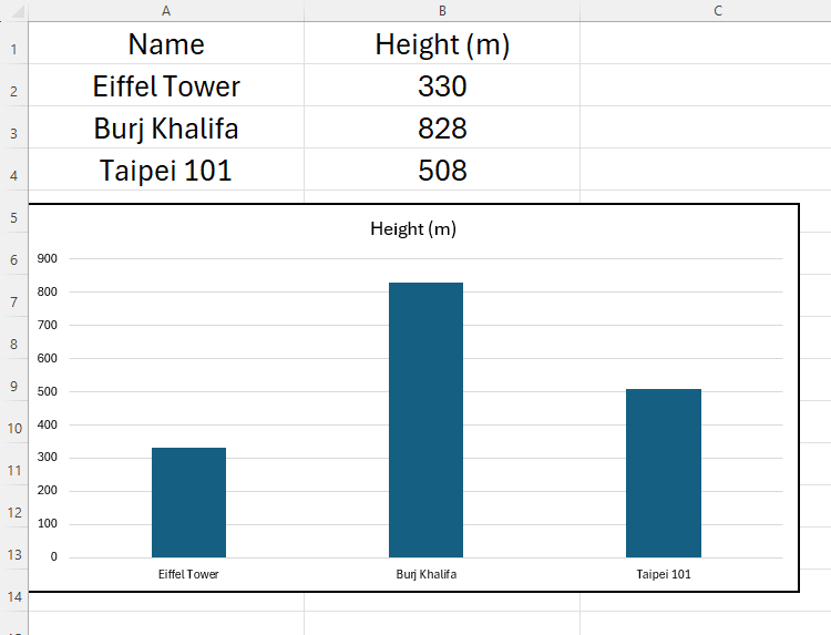
This Excel sheet lists the heights of three well-known buildings. To create a column chart, I will select the data, click "Insert," and choose the "2D Clustered Column" option.

This produces a neat chart that is easy to read.
As useful as this is, I now want to make my chart even more visual by replacing the columns with silhouettes of the three buildings. When I first discovered this trick, I was surprised by how easy it was to do. First, use a search engine to find suitable images, and copy and paste them into Excel.

Before you transfer these images to your chart, you need to remove any unneeded space from around their edges. Select the first graphic, and in the Picture Format tab, click "Crop," and use the handles as appropriate.

Repeat this process for all the images you're going to use in your chart.
Now, select the image that will replace the first column, and press Ctrl C. Moving back to your graph, click the first column twice—the first click selects all the columns, and the second click isolates that single column. Make sure you don't double-click, as this is a different command in Excel. Instead, click once, leave a second or two, and then click again.
You can tell that you've done this correctly by seeing the handles around the edge of that column only, and not the other columns.

Paste the copied image by pressing Ctrl V. You will see the cropped image replace the default column in your chart.

Follow the same process with the other columns, remembering to click each of them twice before replacing it with the image.

Play around with your new chart by changing the original data. You'll see the images grow and shrink—exactly the same way as a column would—according to the changes you make.
Now, delete the originally pasted images, and tidy up your chart to make it stand out. For example, you might want to add data labels, rename your axes, or even change your chart's background.

Who knew that you could create something so visually impressive in Microsoft Excel? Take a moment to compare this chart to the original column chart I created earlier, and appreciate how adding images and making a few changes have such a huge impact.
Advanced: Creating Partially Filled Column Graphics
You can make use of Excel's ability to replace columns with images to create more specific comparisons, like a male-female ratio chart.
This Excel data and the corresponding chart shows the number of Manchester United supporters who identify as male, and the number who identify as female (numbers fabricated for demonstration purposes). It's important that you include the 100% values within your chart's data for reasons that'll become clear soon.

This time, rather than searching for images online, I'm going to use Microsoft's gallery of icons. You can do the same by clicking Insert > Icons, and using the search bar to find the icons you need. In my case, I've typed person, and selected standard male and female icons, before clicking "Insert."

Next, select one of the icons, and click the "Graphics Fill" drop-down in the Graphics Format tab to change its color. Then, do the same with the other icon, choosing a color that's clearly distinguishable from the first. I've gone with the very stereotypical blue and pink identification in my demonstration.

Now, select one icon, hold Ctrl, and select the other icon—this will mean that both icons are selected simultaneously. Then, press Ctrl C > Ctrl V to duplicate them.
Your job now is to add an outline and remove the color fill from these duplicated icons. Select the first duplicated graphic, click "Graphics Outline" in the Graphics Format tab, and choose the same color as you selected for its fill. Then, click "Graphics Fill," and "No Fill." Repeat this process for both of these duplicated icons. Now, you should have four icons, two of which are filled, and two of which have outlines only.

You're now ready to insert these icons into your graph. Select the first filled icon that corresponds to the first column in your chart, and press Ctrl C. Then, click the first column twice (not a double-click) to select it independently, and press Ctrl V.

Repeat the process with the other three columns, where the filled icons replace the data values on the left, and the hollow icons replace the 100% columns on the right.

The next steps involve scaling and overlapping the icons. Click the first icon twice to select it independently, right-click it, and then select "Format Data Point."

In the Format Data Point sidebar, click the "Fill And Line" icon, and check "Stack And Scale With."

Repeat this process for all remaining icons, ensuring you select them individually as you go. When you're done, leave the Format Data Point sidebar open, as you're going to use it in the next step.
Although this might make your chart look unusual, don't worry—this is just a temporary issue that will rectify itself shortly.

Now, to overlap the filled and outlined icons for each gender, single-click one of the outlined icons to select them both, and in the Format Data Point sidebar, click the "Series Options" icon. There, slide the Series Overlap value to "100%," and change the Gap Width to a value that works well on your chart (your chart will change as you drag the slider).

In my case, I've gone for a 58% gap width, as this leaves my human icons reasonably proportioned.

Finally, tidy up your chart to give it the best appearance possible. In my case, I've removed the legend and gridlines, and I've added a semi-transparent soccer-themed background.

Tinker with the numbers in your original data set to see the filled areas of your icons change. Here, I've changed the female representation to 90% and the male representation to 10%.

The hollowed-out icons remain at the full height, as they correspond with the 100% values in my data. The colored icons, on the other hand, grow and shrink with my variable data.
You can use the same techniques for bar charts, too. For example, if you're comparing the average lengths of certain breeds of snakes, you could replace the bars with horizontal images.
The above is the detailed content of How to Use Pictures and Icons as Chart Columns in Excel. For more information, please follow other related articles on the PHP Chinese website!

Hot AI Tools

Undresser.AI Undress
AI-powered app for creating realistic nude photos

AI Clothes Remover
Online AI tool for removing clothes from photos.

Undress AI Tool
Undress images for free

Clothoff.io
AI clothes remover

Video Face Swap
Swap faces in any video effortlessly with our completely free AI face swap tool!

Hot Article
Hot Tools

Notepad++7.3.1
Easy-to-use and free code editor

SublimeText3 Chinese version
Chinese version, very easy to use

Zend Studio 13.0.1
Powerful PHP integrated development environment

Dreamweaver CS6
Visual web development tools

SublimeText3 Mac version
God-level code editing software (SublimeText3)
Hot Topics


 How to Create a Timeline Filter in Excel
Apr 03, 2025 am 03:51 AM
How to Create a Timeline Filter in Excel
Apr 03, 2025 am 03:51 AM
In Excel, using the timeline filter can display data by time period more efficiently, which is more convenient than using the filter button. The Timeline is a dynamic filtering option that allows you to quickly display data for a single date, month, quarter, or year. Step 1: Convert data to pivot table First, convert the original Excel data into a pivot table. Select any cell in the data table (formatted or not) and click PivotTable on the Insert tab of the ribbon. Related: How to Create Pivot Tables in Microsoft Excel Don't be intimidated by the pivot table! We will teach you basic skills that you can master in minutes. Related Articles In the dialog box, make sure the entire data range is selected (
 If You Don't Rename Tables in Excel, Today's the Day to Start
Apr 15, 2025 am 12:58 AM
If You Don't Rename Tables in Excel, Today's the Day to Start
Apr 15, 2025 am 12:58 AM
Quick link Why should tables be named in Excel How to name a table in Excel Excel table naming rules and techniques By default, tables in Excel are named Table1, Table2, Table3, and so on. However, you don't have to stick to these tags. In fact, it would be better if you don't! In this quick guide, I will explain why you should always rename tables in Excel and show you how to do this. Why should tables be named in Excel While it may take some time to develop the habit of naming tables in Excel (if you don't usually do this), the following reasons illustrate today
 You Need to Know What the Hash Sign Does in Excel Formulas
Apr 08, 2025 am 12:55 AM
You Need to Know What the Hash Sign Does in Excel Formulas
Apr 08, 2025 am 12:55 AM
Excel Overflow Range Operator (#) enables formulas to be automatically adjusted to accommodate changes in overflow range size. This feature is only available for Microsoft 365 Excel for Windows or Mac. Common functions such as UNIQUE, COUNTIF, and SORTBY can be used in conjunction with overflow range operators to generate dynamic sortable lists. The pound sign (#) in the Excel formula is also called the overflow range operator, which instructs the program to consider all results in the overflow range. Therefore, even if the overflow range increases or decreases, the formula containing # will automatically reflect this change. How to list and sort unique values in Microsoft Excel
 How to change Excel table styles and remove table formatting
Apr 19, 2025 am 11:45 AM
How to change Excel table styles and remove table formatting
Apr 19, 2025 am 11:45 AM
This tutorial shows you how to quickly apply, modify, and remove Excel table styles while preserving all table functionalities. Want to make your Excel tables look exactly how you want? Read on! After creating an Excel table, the first step is usual
 How to Format a Spilled Array in Excel
Apr 10, 2025 pm 12:01 PM
How to Format a Spilled Array in Excel
Apr 10, 2025 pm 12:01 PM
Use formula conditional formatting to handle overflow arrays in Excel Direct formatting of overflow arrays in Excel can cause problems, especially when the data shape or size changes. Formula-based conditional formatting rules allow automatic formatting to be adjusted when data parameters change. Adding a dollar sign ($) before a column reference applies a rule to all rows in the data. In Excel, you can apply direct formatting to the values or background of a cell to make the spreadsheet easier to read. However, when an Excel formula returns a set of values (called overflow arrays), applying direct formatting will cause problems if the size or shape of the data changes. Suppose you have this spreadsheet with overflow results from the PIVOTBY formula,

 Excel MATCH function with formula examples
Apr 15, 2025 am 11:21 AM
Excel MATCH function with formula examples
Apr 15, 2025 am 11:21 AM
This tutorial explains how to use MATCH function in Excel with formula examples. It also shows how to improve your lookup formulas by a making dynamic formula with VLOOKUP and MATCH. In Microsoft Excel, there are many different lookup/ref
 How to Use Excel's AGGREGATE Function to Refine Calculations
Apr 12, 2025 am 12:54 AM
How to Use Excel's AGGREGATE Function to Refine Calculations
Apr 12, 2025 am 12:54 AM
Quick Links The AGGREGATE Syntax
