

About the method of realizing hexagonal picture in css

This article mainly introduces the sample code for realizing hexagonal images with CSS. The content is quite good. I will share it with you now and give it as a reference.
This article mainly introduces the sample code for realizing hexagonal images with css and shares it with everyone. The details are as follows:
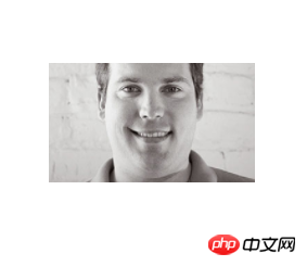
Without talking about anything else, let’s talk about the effects first:

Using a simple p with pseudo elements, you can 'draw' this hexagonal picture. The principle is that three p's of the same width and height are assembled into a hexagon through positioning and rotation, and then used Background images are layered to form a visually complete image. Let’s implement it step by step.
(1) Then the first step is, of course, to draw the container. The container is a p with width and height.
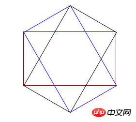
Before drawing, you must understand a problem, that is, an equilateral hexagon is made up of three p’s with the same width and height (as shown in the figure below), so the width and height of p must satisfy √ Only three times the conditions can be used to form a regular hexagon. I won’t show you how to calculate this value here. If you are interested, you can use trigonometric functions to calculate it yourself in private.
Here, I set the width of the outer container to 190px, the height to 110px, and then set the background image. The code is as follows
<!DOCTYPE html>
<html lang="en">
<head>
<meta charset="UTF-8">
<title>Document</title>
</head>
<style>
.wrap{
height:110px;
width: 190px;
position: relative;
margin: 200px auto;
background: url('./eddie.jpg') 50% 50% no-repeat;
background-size: auto 220px;
}
</style>
<body>
<p class='wrap'>
</p>
</body>
</html>The effect is a picture
(2) In the second step, draw the left p and its pseudo-element picture
In this step, use the new p to position and rotate the left side of the hexagon, and set the width and height of the new p pseudo-element and set a background image consistent with the above picture. Note that the width and height of the new p pseudo-element are the entire The width and height of the hexagon. Then rotate the pseudo element to display the picture vertically (the new p should be rotated, so the pseudo element picture is also rotated, so it needs to be reversely rotated back to the normal angle) and the position of the pseudo element must be adjusted (the new p is rotated, which affects the positioning of the pseudo element) position), and finally set the new p to exceed the hidden value, and the left side of the hexagon will be drawn
<!DOCTYPE html>
<html lang="en">
<head>
<meta charset="UTF-8">
<title>Document</title>
</head>
<style>
.wrap{
height:110px;
width: 190px;
position: relative;
margin: 200px auto;
background: url('./eddie.jpg') 50% 50% no-repeat;
background-size: auto 220px;
}
.common{
position: absolute;
height: 100%;
width: 100%;
overflow: hidden;
left:0;
23
}
.common:before{
content:'';
position: absolute;
background:url('./eddie.jpg') 50% 50% no-repeat;
background-size: auto 220px;
width: 190px;
height: 220px;
}
.left{
transform: rotate(60deg);
}
.left:before{
transform: rotate(-60deg) translate(48px,-28px);
}
</style>
<body>
<p class='wrap'>
<p class='left common'></p>
</p>
</body>
</html>The effect is as follows:

(3) Third Step 1: Draw p on the right and its pseudo-element image
The principle of this step is the same as the second part, except that the angle is reversed, so I won’t go into details and go directly to the complete code
<!DOCTYPE html>
<html lang="en">
<head>
<meta charset="UTF-8">
<title>Document</title>
</head>
<style>
.wrap{
height:110px;
width: 190px;
position: relative;
margin: 200px auto;
background: url('./eddie.jpg') 50% 50% no-repeat;
background-size: auto 220px;
}
.common{
position: absolute;
height: 100%;
width: 100%;
overflow: hidden;
left:0;
}
.common:before{
content:'';
position: absolute;
background:url('./eddie.jpg') 50% 50% no-repeat;
background-size: auto 220px;
width: 190px;
height: 220px;
}
.left{
transform: rotate(60deg);
}
.left:before{
transform: rotate(-60deg) translate(48px,-28px);
}
.right{
transform: rotate(-60deg);
}
.right:before{
transform: rotate(60deg) translate(48px,28px);
bottom: 0;
}
</style>
<body>
<p class='wrap'>
<p class='left common'></p>
<p class='right common'></p>
</p>
</body>
</html>So far , you can display the picture at the beginning of the article. Using this principle, you can also create various other shapes of picture display effects. Welcome to continue your research. In the future, picture display will no longer be a single brick line! !
The above is the entire content of this article. I hope it will be helpful to everyone's study. For more related content, please pay attention to the PHP Chinese website!
Related recommendations:
Use css3 to achieve ripple effects and H5 to achieve dynamic wave effects
How to set up CSS
Text font color
How to draw a circle loading circle animation using css3
The above is the detailed content of About the method of realizing hexagonal picture in css. For more information, please follow other related articles on the PHP Chinese website!

Hot AI Tools

Undresser.AI Undress
AI-powered app for creating realistic nude photos

AI Clothes Remover
Online AI tool for removing clothes from photos.

Undress AI Tool
Undress images for free

Clothoff.io
AI clothes remover

Video Face Swap
Swap faces in any video effortlessly with our completely free AI face swap tool!

Hot Article
Hot Tools

Notepad++7.3.1
Easy-to-use and free code editor

SublimeText3 Chinese version
Chinese version, very easy to use

Zend Studio 13.0.1
Powerful PHP integrated development environment

Dreamweaver CS6
Visual web development tools

SublimeText3 Mac version
God-level code editing software (SublimeText3)
Hot Topics


 Vue 3
Apr 02, 2025 pm 06:32 PM
Vue 3
Apr 02, 2025 pm 06:32 PM
It's out! Congrats to the Vue team for getting it done, I know it was a massive effort and a long time coming. All new docs, as well.
 Building an Ethereum app using Redwood.js and Fauna
Mar 28, 2025 am 09:18 AM
Building an Ethereum app using Redwood.js and Fauna
Mar 28, 2025 am 09:18 AM
With the recent climb of Bitcoin’s price over 20k $USD, and to it recently breaking 30k, I thought it’s worth taking a deep dive back into creating Ethereum
 Can you get valid CSS property values from the browser?
Apr 02, 2025 pm 06:17 PM
Can you get valid CSS property values from the browser?
Apr 02, 2025 pm 06:17 PM
I had someone write in with this very legit question. Lea just blogged about how you can get valid CSS properties themselves from the browser. That's like this.
 Stacked Cards with Sticky Positioning and a Dash of Sass
Apr 03, 2025 am 10:30 AM
Stacked Cards with Sticky Positioning and a Dash of Sass
Apr 03, 2025 am 10:30 AM
The other day, I spotted this particularly lovely bit from Corey Ginnivan’s website where a collection of cards stack on top of one another as you scroll.
 A bit on ci/cd
Apr 02, 2025 pm 06:21 PM
A bit on ci/cd
Apr 02, 2025 pm 06:21 PM
I'd say "website" fits better than "mobile app" but I like this framing from Max Lynch:
 Comparing Browsers for Responsive Design
Apr 02, 2025 pm 06:25 PM
Comparing Browsers for Responsive Design
Apr 02, 2025 pm 06:25 PM
There are a number of these desktop apps where the goal is showing your site at different dimensions all at the same time. So you can, for example, be writing
 Using Markdown and Localization in the WordPress Block Editor
Apr 02, 2025 am 04:27 AM
Using Markdown and Localization in the WordPress Block Editor
Apr 02, 2025 am 04:27 AM
If we need to show documentation to the user directly in the WordPress editor, what is the best way to do it?
 Why are the purple slashed areas in the Flex layout mistakenly considered 'overflow space'?
Apr 05, 2025 pm 05:51 PM
Why are the purple slashed areas in the Flex layout mistakenly considered 'overflow space'?
Apr 05, 2025 pm 05:51 PM
Questions about purple slash areas in Flex layouts When using Flex layouts, you may encounter some confusing phenomena, such as in the developer tools (d...
