

How to use css3 to draw a loading circle animation of a circle

This article mainly introduces the relevant information on how to draw a round loading circle in CSS3. The content is quite good. I will share it with you now and give it as a reference.
How to draw a round loading circle
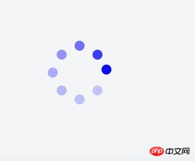
The applet needs a loading like the one below. There is no native one. It is too difficult to introduce other component libraries. So, I decided to write one myself.
1. Basic principle
The dynamic implementation principle is to animate the transparency from large to small for 8 small circles, and set different settings for each circle Animation start time. The implementation principle of layout is to set the parent element to position: relative, and set the style of each circle to position: absolute; left: xx; top: xx; right: xx; bottom: xx. Distribute them evenly on a circle by setting different values for left/right/top/bottom. The html code is as follows:
<view class="q-loading-dot-warp">
                <view class="dot dot1"></view>
                <view class="dot dot2"></view>
                <view class="dot dot3"></view>
                <view class="dot dot4"></view>
                <view class="dot dot5"></view>
                <view class="dot dot6"></view>
                <view class="dot dot7"></view>
                <view class="dot dot8"></view>
</view>It sounds simple, but I have no experience in assigning values to them. For the first time, I used the thinking of a science student to simply divide the circle into three equal parts to calculate the coordinates. Often 8 circles form a circle. Diamond/Square. . . Just like the following

2. Position setting skills
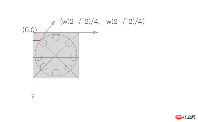
Later I saw the article posted by a classmate with css3 to achieve 10 loading effects. According to the code of JRd3, it is indeed possible to achieve a good-looking effect, but when I want to change the size of the loading circle, the style collapses. After analysis, there is a certain mathematical relationship between their coordinates, as shown in the figure below. The coordinates on the vertical or horizontal lines can be positioned by 50%, and the coordinates on the diagonal line are as shown in the figure, where w is the width and height of the rectangle or the radius of the large circle surrounded by 8 small circles.
The formula is derived as follows:
The specific css code is as follows:
$width: 64px;
$height: 64px;
$dotWidth: 10px;
$dotHeight: 10px;
$radius: 5px;
$offset: 9.37px;

@function getLeft( $x ) {
  @return ($width/4)*$x;
}

@function getTop( $y ) {
  @return ($height/4)*$y;
}

@keyframes changeOpacity {
    from { opacity: 1; }
    to { opacity: .2; }
}

.q-loading {
    position: fixed;
    top: 0;
    left: 0;
    right: 0;
    bottom: 0;
    .q-loading-overlay {
        position: fixed;
        top: 0;
        left: 0;
        right: 0;
        bottom: 0;
        background-color: rgba(255, 255, 255, .5);
    }
    .q-loading-content {
        position: absolute;
        left: 50%;
        top: 50%;
        transform: translate(-50%, -50%);
        width: $width;
        height: $height;
        z-index: 2;
    }
    .dot {
        width: 10px;
        height: 10px;
        position: absolute;
        background-color: #0033cc;
        border-radius: 50% 50%;
        opacity: 1;
        animation: changeOpacity 1.04s ease infinite;
    }
    .dot1 {
        left: 0;
        top: 50%;
        margin-top: -$radius;
        animation-delay: 0.13s;
    }
    .dot2 {
        left: $offset;
        top: $offset;
        animation-delay: 0.26s;
    }
    .dot3 {
        left: 50%;
        top: 0;
        margin-left: -$radius;
        animation-delay: 0.39s;
    }
    .dot4 {
        top: $offset;
        right: $offset;
        animation-delay: 0.52s;
    }
    .dot5 {
        right: 0;
        top: 50%;
        margin-top: -$radius;
        animation-delay: 0.65s;
    }
    .dot6 {
        right: $offset;
        bottom: $offset;
        animation-delay: 0.78s;
    }
    .dot7 {
        bottom: 0;
        left: 50%;
        margin-left: -$radius;
        animation-delay: 0.91s;
    }
    .dot8 {
        bottom: $offset;
        left: $offset;
        animation-delay: 1.04s;
    }
}The code uses scss to define the radius of the large circle and the small circle, regardless of To change the size, you only need to change the variables, and the following styles do not need to be changed.
The calculation calculated by this formula will look like a circle
3. Animation time setting
Assume that the animation duration is t, the number of circles is c, and the position of a certain small circle is i (for example, i is 1~8 above), then the time for small circles to start one after another is i * t/c
The above is the entire content of this article. I hope it will be helpful to everyone's study. For more related content, please pay attention to the PHP Chinese website!
Related recommendations:
How to use CSS3 linear gradient linear-gradient to create a border
How to hide the scroll bar in CSS
The above is the detailed content of How to use css3 to draw a loading circle animation of a circle. For more information, please follow other related articles on the PHP Chinese website!

Hot AI Tools

Undresser.AI Undress
AI-powered app for creating realistic nude photos

AI Clothes Remover
Online AI tool for removing clothes from photos.

Undress AI Tool
Undress images for free

Clothoff.io
AI clothes remover

Video Face Swap
Swap faces in any video effortlessly with our completely free AI face swap tool!

Hot Article
Hot Tools

Notepad++7.3.1
Easy-to-use and free code editor

SublimeText3 Chinese version
Chinese version, very easy to use

Zend Studio 13.0.1
Powerful PHP integrated development environment

Dreamweaver CS6
Visual web development tools

SublimeText3 Mac version
God-level code editing software (SublimeText3)
Hot Topics


 How to achieve wave effect with pure CSS3? (code example)
Jun 28, 2022 pm 01:39 PM
How to achieve wave effect with pure CSS3? (code example)
Jun 28, 2022 pm 01:39 PM
How to achieve wave effect with pure CSS3? This article will introduce to you how to use SVG and CSS animation to create wave effects. I hope it will be helpful to you!
 What to do if the win10 taskbar is stuck and cannot be operated?
Jun 30, 2023 pm 04:17 PM
What to do if the win10 taskbar is stuck and cannot be operated?
Jun 30, 2023 pm 04:17 PM
What should I do if the win10 taskbar keeps spinning in circles and cannot be operated? When some friends use the win10 system, they will encounter the situation where the taskbar keeps spinning in circles, the start menu, the win key, etc. are inoperable. This is a bug brought by the patch updated by Microsoft. Many friends do not know how to operate it. The editor below We have sorted out the solutions to the inoperability of the Windows 10 system taskbar. If you are interested, follow the editor and take a look below! The Windows 10 system taskbar cannot be operated. Solution 1: (Prerequisite is that there is a control panel on the desktop) 1. Open the control panel on the desktop and click Uninstall the program. 2. After entering, click on the left side to view installed updates. 3. Then find the corresponding KB5008212 patch, right-click to uninstall
 How to fix screen mirroring that keeps spinning in circles
Feb 23, 2024 pm 01:20 PM
How to fix screen mirroring that keeps spinning in circles
Feb 23, 2024 pm 01:20 PM
When you use Apple, you will encounter the problem of screen mirroring that keeps spinning in circles, so how to solve this problem? Users need to click on Wireless LAN, find the Wireless LAN Cellular network, and view screen mirroring. This article's introduction to the solution to screen mirroring that keeps spinning in circles will tell you how to operate it. The following is a detailed introduction, come and take a look! How to solve the problem of screen mirroring on Apple mobile phone that keeps spinning in circles: In the wireless LAN, click Cellular Network, and then view the screen mirroring. The specific method: 1. First, click Wireless LAN in the settings. 2. After switching, find the one that uses wireless LAN and cellular network. APP. 3. After that, return to the control center and view the screen mirroring and it will no longer be transferred.
 Use CSS skillfully to realize various strange-shaped buttons (with code)
Jul 19, 2022 am 11:28 AM
Use CSS skillfully to realize various strange-shaped buttons (with code)
Jul 19, 2022 am 11:28 AM
This article will show you how to use CSS to easily realize various weird-shaped buttons that appear frequently. I hope it will be helpful to you!
 How to hide elements in css without taking up space
Jun 01, 2022 pm 07:15 PM
How to hide elements in css without taking up space
Jun 01, 2022 pm 07:15 PM
Two methods: 1. Using the display attribute, just add the "display:none;" style to the element. 2. Use the position and top attributes to set the absolute positioning of the element to hide the element. Just add the "position:absolute;top:-9999px;" style to the element.
 How to implement lace borders in css3
Sep 16, 2022 pm 07:11 PM
How to implement lace borders in css3
Sep 16, 2022 pm 07:11 PM
In CSS, you can use the border-image attribute to achieve a lace border. The border-image attribute can use images to create borders, that is, add a background image to the border. You only need to specify the background image as a lace style; the syntax "border-image: url (image path) offsets the image border width inward. Whether outset is repeated;".
 How to enlarge the image by clicking the mouse in css3
Apr 25, 2022 pm 04:52 PM
How to enlarge the image by clicking the mouse in css3
Apr 25, 2022 pm 04:52 PM
Implementation method: 1. Use the ":active" selector to select the state of the mouse click on the picture; 2. Use the transform attribute and scale() function to achieve the picture magnification effect, the syntax "img:active {transform: scale(x-axis magnification, y Axis magnification);}".
 It turns out that text carousel and image carousel can also be realized using pure CSS!
Jun 10, 2022 pm 01:00 PM
It turns out that text carousel and image carousel can also be realized using pure CSS!
Jun 10, 2022 pm 01:00 PM
How to create text carousel and image carousel? The first thing everyone thinks of is whether to use js. In fact, text carousel and image carousel can also be realized using pure CSS. Let’s take a look at the implementation method. I hope it will be helpful to everyone!
