

The use of CSS3 layer shadow and text shadow

This article mainly introduces the use of CSS3 layer shadows and text shadows. It has a certain reference value. Now I share it with you. Friends in need can refer to
box-shadow layer The shadow attribute and the text-shadow text shadow attribute are similar in usage. They both use the X-axis and Y-axis coordinate systems to control the shadow expansion. Here we will explain in detail the use of CSS3 layer shadow and text shadow effects:
box-shadow layer shadow
box-shadow: Shadow type X horizontal offset (can take positive and negative values) Y vertical offset (can take positive and negative values) Shadow size shadow extended shadow color value
The shadow type can be omitted, the default is outer shadow, when its value is inset, it is inner shadow effect.
X horizontal offset and Y vertical offset can take positive and negative values. When X is negative, it is projected on the left, and when it is positive, it is projected on the right. When Y is negative, it is projected on top, when it is positive, it is projected on the bottom.
The shadow size and expansion are the same as in ps.
Browser compatibility:
Different browsers have different compatibility. The mozilla kernel browser is written as follows (but the new version of Firefox does not need to be added):
-moz-box-shadow: Shadow type
-webkit-box-shadow:Shadow type :
<p class="shadow"></p>
.shadow{
 width:200px;
 height:50px;
 box-shadow:3px 3px 3px 3px #000;
 /*-moz-box-shadow:3px 3px 3px 3px #000;    //以火狐为代表的mozilla内核浏览器,火狐现在的版本已经支持这个属性,所以不用再加-moz*/
 -webkit-box-shadow:3px 3px 3px 3px #000;
}Rendering:
Change the box-shadow projection type to inset, rendering: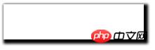
Example 2: 
<p class="shadow"></p>
.shadow{
 width:200px;
 height:50px;
 box-shadow:0 -5px 5px 0 red,5px 0 5px 0 yellow,0 5px 5px 0 green,-5px 0 5px 0 blue;
 /*-moz-box-shadow:0 -5px 5px 0 red,5px 0 5px 0 yellow,0 5px 5px 0 green,-5px 0 5px 0 blue;    //以火狐为代表的mozilla内核浏览器,火狐现在的版本已经支持这个属性,所以不用再加-moz*/
 -webkit-box-shadow:0 -5px 5px 0 red,5px 0 5px 0 yellow,0 5px 5px 0 green,-5px 0 5px 0 blue;
}Rendering:
##text-shadow text-shadow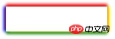
Above we discussed about css3 layer shadow box-shadow to achieve the effect of layer shadow. Today we will learn together how to achieve the effect of text shadow. We will use css3 in addition An attribute text-shadow, these two effects enhance the texture of the layer and text respectively, creating a three-dimensional effect. Syntax:
text-shadow : none | <length> none | [<shadow>, ] * <shadow> 或none | <color> [, <color> ]*
Description:
is similar to the layer shadow. It can also apply one or more sets of shadow effects to the same object, separated by commas. The X-axis offset can be positive or negative. When X is positive, it is offset to the right, and when it is negative, it is offset to the left. The Y-axis offset can be positive or negative. When X is positive, it is offset downward, and when it is negative, it is offset upward. The color value of the shadow can be #xxx, rgb, or rgba transparent color.
Example: text-shadow
<h1 style="font-family:Microsoft Yahei; font-size:28px; color:#333; text-shadow:2px 2px 5px #f60;">雨打浮萍</h1>
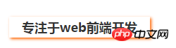
Compare box-shadow

<h2 style="font-family:Microsoft Yahei; font-size:18px; color:#333; width:200px; line-height:30px; text-align:center; box-shadow:2px 2px 5px #f60;">专注于web前端开发</h2>
The display effect is as follows:
Related recommendations: 
Analysis on the difference between using rgba and opacity to set transparency in css
##How to use css3 to achieve multiple Elements are displayed in sequence
How to use css to stretch and fill the background image to avoid repeated display
The above is the detailed content of The use of CSS3 layer shadow and text shadow. For more information, please follow other related articles on the PHP Chinese website!

Hot AI Tools

Undresser.AI Undress
AI-powered app for creating realistic nude photos

AI Clothes Remover
Online AI tool for removing clothes from photos.

Undress AI Tool
Undress images for free

Clothoff.io
AI clothes remover

Video Face Swap
Swap faces in any video effortlessly with our completely free AI face swap tool!

Hot Article
Hot Tools

Notepad++7.3.1
Easy-to-use and free code editor

SublimeText3 Chinese version
Chinese version, very easy to use

Zend Studio 13.0.1
Powerful PHP integrated development environment

Dreamweaver CS6
Visual web development tools

SublimeText3 Mac version
God-level code editing software (SublimeText3)
Hot Topics


 How to achieve wave effect with pure CSS3? (code example)
Jun 28, 2022 pm 01:39 PM
How to achieve wave effect with pure CSS3? (code example)
Jun 28, 2022 pm 01:39 PM
How to achieve wave effect with pure CSS3? This article will introduce to you how to use SVG and CSS animation to create wave effects. I hope it will be helpful to you!
 Detailed explanation of how to deal with all font shadows in Win10 computer
Jul 23, 2023 pm 11:13 PM
Detailed explanation of how to deal with all font shadows in Win10 computer
Jul 23, 2023 pm 11:13 PM
In the process of using the computer, some problems may occur due to improper operation and other situations. Recently, some netizens said that what to do with all the font shadows on their win10 computers, which affects viewing, and the icons on the desktop have shadows. The editor below will teach you how to clear all font shadows on your computer desktop. The specific steps are as follows: 1. First turn on the computer, enter the win+r key combination, open the run window, and enter gpedit.msc to confirm. 2. Find Enable ActiveDesktop, double-click it to open it, and disable it. 3. Next we need to open the disable ActiveDesktop button below, and then enable it. 4. Then open the system of the control panel, open its advanced system settings properties, and then enter the Properties
 Use CSS skillfully to realize various strange-shaped buttons (with code)
Jul 19, 2022 am 11:28 AM
Use CSS skillfully to realize various strange-shaped buttons (with code)
Jul 19, 2022 am 11:28 AM
This article will show you how to use CSS to easily realize various weird-shaped buttons that appear frequently. I hope it will be helpful to you!
 How to hide elements in css without taking up space
Jun 01, 2022 pm 07:15 PM
How to hide elements in css without taking up space
Jun 01, 2022 pm 07:15 PM
Two methods: 1. Using the display attribute, just add the "display:none;" style to the element. 2. Use the position and top attributes to set the absolute positioning of the element to hide the element. Just add the "position:absolute;top:-9999px;" style to the element.
 How to implement lace borders in css3
Sep 16, 2022 pm 07:11 PM
How to implement lace borders in css3
Sep 16, 2022 pm 07:11 PM
In CSS, you can use the border-image attribute to achieve a lace border. The border-image attribute can use images to create borders, that is, add a background image to the border. You only need to specify the background image as a lace style; the syntax "border-image: url (image path) offsets the image border width inward. Whether outset is repeated;".
 How to achieve the effect of adding shadow to element blocks in css
Sep 16, 2022 pm 05:08 PM
How to achieve the effect of adding shadow to element blocks in css
Sep 16, 2022 pm 05:08 PM
In CSS, you can use the box-shadow attribute to add shadow to an element block. The box-shadow attribute can realize the border shadow effect and apply the shadow to the box element. The syntax is "box-shadow: Horizontal shadow Vertical shadow Blur radius Expansion radius Shadow color Projection mode"; if the projection mode is set to "inset", inner shadow can be achieved.
 It turns out that text carousel and image carousel can also be realized using pure CSS!
Jun 10, 2022 pm 01:00 PM
It turns out that text carousel and image carousel can also be realized using pure CSS!
Jun 10, 2022 pm 01:00 PM
How to create text carousel and image carousel? The first thing everyone thinks of is whether to use js. In fact, text carousel and image carousel can also be realized using pure CSS. Let’s take a look at the implementation method. I hope it will be helpful to everyone!
 How to enlarge the image by clicking the mouse in css3
Apr 25, 2022 pm 04:52 PM
How to enlarge the image by clicking the mouse in css3
Apr 25, 2022 pm 04:52 PM
Implementation method: 1. Use the ":active" selector to select the state of the mouse click on the picture; 2. Use the transform attribute and scale() function to achieve the picture magnification effect, the syntax "img:active {transform: scale(x-axis magnification, y Axis magnification);}".
