

css3 chat bubble style
This time I will bring you the css3 chat bubble style. What are the precautions for making the css3 chat bubble style? The following is a practical case, let’s take a look.
In the chat scenario, the chat content needs to be modified with bubbles, as shown below. Let’s explain them one by one below.
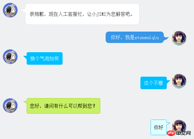
Picture style:
The first style is JD customer service. The rounded corners and hooks of the bubbles are all made of pictures. A table is used to form a rounded frame. The lm style spells out the hook.
 <p class="jimi_lists clearfix">
                <p class="header_img jimi3 fl"></p>
                <table class="msg" cellspacing="0" cellpadding="0">
                    <tbody><tr><td class="lt"></td><td class="tt"></td><td class="rt"></td></tr>
                    <tr><td class="lm"><span></span></td><td class="mm"><span class="wel"><span class="visitor"><p>很抱歉,现在人工客服忙,让小JIMI为您解答吧。</p></span></span></td><td class="rm"></td></tr>
                    <tr><td class="lb"></td><td class="bm"></td><td class="rb"></td></tr><tr><td></td></tr>
                    </tbody>
                </table>
            </p>
            <p class="customer_lists clearfix">
                <p class="header_img jimi3" style="background: url(img/mine.jpg) no-repeat center;">
                    <p class="header_img_hover"></p>
                </p>
                <table class="msg" cellspacing="0" cellpadding="0"><tbody><tr><td class="lt"></td><td class="tt"></td><td class="rt"></td></tr><tr><td class="lm"></td><td class="mm">你好,我是stoneniqiu</td><td class="rm"><span></span></td></tr><tr><td class="lb"></td><td class="bm"></td><td class="rb"></td></tr><tr><td></td><td class="time"></td><td></td></tr></tbody></table>
            </p>
Style:
 .jimi_lists {
    margin: 0 -10px 20px 10px;
    position: relative;
}
 .jimi_lists .header_img.jimi3 {
    background: url(../img/jimi_50_3.png) no-repeat 0 0;
}
 .jimi_lists .header_img {
    width: 50px;
    height: 50px;
    position: absolute;
    top: 0;
    left: 0;
}.fl {
    float: left;
}
 .jimi_lists .msg {
    margin-left: 59px;
    margin-right: 40px;
    margin-top: 2px;
    float: left;
    display: inline;
}
 .jimi_lists .lt {
    background: url(../img/msg_bg_lr.png) no-repeat 0 0;
    width: 26px;
    height: 10px;
}
 .jimi_lists .tt {
    background: url(../img/msg_bg_tb.png) repeat-x 0 -23px;
    height: 10px;
}.jimi_lists .rt {
    background: url(../img/msg_bg_lr.png) no-repeat -35px 0;
    width: 10px;
    height: 10px;
}.jimi_lists .lm {
    background: url(../img/msg_bg_lr.png) repeat-y -94px 0;
    width: 26px;
    vertical-align: top;
    position: relative;
}.jimi_lists .mm {
    padding: 0 5px;
    background-color: #FFF;
    word-break: break-all;
    word-wrap: break-word;
    color: #333;
    line-height: 20px;
}.jimi_lists .lm span {
    background: url(../img/msg_bg_lr.png) no-repeat 0 -14px;
    display: inline-block;
    width: 26px;
    height: 16px;
    position: absolute;
    top: 5px;
}.jimi_lists .rm {
    background: url(../img/msg_bg_lr.png) repeat-y -113px 0;
    width: 10px;
}.jimi_lists .lb {
    background: url(../img/msg_bg_lr.png) no-repeat 0 -43px;
    width: 10px;
    height: 10px;
}.jimi_lists .bm {
    background: url(../img/msg_bg_tb.png) repeat-x 0 -25px;
    height: 10px;
}.jimi_lists .rb {
    background: url(../img/msg_bg_lr.png) no-repeat -35px -43px;
    width: 10px;
    height: 10px;
}.customer_lists {
    position: relative;
    margin: 0 12px 20px 20px;
}.customer_lists .msg {
    float: right;
    margin-right: 73px;
    _margin-right: 38px;
    margin-top: 2px;
}.customer_lists .lt {
    background: url(../img/msg_bg_lr.png) no-repeat -47px -0;
    width: 10px;
    height: 10px;
}.customer_lists .tt {
    background: url(../img/msg_bg_tb.png) repeat-x 0 0;
    height: 10px;
}.customer_lists .rt {
    background: url(../img/msg_bg_lr.png) no-repeat -63px 0;
    width: 26px;
    height: 10px;
}.customer_lists .lm {
    background: url(../img/msg_bg_lr.png) repeat-y -126px 0;
    width: 10px;
}.customer_lists .mm {
    padding: 1px 8px;
    background-color: #3897E7;
    word-break: break-all;
    word-wrap: break-word;
    color: #FFF;
}.customer_lists .rm {
    background: url(../img/msg_bg_lr.png) repeat-y -129px 0;
    width: 26px;
    vertical-align: top;
    position: relative;
}.customer_lists .lb {
    background: url(../img/msg_bg_lr.png) no-repeat -47px -36px;
    width: 10px;
    height: 10px;
}.customer_lists .bm {
    background: url(../img/msg_bg_tb.png) repeat-x -106px -4px;
    height: 10px;
}.customer_lists .rb {
    background: url(../img/msg_bg_lr.png) no-repeat -63px -36px;
    width: 26px;
    height: 10px;
}.customer_lists .rm span {
    background: url(../img/msg_bg_lr.png) no-repeat -63px -14px;
    display: inline-block;
    width: 26px;
    height: 16px;
    position: absolute;
    top: 5px;
}.customer_lists .header_img_hover {
    position: absolute;
    background: url(../img/avatar_mask_01.png);
    top: 0;
    width: 50px;
    height: 50px;
}.customer_lists .header_img {
    position: absolute;
    top: 0;
    right: 14px;
    width: 50px;
    height: 50px;
}
 .clearfix:after {
    content: " .";
    display: block;
    clear: both;
    visibility: hidden;
    height: 0;
}View Code
Background style:
The second type mainly uses: before pseudo-class to draw the triangle, and then Put together with positioning.
  <p class="jimi_lists clearfix">
                <p class="header_img jimi3 fl"></p>
                <p class="bkbubble right">
                     <p>换个气泡如何</p>
                </p>
            </p>
            <p class="customer_lists clearfix">
                <p class="header_img jimi3" style="background: url(img/mine.jpg) no-repeat center;">
                    <p class="header_img_hover"></p>
                </p>
                <p class="bkbubble left">
                    <p>这个不错</p>
                </p>
            </p>
Style:
  .bkbubble.right p:before, .bkbubble.left p:before {
      width: 0;
    position: absolute;
    top: 12px;
    border-style: solid;
    content: "";
  }
  .bkbubble.left {
      text-align: right;
  }
 .bkbubble.right p:before {
     left: -12px;
    border-color: transparent #00bfff;
    border-width: 0 12px 12px 0; }
 .bkbubble.left p:before {
     right: -12px;
    border-color: transparent #00bfff;
border-width: 0 0 12px 12px ; }More triangles: http://www.cnblogs.com/lhb25/p/css-and-css3-triangle.html
Border Format:
What if the border color and background color are required to be different? The above method will not work, because using :before to draw a triangle uses the principle of border. In other words, in the above method, the small triangle on the edge of the bubble cannot show two colors, because it only has one border. color. Then we have to find a way to make a triangle with a border.
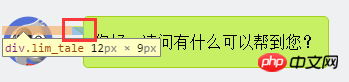
  <p class="jimi_lists lim_operator clearfix">
                <p class="header_img jimi3 fl"></p>
                <p class="lim_bubble lim_shadow"><p class="lim_dot">您好,请问有什么可以帮到您?</p></p>
                <p class="lim_tale"><p class="radiusborder"></p></p>
            </p>
1. First draw a small rectangle.
.lim_operator .lim_tale {
    left: -1px;
    background-color: #c8f064;
    border-color: #a5d01b;
    margin-left: 70px;
}.lim_tale {
    position: absolute;
    width: 12px;
    height: 8px;
    overflow: hidden !important;
    top: 10px;
    z-index: 2;
    border-top-style: solid;
    border-top-width: 1px;
}
#2. Draw a diagonal line.
There are no slashes in css. Here, a round arc is used to spell it out. On a large circle, if you cut off an arc, it becomes a diagonal line.
.lim_operator .radiusborder {
    position: absolute;
    background-color: #EFF0F2;
    top: -29px;
    left: -94px;
    height: 160px;
    width: 160px;
    border-top-style: solid;
    border-top-width: 1px;
    border-right-style: solid;
    border-right-width: 1px;
    border-top-right-radius: 154px;
    border-color: #a5d01b;
}Overlay type:
The principle is equivalent to using before to draw a colored background, then using after to draw a white background, and then overlaying and staggering the top 1-2px, so it appears A triangle with a border and a background. This is how web WeChat does
.expression:before {
    content: '';
    position: absolute;
    left: 16px;
    top: 100%;
    margin-left: -7px;
    border: 7px solid transparent;
    border-top-color: #CFCFCF}.expression:after {
    content: '';
    position: absolute;
    left: 16px;
    top: 100%;
    margin-left: -7px;
    margin-top: -1px;
    border: 7px solid transparent;
border-top-color: #FFF}I believe you have mastered the method after reading the case in this article. For more exciting information, please pay attention to other related articles on the php Chinese website!
Recommended reading:
JavaScript's var and this, {} and function
How to use the gradient of ss3
The above is the detailed content of css3 chat bubble style. For more information, please follow other related articles on the PHP Chinese website!

Hot AI Tools

Undresser.AI Undress
AI-powered app for creating realistic nude photos

AI Clothes Remover
Online AI tool for removing clothes from photos.

Undress AI Tool
Undress images for free

Clothoff.io
AI clothes remover

Video Face Swap
Swap faces in any video effortlessly with our completely free AI face swap tool!

Hot Article
Hot Tools

Notepad++7.3.1
Easy-to-use and free code editor

SublimeText3 Chinese version
Chinese version, very easy to use

Zend Studio 13.0.1
Powerful PHP integrated development environment

Dreamweaver CS6
Visual web development tools

SublimeText3 Mac version
God-level code editing software (SublimeText3)
Hot Topics


 How to use bootstrap in vue
Apr 07, 2025 pm 11:33 PM
How to use bootstrap in vue
Apr 07, 2025 pm 11:33 PM
Using Bootstrap in Vue.js is divided into five steps: Install Bootstrap. Import Bootstrap in main.js. Use the Bootstrap component directly in the template. Optional: Custom style. Optional: Use plug-ins.
 The Roles of HTML, CSS, and JavaScript: Core Responsibilities
Apr 08, 2025 pm 07:05 PM
The Roles of HTML, CSS, and JavaScript: Core Responsibilities
Apr 08, 2025 pm 07:05 PM
HTML defines the web structure, CSS is responsible for style and layout, and JavaScript gives dynamic interaction. The three perform their duties in web development and jointly build a colorful website.
 Understanding HTML, CSS, and JavaScript: A Beginner's Guide
Apr 12, 2025 am 12:02 AM
Understanding HTML, CSS, and JavaScript: A Beginner's Guide
Apr 12, 2025 am 12:02 AM
WebdevelopmentreliesonHTML,CSS,andJavaScript:1)HTMLstructurescontent,2)CSSstylesit,and3)JavaScriptaddsinteractivity,formingthebasisofmodernwebexperiences.
 How to set up the framework for bootstrap
Apr 07, 2025 pm 03:27 PM
How to set up the framework for bootstrap
Apr 07, 2025 pm 03:27 PM
To set up the Bootstrap framework, you need to follow these steps: 1. Reference the Bootstrap file via CDN; 2. Download and host the file on your own server; 3. Include the Bootstrap file in HTML; 4. Compile Sass/Less as needed; 5. Import a custom file (optional). Once setup is complete, you can use Bootstrap's grid systems, components, and styles to create responsive websites and applications.
 How to write split lines on bootstrap
Apr 07, 2025 pm 03:12 PM
How to write split lines on bootstrap
Apr 07, 2025 pm 03:12 PM
There are two ways to create a Bootstrap split line: using the tag, which creates a horizontal split line. Use the CSS border property to create custom style split lines.
 How to insert pictures on bootstrap
Apr 07, 2025 pm 03:30 PM
How to insert pictures on bootstrap
Apr 07, 2025 pm 03:30 PM
There are several ways to insert images in Bootstrap: insert images directly, using the HTML img tag. With the Bootstrap image component, you can provide responsive images and more styles. Set the image size, use the img-fluid class to make the image adaptable. Set the border, using the img-bordered class. Set the rounded corners and use the img-rounded class. Set the shadow, use the shadow class. Resize and position the image, using CSS style. Using the background image, use the background-image CSS property.
 How to use bootstrap button
Apr 07, 2025 pm 03:09 PM
How to use bootstrap button
Apr 07, 2025 pm 03:09 PM
How to use the Bootstrap button? Introduce Bootstrap CSS to create button elements and add Bootstrap button class to add button text
 How to resize bootstrap
Apr 07, 2025 pm 03:18 PM
How to resize bootstrap
Apr 07, 2025 pm 03:18 PM
To adjust the size of elements in Bootstrap, you can use the dimension class, which includes: adjusting width: .col-, .w-, .mw-adjust height: .h-, .min-h-, .max-h-
