

How to use the gradient of ss3
This time I will show you how to use the gradient of ss3, what are the precautions when using the gradient of ss3, the following is a practical case, let's take a look.
"CSS Revealed" is a very good book, full of useful information and surprises. The following are mainly notes on some effects created using gradients. Please use the latest modern browser to view.
First of all, we need to review the next css statement:
linear-gradient([ [ <angle> | to <side-or-corner> ] ,]? <color-stop>[, <color-stop>]+)
This is a linear gradient. The first parameter is the gradient direction, which is optional. It can be an angle, and the value of angle is a degree, such as 45deg, 90deg. You can also use to side-or-corner. For example, to left (from right to left), to bottom (from top to bottom); the second and third parameters are gradient colors. So the simplest way to write it can be:
background: linear-gradient(aquamarine,orange)
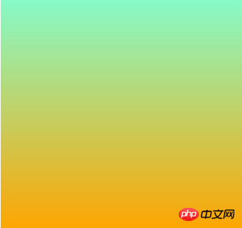
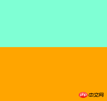
The default is a gradient from top to bottom. But if we don't want gradients, we want color bars. The trick is not to leave a gap between the two colors, because if you leave a gap, a gradient transition effect will appear. So we can set 50% each. This 50% represents the color position. Can also be a unit of length.
background: linear-gradient(aquamarine 50%,orange 50%)
What if we need multiple colors, such as blue, white and red.
background: linear-gradient(90deg,aqua 0 ,aqua 33%,white 0 ,white 67%,crimson 0 ,crimson )
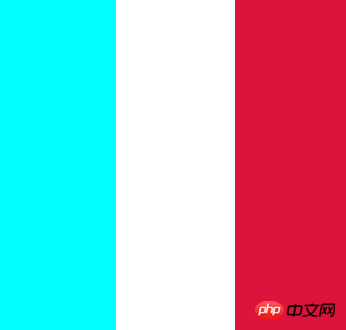
Notice that the three zeros and the last crimon color have no color scale. The first aqua 0, aqua 33% means aqua accounts for 33%, while the second white is white 0, white 67%. It seems to account for 67%, but it actually starts from 33%.
If the position of a certain color mark is smaller than its previous position, the position of the color mark will be set to the maximum value of all previous color mark positions.
So the second 0 represents 33%, and the third 0 represents 67%. You can change 0 to a value smaller than these two values, and the effect will be the same. The last color will be filled in automatically without a color scale. So if we just want to draw a line, the gradient color can use a transparent color:
linear-gradient(white 2px, transparent 0)
But if we want to achieve a repeating effect, we also need the cooperation of background-size. The default background-size is 100% 100%. But if the size is defined, it is equivalent to dividing the entire area into repeated small pieces.
Grid 1:
<br>
 .grid {
            width: 225px;
            height: 225px;
            background: #58a;
            background-image: linear-gradient(white 2px, transparent 0),linear-gradient(90deg,white 2px,transparent 0);
            background-size: 75px 75px, 75px, 75px;
}The first gradient is to divide 225px into thirds horizontally. Then the second gradient is divided into thirds vertically. This is the effect seen by the naked eye, but it is actually the result of nine 75px*75px squares.
Grid 2:
<br>
background-image: linear-gradient(white 2px, transparent 0),linear-gradient(90deg,white 2px,transparent 0),linear-gradient(hsla(0,0%,100%,.3) 1px,transparent 0),linear-gradient(90deg, hsla(0,0%,100%,.3) 1px,transparent 0);
background-size: 75px 75px, 75px 75px,15px 15px,15px 15px;
Then the implementation of this grid is simple. Then superimpose the gradient, and divide each 75 into 5 15s. The effect looks like ceramic tiles.
Chessboard
<br>
But how to draw a chessboard? Note that the lines are not continuous. As shown in the picture above, based on the background-size idea above, we know that such a chessboard is composed of multiple such squares.

And these two squares are composed of four triangles. One characteristic of linear gradient is that there will be only one color on one line in the background-size area.
background-image: linear-gradient(45deg, #bbb 25%, transparent 0),linear-gradient(45deg, transparent 75%,#bbb 0),linear-gradient(45deg, #ffbb33 25%, transparent 0),linear-gradient(45deg, transparent 75%,#ffbb33 0);
background-size: 30px 30px;
background-position: 0 0, 15px 15px,15px 15px, 30px 30px;
Notice that a set of background-position is also used. The first #bbb color occupies 25% of the 45-degree direction, and the second #bbb color occupies the last 25% of the 45-degree direction. . If you change the second triangle to red, then the position starting from 0,0 will be clear at a glance.
 background-image: linear-gradient(45deg, #bbb 25%, transparent 0),linear-gradient(45deg, transparent 75%,red 0);
 background-size: 30px 30px;
 background-position: 0 0, 0px 0px,15px 15px, 30px 30px;

Change the position of the red triangle to 15px, and 15px will form a square. In the same way, superimpose a square to get the chessboard format. In the same way, we can put together a resting grid.

Let the triangle rotate 90 degrees each time without moving its position.
background-image: linear-gradient(45deg, red 0, red 25%,transparent 0), linear-gradient(135deg, orange 0, orange 25%,transparent 0),linear-gradient(225deg, yellow 0, yellow 25%,transparent 0),linear-gradient(315deg, green 0, green 25%,transparent 0)
Oblique grid
With the above accumulation, it is simple to draw an oblique grid:
 background-image: linear-gradient(45deg,transparent 49% ,black 0,black 51% ,transparent 0), linear-gradient(135deg,transparent 49% ,black 0,black 51% ,transparent 0);
 background-size: 30px 30px;

相当于是每个单元就渐变了两条斜线。
斜格子
一直去拼这种单元可能让你有点烦,于是出来了repeating-linear-gradient。
background: repeating-linear-gradient( 45deg, transparent, transparent 1em, moccasin 0, moccasin 2em, transparent 0, transparent 3em, powderblue 0, powderblue 4em, transparent 0, transparent 5em, lavender 0, lavender 6em, transparent 0, transparent 7em, beige 0, beige 8em), repeating-linear-gradient( -45deg, transparent, transparent 1em, khaki 0, khaki 2em, transparent 0, transparent 3em, beige 0, beige 4em, transparent 0, transparent 5em, peachpuff 0, peachpuff 6em );
注意到颜色都是成对出现。这样才会出现我们的色条。注意这里使用了background-blend-mode: multiply; 混合模式。不然效果没有这么好看。
圆点:
思路和上面一样,使用径向渐变叠加和错位
 background-image:radial-gradient(#fff 5px,transparent 0),radial-gradient(#fff 10px, transparent 0);
 background-size: 40px;
 background-position: 0 0, 20px 20px;
沙发
沙发这个效果比较复杂,使用了径向渐变制作圆点和阴影,线性渐变勾勒出线条。
 background:
radial-gradient(hsl(0, 100%, 27%) 4%, hsl(0, 100%, 18%) 9%, hsla(0, 100%, 20%, 0) 9%) 0 0,
                radial-gradient(hsl(0, 100%, 27%) 4%, hsl(0, 100%, 18%) 8%, hsla(0, 100%, 20%, 0) 10%) 50px 50px,
                radial-gradient(hsla(0, 100%, 30%, 0.8) 20%, hsla(0, 100%, 20%, 0)) 50px 0,
                radial-gradient(hsla(0, 100%, 30%, 0.8) 20%, hsla(0, 100%, 20%, 0)) 0 50px,
                radial-gradient(hsla(0, 100%, 20%, 1) 35%, hsla(0, 100%, 20%, 0) 60%) 50px 0,
                radial-gradient(hsla(0, 100%, 20%, 1) 35%, hsla(0, 100%, 20%, 0) 60%) 100px 50px,
                radial-gradient(hsla(0, 100%, 15%, 0.7), hsla(0, 100%, 20%, 0)) 0 0,
                radial-gradient(hsla(0, 100%, 15%, 0.7), hsla(0, 100%, 20%, 0)) 50px 50px,
          linear-gradient(45deg, hsla(0, 100%, 20%, 0) 49%, hsla(0, 100%, 0%, 1) 50%, hsla(0, 100%, 20%, 0) 70%) 0 0,
                linear-gradient(-45deg, hsla(0, 100%, 20%, 0) 49%, hsla(0, 100%, 0%, 1) 50%, hsla(0, 100%, 20%, 0) 70%) 0 0
                ;
background-color: #300;
background-size: 100px 100px;
radial-gradient语法:
radial-gradient(
  [ [ circle || <length> ]                         [ at <position> ]? , |
    [ ellipse || [ <length> | <percentage> ]{2} ]  [ at <position> ]? , |
    [ [ circle | ellipse ] || <extent-keyword> ]   [ at <position> ]? , |
    at <position> ,
  ]?
  <color-stop> [ , <color-stop> ]+
)看上去有点复杂,[]表示一个参数,[]?表示这个参数可选,| 表示这两个参数二选一,||表示这两个参数可以同时存在,','号表示这个参数结束。包含形状,中心点位置,扩展关键字和颜色。形状分圆形(circle)和椭圆(ellipse),位置可以是长度/百分比/简写的left、center等。颜色和线性渐变一样,比如渐变一个太阳:
background:radial-gradient(at 45px 45px,rgb(248, 242, 209),gold,#FFF);
<br>
不过这里的at不仅影响着渐变的中心点而且还影响着渐变的形状。 如果加上background-size我们可以得到一块饼干:想吃么 (*^^*) ……
而扩展关键字主要有下面几种情况
closest-side:指定径向渐变的半径长度为从圆心到离圆心最近的边
background:radial-gradient(circle closest-side ,aqua,gold);

closest-corner:指定径向渐变的半径长度为从圆心到离圆心最近的角
background:radial-gradient(circle closest-corner ,aqua,gold);
farthest-side:指定径向渐变的半径长度为从圆心到离圆心最远的边
background:radial-gradient(circle farthest-side at 30% 30% ,aqua,gold);
farthest-corner:指定径向渐变的半径长度为从圆心到离圆心最远的角
background:radial-gradient(circle farthest-corner at 30% 30% ,aqua,gold);
如果我们想画出色圈呢,这就要用到线性渐变中的技巧。
background:radial-gradient(white 0,white 10%,red 0, red 20%,white 0,white 30%,red 0,red 40%,white 0,white 50%,red 0,red 60%,white 0,white 100%);
小结:这些效果还是蛮有意思的,这一篇主要是学习了 linear-gradient,repeating-linear-gradient以及background-size、background-position来实现网格效果,最后还用到了radial-gradient,径向渐变的花样更多,所有的效果基本都是基于渐变叠加和重复,更多的效果可以参考下面的链接。
相信看了本文案例你已经掌握了方法,更多精彩请关注php中文网其它相关文章!
推荐阅读:
jQuery、Angular、node中的Promise详解<br>
The above is the detailed content of How to use the gradient of ss3. For more information, please follow other related articles on the PHP Chinese website!

Hot AI Tools

Undresser.AI Undress
AI-powered app for creating realistic nude photos

AI Clothes Remover
Online AI tool for removing clothes from photos.

Undress AI Tool
Undress images for free

Clothoff.io
AI clothes remover

Video Face Swap
Swap faces in any video effortlessly with our completely free AI face swap tool!

Hot Article
Hot Tools

Notepad++7.3.1
Easy-to-use and free code editor

SublimeText3 Chinese version
Chinese version, very easy to use

Zend Studio 13.0.1
Powerful PHP integrated development environment

Dreamweaver CS6
Visual web development tools

SublimeText3 Mac version
God-level code editing software (SublimeText3)
Hot Topics


 How to use magnet links
Feb 18, 2024 am 10:02 AM
How to use magnet links
Feb 18, 2024 am 10:02 AM
Magnet link is a link method for downloading resources, which is more convenient and efficient than traditional download methods. Magnet links allow you to download resources in a peer-to-peer manner without relying on an intermediary server. This article will introduce how to use magnet links and what to pay attention to. 1. What is a magnet link? A magnet link is a download method based on the P2P (Peer-to-Peer) protocol. Through magnet links, users can directly connect to the publisher of the resource to complete resource sharing and downloading. Compared with traditional downloading methods, magnetic
 How to use mdf and mds files
Feb 19, 2024 pm 05:36 PM
How to use mdf and mds files
Feb 19, 2024 pm 05:36 PM
How to use mdf files and mds files With the continuous advancement of computer technology, we can store and share data in a variety of ways. In the field of digital media, we often encounter some special file formats. In this article, we will discuss a common file format - mdf and mds files, and introduce how to use them. First, we need to understand the meaning of mdf files and mds files. mdf is the extension of the CD/DVD image file, and the mds file is the metadata file of the mdf file.
 What software is crystaldiskmark? -How to use crystaldiskmark?
Mar 18, 2024 pm 02:58 PM
What software is crystaldiskmark? -How to use crystaldiskmark?
Mar 18, 2024 pm 02:58 PM
CrystalDiskMark is a small HDD benchmark tool for hard drives that quickly measures sequential and random read/write speeds. Next, let the editor introduce CrystalDiskMark to you and how to use crystaldiskmark~ 1. Introduction to CrystalDiskMark CrystalDiskMark is a widely used disk performance testing tool used to evaluate the read and write speed and performance of mechanical hard drives and solid-state drives (SSD). Random I/O performance. It is a free Windows application and provides a user-friendly interface and various test modes to evaluate different aspects of hard drive performance and is widely used in hardware reviews
 How to download foobar2000? -How to use foobar2000
Mar 18, 2024 am 10:58 AM
How to download foobar2000? -How to use foobar2000
Mar 18, 2024 am 10:58 AM
foobar2000 is a software that can listen to music resources at any time. It brings you all kinds of music with lossless sound quality. The enhanced version of the music player allows you to get a more comprehensive and comfortable music experience. Its design concept is to play the advanced audio on the computer The device is transplanted to mobile phones to provide a more convenient and efficient music playback experience. The interface design is simple, clear and easy to use. It adopts a minimalist design style without too many decorations and cumbersome operations to get started quickly. It also supports a variety of skins and Theme, personalize settings according to your own preferences, and create an exclusive music player that supports the playback of multiple audio formats. It also supports the audio gain function to adjust the volume according to your own hearing conditions to avoid hearing damage caused by excessive volume. Next, let me help you
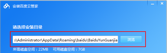 How to use Baidu Netdisk app
Mar 27, 2024 pm 06:46 PM
How to use Baidu Netdisk app
Mar 27, 2024 pm 06:46 PM
Cloud storage has become an indispensable part of our daily life and work nowadays. As one of the leading cloud storage services in China, Baidu Netdisk has won the favor of a large number of users with its powerful storage functions, efficient transmission speed and convenient operation experience. And whether you want to back up important files, share information, watch videos online, or listen to music, Baidu Cloud Disk can meet your needs. However, many users may not understand the specific use method of Baidu Netdisk app, so this tutorial will introduce in detail how to use Baidu Netdisk app. Users who are still confused can follow this article to learn more. ! How to use Baidu Cloud Network Disk: 1. Installation First, when downloading and installing Baidu Cloud software, please select the custom installation option.
 How to use NetEase Mailbox Master
Mar 27, 2024 pm 05:32 PM
How to use NetEase Mailbox Master
Mar 27, 2024 pm 05:32 PM
NetEase Mailbox, as an email address widely used by Chinese netizens, has always won the trust of users with its stable and efficient services. NetEase Mailbox Master is an email software specially created for mobile phone users. It greatly simplifies the process of sending and receiving emails and makes our email processing more convenient. So how to use NetEase Mailbox Master, and what specific functions it has. Below, the editor of this site will give you a detailed introduction, hoping to help you! First, you can search and download the NetEase Mailbox Master app in the mobile app store. Search for "NetEase Mailbox Master" in App Store or Baidu Mobile Assistant, and then follow the prompts to install it. After the download and installation is completed, we open the NetEase email account and log in. The login interface is as shown below
 Simple guide to pip mirror source: easily master how to use it
Jan 16, 2024 am 10:18 AM
Simple guide to pip mirror source: easily master how to use it
Jan 16, 2024 am 10:18 AM
Get started easily: How to use pip mirror source With the popularity of Python around the world, pip has become a standard tool for Python package management. However, a common problem that many developers face when using pip to install packages is slowness. This is because by default, pip downloads packages from Python official sources or other external sources, and these sources may be located on overseas servers, resulting in slow download speeds. In order to improve download speed, we can use pip mirror source. What is a pip mirror source? To put it simply, just
 BTCC tutorial: How to bind and use MetaMask wallet on BTCC exchange?
Apr 26, 2024 am 09:40 AM
BTCC tutorial: How to bind and use MetaMask wallet on BTCC exchange?
Apr 26, 2024 am 09:40 AM
MetaMask (also called Little Fox Wallet in Chinese) is a free and well-received encryption wallet software. Currently, BTCC supports binding to the MetaMask wallet. After binding, you can use the MetaMask wallet to quickly log in, store value, buy coins, etc., and you can also get 20 USDT trial bonus for the first time binding. In the BTCCMetaMask wallet tutorial, we will introduce in detail how to register and use MetaMask, and how to bind and use the Little Fox wallet in BTCC. What is MetaMask wallet? With over 30 million users, MetaMask Little Fox Wallet is one of the most popular cryptocurrency wallets today. It is free to use and can be installed on the network as an extension
