

About the position attribute in css

The position attribute specifies the positioning type of the element. This attribute defines the positioning mechanism used to establish the layout of the element. Any element can be positioned, but absolute or fixed elements generate a block-level box, regardless of the type of the element itself. A relatively positioned element is offset from its default position in normal flow. In this article, we will talk about the position attribute in CSS.
Standard
According to the MDN documentation, the CSS property position is used to specify how an element is positioned in the document. In addition, the offset attributes top, right, bottom and left are needed to determine the final position of the element. Applies to all elements, has no inheritance, and creates a cascading context. There are 5 types of positioning values (?):
position: static Default value
position:relative relative positioning
position:absolute absolute positioning
position : fixed fixed positioning
position: sticky sticky positioning
Because the position attribute is very Basic knowledge, so I will not use many pictures or demos to demonstrate the effects in the following pages. After all, these contents should be known by consulting the documentation or tutorials.
Default value static
When the position attribute of the element is not set or the value is static, the element is in the document flow, and the left and other offsets Transfer attributes have no effect. The documentation also says that the z-index value is invalid. I thought about it for a while. If the element is in the normal document flow, there will generally be no other elements that conflict with it in the upper and lower layers, so there are basically no application scenarios for z-index. Maybe there's something I missed? Apart from these, there is nothing special about static.
Relative positioning relative
The element with relative positioning is still in the document flow, and the space it occupies is still retained. However, if the up, down, left, and right offset properties are set, it will move in the corresponding direction relative to the original position. At this time, the element space still exists, and the surrounding elements will not be rearranged. In other words, a transparent brick is placed in the original position of the element, invisible but tangible. In addition, relatively positioned elements create a containing block that serves as a base point for positioning internal child elements.
The definition of a containing block: It consists of the content edge (content edge) of the nearest block-level ancestor box, table cell, or inline block inline-block ancestor box.
Conclusion block determination:
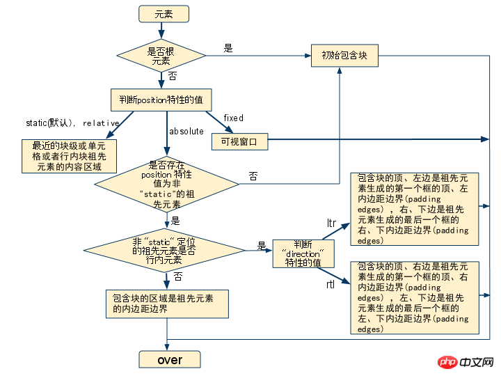
##Absolute positioning absolute
The absolutely positioned element will break away from the document flow (normal flow). At this time, its original space is 0, that is, there is no transparent brick occupancy. Nearby elements are also rearranged. At the same time, the element will generate a formatting context (BFC), the upper and lower margins will not be merged, and the height will not collapse due to internal floating elements.
The reason why we need to explain the definition and judgment of the containing block is because the positioning point of the absolutely positioned element is the nearest containing block, and the up, down, left, and right offset attributes set are all based on the containing block. The upper left corner of is the origin (this is related to the direction of the text). As can be seen from the above figure, if the position attribute of the absolutely positioned ancestor element is static, it will be positioned relative to the initial containing block - body. If there is an ancestor element with a position attribute of another value, it is positioned relative to the containing block it was created with.
I actually want to make a comparison with floating elements here. I saw Zhang Xinxu mentioned in his blog that floating elements can be regarded as inline-block elements with width but no height, while absolute positioning is An inline-block element with no width or height. As for why it is regarded as an inline-block element, I don’t quite remember~
Fixed positioning fixed
Fixed positioning elements are positioned relative to the screen viewport. In this case, the position will not change due to scrolling. If the web page is printed, this element will appear at a fixed position on each page. Additionally, fixed positioned elements also create formatting context.
The document also mentions that there is a special situation that will affect fixed positioning. That is, when the transform attribute of the parent element is not none, the fixed positioning container is changed to the parent element instead of the viewport. This kind of unexpected situation needs to be paid attention to and avoided.
Finally, if you are a mobile web developer, you will also encounter some bugs in the fixed layout under the ios system webview. It may not be possible to find a perfect solution to these bugs, so if you encounter them, consider using js to dynamically determine and modify the style or simply re-layout.
sticky positioning sticky
I believe many people have never seen this positioning method, because it is an experimental attribute, and the document recommends that it be avoided as much as possible Used in production environment. However, its function is still very useful, you can learn about it.
Sticky positioning is a combination of relative positioning and fixed positioning. Set the threshold based on the offset properties of up, down, left and right. If the relative positioning exceeds the threshold, it will be converted to fixed positioning.
Since it is a new attribute, please go to this demo to have a look.
In the demo, the code is mainly
<span style="font-size: 16px;">dt{<br> position: -webkit-sticky;<br> position: sticky;<br> top: -1px;<br>}<br></span>First of all, from the support of sticky positioning in the browser, we can see that it is basically supported , except ie. However, table-related elements are not supported in Firefox, and elements such as thead and tr are not supported in Chrome. Therefore, if you want to use it normally, you may need to add prefixes such as -webkit.
Secondly, set top:-1px as the threshold. When the element is a relatively positioned element, if the distance between its top and the containing block is >= -1px, it will be converted to fixed positioning. Therefore, to use sticky positioning, threshold setting is key.
In addition to the functions shown in the demo, sticky positioning application scenarios can also be used in the so-called sticky footer. I believe that many times products will require such a layout~
Positioning elements with limited width
Many times, we will absolutely position The element is vertically and horizontally centered using
<span style="font-size: 16px;">position:absolute;<br>top:0;<br>bottom:0;<br>right:0;<br>left:0;<br>width:50%;<br>height:50%;<br>margin:auto;<br></span>
In this case, since the margin is set to the auto value, according to the equation:
margin+border+padding+width=element width /Height
So the margin will be set to half of the free part in the corresponding direction to achieve centering.
But, aren’t absolutely positioned elements out of the document flow? Why does margin still work? It turns out that it is because we also set the up, down, left and right offset properties. Generally, we only need to set up or down, left or right. If up, down or left and right are set at the same time, that is to say, when the opposite positioning direction attributes have specific positioning values at the same time, fluid characteristics will occur. At this point, the width of the absolutely positioned element will adapt to the width of the containing block. In this case, the absolutely positioned element is the same as the element in the normal document flow, and can be centered using margin:auto.
Triangular relationship between display/float/position
When the element is set to absolute positioning or fixed positioning , the floating attribute is invalid, and the display is also changed to the block value. In other words, the elements at this time are all block-level elements.
-
If display is set to none, the element disappears, and the set position and float attributes are naturally meaningless.
The above content is about the position attribute in css, I hope it can help everyone.
Related recommendations:
Detailed explanation of CSS position property examples
How to use the CSS Position property
The above is the detailed content of About the position attribute in css. For more information, please follow other related articles on the PHP Chinese website!

Hot AI Tools

Undresser.AI Undress
AI-powered app for creating realistic nude photos

AI Clothes Remover
Online AI tool for removing clothes from photos.

Undress AI Tool
Undress images for free

Clothoff.io
AI clothes remover

Video Face Swap
Swap faces in any video effortlessly with our completely free AI face swap tool!

Hot Article
Hot Tools

Notepad++7.3.1
Easy-to-use and free code editor

SublimeText3 Chinese version
Chinese version, very easy to use

Zend Studio 13.0.1
Powerful PHP integrated development environment

Dreamweaver CS6
Visual web development tools

SublimeText3 Mac version
God-level code editing software (SublimeText3)
Hot Topics


 How to use bootstrap in vue
Apr 07, 2025 pm 11:33 PM
How to use bootstrap in vue
Apr 07, 2025 pm 11:33 PM
Using Bootstrap in Vue.js is divided into five steps: Install Bootstrap. Import Bootstrap in main.js. Use the Bootstrap component directly in the template. Optional: Custom style. Optional: Use plug-ins.
 The Roles of HTML, CSS, and JavaScript: Core Responsibilities
Apr 08, 2025 pm 07:05 PM
The Roles of HTML, CSS, and JavaScript: Core Responsibilities
Apr 08, 2025 pm 07:05 PM
HTML defines the web structure, CSS is responsible for style and layout, and JavaScript gives dynamic interaction. The three perform their duties in web development and jointly build a colorful website.
 Understanding HTML, CSS, and JavaScript: A Beginner's Guide
Apr 12, 2025 am 12:02 AM
Understanding HTML, CSS, and JavaScript: A Beginner's Guide
Apr 12, 2025 am 12:02 AM
WebdevelopmentreliesonHTML,CSS,andJavaScript:1)HTMLstructurescontent,2)CSSstylesit,and3)JavaScriptaddsinteractivity,formingthebasisofmodernwebexperiences.
 How to set up the framework for bootstrap
Apr 07, 2025 pm 03:27 PM
How to set up the framework for bootstrap
Apr 07, 2025 pm 03:27 PM
To set up the Bootstrap framework, you need to follow these steps: 1. Reference the Bootstrap file via CDN; 2. Download and host the file on your own server; 3. Include the Bootstrap file in HTML; 4. Compile Sass/Less as needed; 5. Import a custom file (optional). Once setup is complete, you can use Bootstrap's grid systems, components, and styles to create responsive websites and applications.
 How to write split lines on bootstrap
Apr 07, 2025 pm 03:12 PM
How to write split lines on bootstrap
Apr 07, 2025 pm 03:12 PM
There are two ways to create a Bootstrap split line: using the tag, which creates a horizontal split line. Use the CSS border property to create custom style split lines.
 How to insert pictures on bootstrap
Apr 07, 2025 pm 03:30 PM
How to insert pictures on bootstrap
Apr 07, 2025 pm 03:30 PM
There are several ways to insert images in Bootstrap: insert images directly, using the HTML img tag. With the Bootstrap image component, you can provide responsive images and more styles. Set the image size, use the img-fluid class to make the image adaptable. Set the border, using the img-bordered class. Set the rounded corners and use the img-rounded class. Set the shadow, use the shadow class. Resize and position the image, using CSS style. Using the background image, use the background-image CSS property.
 How to use bootstrap button
Apr 07, 2025 pm 03:09 PM
How to use bootstrap button
Apr 07, 2025 pm 03:09 PM
How to use the Bootstrap button? Introduce Bootstrap CSS to create button elements and add Bootstrap button class to add button text
 How to resize bootstrap
Apr 07, 2025 pm 03:18 PM
How to resize bootstrap
Apr 07, 2025 pm 03:18 PM
To adjust the size of elements in Bootstrap, you can use the dimension class, which includes: adjusting width: .col-, .w-, .mw-adjust height: .h-, .min-h-, .max-h-
