

Detailed explanation of CSS position property examples
This article mainly introduces the CSS position attribute and application examples, absolute (absolute positioning), relative (relative positioning), the combination of relative and absolute, and fixed (fixed positioning). Friends in need can refer to it
At present, almost all mainstream browsers support the position attribute (except "inherit", "inherit" does not support all browsers including IE8 and previous versions of IE, and IE9 and IE10 have not been tested). The following is w3school's explanation of position Explanation of the five values:
Among them, absolute and relative are the most commonly used, and fixed is also used more frequently (IE6 does not support fixed).
1. Absolute (absolute positioning)
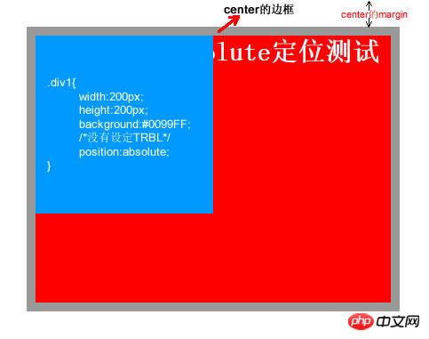
Absolute is an element that generates visual positioning and is separated from the text flow (that is, it is already in the document) does not occupy the position), refer to the upper left corner of the browser through top, right, bottom, left (referred to as TRBL) positioning. You can select a positioned parent object (the combination of relative and absolute will be discussed below) or the body coordinate origin for positioning, or you can perform hierarchical classification through z-index. When the TRBL value is not set, absolute uses the coordinates of the parent object as the starting point. When the TRBL value is set, the upper left corner of the browser is used as the original point. The specific case is as follows:
<!DOCTYPE html PUBLIC "-//W3C//DTD XHTML 1.0 Transitional//EN" "http://www.w3.org/TR/xhtml1/DTD/xhtml1-transitional.dtd">
<html xmlns="http://www.w3.org/1999/xhtml">
<head>
<meta http-equiv="Content-Type" content="text/html; charset=utf-8" />
<title>position:absolute定位</title>
<style type="text/css">
    html,body,p{
                    margin:0;
                    padding:0;
                    list-style:none;
    }
    .center{
                margin:30px;
                border:#999999 solid 10px;
                width:400px;
                height:300px;
    }
    .p1{
            width:200px;
            height:200px;
            background:#0099FF;
            /*设定TRBL*/
            position:absolute;
            left:0px;
            top:0px;
    }
    .p2{
            width:400px;
            height:300px;
            font-size:30px;
            font-weight:bold;
            color:#fff;
            background:#FF0000;
    }
</style>
</head>
<body>
    <p class="center">
        <p class="p1"></p>
        <p class="p2">position:absolute定位测试</p>
    </p>
</body>
</html>The effect of this code is as follows:
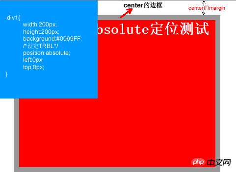
This is the setting The effect after TRBL (setting TRBL to the upper left corner of the browser as the origin), when TRBL is not set (TRBL is not set, using the coordinates of the parent object as the origin), that is, when p1 is changed to the following code
.p1{
            width:200px;
            height:200px;
            background:#0099FF;
            /*没有设定TRBL*/
            position:absolute;
    }
The effect is as follows:
## 2. relative (relative positioning)
<!DOCTYPE html PUBLIC "-//W3C//DTD XHTML 1.0 Transitional//EN" "http://www.w3.org/TR/xhtml1/DTD/xhtml1-transitional.dtd">
<html xmlns="http://www.w3.org/1999/xhtml">
<head>
<meta http-equiv="Content-Type" content="text/html; charset=utf-8" />
<title>position:relative定位</title>
<style type="text/css">
    html,body,p{
                    margin:0;
                    padding:0;
                    list-style:none;
    }
    .center{
                margin:30px;
                border:#999999 solid 10px;
                width:400px;
                height:300px;
                background:#FFFF00;
    }
    .p1{
            width:200px;
            height:150px;
            background:#0099FF;
            position:relative;
            top:-20px;
            left:0px;
    }
    .p2{
            width:400px;
            height:150px;
            font-size:30px;
            font-weight:bold;
            color:#fff;
            background:#FF0000;
    }
</style>
</head>
<body>
    <p class="center">
        <p class="p1"></p>
        <p class="p2">position:relative定位测试</p>
    </p>
</body>
</html>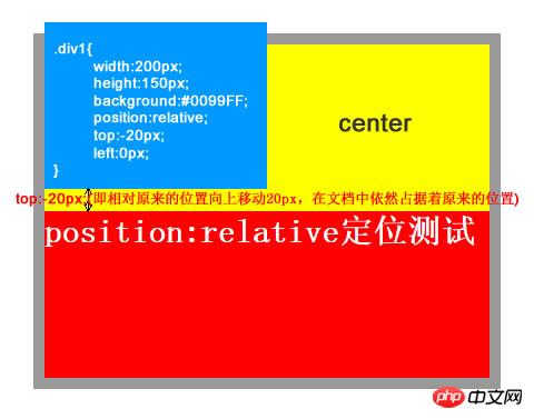
3. The combination of relative and absolute
<!DOCTYPE html PUBLIC "-//W3C//DTD XHTML 1.0 Transitional//EN" "http://www.w3.org/TR/xhtml1/DTD/xhtml1-transitional.dtd">
<head>
<meta http-equiv="Content-Type" content="text/html; charset=utf-8" />
<style type="text/css">
html,body,p,ul,li,a{
                    margin:0;
                    padding:0;
                    list-style:none;
}
a, a:hover{
 color:#000;
 border:0;
 text-decoration:none;
}
    #warp,#head,#main,#foot
{
    width: 962px;
}
/*设置居中*/
#warp{
    margin: 0 auto;
}
#head{
            height:132px;
            position:relative;
}
.logo{
        position:absolute;
        top:17px;
}
.head_pic{
            position:absolute;
            top:17px;
            left:420px;
}
.sc{
            position:absolute;
            right:5px;
            top:12px;
}
.sc a{
            padding-left:20px;
            color:#666;
}
.nav{
        width:960px;
        height:42px;
        line-height:42px;
        position:absolute;
        bottom:0px;
        background:url(img/nav_bj.jpg) no-repeat center;
}
.nav ul{
            float:left;
            padding:0 10px;
}
.nav li{
            float:left;
            background:url(img/li_bj.jpg) no-repeat right center;
            padding-right:40px;
            padding-left:20px;
            text-align:center;
            display:inline;
}
.nav li a{
                font-size:14px;
                font-family:Microsoft YaHei !important;
                white-space:nowrap;
}
.nav li a:hover{
                    color:#FBECB7;
}
</style>
<title></title>
</head>
<body>
    <p id="warp">
        <p id="head">
            <p class="logo"><img src="img/logo.jpg" /></p>
            <p class="head_pic"><img src="img/head_pic.jpg" /></p>
            <p class="sc">
                <a href=""><img src="img/sc_btn.jpg" /></a>
                <a href=""><img src="img/sy_btn.jpg" /></a>
                <a href=""><img src="img/kf_btn.jpg" /></a>
            </p>
            <p class="nav">
                <ul>
                    <li><a href="">首页</a></li>
                    <li><a href="">关于我们</a></li>
                    <li><a href="">团队文化</a></li>
                    <li><a href="">公司动态</a></li>
                    <li><a href="">资讯参考</a></li>
                    <li><a href="">业务中心</a></li>
                    <li><a href="">合作银行</a></li>
                    <li><a href="">联系我们</a></li>
                </ul>
            </p>
        </p>
        <p id="main"></p>
        <p id="foot"></p>
    </p>
</body>
</html>
In the above code, the first thing is to set the relative positioning for the head. , then you can see that all child elements inside will be positioned relative to the head instead of relative to the body after setting absolute. This is much simpler and more convenient than using floating, and there is no need to worry about compatibility issues.
The above is the detailed content of Detailed explanation of CSS position property examples. For more information, please follow other related articles on the PHP Chinese website!

Hot AI Tools

Undresser.AI Undress
AI-powered app for creating realistic nude photos

AI Clothes Remover
Online AI tool for removing clothes from photos.

Undress AI Tool
Undress images for free

Clothoff.io
AI clothes remover

Video Face Swap
Swap faces in any video effortlessly with our completely free AI face swap tool!

Hot Article
Hot Tools

Notepad++7.3.1
Easy-to-use and free code editor

SublimeText3 Chinese version
Chinese version, very easy to use

Zend Studio 13.0.1
Powerful PHP integrated development environment

Dreamweaver CS6
Visual web development tools

SublimeText3 Mac version
God-level code editing software (SublimeText3)
Hot Topics


 How to use bootstrap in vue
Apr 07, 2025 pm 11:33 PM
How to use bootstrap in vue
Apr 07, 2025 pm 11:33 PM
Using Bootstrap in Vue.js is divided into five steps: Install Bootstrap. Import Bootstrap in main.js. Use the Bootstrap component directly in the template. Optional: Custom style. Optional: Use plug-ins.
 The Roles of HTML, CSS, and JavaScript: Core Responsibilities
Apr 08, 2025 pm 07:05 PM
The Roles of HTML, CSS, and JavaScript: Core Responsibilities
Apr 08, 2025 pm 07:05 PM
HTML defines the web structure, CSS is responsible for style and layout, and JavaScript gives dynamic interaction. The three perform their duties in web development and jointly build a colorful website.
 Understanding HTML, CSS, and JavaScript: A Beginner's Guide
Apr 12, 2025 am 12:02 AM
Understanding HTML, CSS, and JavaScript: A Beginner's Guide
Apr 12, 2025 am 12:02 AM
WebdevelopmentreliesonHTML,CSS,andJavaScript:1)HTMLstructurescontent,2)CSSstylesit,and3)JavaScriptaddsinteractivity,formingthebasisofmodernwebexperiences.
 How to set up the framework for bootstrap
Apr 07, 2025 pm 03:27 PM
How to set up the framework for bootstrap
Apr 07, 2025 pm 03:27 PM
To set up the Bootstrap framework, you need to follow these steps: 1. Reference the Bootstrap file via CDN; 2. Download and host the file on your own server; 3. Include the Bootstrap file in HTML; 4. Compile Sass/Less as needed; 5. Import a custom file (optional). Once setup is complete, you can use Bootstrap's grid systems, components, and styles to create responsive websites and applications.
 How to write split lines on bootstrap
Apr 07, 2025 pm 03:12 PM
How to write split lines on bootstrap
Apr 07, 2025 pm 03:12 PM
There are two ways to create a Bootstrap split line: using the tag, which creates a horizontal split line. Use the CSS border property to create custom style split lines.
 How to insert pictures on bootstrap
Apr 07, 2025 pm 03:30 PM
How to insert pictures on bootstrap
Apr 07, 2025 pm 03:30 PM
There are several ways to insert images in Bootstrap: insert images directly, using the HTML img tag. With the Bootstrap image component, you can provide responsive images and more styles. Set the image size, use the img-fluid class to make the image adaptable. Set the border, using the img-bordered class. Set the rounded corners and use the img-rounded class. Set the shadow, use the shadow class. Resize and position the image, using CSS style. Using the background image, use the background-image CSS property.
 How to use bootstrap button
Apr 07, 2025 pm 03:09 PM
How to use bootstrap button
Apr 07, 2025 pm 03:09 PM
How to use the Bootstrap button? Introduce Bootstrap CSS to create button elements and add Bootstrap button class to add button text
 How to resize bootstrap
Apr 07, 2025 pm 03:18 PM
How to resize bootstrap
Apr 07, 2025 pm 03:18 PM
To adjust the size of elements in Bootstrap, you can use the dimension class, which includes: adjusting width: .col-, .w-, .mw-adjust height: .h-, .min-h-, .max-h-
