A comprehensive understanding of absolute positioning
The following editor will bring you a comprehensive understanding of absolute positioning. The editor thinks it is quite good, so I will share it with you now and give it as a reference for everyone. Let’s follow the editor and take a look.
<!DOCTYPE html>
<html>
<head>
<meta charset="UTF-8">
<title>有关绝对定位的理解</title>
</head>
<style type="text/css">
/* 1. Before the positioning is set, the big box wraps the small box, which conforms to the standard document flow, as shown in Picture 1
.box1{
width: 500px;
height: 500px;
background:red;
}
.box2{
width: 200px;
height: 200px;
background:blue;
}*/Picture 1
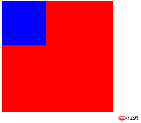
##/*2. Absolute positioning changes the position of the element It has nothing to do with the document flow and therefore takes up no space.
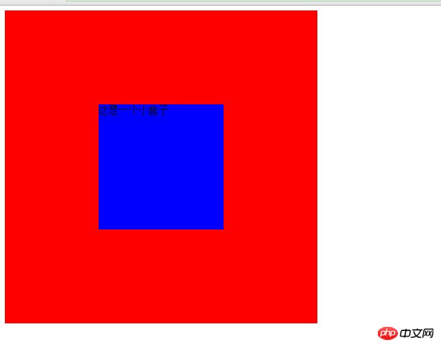
because the position of the element is relative to its position in the ordinary flow s position. The position of an absolutely positioned element is relative to the nearest positioned ancestor element.
If the element has no positioned ancestor elements, its position is relative to the original containing block.
.box1{width: 500px;height: 500px;background:red;position: relative;}.box2{width: 200px;height: 200px;background:blue;position:absolute;top:150px;left:150px;
}*/
## /*3. Box2 has no width and height and without setting positioning, box2 will be wrapped by box1, conforming to the standard document flow, and occupying the position of the document. The width inherits the width of the parent element, and the height is automatically supported by the content open.
Like picture 3.
.box1{
width: 500px;
height: 500px;
background:red;
}
.box2{
background:blue;
}*/Picture 3
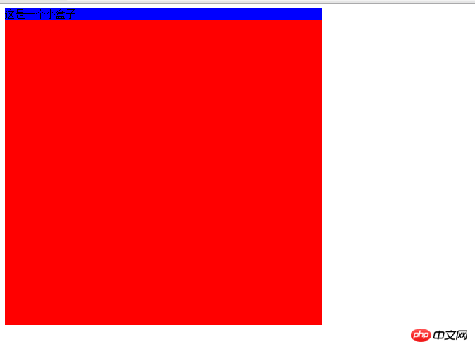
##/*4. Box2 has no width and height. When positioning is set, box2 will break away from the document flow, and the position will be specified relative to the relative positioning element.
The width will be invalid, which means that the width and height will be automatically determined by the content. Spread open. As shown in picture 4. If you need width and height, you need to set it separately*/.box1{
width: 500px;
height: 500px;
background:red;
position: relative;
}
.box2{
background:blue;
position:absolute;
top:150px;
left:150px;
}
</style>
<body>
<p class="box1">
<p class="box2">这是一个小盒子</p>
</p>
</body>
</html>
The above comprehensive understanding of absolute positioning is all the content shared by the editor. I hope it can give you a reference, and I hope you will support the PHP Chinese website. 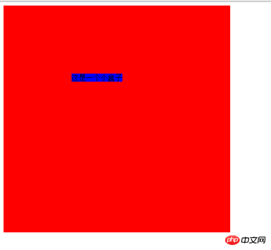

Hot AI Tools

Undresser.AI Undress
AI-powered app for creating realistic nude photos

AI Clothes Remover
Online AI tool for removing clothes from photos.

Undress AI Tool
Undress images for free

Clothoff.io
AI clothes remover

Video Face Swap
Swap faces in any video effortlessly with our completely free AI face swap tool!

Hot Article

Hot Tools

Notepad++7.3.1
Easy-to-use and free code editor

SublimeText3 Chinese version
Chinese version, very easy to use

Zend Studio 13.0.1
Powerful PHP integrated development environment

Dreamweaver CS6
Visual web development tools

SublimeText3 Mac version
God-level code editing software (SublimeText3)

Hot Topics
 Does sticky positioning break away from the document flow?
Feb 20, 2024 pm 05:24 PM
Does sticky positioning break away from the document flow? Specific code examples are needed. In web development, layout is a very important topic. Among them, positioning is one of the commonly used layout techniques. In CSS, there are three common positioning methods: static positioning, relative positioning and absolute positioning. In addition to these three positioning methods, there is also a more special positioning method, namely sticky positioning. So, does sticky positioning break away from the document flow? Let’s discuss it in detail below and provide some code examples to help understand. First, we need to understand what document flow is
 How to put the image in the middle with css
Apr 25, 2024 am 11:51 AM
There are three main ways to center an image in CSS: using display: block; and margin: 0 auto;. Use flexbox layout or grid layout and set align-items or justify-content to center. Use absolute positioning, set top and left to 50%, and apply transform: translate(-50%, -50%);.
 bottom attribute syntax in CSS
Feb 21, 2024 pm 03:30 PM
Bottom attribute syntax and code examples in CSS In CSS, the bottom attribute is used to specify the distance between an element and the bottom of the container. It controls the position of an element relative to the bottom of its parent element. The syntax of the bottom attribute is as follows: element{bottom:value;} where element represents the element to which the style is to be applied, and value represents the bottom value to be set. value can be a specific length value, such as pixels
 How to center the box in html5
Apr 05, 2024 pm 12:27 PM
To center the box in HTML5, there are the following methods: horizontal centering: text-align: centermargin: autodisplay: flex; justify-content: center; vertical centering: vertical-align: middletransform: translate(-50%, -50%); position: absolute; top: 50%; left: 50%; transform: translate(-50%, -50%);
 How to position elements in css
Apr 26, 2024 am 10:24 AM
There are four methods of CSS element positioning: static, relative, absolute, and fixed positioning. Static positioning is the default and the element is not affected by positioning rules. Relative positioning moves an element relative to itself without affecting document flow. Absolute positioning removes an element from the document flow and positions it relative to its ancestor elements. Fixed positioning positions an element relative to the viewport, always keeping it in the same position on the screen.
 A closer look at the advantages and limitations of absolute positioning
Jan 23, 2024 am 10:20 AM
Absolute Positioning (AbsolutePositioning) is a commonly used positioning method in CSS. It performs layout by specifying the position offset of an element relative to its nearest positioned ancestor element. When using absolute positioning, we need to understand its advantages and limitations, and use concrete code examples to deepen our understanding. First of all, one of the advantages of absolute positioning is that you have complete control over the position of your element. Compared with other layout methods, absolute positioning can accurately position elements anywhere on the page without being restricted by the document.
 What is layout layout?
Feb 24, 2024 pm 03:03 PM
Layout refers to a typesetting method adopted in web design to arrange and display web page elements according to certain rules and structures. Through reasonable layout, the webpage can be made more beautiful and neat, and achieve a good user experience. In front-end development, there are many layout methods to choose from, such as traditional table layout, floating layout, positioning layout, etc. However, with the promotion of HTML5 and CSS3, modern responsive layout technologies, such as Flexbox layout and Grid layout, have become
 How to set the position of img image in css
Apr 25, 2024 pm 02:06 PM
To set the position of an img image in CSS, you need to specify the positioning type (static, relative or absolute), and then use the top, right, bottom and left properties to set the position offset. These offsets specify the image's position relative to its positioning type.


