


 收藏
收藏


 PHPz
PHPz批改状态:合格
老师批语:


| 序号 | 属性 | 描述 |
|---|---|---|
| 1 | grid |
创建grid容器,display:grid |
| 2 | grid-template-columns/rows |
显示生成的网格单元,大多数情况下,让其自动生成 |
| 3 | grid-area |
将项目放入指定的网格单元中 |
| 4 | grid-auto-flow |
行与列的排列规则 |
| 5 | grid-auto-row/column |
隐式(自动生成的)网格单元行/列的大小(宽高) |
| 6 | gap |
行/列间距 |
| 7 | place-content |
所有项目在“容器”中的对齐方式 |
| 8 | place-items |
所有项目在网格单元中的对齐方式 |
| 9 | place-self |
指定某个项目在网格单元中的对齐方式 |
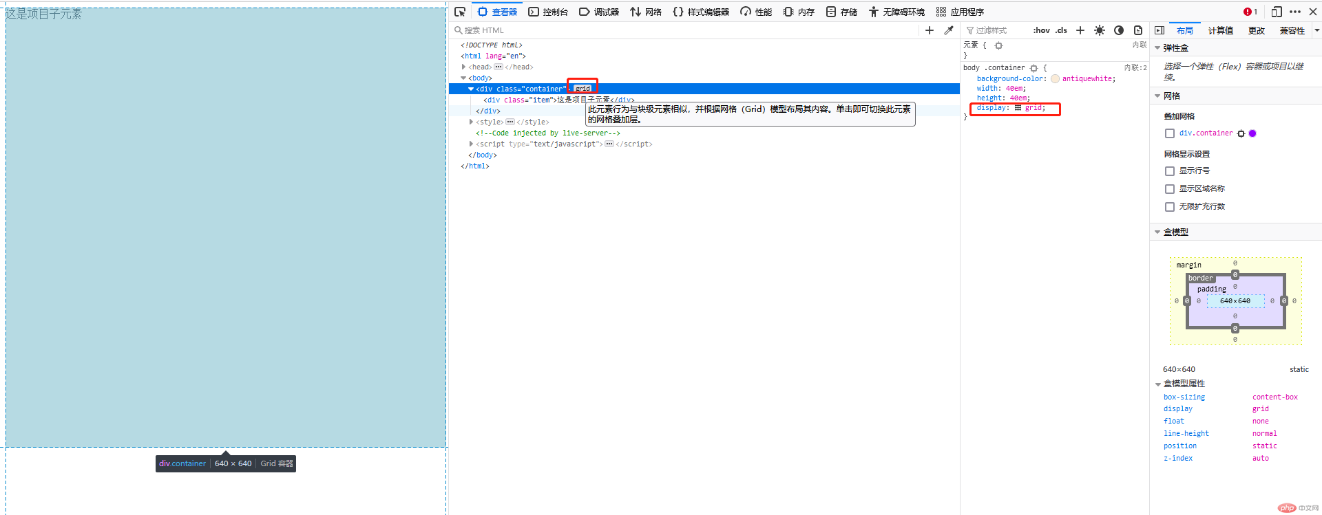
使用
display:grid声明该容器是grid网格布局方式
<div class="container"><div class="item">这是项目子元素</div></div><style>body .container {background-color: antiquewhite;width: 40em;height: 40em;/* 创建grid容器 */display: grid;}</style>
| 序号 | 属性 | 描述 |
|---|---|---|
| 1 | grid-template-columns |
指定生成多少列和列宽 |
| 2 | grid-template-rows |
指定生成多少行和行高 |
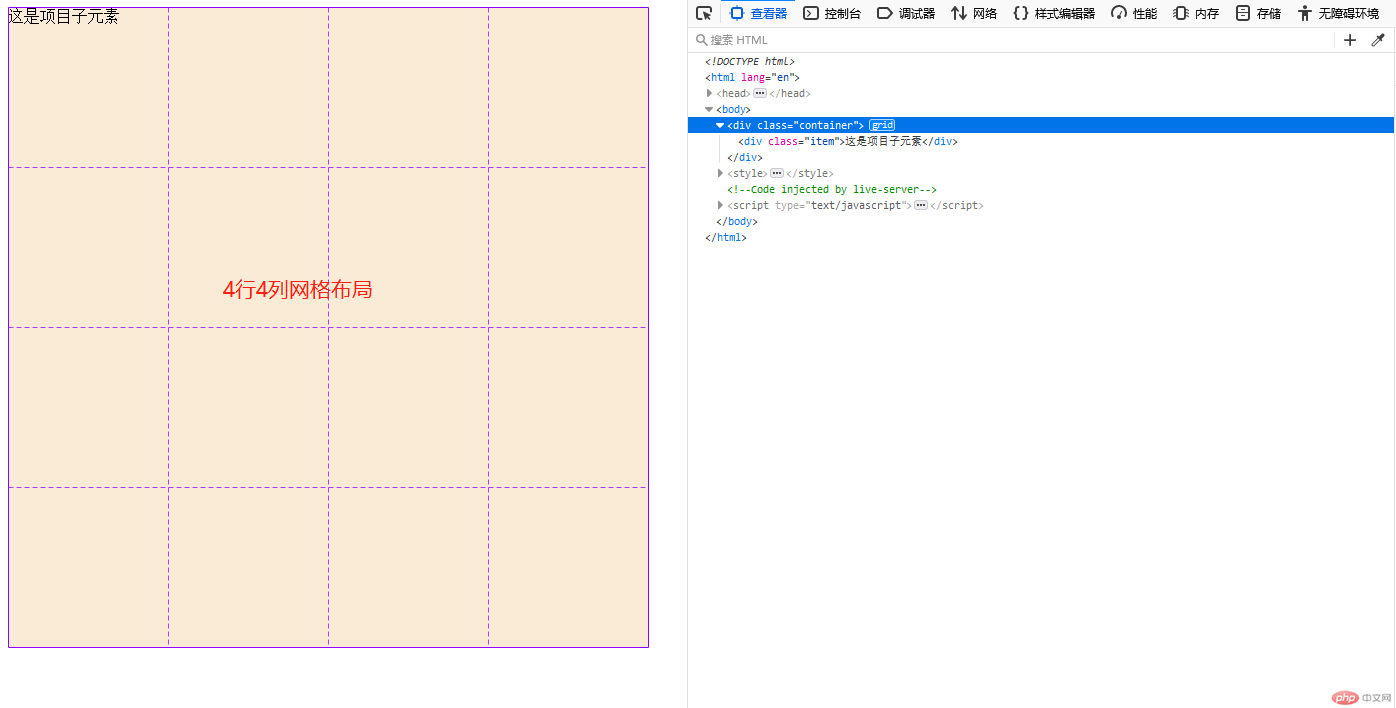
例如:生成4行4列且宽高都是10em的写法如下:
列:
grid-template-columns:10em 10em 10em 10em;
行:grid-template-rows:10em 10em 10em 10em;可以用
repeat来进行简写,如下:列:
grid-template-columns:repeat(4,10em);
行:grid-template-rows:(4,10em);
<div class="container"><div class="item">这是项目子元素</div></div><style>body .container {background-color: antiquewhite;width: 40em;height: 40em;/* 创建grid容器 */display: grid;/* 生成4行4列且宽高都是10em网格容器 */grid-template-columns: 10em 10em 10em 10em;grid-template-rows: 10em 10em 10em 10em;/* 简写 */grid-template-columns: repeat(4, 10em);grid-template-columns: repeat(4, 10em);}</style>
语法:
grid-area:行开始/列开始/行结束/列结束,若不跨越网格单元,后面2个数值可以不写
等价于grid-column/row,但grid-area写发更为简化,推荐使用grid-area例1:指定项目填充在第二行第二列的语法:
grid-area:2/2
<div class="container"><div class="item">这是项目子元素</div></div><style>body .container {background-color: antiquewhite;width: 40em;height: 40em;/* 创建grid容器 */display: grid;/* 生成4行4列且宽高都是10em网格容器 */grid-template-columns: 10em 10em 10em 10em;grid-template-rows: 10em 10em 10em 10em;/* 简写 */grid-template-columns: repeat(4, 10em);grid-template-columns: repeat(4, 10em);}body .container .item {background-color: aqua;grid-area: 2/2;}</style>
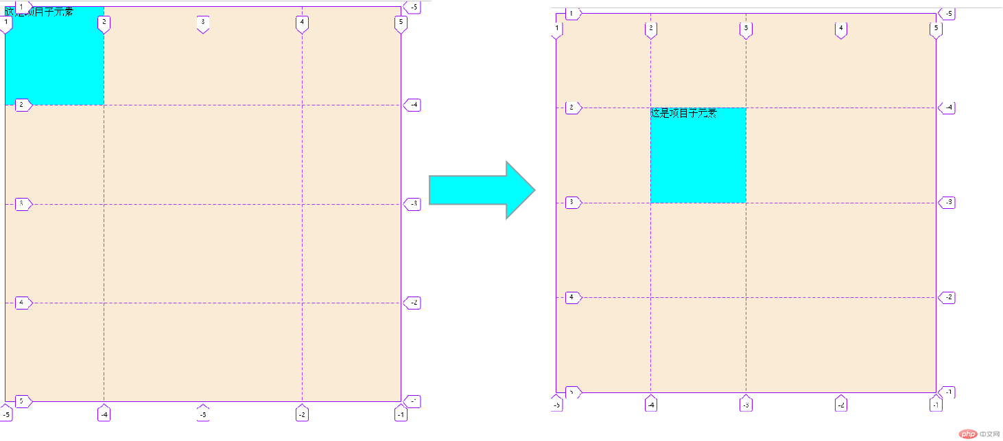
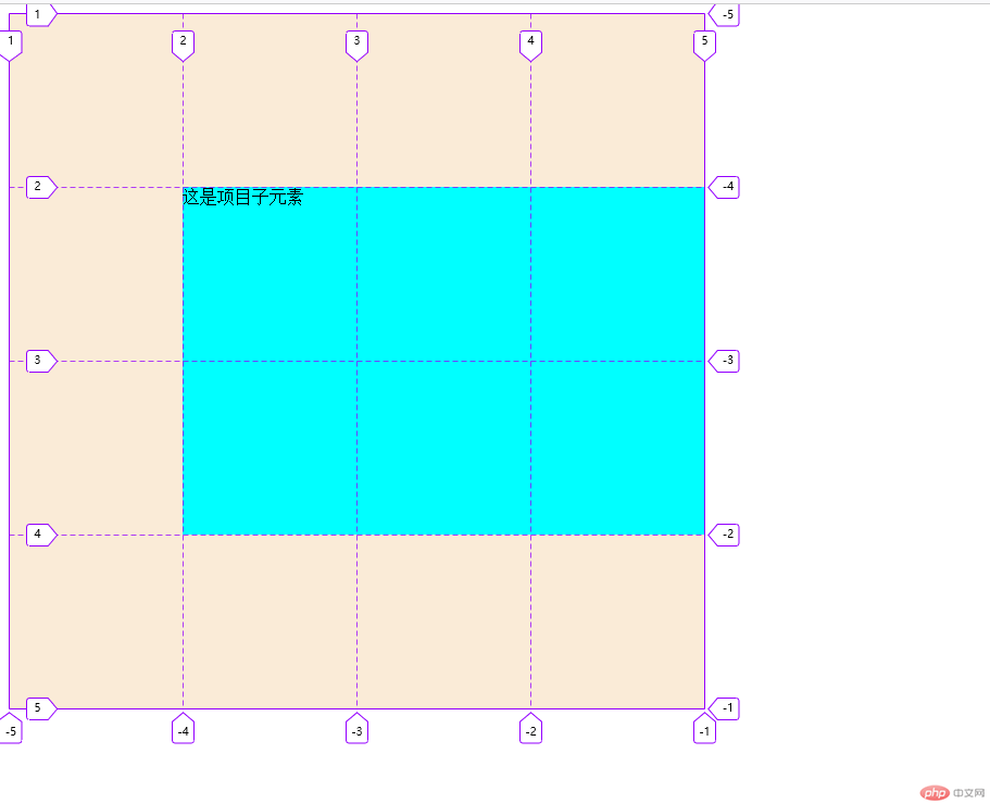
例2:指定项目填充在第二行第二列,且跨越两行三列的语法:
grid-area:2/2/span 2/span 3
<div class="container"><div class="item">这是项目子元素</div></div><style>body .container {background-color: antiquewhite;width: 40em;height: 40em;/* 创建grid容器 */display: grid;/* 生成4行4列且宽高都是10em网格容器 */grid-template-columns: 10em 10em 10em 10em;grid-template-rows: 10em 10em 10em 10em;/* 简写 */grid-template-columns: repeat(4, 10em);grid-template-columns: repeat(4, 10em);}body .container .item {background-color: aqua;grid-area:2/2/span 2/span 3;}</style>
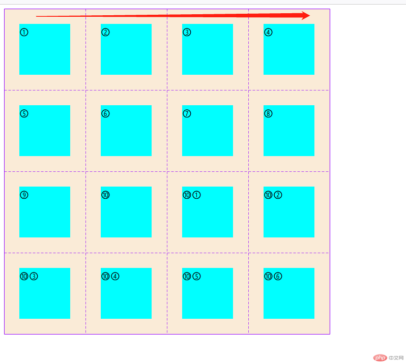
例1:行优先(水平排列),浏览器默认的,语法:
grid-auto-flow:row如下:
<div class="container"><div class="item">①</div><div class="item">②</div><div class="item">③</div><div class="item">④</div><div class="item">⑤</div><div class="item">⑥</div><div class="item">⑦</div><div class="item">⑧</div><div class="item">⑨</div><div class="item">⑩</div><div class="item">⑩①</div><div class="item">⑩②</div><div class="item">⑩③</div><div class="item">⑩④</div><div class="item">⑩⑤</div><div class="item">⑩⑥</div></div><style>body .container {background-color: antiquewhite;width: 40em;height: 40em;/* 创建grid容器 */display: grid;/* 简写 */grid-template-columns: repeat(4, 10em);grid-template-columns: repeat(4, 10em);/* 这个可以不写,因为默认的排序方式就是以行优先 */grid-auto-flow:row;}body .container .item {width: 100px;height: 100px;background-color: aqua;margin: auto;font-size: 22px;}</style>
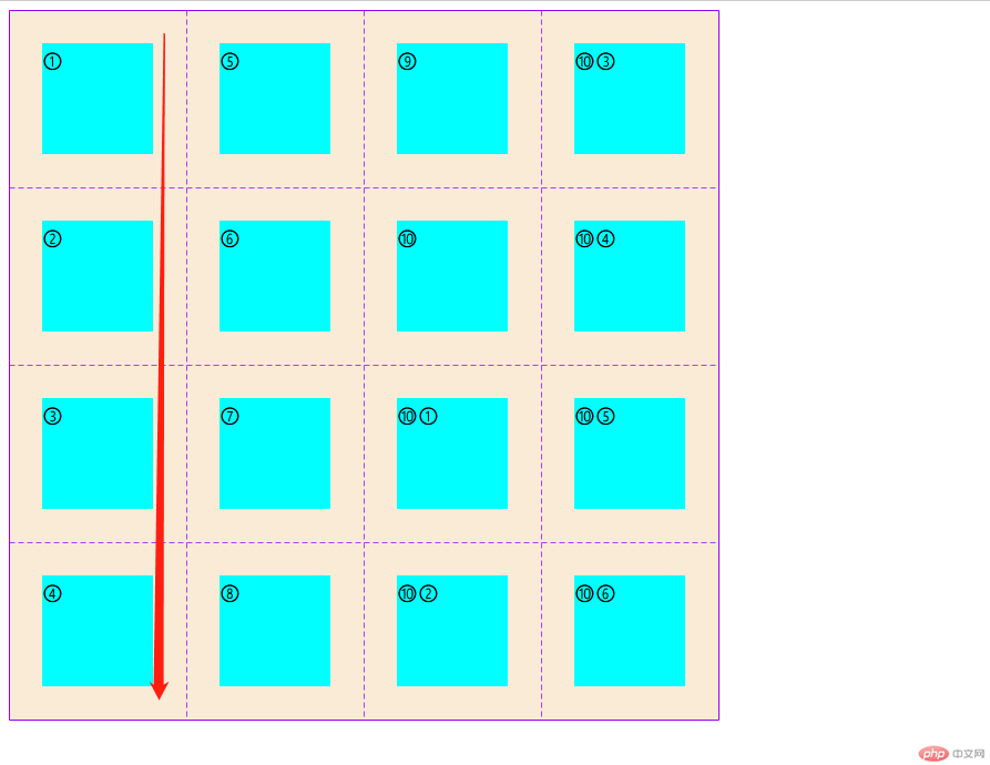
例2:列优先(垂直排列),修改关键代码即可
grid-auto-flow:column效果如下:
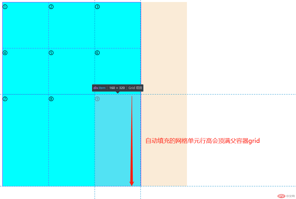
grid-auto-rows设置自动填充的行高
这里我只设置了2行3列,且容器中有9个项目,那么多出来的3个项目会自动填充,并且网格单元行高会顶满父容器,这时就可以通过grid-auto-rows:10em来设置多出来的3个项目的网格单元的行高,如下:
未设置grid-auto-rows属性之前:
<div class="container"><div class="item">①</div><div class="item">②</div><div class="item">③</div><div class="item">④</div><div class="item">⑤</div><div class="item">⑥</div><div class="item">⑦</div><div class="item">⑧</div><div class="item">⑨</div></div><style>body .container {background-color: antiquewhite;width: 40em;height: 40em;/* 创建grid容器 */display: grid;/* 简写 设置3例2行的网格*/grid-template-columns: repeat(3, 10em);grid-template-rows: repeat(2, 10em);}body .container .item {width: 100px;height: 100px;background-color: aqua;margin: auto;font-size: 22px;}</style>
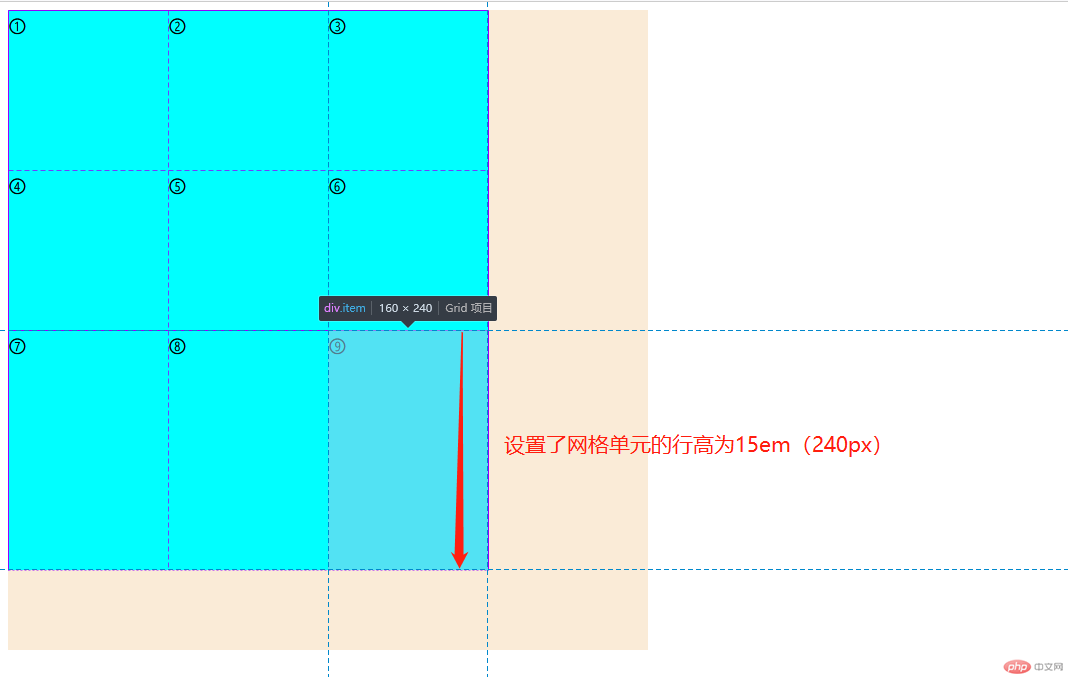
设置
grid-auto-rows:15em属性之后,关键代码如下:
body .container {background-color: antiquewhite;width: 40em;height: 40em;/* 创建grid容器 */display: grid;/* 简写 设置3例2行的网格*/grid-template-columns: repeat(3, 10em);grid-template-rows: repeat(2, 10em);/* 设置自动填充的网格单元的行高为15em */grid-auto-rows:15em;}
grid-auto-colum的使用方法差不多,就不做演示了
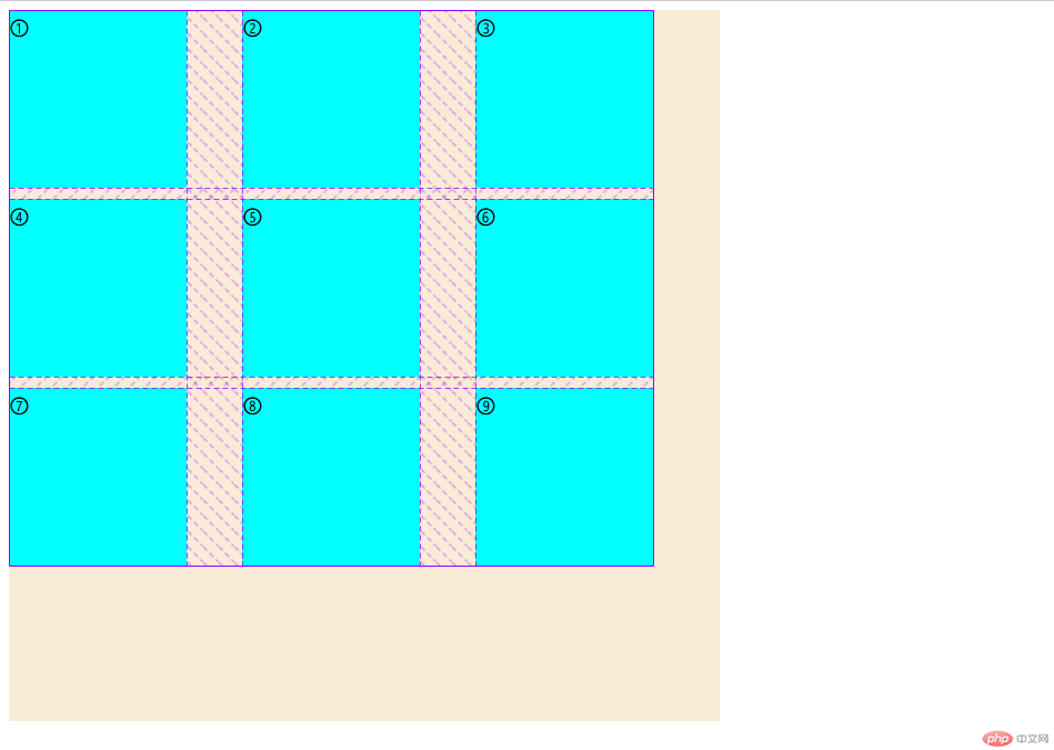
gap:行间距/列间距,当行间距和列间距相同时,值设置一个值即可,如:grp:10px表示行和列的间距都为10px。
例:设置网格单元之间的行间距为10px,列间距为50px,语法:gap:10px 50px;,如下:
<div class="container"><div class="item">①</div><div class="item">②</div><div class="item">③</div><div class="item">④</div><div class="item">⑤</div><div class="item">⑥</div><div class="item">⑦</div><div class="item">⑧</div><div class="item">⑨</div></div><style>body .container {background-color: antiquewhite;width: 40em;height: 40em;/* 创建grid容器 */display: grid;/* 简写 设置3例2行的网格*/grid-template-columns: repeat(3, 10em);grid-template-rows: repeat(2, 10em);/* 设置网格单元之间的行间距为10px,列间距为50px */gap:10px 50px;}body .container .item {width: 100px;height: 100px;background-color: aqua;margin: auto;font-size: 22px;}</style>
grid网格布局和flex弹性盒子中的属性place-content用法大致相同,place-content属性在flex只能控制一个方向排列(单值),而在grid中可以同时控制垂直和水平方向排列(双值):第一个值控制垂直方向,第二值控制水平方向
| 序号 | 属性 | 描述 |
|---|---|---|
| 1 | start |
顶(左)对齐 剩余空间在项目的右侧(默认值) |
| 2 | end |
底(右)对齐 剩余空间在项目的左侧 |
| 3 | center |
水平居中 剩余空间平均分配在项目两侧 |
| 4 | space-between |
两端对齐 剩余空间在除首尾两个项目外平均分配 |
| 5 | space-around |
分散对齐 剩余空间在每个项目的两侧平均分配 |
| 6 | space-evenly |
平均对齐/等间距 剩余空间在每个项目之间平均分配 |
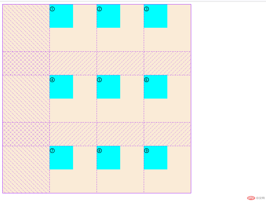
例:设置所有项目在“容器”中的垂直方向为”两端对齐”,水平方向左对齐 ,语法
place-content:space-between;,如下:
body .container {background-color: antiquewhite;width: 40em;height: 40em;/* 创建grid容器 */display: grid;/* 简写 设置3例2行的网格*/grid-template-columns: repeat(3, 10em);grid-template-rows: repeat(2, 10em);/* 设置所有项目在“容器”中的垂直方向为"两端对齐",水平方向左对齐 */place-content:space-between end;}
grid网格布局和flex弹性盒子中的属性place-items用法大致相同,place-items属性在flex只能控制一个方向排列(单值),而在grid中可以同时控制垂直和水平方向排列(双值):第一个值控制垂直方向,第二值控制水平方向
| 序号 | 属性 | 描述 |
|---|---|---|
| 1 | start |
顶(左)对齐: 项目在网格单元中终止线开始排列 |
| 2 | end |
底(右)对齐: 项目在网格单元中终止线开始排列 |
| 3 | center |
居中对齐: 项目在网格单元中居中排列 |
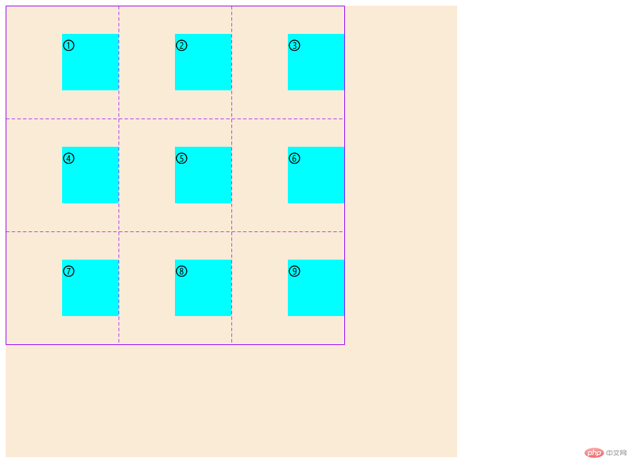
例:设置所有项目垂直方向居中显示,水平方向右对齐显示,语法:
place-items:center end;
<div class="container"><div class="item">①</div><div class="item">②</div><div class="item">③</div><div class="item">④</div><div class="item">⑤</div><div class="item">⑥</div><div class="item">⑦</div><div class="item">⑧</div><div class="item">⑨</div></div><style>body .container {background-color: antiquewhite;width: 40em;height: 40em;/* 创建grid容器 */display: grid;grid-template-columns: repeat(3, 10em);grid-template-rows: repeat(3, 10em);/* 设置项目垂直方向居中显示,水平方向右对齐显示 */place-items:center end;}body .container .item {width: 80px;height: 80px;background-color: aqua;font-size: 22px;}</style>
grid网格布局和flex弹性盒子中的属性place-self用法大致相同,place-self属性在flex只能控制一个方向排列(单值),而在grid中可以同时控制垂直和水平方向排列(双值):第一个值控制垂直方向,第二值控制水平方向
| 序号 | 属性 | 描述 |
|---|---|---|
| 1 | start |
顶(右)对齐: 项目在网格区域中以起始线开始排列 |
| 2 | end |
底(左)对齐: 项目在网格区域中以终止线开始排列 |
| 3 | center |
居中对齐: 项目在交叉轴中居中显示 |
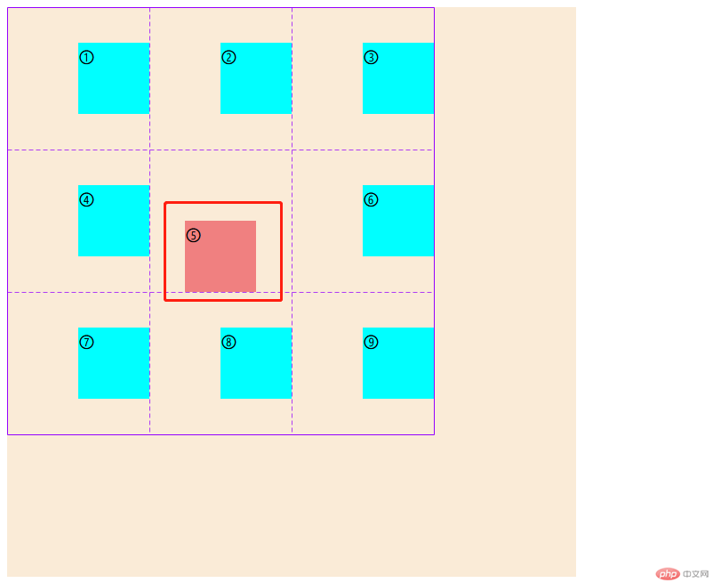
例:设置第5个项目垂直方向底对齐显示,水平方向居中显示,语法:
place-self:end center;
<div class="container"><div class="item">①</div><div class="item">②</div><div class="item">③</div><div class="item">④</div><div class="item">⑤</div><div class="item">⑥</div><div class="item">⑦</div><div class="item">⑧</div><div class="item">⑨</div></div><style>body .container {background-color: antiquewhite;width: 40em;height: 40em;/* 创建grid容器 */display: grid;grid-template-columns: repeat(3, 10em);grid-template-rows: repeat(3, 10em);/* 设置项目垂直方向居中显示,水平方向底对齐显示 */place-items:center end;}body .container .item {width: 80px;height: 80px;background-color: aqua;font-size: 22px;}/* 获取第五个项目 */body .container .item:nth-last-of-type(5){background-color: lightcoral;/* 设置该项目垂直方向底对齐显示,水平方向居中显示 */place-self: end center;}</style>

Copyright 2014-2025 https://www.php.cn/ All Rights Reserved | php.cn | 湘ICP备2023035733号


