


 收藏
收藏


 PHPz
PHPz批改状态:合格
老师批语:


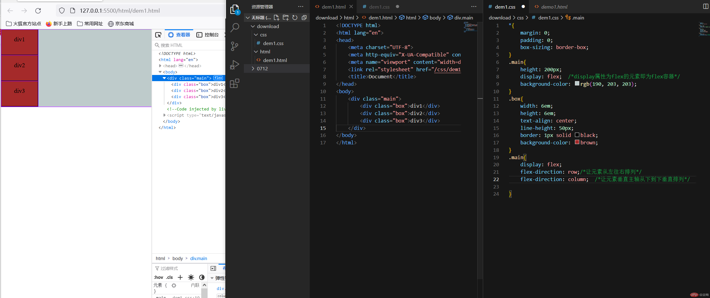
1.flex-direction: row; 让元素从左往右排列
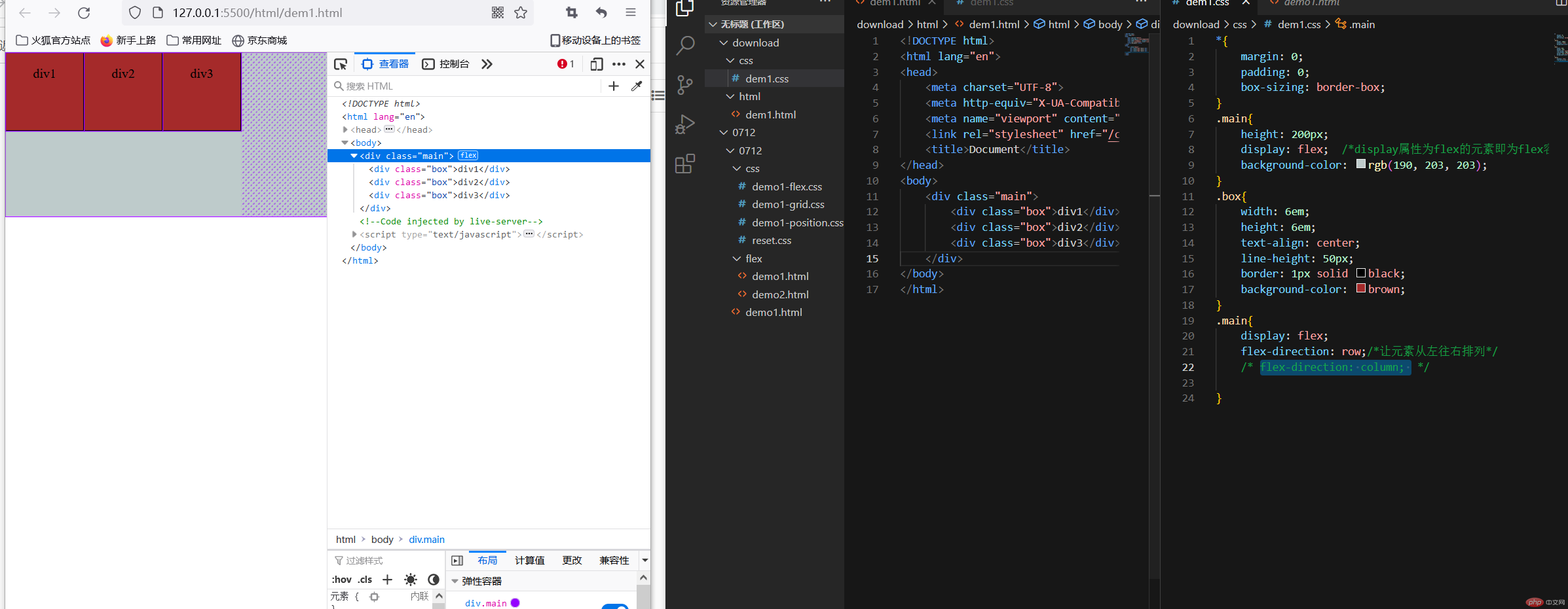
2.flex-direction: column:让元素垂直主轴从上到下垂直排列
flex-wrap: wrap:换行(默认是不允许换行(flex-wrap: nowrap)

| 属性 | 声明 |
|---|---|
| place-content: start | 将所有剩余空间全部分到了左边,所有项目从右边开始排列 |
| place-content: end; | 将所有剩余空间在所有项目左右二边平均分配 |
| place-content: center | 将所有剩余空间在两边分配 |
| place-content: space-between | 将剩余的项目两端对齐 |
| place-content: space-around | 分散对齐 |
| place-content: space-evenly | 平均对齐 |
第一种方案:使用place-content: start/place-content: end将所有剩余空间全部分到了左边,所有项目从右边开始排列
使用:place-content: center | 将所有剩余空间在两边分配 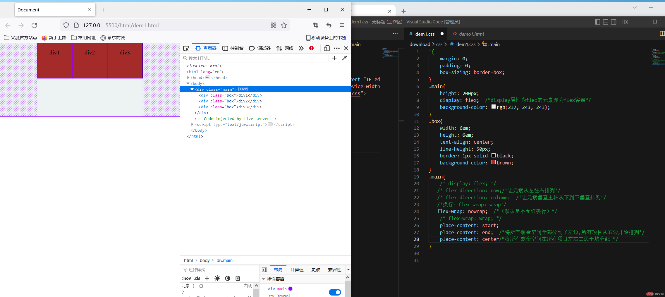
方案二: place-content: space-between 将剩余的项目两端对齐 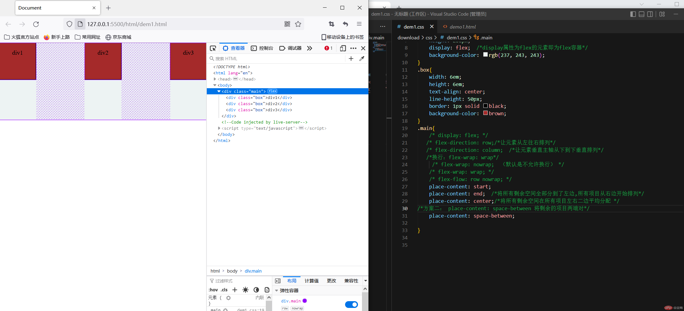
place-content: space-around | 分散对齐 |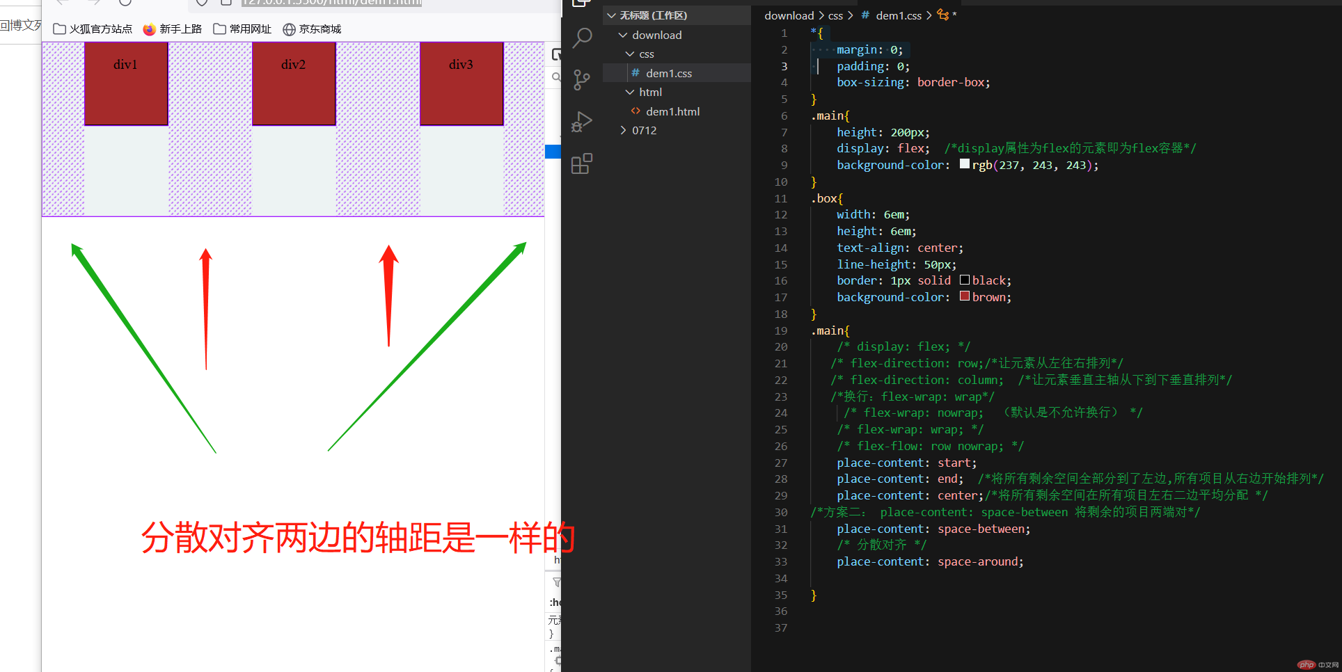
place-content: space-evenly | 平均对齐 |
place-items: stretch;(自动伸展)默认情况下自动伸展,当我们给box盒子添加高度的时候就会显示出来
place-items: stretch;(自动伸展)
place-items: start;(上对齐)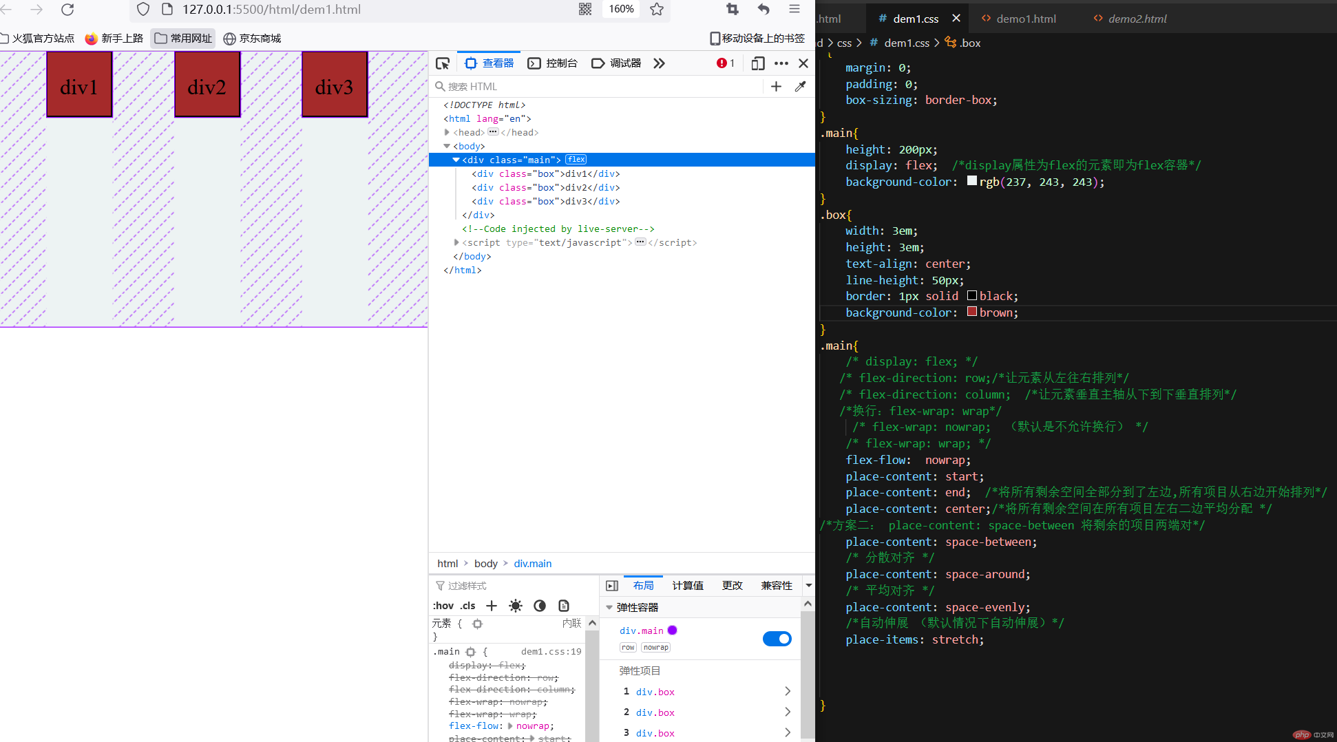
place-items: end;(下对齐)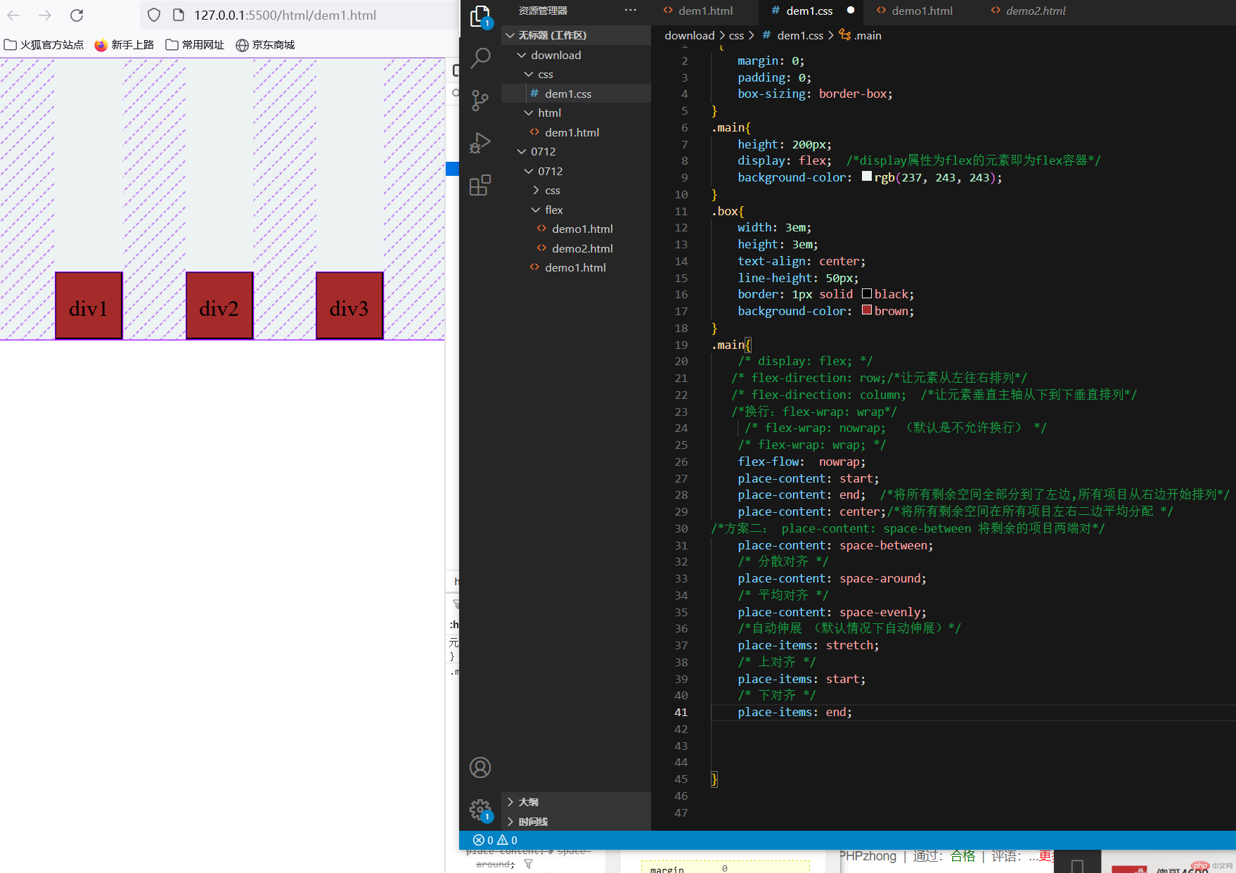
<!DOCTYPE html><html lang="en"><head><meta charset="UTF-8"><meta http-equiv="X-UA-Compatible" content="IE=edge"><meta name="viewport" content="width=device-width, initial-scale=1.0"><link rel="stylesheet" href="/css/dem1.css"><title>Document</title></head><style>*{margin: 0;padding: 0;box-sizing: border-box;}.main{height: 200px;display: flex; /*display属性为flex的元素即为flex容器*/background-color: rgb(237, 243, 243);}.box{width: 3em;text-align: center;line-height: 50px;border: 1px solid black;background-color: brown;}.main{/* display: flex; *//* flex-direction: row;/*让元素从左往右排列*//* flex-direction: column; /*让元素垂直主轴从下到下垂直排列*//*换行:flex-wrap: wrap*//* flex-wrap: nowrap; (默认是不允许换行) *//* flex-wrap: wrap; */flex-flow: nowrap;place-content: start;place-content: end; /*将所有剩余空间全部分到了左边,所有项目从右边开始排列*/place-content: center;/*将所有剩余空间在所有项目左右二边平均分配 *//*方案二: place-content: space-between 将剩余的项目两端对*/place-content: space-between;/* 分散对齐 */place-content: space-around;/* 平均对齐 */place-content: space-evenly;/*自动伸展 (默认情况下自动伸展)*/place-items: stretch;/* 上对齐 */place-items: start;/* 下对齐 */place-items: end;}</style><body><div class="main"><div class="box">div1</div><div class="box">div2</div><div class="box">div3</div></div></body></html>
当flex: 1 1 auto 设置第一个值是1的时候页面会随拉伸而放大
flex: 0 1 12em;如果设置了项目宽度,所以auto直接引用了width,在flex中设置了宽度的话会优先,因为flex
当没有设置宽度的时候我们flex属性的值设为flex: 1 1 auto; 页面即可进行响应式: 允许放大,允许缩小,宽度自动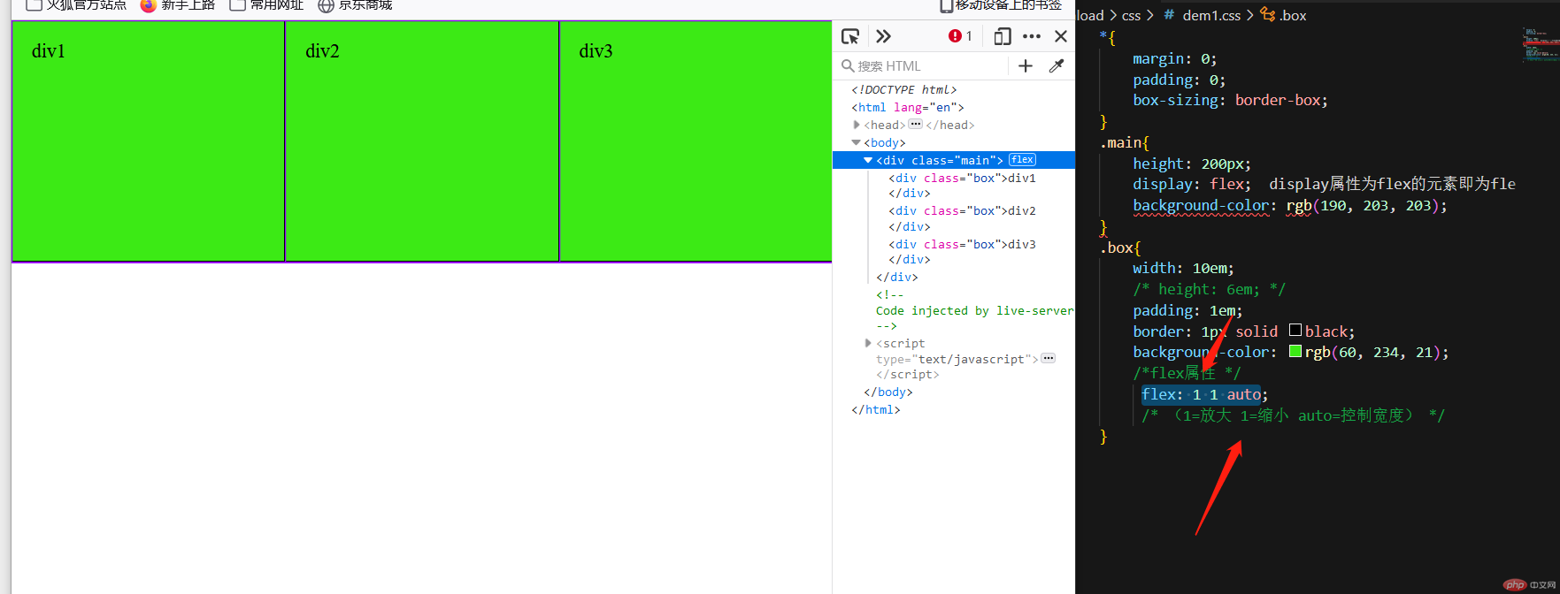
<!DOCTYPE html><html lang="en"><head><meta charset="UTF-8"><meta http-equiv="X-UA-Compatible" content="IE=edge"><meta name="viewport" content="width=device-width, initial-scale=1.0"><link rel="stylesheet" href="/css/dem1.css"><title>Document</title></head><style>* {margin: 0;padding: 0;box-sizing: border-box;}.container {display: flex;height: 20em;border: 1px solid #000;}.container > .item {/* width: 30em; *//* min-width: 15em; */padding: 1em;background-color: lightcyan;border: 1px solid #000;flex: 0 1 auto; /*默认值*/flex: 1 1 auto;/* 完全响应式: 允许放大,允许缩小,宽度自动 */}</style><body><div class="container"><div class="item">item1</div><div class="item">item2</div><div class="item">item3</div></div></body></html>
order:值越小越靠前,支持负数


Copyright 2014-2025 https://www.php.cn/ All Rights Reserved | php.cn | 湘ICP备2023035733号


