


 收藏
收藏


 PHPz
PHPz批改状态:合格
老师批语:漂亮


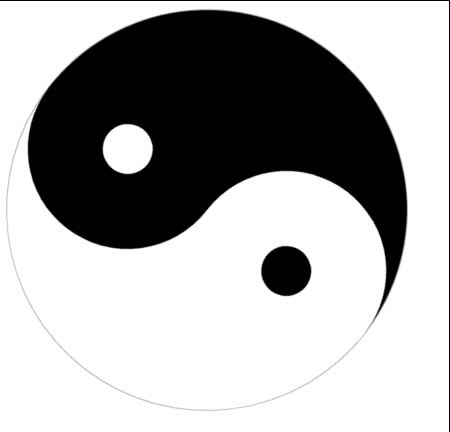
html 页面
<!DOCTYPE html><html lang="en"><head><meta charset="UTF-8"><title>Title</title><style>.dayuan{position: absolute;align-items: center;width: 400px;height: 400px;border: 1px solid darkgray;border-radius: 50%;}.heise{width: 400px;height: 200px;background: #000000;border-radius: 200px 200px 0 0;}.yuan-l{position: relative;top: -100px;display: flex;align-items: center;justify-content: center;float: left;width: 200px;height: 200px;background: #000000;border-radius: 50%;position: relative;}.yuan-r{position: relative;top: -100px;display: flex;align-items: center;justify-content: center;float: right;width: 200px;height: 200px;background: #ffffff;border-radius: 50%;}.xy-l{width: 50px;height: 50px;background: #fff;border-radius: 50%;}.xy-r{width: 50px;height: 50px;background: #000000;border-radius: 50%;}</style></head><body><div class="dayuan"><div class="heise"></div><div class="yuan-l"><div class="xy-l"></div></div><div class="yuan-r"><div class="xy-r"></div></div></div></body></html>
页面效果图

index.html 页面
<!DOCTYPE html><html lang="en"><head><meta charset="UTF-8"><title>Title</title><style>.dayuan{position: absolute;align-items: center;width: 400px;height: 400px;border: 1px solid darkgray;border-radius: 50%;animation: dayuan 8s linear infinite;/* 加上动画属性 8s是速度8秒 linear是均速 infinite是循环无限的 */}.heise{width: 400px;height: 200px;background: #000000;border-radius: 200px 200px 0 0;}.yuan-l{position: relative;top: -100px;display: flex;align-items: center;justify-content: center;float: left;width: 200px;height: 200px;background: #000000;border-radius: 50%;position: relative;}.yuan-r{position: relative;top: -100px;display: flex;align-items: center;justify-content: center;float: right;width: 200px;height: 200px;background: #ffffff;border-radius: 50%;}.xy-l{width: 50px;height: 50px;background: #fff;border-radius: 50%;}.xy-r{width: 50px;height: 50px;background: #000000;border-radius: 50%;}/* 加上动画属性:在CSS3中,可以利用transform功能来实现太极图像的旋转,rotate是旋转,deg为度的意思,正数为顺时针旋转,负数为逆时针旋转 */@keyframes dayuan{0%{transform: rotate(0deg);}100%{transform: rotate(-360deg);}}</style></head><body><div class="dayuan"><div class="heise"></div><div class="yuan-l"><div class="xy-l"></div></div><div class="yuan-r"><div class="xy-r"></div></div></div></body></html>
效果图如下
学习到了css的盒子模型和动画属性,这有好玩的动画,比如css中可以利用transform功能来实现图像的旋转、缩放、倾斜、移动等类型的变形处理。继续学习中,加油~

Copyright 2014-2025 https://www.php.cn/ All Rights Reserved | php.cn | 湘ICP备2023035733号


