


 收藏
收藏


 PHPz
PHPz批改状态:合格
老师批语:
margin: 20px;/* 外边距 */border: 10px;/* 边框 */padding: 20px;/* 内边距 */border-style: solid;/* 边框样式 */border-color: violet;/* 边框颜色 */background-clip: content-box;/* 背影在内容区显示 */box-sizing: border-box;/* 盒子大小与内容高、宽与内边距、边框之和 */
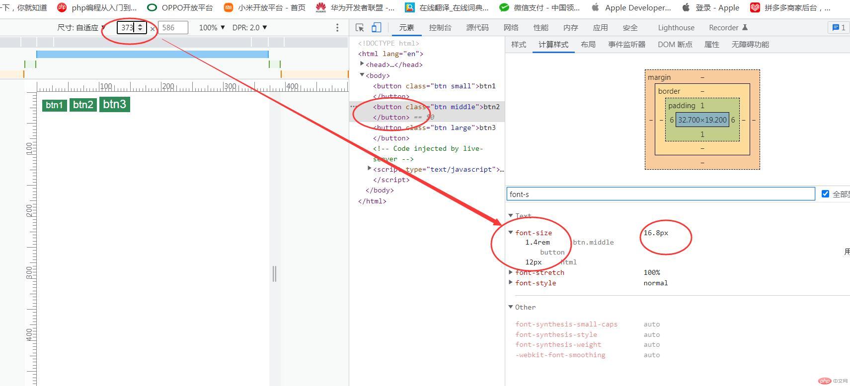
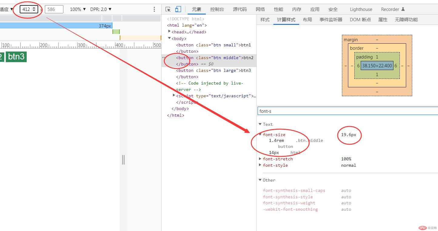
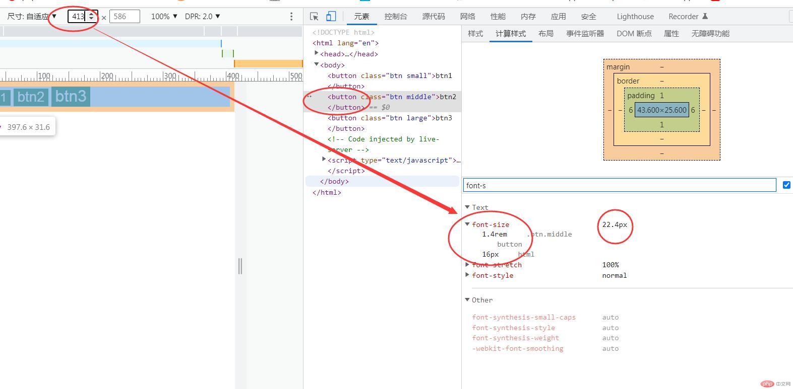
<!DOCTYPE html><html lang="en"><head><meta charset="UTF-8"><meta http-equiv="X-UA-Compatible" content="IE=edge"><meta name="viewport" content="width=device-width, initial-scale=1.0"><title>Document</title><style>.btn {border: none;outline: none;background-color: seagreen;color: white;}.btn:hover {cursor: pointer;opacity: 0.8;transition: 0.3s;padding: 0.4rem 0.8rem;}.btn.small {font-size: 1.2rem;}.btn.middle {font-size: 1.4rem;}.btn.large {font-size: 1.6rem;}@media (max-width:374px) {html {font-size: 12px;}}@media (min-width:374px) and (max-width:413px) {html {font-size: 14px;}}@media (min-width:413px) {html {font-size:16px;}}</style></head><body><button class="btn small">btn1</button><button class="btn middle">btn2</button><button class="btn large">btn3</button></body></html>
图例变化
1.当媒体宽度为373px时
2.当媒体宽度为412px时
3.当媒体宽度为413px时
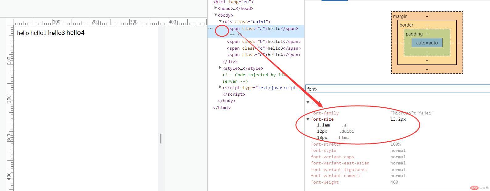
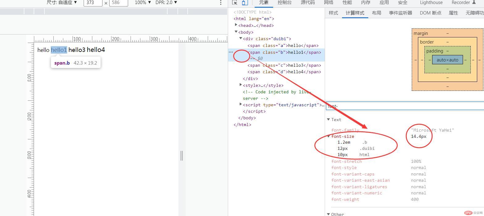
em是相对于自身或父元素字号,随着自身或父元素字号变化而变化
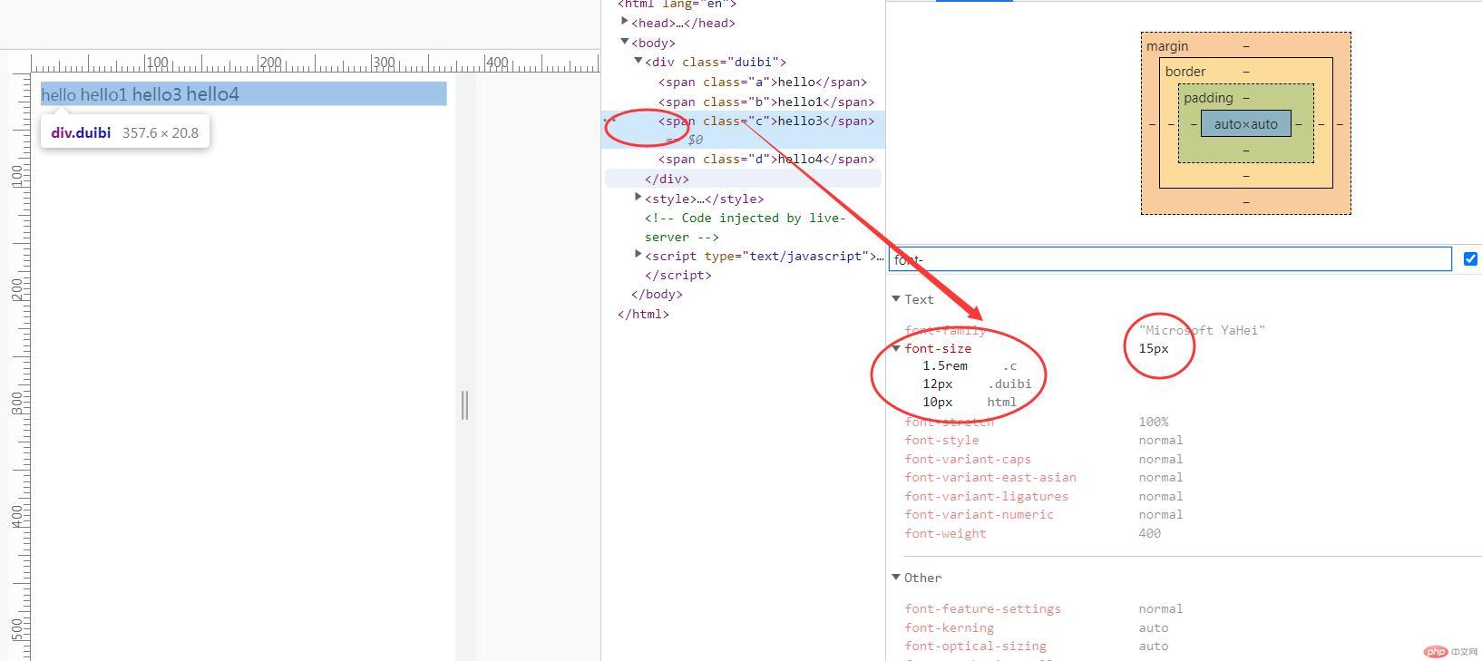
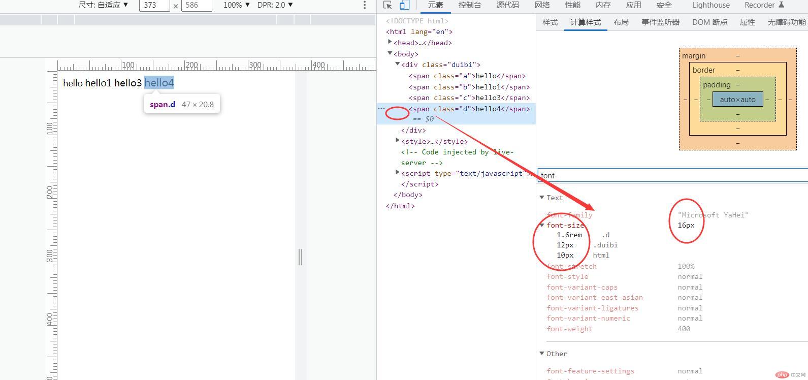
rem是相对于根元素字号,随着根元素变化而变化
<!DOCTYPE html><html lang="en"><head><meta charset="UTF-8"><meta http-equiv="X-UA-Compatible" content="IE=edge"><meta name="viewport" content="width=device-width, initial-scale=1.0"><title>Document</title></head><body><div class="duibi"><span class="a">hello</span><span class="b">hello1</span><span class="c">hello3</span><span class="d">hello4</span></div><style>html {font-size: 10px;}.duibi {font-size: 12px;}.a {font-size: 1.1em;}.b {font-size:1.2em;}.c {font-size:1.5rem}.d {font-size: 1.6rem;}</style></body></html>

Copyright 2014-2025 https://www.php.cn/ All Rights Reserved | php.cn | 湘ICP备2023035733号


