


 收藏
收藏


 PHPz
PHPz批改状态:合格
老师批语:
@media 查询当前视口宽度
<div class="box"><p><label for="user">用户名:</label><input type="text" name="user" placeholder="user@email.com" /></p><p><label for="password">密 码:</label><input type="password" name="password" placeholder="请输入密码" /></p><p><button>登录</button></p></div><style>html {font-size: 16px;}* {box-sizing: border-box;}.box {text-align: center;}button:hover {background-color: lightcoral;color: lightcyan;/* 透明度 */opacity: 0.8;/* 动画时间 */transition: 0.3s;}label {font-size: 0.5rem;}input {width: 5rem;height: 1rem;}button {width: 3rem;font-size: 0.5rem;}/* @media 查询当前视口宽度。根据视口宽度调整字体大小,进而控制元素大小。 *//* 视口宽 <= 2560px */@media (min-width: 2560px) {html {font-size: 80px;}}/* 1024px <= 视口宽 <= 2559px */@media (min-width: 1024px) and (max-width: 2559px) {html {font-size: 30px;}}/* 768px <= 视口宽 <= 1023px */@media (min-width: 768px) and (max-width: 1023px) {html {font-size: 20px;}}/* 视口宽 <= 767px */@media (max-width: 767px) {html {font-size: 16px;}}</style>
position: static(默认)、 relative、absolute、fixed
<div class="box"><p>父框架</p><div class="child child1">相对定位</div><div class="child child2">绝对定位</div><div class="child child3">固定定位</div></div><style>* {padding: 0;margin: 0;box-sizing: border-box;}div {border: 1px solid black;}.box {width: 500px;height: 100rem;margin: 0 auto;}.child {width: 100px;height: 100px;color: yellow;}.child.child1 {background-color: blueviolet;}.child.child2 {background-color: burlywood;}/* fixed : 固定定位固定定位: 是绝对定位的子集, 只不过他的定位包含块是固定的,永远是body */.child.child3 {background-color: darkgoldenrod;position: fixed;top: 70vh;left: 70vw;}/* relative : 相对定位相对定位元素仍然在文档流中,所占空间不释放,只有相对原位置进行了偏移 */.child.child1 {position: relative;top: 30px;left: 40px;}/* absolute:绝对定位 *//* 绝对定位, 不再相对于自身, 而是相对于它的包含块 *//* 而能充当绝对定位包含块的元素, 必须是"定位元素" *//* 定位元素: position 不能是 static 就可以了 *//* 如果绝对定位元素, 一直向上,找不到可定位的父级元素,就相对于body */.child.child2 {position: absolute;top: 10px;right: 100px;}</style>
图示: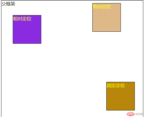
<div class="top"><span>模态框</span><button onclick="document.querySelector('.model').style.display='block'">登录</button></div><div class="model"><div class="login" onclick="this.parentNode.style.display='none'"></div><form action="" class="loginForm"><fieldset class="loginfieldset"><legend>用户登录</legend><label for="user">用户名: </label><input type="email" name="user" placeholder="user@mail.com" /><label for="password">密码: </label><input type="password" name="password" placeholder="请输入密码" /><button class="dl">登录</button></fieldset></form></div><style>/* flex 布局 *//* 用在容器中的属性 *//* flex-direction: row; *//* flex-direction: column; *//* flex-wrap: wrap; *//* 1. 主轴方向,是否换行? *//* flex-flow: row wrap; *//* 2. place-content: 容器中的剩余空间在项目之间进行分配 *//* place-content: start;place-content: end;place-content: center; *//* 二端对齐 *//* place-content: space-between; *//* 分散对齐 *//* place-content: space-around; *//* 平均对齐 *//* place-content: space-evenly; *//* 3. 项目在交叉轴上的对齐 *//* place-items: stretch;place-items: start;place-items: end;place-items: center; *//* flex容器上只需要记住三个属性就可以了 *//* 1. flex-flow: 主轴方向, 换行 *//* 2. place-content: 项目在主轴上的排列与空间分配 *//* 2. place-items: 项目在交叉轴上的对齐方式 */.top {padding: 1em;display: flex;flex-flow: row nowrap;height: 2em;border: 1px solid black;background-color: burlywood;place-content: space-between;place-items: stretch;}.dl {margin: 20px;border-radius: 0.5em;}.model {display: none;}.login {position: fixed;top: 0;left: 0;right: 0;bottom: 0;background-color: rgb(0, 0, 0, 0.5);}.loginForm {position: fixed;top: 40vh;left: 40vw;}.loginfieldset {display: grid;background-color: white;}legend {background-color: tomato;color: white;}</style>
图示: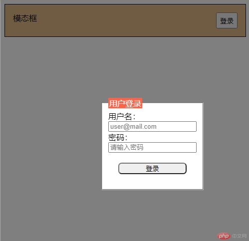

Copyright 2014-2025 https://www.php.cn/ All Rights Reserved | php.cn | 湘ICP备2023035733号


