


 收藏
收藏


 PHPz
PHPz批改状态:合格
老师批语:

1.1 移动优先案例解析
案例代码如下:
<body><!-- 媒体: 屏幕, 打印机 --><!-- 查询: 查询当前的屏幕的宽度变化 --><!-- 布局前提: 宽度受限, 而高度不受限的空间内进行布局 --><button class="btn small">按钮1</button><button class="btn middle">按钮2</button><button class="btn large">按钮3</button></body>
布局样式代码:
<style>html {font-size: 10px;}/* 按钮基本样式 */.btn {background-color: seagreen;color: white;border: none;outline: none;}.btn:hover {cursor: pointer;opacity: 0.8;transition: 0.3s;padding: 0.4rem 0.8rem;}/* 小按钮 */.btn.small {/* 1.2rem = 12px */font-size: 1.2rem;}/* 中按钮 */.btn.middle {/* 1.6rem = 16px */font-size: 1.6rem;}/* 中按钮 */.btn.large {/* 1.8rem = 18px */font-size: 1.8rem;}/* 只要动态的修改rem , 就可以实现动态的改变按钮大小 *//* 移动优先: 从最小的屏幕开始进行适配 *//* < 375px */@media (max-width: 374px) {html {font-size: 12px;}}/* 375px - 414px */@media (min-width: 375px) and (max-width: 413px) {html {font-size: 14px;}}/* > 414px */@media (min-width: 414px) {html {font-size: 16px;}}</style>
1.2 PC 优先案例解析
案例代码如下:
<body><button class="btn small">按钮1</button><button class="btn middle">按钮2</button><button class="btn large">按钮3</button></body>
布局样式代码:
<style>html {font-size: 10px;}/* 按钮基本样式 */.btn {background-color: seagreen;color: white;border: none;outline: none;}.btn:hover {cursor: pointer;opacity: 0.8;transition: 0.3s;padding: 0.4rem 0.8rem;}/* 小按钮 */.btn.small {/* 1.2rem = 12px */font-size: 1.2rem;}/* 中按钮 */.btn.middle {/* 1.6rem = 16px */font-size: 1.6rem;}/* 大按钮 */.btn.large {/* 1.8rem = 18px */font-size: 1.8rem;}/* PC优先: 从最大的屏幕开始进行适配 *//* > 1920px */@media (min-width: 1920px) {html {font-size: 16px;}}/* 1025px - 1919px */@media (min-width: 1025px) and (max-width: 1919px) {html {font-size: 14px;}}/* < 1024px */@media (max-width: 1024px) {html {font-size: 12px;}}</style>
2.1 静态定位:(position: static)文档流方式,显示顺序与书写顺序一致,完全由浏览器控制,根据元素在 html 文档中的顺序,也是没有定位。
2.2 相对定位:(position: relative)相对定位元素仍然在文档流中,所占空间不释放,只有相对原位置进行了偏移,指在自己原来的位置上进行偏移变化。
相对定位实例演示:
<!DOCTYPE html><html lang="zh-CN"><head><meta charset="UTF-8" /><meta http-equiv="X-UA-Compatible" content="IE=edge" /><meta name="viewport" content="width=device-width, initial-scale=1.0" /><title>相对定位:相对于自身原始位置的偏移</title></head><body><div class="box father"><div class="box child first"></div><div class="box child second"></div></div></body></html><style>body {border: 1px solid #000;}.box {border: 1px solid #000;}.box.father {width: 400px;height: 400px;background-color: lightcyan;}.box.child {width: 100px;height: 100px;background-color: yellow;}.box.child.first {background-color: red;position: relative;top: 30px;left: 30px;}</style>
效果图示例:(相对于自己本身的偏移)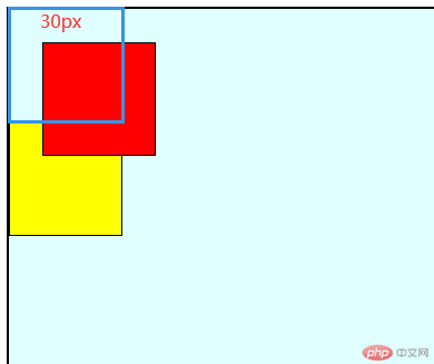
2.3 绝对定位:(position: absolute)不再相对于自身, 而是相对于它的包含块,定位元素: position 不能是 static 就可以了,如果绝对定位元素, 一直向上,找不到可定位的父级元素,就相对于 body 或者 html。
绝对定位实例演示:
<!DOCTYPE html><html lang="zh-CN"><head><meta charset="UTF-8" /><meta http-equiv="X-UA-Compatible" content="IE=edge" /><meta name="viewport" content="width=device-width, initial-scale=1.0" /><title>定位与定位元素</title></head><body><div class="box father"><div class="box child first"></div><div class="box child second"></div></div></body></html><style>body {border: 1px solid #000;}.box {border: 1px solid #000;}.box.father {width: 400px;height: 400px;background-color: lightcyan;}.box.child {width: 100px;height: 100px;background-color: yellow;}.box.child.first {background-color: red;position: relative;top: 30px;left: 30px;position: absolute;}.box.father {/* 设置定位参考父级/包含块,只要不是static 就可以了 */position: relative;}</style>
效果图示例:(相对于包含块的偏移)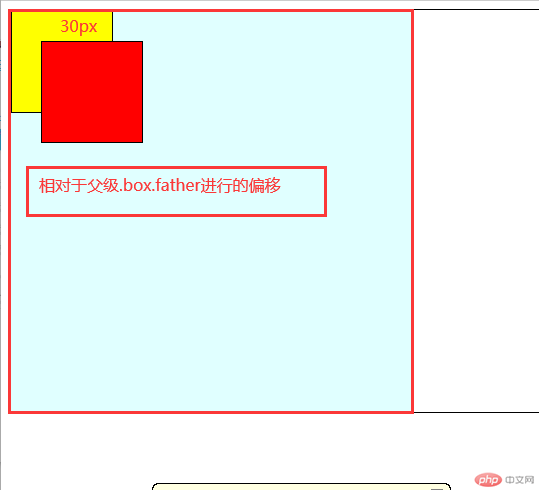
2.4 固定定位: (position: fixed)是绝对定位的子集, 只不过他的定位包含块是固定的,永远是 body
登录页面实例演示:
<!DOCTYPE html><html lang="zh-CN"><head><meta charset="UTF-8" /><meta http-equiv="X-UA-Compatible" content="IE=edge" /><meta name="viewport" content="width=device-width, initial-scale=1.0" /><title>固定定位演示代码</title></head><body><header><h2 class="title">固定定位实例</h2><!-- js点击事件暂未理解的,后续再做案例分析 --><button onclick="document.querySelector('.modal').style.display='block'">登录</button></header><!-- 模态框 --><div class="modal"><!-- 1. 半透明的遮罩 --><!-- 点击遮罩,关闭表单 --><div class="modal-bg" onclick="this.parentNode.style.display='none'"></div><!-- 2. 弹层表单 --><form action="" class="modal-form"><fieldset style="display: grid; gap: 1em"><legend>用户登录</legend><input type="email" name="email" placeholder="guding@php.cn" /><input type="password" name="password" placeholder="不少于6位" /><button>登录</button></fieldset></form></div><style>/* 初始化 */* {margin: 0;padding: 0;box-sizing: border-box;}/* 头部样式采用flex容器布局开始 */header {background-color: lightseagreen;padding: 0.5em 1em;display: flex;}/* 标题logo */header .title {font-weight: lighter;font-style: italic;color: white;text-shadow: 1px 1px 1px #555;letter-spacing: 1px;}/* 登录按钮 */header button {margin-left: auto;width: 5em;border: none;border-radius: 0.5em;}header button:hover {cursor: pointer;background-color: coral;color: white;box-shadow: 0 0 5px #fff;transition: 0.3s;}/* 模态框表单 */.modal .modal-form fieldset {background-color: lightcyan;border: none;padding: 2em;box-shadow: 0 0 5px #888;}/* 模态框表单标题 */.modal .modal-form fieldset legend {padding: 5px 1em;background-color: rebeccapurple;color: white;}.modal .modal-form {/* 固定定位 */position: fixed;/* 顶部要留出头部导航的位置,top:距离顶部的多少 */top: 10em;/* 左右相等,将表单挤到正中间,固定在中部 */left: 20em;right: 20em;}/* 半透明的遮罩 */.modal .modal-bg {/* 固定布局,定位空间在整个屏幕 */position: fixed;/* 屏幕视口的四个顶点的坐标,全部为0时候是覆盖整个页面 */top: 0;left: 0;right: 0;bottom: 0;/* 背景半透明,前三个数据为rgb的参数,第四个参数为透明度 */background-color: rgb(0, 0, 0, 0.5);}/* 初始化时将模态框弹层隐藏 */.modal {display: none;}</style></body></html>
效果图示例:(相对于 body/html 的偏移)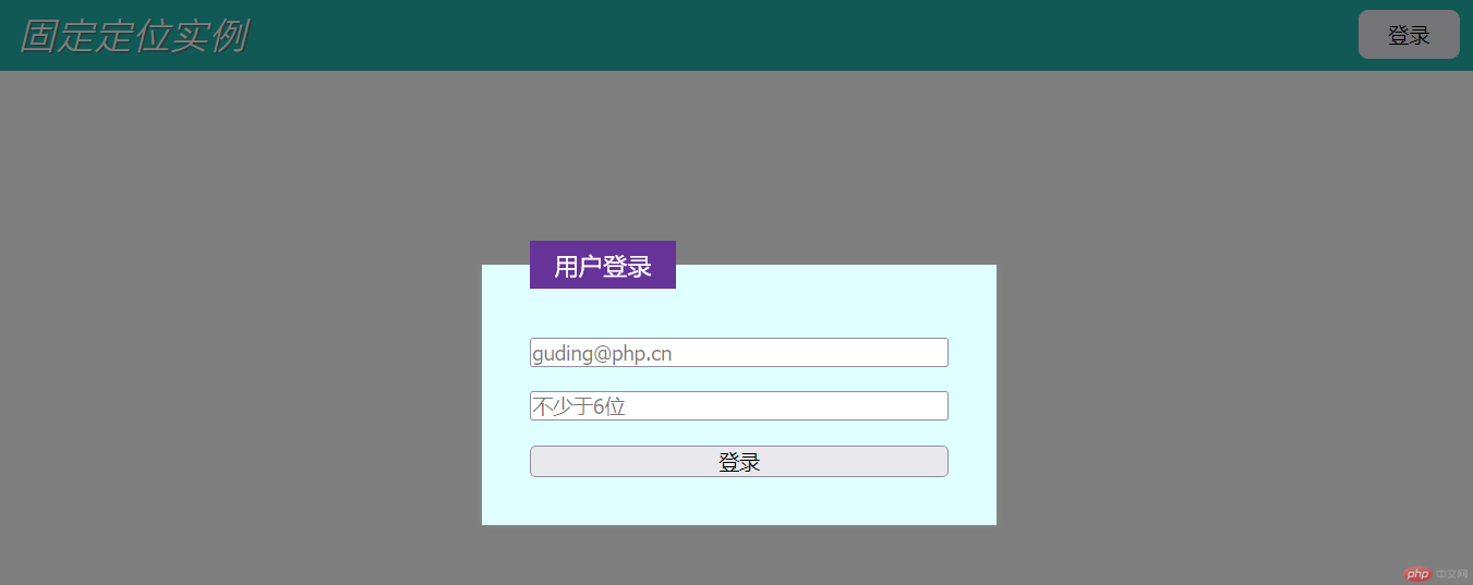
3.1 flex-flow 的常用属性值
| 常用参数 | 参数的值 | 代码 | 说明 |
|---|---|---|---|
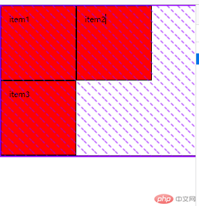
| flex-flow | row wrap | flex-flow: row wrap | 左对齐允许换行 |
| flex-flow | row-reverse wrap | flex-flow: row-reverse wrap | 右对齐允许换行 |
| flex-flow | row nowrap | flex-flow: row nowrap | 左对齐不允许换行 |
| flex-flow | row-reverse nowrap | flex-flow: row-reverse nowrap | 右对齐不允许换行 |
项目属性实例 1:
<!DOCTYPE html><html lang="zh-CN"><head><meta charset="UTF-8" /><meta http-equiv="X-UA-Compatible" content="IE=edge" /><meta name="viewport" content="width=device-width, initial-scale=1.0" /><title>flex项目属性实例1</title></head><body><div class="container"><div class="item">item1</div><div class="item">item2</div><div class="item">item3</div></div><style>* {padding: 0;margin: 0;box-sizing: border-box;}html {font-size: 10px;}.container {display: flex;height: 20em;border: 1px solid;}.container > .item {width: 10em;padding: 1em;background-color: red;border: 1px solid;}.container {/* 左对齐允许换行 */flex-flow: row wrap;/* 右对齐允许换行 */flex-flow: row-reverse wrap;/* 左对齐不允许换行 */flex-flow: row nowrap;/* 右对齐,不允许换行 */flex-flow: row-reverse nowrap;}</style></body></html>
效果图 1:左对齐允许换行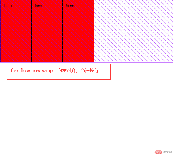
效果图 2:右对齐允许换行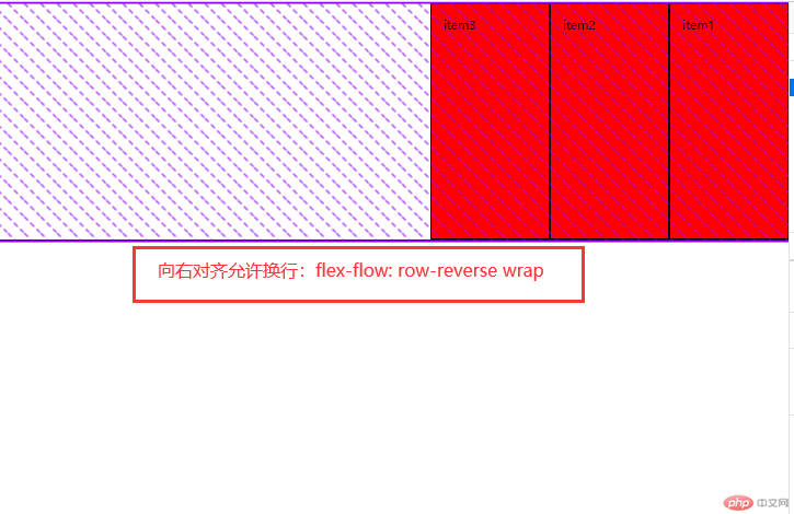
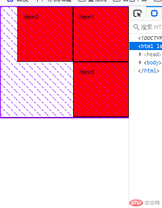
效果图 3:左对齐不允许换行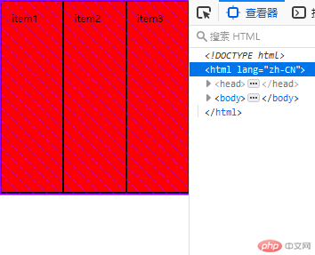
效果图 4:右对齐不允许换行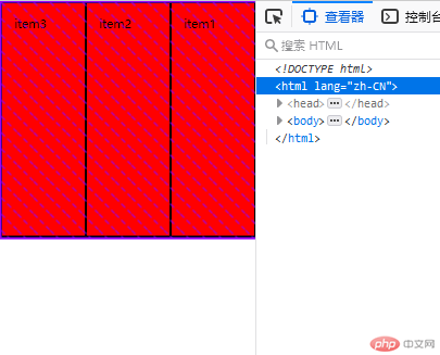
3.2 place-content 的常用属性值(项目在容器主轴上剩余空间的分配)
| 常用参数 | 参数的值 | 代码 | 说明 |
|---|---|---|---|
| place-content | start | place-content: start | 项目左对齐分配 |
| place-content | center | place-content: center | 项目居中分配 |
| place-content | end | place-content: end | 项目右对齐分配 |
| place-content | space-between | place-content: space-between | 项目两端分配 |
| place-content | space-around | place-content: space-around | 项目分散分配 |
| place-content | space-evenly | place-content: space-evenly | 项目平均分配 |
项目属性实例:
<!DOCTYPE html><html lang="zh-CN"><head><meta charset="UTF-8" /><meta http-equiv="X-UA-Compatible" content="IE=edge" /><meta name="viewport" content="width=device-width, initial-scale=1.0" /><title>flex项目属性实例2</title></head><body><div class="container"><div class="item">item1</div><div class="item">item2</div><div class="item">item3</div></div><style>* {padding: 0;margin: 0;box-sizing: border-box;}html {font-size: 10px;}.container {display: flex;height: 20em;border: 1px solid;}.container > .item {width: 10em;padding: 1em;background-color: red;border: 1px solid;}.container {/* 项目左对齐分配,允许收缩 */place-content: start;/* 项目居中分配,允许收缩 */place-content: center;/* 项目右对齐分配,允许收缩 */place-content: end;/* 项目两端分配,允许收缩 */place-content: space-between;/* 项目分散分配,首尾两段间隔与中间不一样,允许收缩 */place-content: space-around;/* 项目平均分配,首尾两段间隔与中间都一样,允许收缩 */place-content: space-evenly;}</style></body></html>
效果图 1:项目左对齐分配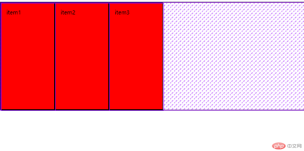
效果图 2:项目居中对齐分配,允许收缩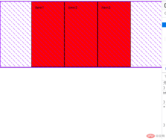
效果图 3:项目右对齐分配(和flow的右对齐顺序不同)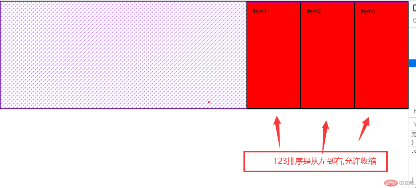
效果图 4:项目两端分配,允许收缩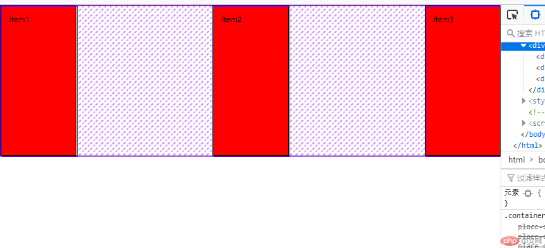
效果图 5:项目分散对齐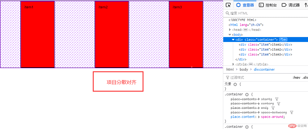
效果图 6:项目平均分配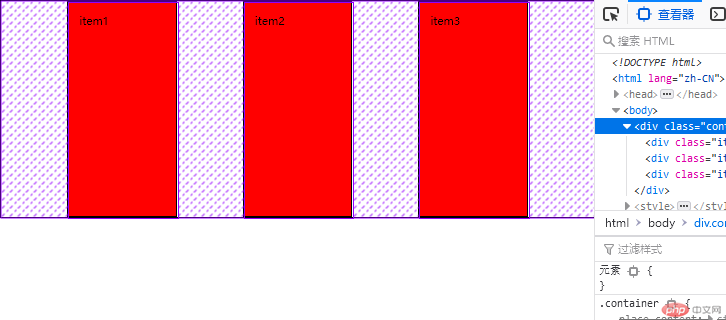
3.3 place-items 的常用属性值(项目在交叉轴上的对齐,因交叉轴无剩余空间概念,所以无法再分配)
| 常用参数 | 参数的值 | 代码 | 说明 |
|---|---|---|---|
| place-items | start | place-items: start | 向上排列 |
| place-items | center | place-items: center | 居中排列 |
| place-items | end | place-items: end | 向下排列 |
| place-items | stretch | place-items: stretch | 拉伸占满 |
交叉轴属性实例演示:
<!DOCTYPE html><html lang="zh-CN"><head><meta charset="UTF-8" /><meta http-equiv="X-UA-Compatible" content="IE=edge" /><meta name="viewport" content="width=device-width, initial-scale=1.0" /><title>flex项目属性实例</title></head><body><div class="container"><div class="item">item1</div><div class="item">item2</div><div class="item">item3</div></div><style>* {padding: 0;margin: 0;box-sizing: border-box;}html {font-size: 10px;}.container {display: flex;height: 20em;border: 1px solid;}.container > .item {width: 10em;padding: 1em;background-color: red;border: 1px solid;}.container {/* 向上对齐 */place-items: start;/* 居中对齐 */place-items: center;/* 向下对齐 */place-items: end;/* 拉伸占满 */place-items: stretch;}</style></body></html>
交叉轴的实例图
效果图 1:项目向上排列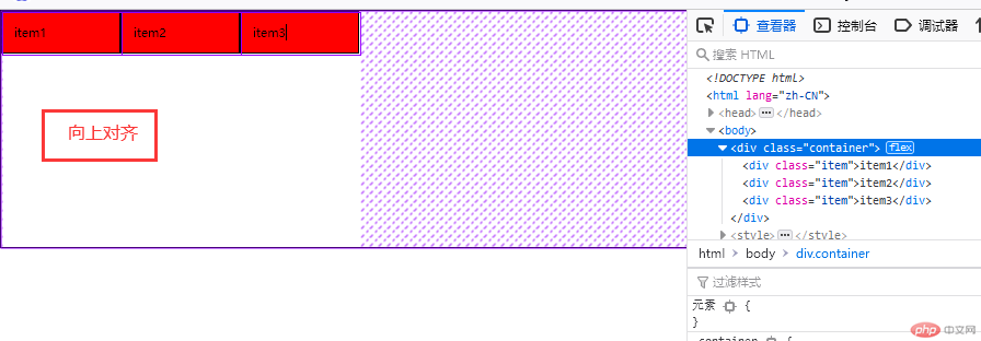
效果图 2:项目居中排列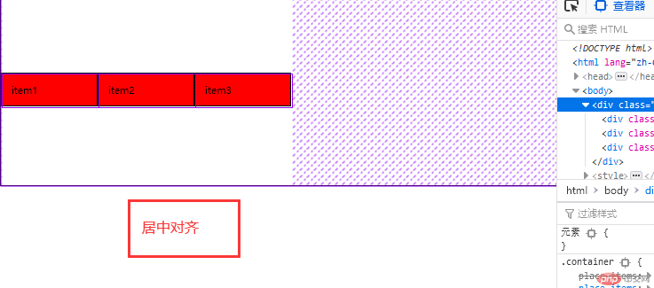
效果图 3:项目向下排列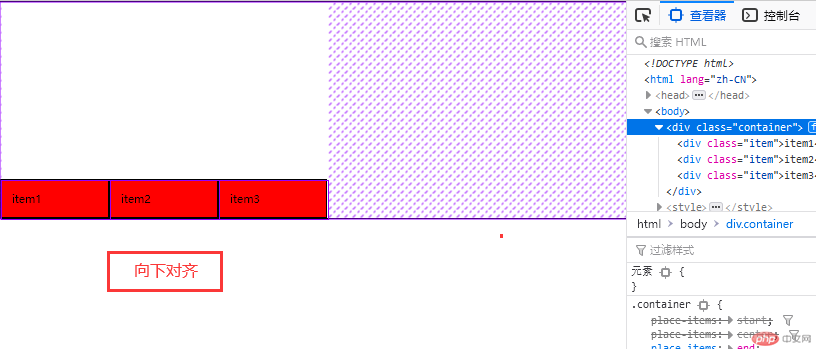
效果图 4:项目拉伸占满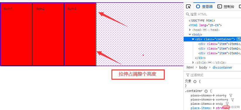
3.4 flex 的三个值解析(是否放大,是否缩小,计算宽度)
其中 flex 计算宽度的权重大小为 max-width > 计算宽度 > width
| 代码 | 简化 | 说明 |
|---|---|---|
| flex: 0 1 auto | flex: initial | 默认值,禁止放大允许缩小 |
| flex: 1 1 auto | flex: auto | 允许放大缩小,完全响应式 |
| flex: 0 0 auto | flex: none | 用于 PC 端完全失去响应式 |
| flex:1 | flex-grow:1 | 允许放大缩小,完全响应式 |
| flex: 1 300px; | 无 | 允许缩小,可以放大到 300px,然后固定。 |
3.5 flex 内的 order 值
每个项目的默认顺序是 0,order 的值越大,越靠后。

Copyright 2014-2025 https://www.php.cn/ All Rights Reserved | php.cn | 湘ICP备2023035733号


