


 收藏
收藏


 PHPz
PHPz批改状态:合格
老师批语:
响应式布局的最大特点就是随着设备屏幕的大小改变,页面布局发生改变。
而我们一般的布局前提是宽度受限而高度不受限的空间。
以下,我们一PC端布局为例,进行响应式布局的解析:
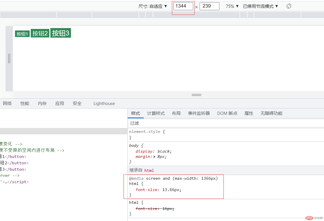
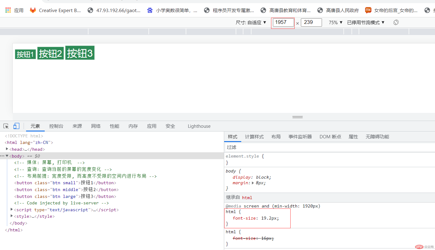
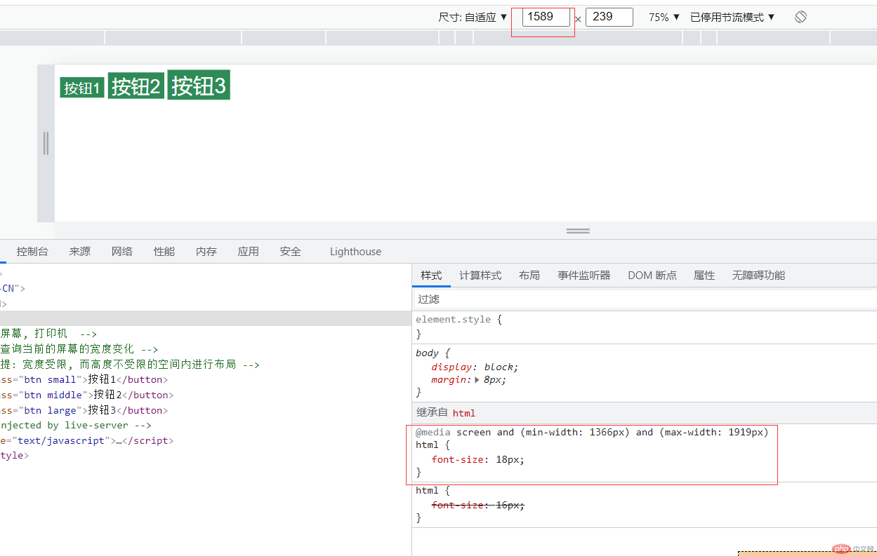
首先页面中有三个按钮
<button class="btn small">按钮1</button><button class="btn middle">按钮2</button><button class="btn large">按钮3</button><style>/* 小按钮 */.btn.small {font-size: 1.2rem;}/* 中按钮 */.btn.middle {font-size: 1.6rem;}/* 大按钮 */.btn.large {font-size: 1.8rem;}</style>
html {font-size: 16px;}
@media (max-width : 1366px) {html {font-size:13.66px;}}
@media (min-width : 1920px){html {font-size:19.2px;}}
@media (min-width:1366px) and (max-width:1919px) {html {font-size:18px;}}
综上,我们可以总结一下响应式布局的写法,首先基本语法是@media开头,有两种写法:@media only screen and (max-width:XXXpx)=@media (max-width:XXXpx);
其中的max-width的含义为当屏幕宽度小于XX值的时候,min-width的含义为当屏幕宽度大于XX值的时候。即画一条轴来表示: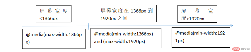
首先分析一下需求,我们需要一个登录页面的蒙层,那么势必是有一个原始页面,然后点击登录按钮之后,触发蒙层页面显示。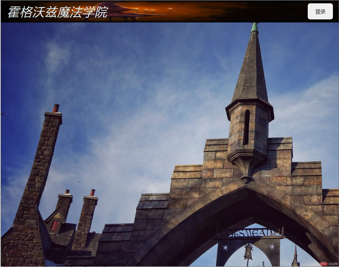
那么我这写了一个很简单的原始页面,有个头部,头部有个登录按钮,然后有一些简单的样式
<header><h1 class="title">霍格沃兹魔法学院</h1><button onclick="document.querySelector('.modal').style.display='block'">登录</button></header><style>/* 初始化 */* {margin: 0;padding: 0;box-sizing: border-box;}body {background-image: url('images/bg.jpg');}header {background-image: url('images/mao.jpg');background-size: 100% 100%;padding: 0.5em 1em;display: flex;}header .title {font-weight: lighter; /*设置文本的粗细,normal默认,bold加粗,bolder更粗的,lighter更细的,或数字*/font-style: italic; /*设置文本样式,normal默认,italic斜体,oblique倾斜的*/color: azure;text-shadow: 1px 1px 1px #555; /*文本阴影效果 水平阴影位置,垂直阴影位置,模糊距离,颜色*/letter-spacing: 1px; /*设置h1,h2字母间距*/}header button {margin-left: auto;width: 5em;border: none;border-radius: 0.5em;}header button:hover {background-color: blueviolet;color: white;cursor: pointer; /*圆角*/box-shadow: 0 0 10px white;transition: 0.3s;}</style>
重点来了,写一个登录表单,在页面点击登录的时候跳出来
<!-- 模态框表单 --><div class="modal"><divclass="modal-bg"onclick="this.parentNode.style.display='none'"></div><form action="a.php" method="post" class="modal-form"><fieldset style="display: grid; gap: 1em;"><legend>用户登录</legend><input type="email" name="email" placeholder="email@email.com" /><input type="password" name="password" placeholder="******" /><button>登录</button></fieldset></form></div>
/* 模态框表单 */.modal .modal-form fieldset {background-color: lightcyan;border: none;padding: 2em;box-shadow: 0 0 5px #888;}/* 模态框表单标题 */.modal .modal-form fieldset legend {padding: 5px 1em;background-color: rebeccapurple;color: white;}.modal .modal-form {/* 固定定位 */position: fixed;/* 顶部留出预留 */top: 15em;/* 左右相等,把表单放正中间 */left: 20em;right: 20em;}.modal .modal-bg {position: fixed;/*全部铺满*/top: 0;left: 0;right: 0;bottom: 0;background-color: rgb(0, 0, 0, 0.5); /*0.5透明度*/}.modal {display: none;}
那么来看一下神奇的效果吧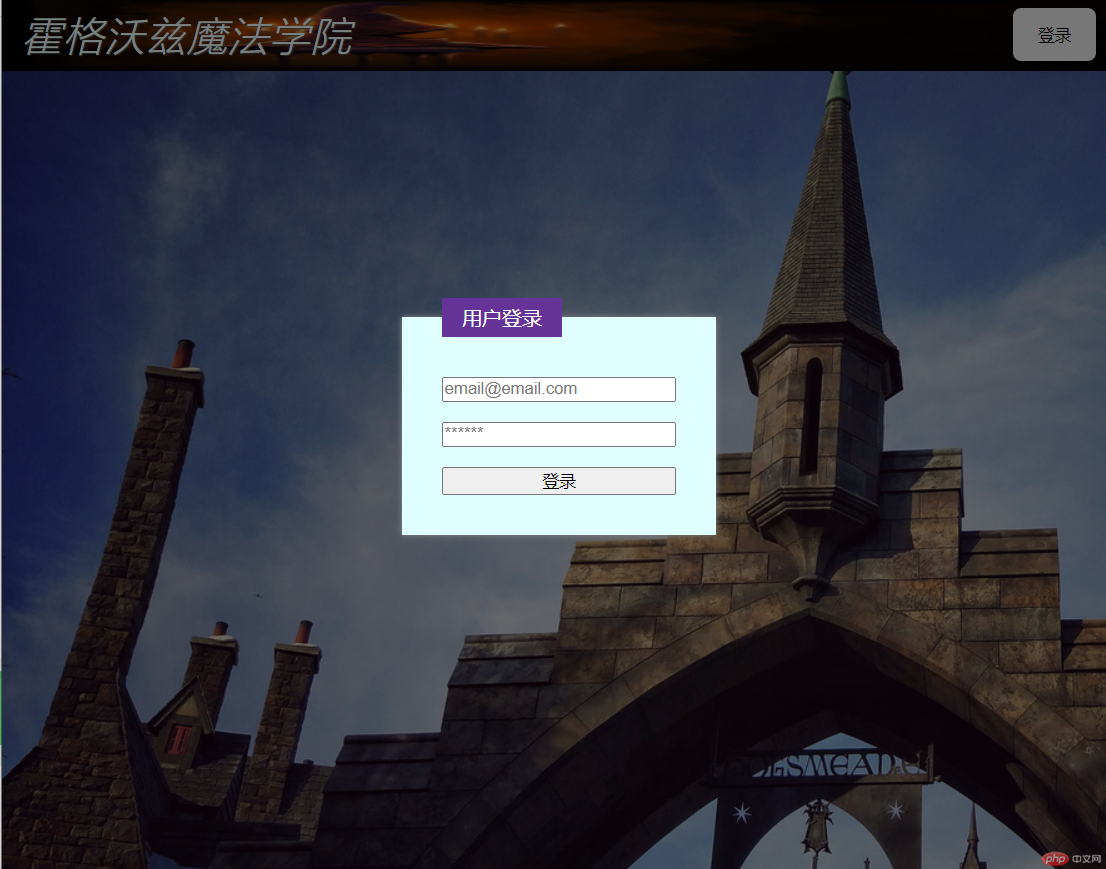
定义一个flex布局的容器:display:flex
flex容器中的子元素被称为弹性项目或flex项目;
flex容器上只要记住三个属性就可以了:flex-flow:主轴方向 换行,例:flex-flow:row nowrap(不换行【wrap为可换行】)
place-content:项目在主轴上的排列和剩余空间的分配【值:start起始边对齐,end结束边对齐,center居中对齐,space-between两端对齐,space-around分散对齐,space-evenly平均对齐】
place-items:项目在交叉轴上的对齐方式【值:stretch如果子项加起来的尺寸小于对齐容器的尺寸,则任何未尺寸为 auto 的项将增加同等的大小(不是按比例),但也会受到 max-height/max-width (或等同的功能)的限制,因此所有项刚好能填满对齐容器;start:起始边对齐;end:结束边对齐;center:居中对齐】
flex 属性用于设置或检索弹性盒模型对象的子元素如何分配空间。
flex 属性是 flex-grow、flex-shrink 和 flex-basis 属性的简写属性。
注意:如果元素不是弹性盒模型对象的子元素,则 flex 属性不起作用。
flex:放大因子 收缩因子 计算宽度
| 参数 | 备注 |
|---|---|
| 放大因子(flex-grow): | 一个数字,规定项目将相对于其他灵活的项目进行扩展的量。 |
| 收缩因子(flex-shrink): | 一个数字,规定项目将相对于其他灵活的项目进行收缩的量。 |
| 计算宽度(flex-basis): | 项目的长度。合法值:”auto”、”inherit” 或一个后跟 “%”、”px”、”em” 或任何其他长度单位的数字。 |
| auto | = 1 1 auto |
| none | = 0 0 auto |
| initial | = 0 1 auto (默认值) |
| inherit | 从父级继承 |
另外flex的项目上还可以设置order属性,order=0的时候是默认值,order=1的时候会往后排,order=-1会往前排,也就是order越小越靠前!

Copyright 2014-2025 https://www.php.cn/ All Rights Reserved | php.cn | 湘ICP备2023035733号


