


 收藏
收藏


 PHPz
PHPz批改状态:合格
老师批语:
示例代码1:
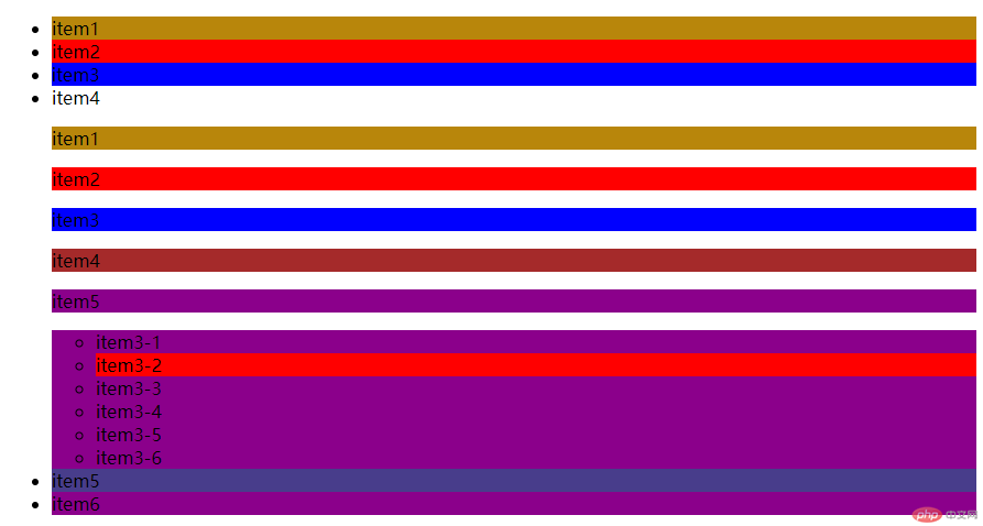
<!DOCTYPE html><html lang="en"><head><meta charset="UTF-8" /><meta http-equiv="X-UA-Compatible" content="IE=edge" /><meta name="viewport" content="width=device-width, initial-scale=1.0" /><title>伪类</title></head><body><ul class="list"><li>item1</li><li>item2</li><li>item3</li><li>item4</li><p>item1</p><p>item2</p><p>item3</p><p>item4</p><p>item5</p><ul><li>item3-1</li><li>item3-2</li><li>item3-3</li><li>item3-4</li><li>item3-5</li><li>item3-6</li></ul><li>item5</li><li>item6</li></ul><style>/* :nth-of-type()分组匹配,在匹配之前将元素根据类型进行分组后再匹配 *//* 通过空格符号,选择当前父元素中的第2个子元素li,同时孙子元素的第2个也起 */.list :nth-of-type(2) {background-color: red;}/* 通过>符号,选择当前父元素中的第3个子元素li,仅第3个子元素起作用 */.list > :nth-of-type(3) {background-color: blue;}/* 通过>符号,选择当前父元素中的第4个子元素p,仅第4个子元素起作用 */.list > p:nth-of-type(4) {background-color: brown;}/* 通过*符号,选择当前父元素中的第5个子元素,所有第5个子元素起作用 */.list > *:nth-of-type(5) {background-color: chartreuse;}/* 去掉集合中的第6个li元素,not就是在一个集合中去掉某一些元素 */.list > :nth-of-type(6) :not(li:nth-of-type(6)) {background-color: cyan;}/* 选中第一个 */.list > :nth-of-type(1) {background-color: cyan;}.list > :first-of-type {background-color: darkgoldenrod;}/* 选中最后一个 */.list > :last-of-type {background-color: darkmagenta;}/* 倒数选择第2个 */.list > li:nth-last-of-type(2) {background-color: darkslateblue;}</style></body></html>
示例代码2
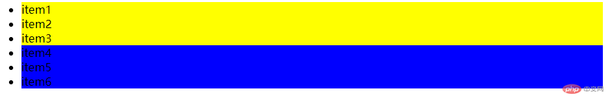
<!DOCTYPE html><html lang="en"><head><meta charset="UTF-8" /><meta http-equiv="X-UA-Compatible" content="IE=edge" /><meta name="viewport" content="width=device-width, initial-scale=1.0" /><title>伪类选择器的参数</title></head><body><ul class="list"><li>item1</li><li>item2</li><li>item3</li><li>item4</li><li>item5</li><li>item6</li></ul><style>/* :nth-of-type(参数) *//* 参数公式=an+b a,n,b的取值为[0,1,2,3……] *//* a:系数 n:计数器 b:偏移量 *//* 元素的有效编号必须从1开始,n是从0开始,b是从0开始 *//* :nth-of-type(3)===> : nth-of-type(0n+3) */.list :nth-of-type(0n + 3) {background-color: red;}/* 1n+b: 选择从第几个开始 */.list :nth-of-type(1n + 2) {background-color: salmon;}/* even:偶数 */.list :nth-of-type(2n) {background-color: slateblue;}.list :nth-of-type(even) {background-color: slateblue;}/* 奇数: */.list :nth-of-type(2n + 1) {background-color: teal;}.list :nth-of-type(odd) {background-color: teal;}/* 选择前三个 */.list > :nth-of-type(-n + 3) {background-color: yellow;}/* 选择后三个 */.list > :nth-last-of-type(-n + 3) {background-color: blue;}</style></body></html>
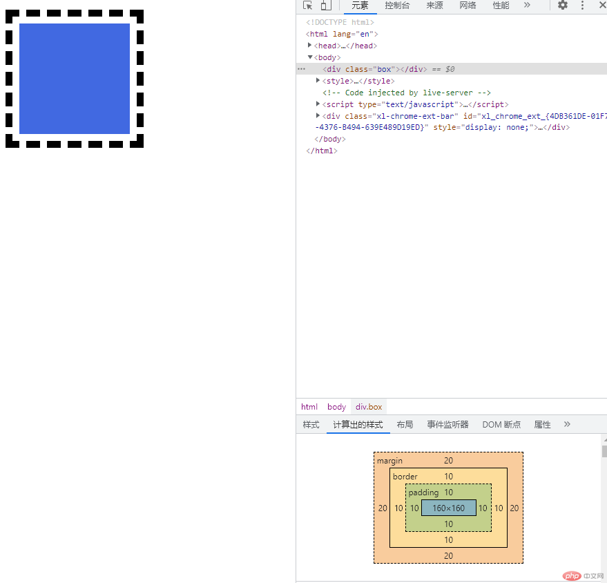
box-sizing: content-boxbox-sizing: border-box
<div class="box"></div><style>.box {width: 200px;height: 200px;border: 10px solid currentColor;background-color: royalblue;border: 10px dashed currentColor;background-clip: content-box;/* 内边距 位于边框与内容区之间的区域,呼吸区*/padding: 20px;/* box-sizing来指定内容区的边界在哪里 *//* 默认height、width就是内容区大小 *//* content-box:在宽度和高度之外绘制元素的内边距和边框 */box-sizing: content-box;/* 通过收缩原来内容区的大小,来保证盒子在页面中的空间不变 */box-sizing: border-box;height: 200px;width: 200px;/* 外边距 */margin: 20px;/* 盒模型的四个方向是可以独立设置的 *//* padding,border,margin *//* 四个方向是用时钟来表示的,上,右,下,左。 */}
媒体查询有移动优先和PC优先两种方式 根据页面的宽度确定,常用的是 min-width和max-width。
移动优先是由小屏到大屏,min-width可以理解为“大于等于多少范围”
max-width可以理解为“小于等于多少范围”使用PC优先的方式,注意最大尺寸的设置min-width,以免超过最大尺寸时,自动设置为默认样式。
示例代码:
<button class="btn small">小按钮</button><button class="btn middle">中按钮</button><button class="btn large">大按钮</button><style>html {font-size: 10px;}.btn {background-color: cyan;color: red;border: none;outline: none;}/* 悬浮鼠标光标小手 */.btn:hover {cursor: pointer;opacity: 0.9;transition: 0.3s;}/* 小按钮 */.btn.small {font-size: 1.2rem;padding: 0.5rem 0.9rem;}/* 中按钮 */.btn.middle {font-size: 1.6rem;padding: 0.4rem 0.8rem;}/* 大按钮 */.btn.large {font-size: 1.8rem;padding: 0.4rem 0.8rem;}/* 移动优先,从最小的屏幕开始进行媒体查询 */@media (min-width: 480px) {html {font-size: 12px;}}@media (min-width: 640px) {html {font-size: 14px;}}@media (min-width: 720px) {html {font-size: 16px;}}/* 桌面优先/PC优先, 由大屏到小屏 */@media (max-width: 720px) {html {font-size: 16px;}}@media (max-width: 640px) {html {font-size: 14px;}}@media (max-width: 480px) {html {font-size: 12px;}}@media (min-width: 720px) {html {font-size: 16px;}}</style>

Copyright 2014-2025 https://www.php.cn/ All Rights Reserved | php.cn | 湘ICP备2023035733号


