


 收藏
收藏


 PHPz
PHPz批改状态:合格
老师批语:注意主轴并非一定就是X,主要看项目的排列方向,交叉轴恒垂直于主轴

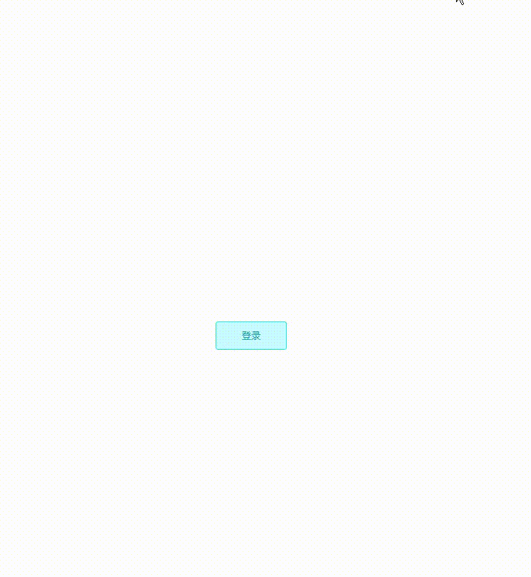
<!DOCTYPE html><html lang="en"><head><meta charset="UTF-8"><meta http-equiv="X-UA-Compatible" content="IE=edge"><meta name="viewport" content="width=device-width, initial-scale=1.0"><title>模态框</title><style>* {padding: 0;margin: 0;/* 文字禁止选中 */user-select: none;box-sizing: border-box;}body {display: flex;justify-content: center;align-items: center;height: 100vh;}button {outline: 0;width: 100px;height: 40px;color: #13a5aa;border-radius: 4px;border: 1px solid rgb(43, 238, 205);background-color: #c9fdff;transition: all 0.3s;cursor: pointer;}button:hover {color: #fff;border-color: #05f2fa;background-color: #09e5ec;}.model-box {display: none;position: absolute;top: 0;left: 0;width: 100%;height: 100vh;background-color: rgba(0, 0, 0, 0.45);}.content {display: none;position: absolute;top: 100px;left: calc(50% - 210px);width: 420px;height: 350px;border-radius: 5px;padding: 0 20px;box-shadow: 0 2px 12px rgba(0, 0, 0, 0.2);background-color: #fff;}.content .title {display: flex;justify-content: space-between;height: 60px;line-height: 60px;}.content .title span {font-size: 18px;color: #333;}.content .title i {font-style: normal;font-size: 24px;color: #909399;cursor: pointer;}.content .title i:hover {color: #09e5ec;}.content form .form-input {margin: 20px 0;}.content form .form-input label {font-size: 14px;color: #606266;cursor: pointer;}.content form .form-input input {outline: 0;width: 100%;height: 42px;padding: 0 15px;margin-top: 20px;border: 1px solid #dcdfe6;border-radius: 4px;}.content form .form-input button {float: right;}</style></head><body><buttononclick="document.querySelector('.model-box').style.display='block';document.querySelector('.content').style.display='block'">登录</button><div class="model-box"onclick="document.querySelector('.model-box').style.display='none';document.querySelector('.content').style.display='none'"></div><div class="content"><div class="title"><span>登录弹窗</span><ionclick="document.querySelector('.model-box').style.display='none';document.querySelector('.content').style.display='none'">x</i></div><form action=""><div class="form-input"><label for="username">请输入用户名</label><input type="text" id="username"></div><div class="form-input"><label for="password">请输入密码</label><input type="text" id="password"></div><div class="form-input"><button>登录</button></div></form></div></body></html>
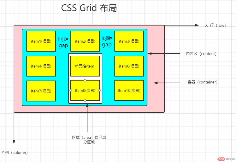
display: grid;/* 单元格宽度 */grid-template-columns: 1fr 2fr 1fr; /* 指定每列的宽度 fr(代表剩余空间) */grid-template-row: 100px 100px 100px; /* 指定每行的宽度 *//* 单元格(item)间距 */column-gap: 24px; /* 设置列间距 */row-gap: 24px; /* 设置行间距 */gap: 24px 24px; /* 统一设置间距 *//* 单元格对齐方式 */align-items: start | conter | end;justify-items: start | conter | end | space-between;/* 内容区相对于容器对齐方式 */align-content: start | conter | end;justify-content: start | conter | end;
display: flex;/* 决定主轴的方向(即项目的排列方向) */flex-direction: row | row-reverse | column | column-reverse;/* 决定是否换行,默认情况下,项目都排在一条线(又称"轴线")上 */flex-wrap: nowrap | wrap | wrap-reverse;/* flex-flow属性是flex-direction属性和flex-wrap属性的简写形式,默认值为row nowrap */flex-flow: <flex-direction> || <flex-wrap>;/* 义了项目在X轴上的对齐方式 */justify-content: flex-start | flex-end | center | space-between | space-around(两侧间距相等);/* 定义项目在Y轴上如何对齐 */align-items: flex-start | flex-end | center | baseline | stretch(填充);/* 定义了多根轴线的对齐方式(多行对齐)。如果项目只有一根轴线,该属性不起作用 */align-content: flex-start | flex-end | center | space-between | space-around | stretch;
/* 定义项目的排列顺序。数值越小,排列越靠前,默认为0 */order: <integer>;/* 定义项目的放大比例,默认为0,即如果存在剩余空间,也不放大 */flex-grow: <number>; /* default 0 *//* 定义了项目的缩小比例,默认为1,即如果空间不足,该项目将缩小 */flex-shrink: <number>; /* default 1 *//* 定义了在分配多余空间之前,项目占据的主轴空间(main size)。浏览器根据这个属性,计算主轴是否有多余空间。它的默认值为auto,即项目的本来大小 */flex-basis: <length> | auto; /* default auto *//* flex属性是flex-grow, flex-shrink 和 flex-basis的简写,默认值为0 1 auto。后两个属性可选。 */flex: none | [ <'flex-grow'> <'flex-shrink'>? || <'flex-basis'> ]/* align-self属性允许单个项目有与其他项目不一样的对齐方式,可覆盖align-items属性。默认值为auto,表示继承父元素的align-items属性,如果没有父元素,则等同于stretch */align-self: auto | flex-start | flex-end | center | baseline | stretch;

Copyright 2014-2025 https://www.php.cn/ All Rights Reserved | php.cn | 湘ICP备2023035733号


