


 收藏
收藏


 PHPz
PHPz批改状态:合格
老师批语:

flex经常用于前端页面的布局,可以用到块元素上,也可以用到行内元素上。元素添加了flex相关属性之后,可以做到元素盒子大小随页面大小灵活变化。
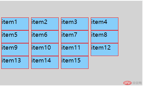
要讨论flex布局,需要先统一对flex布局中提到的一些概念的称呼。借用天蓬老师的一张图,来阐述相关概念。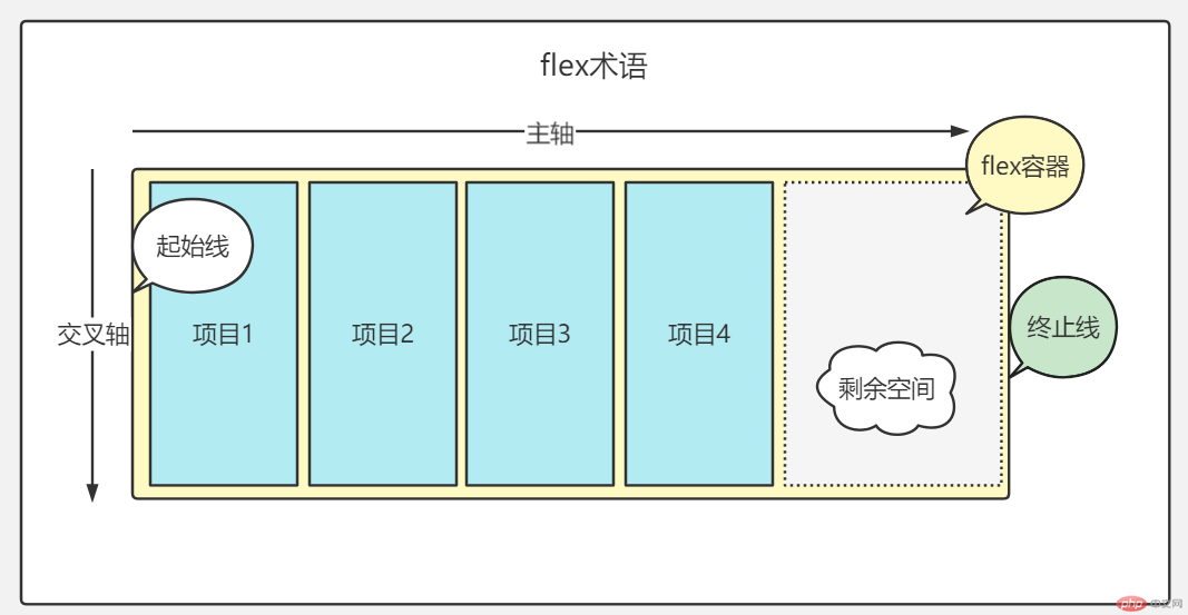
flex容器(container)即为计划要放排列对象的父级元素,项目(item)为将要排列的对象。
其他比较好理解,大家自行看图。
后续内容为了方便理解,约定主轴为水平方向,交叉轴为竖直方向。
flex容器(container)有6个常用属性,分别为:flex-direction,flex-wrap,flex-flow,jusity-content,align-items,align-content。
flex-direction属性有4个值,分别为row,row-reverse、column、column-reverse。
其中row是默认值。
html代码
<div class="container"><div class="item">item1</div><div class="item">item2</div><div class="item">item3</div><div class="item">item4</div><div class="item">item5</div></div>
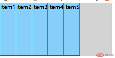
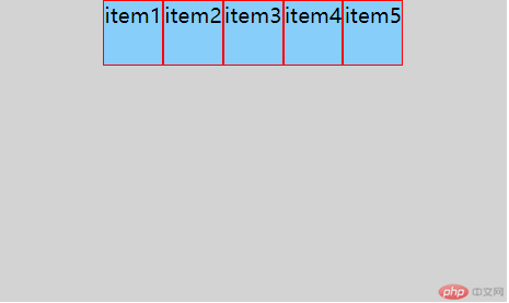
row:项目沿着主轴排列;
效果图如下
css 代码
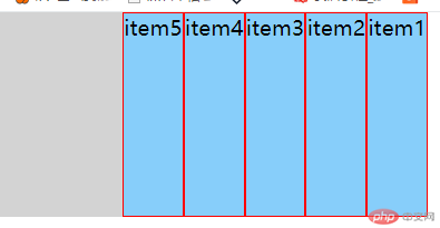
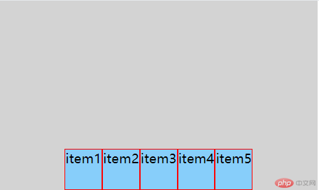
.container {background-color: lightgray;display: flex;flex-direction: row;height: 20vh;width: 20vw;}.item {background-color: lightskyblue;border: 1px solid red;}row-reverse:项目沿着主轴,反向排列;
效果图如下
css 代码
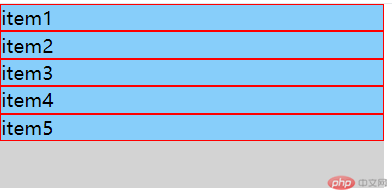
.container {background-color: lightgray;display: flex;flex-direction: row-reverse;height: 20vh;width: 20vw;}column:项目沿着交叉轴排列;
效果图如下
css 代码
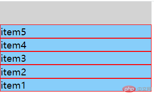
.container {background-color: lightgray;display: flex;flex-direction: column;height: 20vh;width: 20vw;}column-reverse:项目沿着交叉轴,反向排列。
效果图如下
css 代码
.container {background-color: lightgray;display: flex;flex-direction: column-reverse;height: 20vh;width: 20vw;}
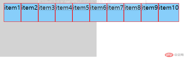
flex-wrap属性有3个值,分别为wrap,nowrap、wrap-reverse。
其中nowrap是默认值。
html代码
<div class="container"><div class="item">item1</div><div class="item">item2</div><div class="item">item3</div><div class="item">item4</div><div class="item">item5</div><div class="item">item6</div><div class="item">item7</div><div class="item">item8</div><div class="item">item9</div><div class="item">item10</div></div>
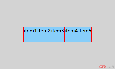
nowrap:不换行;
效果图如下
css 代码
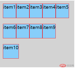
.container {background-color: lightgray;display: flex;flex-direction: row;flex-wrap: nowrap;height: 20vh;width: 20vw;padding: 10px;}.item {background-color: lightskyblue;border: 1px solid red;height: 50px;}wrap:换行;
效果图如下
css 代码
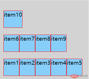
.container {background-color: lightgray;display: flex;flex-direction: row;flex-wrap: wrap;height: 30vh;width: 20vw;padding: 10px;}.item {background-color: lightskyblue;border: 1px solid red;height: 50px;}wrap-reverse:换行,第一行在最下面;
效果图如下
css 代码
.container {background-color: lightgray;display: flex;flex-direction: row;flex-wrap: wrap-reverse;height: 30vh;width: 20vw;padding: 10px;}
flex-flow是flex-direction和flex-wrap两个属性加在一起的简写。两个属性都是必填,flex-direction在前,flex-wrap在后,中间用空格隔开。
默认值为flex-flow:row nowrap;。
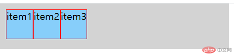
justify-content属性有6个值,分别为flex-start,flex-end,center,space-between,space-around。
其中flex-start是默认值。
html代码
<div class="container"><div class="item">item1</div><div class="item">item2</div><div class="item">item3</div></div>
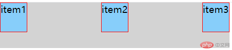
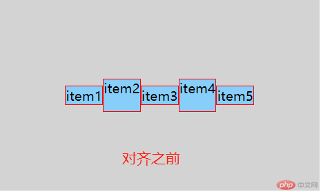
flex-start:左对齐;
效果图如下
css 代码
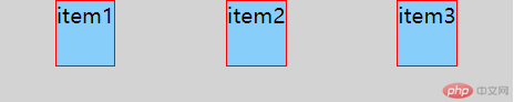
.container {background-color: lightgray;display: flex;flex-flow: row nowrap;justify-content: flex-start;height: 10vh;width: 30vw;padding: 10px;}.item {background-color: lightskyblue;border: 1px solid red;height: 50px;}flex-end:右对齐;
效果图如下
css 代码
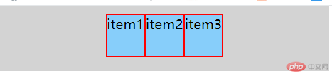
.container {background-color: lightgray;display: flex;flex-flow: row nowrap;justify-content: flex-end;height: 10vh;width: 30vw;padding: 10px;}center:居中;
效果图如下
css 代码
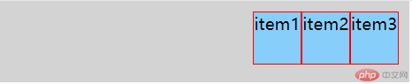
.container {background-color: lightgray;display: flex;flex-flow: row nowrap;justify-content: center;height: 10vh;width: 30vw;padding: 10px;}space-between:把空间分配到每个项目之间;
效果图如下
css 代码
.container {background-color: lightgray;display: flex;flex-flow: row nowrap;justify-content: space-between;height: 10vh;width: 30vw;}space-around:把空间分配到每个项目两边,每个项目两边间距相等,相邻两个项目间隔为单边的两倍;
效果图如下
css 代码
.container {background-color: lightgray;display: flex;flex-flow: row nowrap;justify-content: space-around;height: 10vh;width: 30vw;}
align-items属性有6个值,分别为flex-start,flex-end,center,base-line,stretch。
其中flex-start是默认值。
html代码
<div class="container"><div class="item">item1</div><div class="item">item2</div><div class="item">item3</div><div class="item">item4</div><div class="item">item5</div></div>
flex-start:上对齐;
效果图如下
css 代码
.container {background-color: lightgray;display: flex;flex-flow: row nowrap;justify-content: center;align-items: flex-start;height: 30vh;width: 30vw;}.item {background-color: lightskyblue;border: 1px solid red;height: 50px;}flex-end:下对齐;
效果图如下
css 代码
.container {background-color: lightgray;display: flex;flex-flow: row nowrap;justify-content: center;align-items: flex-end;height: 30vh;width: 30vw;}center:居中;
效果图如下
css 代码
.container {background-color: lightgray;display: flex;flex-flow: row nowrap;justify-content: center;align-items: center;height: 30vh;width: 30vw;}base-line:根据首行文字基线对齐;
效果图如下
css 代码
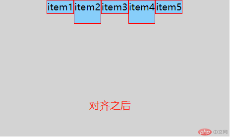
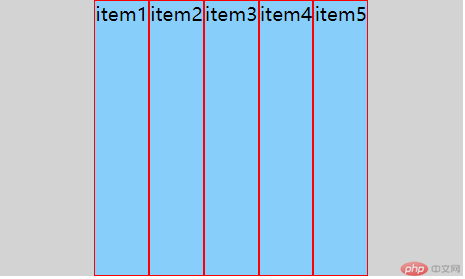
.container {background-color: lightgray;display: flex;flex-flow: row nowrap;justify-content: center;align-items: baseline;height: 30vh;width: 30vw;}stretch:拉伸对齐;
效果图如下
注意不能定义项目高度,否则拉伸无效
css 代码
.container {background-color: lightgray;display: flex;flex-flow: row nowrap;justify-content: center;align-items: stretch;height: 30vh;width: 30vw;}.item {background-color: lightskyblue;border: 1px solid red;}
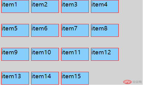
align-content属性有6个值,分别为flex-start,flex-end,center,space-between,space-around,stretch。
其中stretch是默认值。
html代码
<div class="container"><div class="item">item1</div><div class="item">item2</div><div class="item">item3</div><div class="item">item4</div><div class="item">item5</div><div class="item">item6</div><div class="item">item7</div><div class="item">item8</div><div class="item">item9</div><div class="item">item10</div><div class="item">item11</div><div class="item">item12</div><div class="item">item13</div><div class="item">item14</div><div class="item">item15</div></div>
flex-start:顶部对齐;
效果图如下
css 代码
.container {background-color: lightgray;display: flex;flex-flow: row wrap;justify-content: flex-start;align-content: flex-start;height: 30vh;width: 30vw;}.item {background-color: lightskyblue;border: 1px solid red;width: 75px;height: 35px;margin: 0 3px;}flex-end:底部对齐;
效果图如下
css 代码
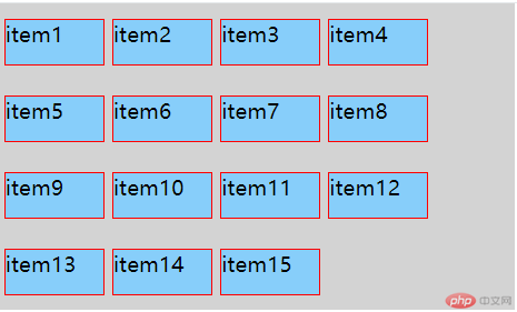
.container {background-color: lightgray;display: flex;flex-flow: row wrap;justify-content: flex-start;align-content: flex-end;height: 30vh;width: 30vw;}center:居中;
效果图如下
css 代码
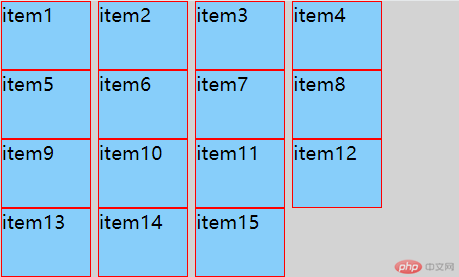
.container {background-color: lightgray;display: flex;flex-flow: row wrap;justify-content: flex-start;align-content: center;height: 30vh;width: 30vw;}space-between:把空间分配到每个项目之间;
效果图如下
css 代码
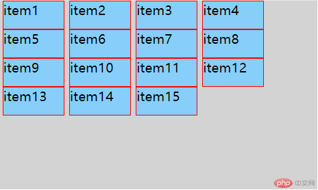
.container {background-color: lightgray;display: flex;flex-flow: row wrap;justify-content: flex-start;align-content: space-between;height: 30vh;width: 30vw;}space-around:把空间分配到每个项目两边,每个项目两边间距相等,相邻两个项目间隔为单边的两倍;
效果图如下
css 代码
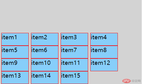
.container {background-color: lightgray;display: flex;flex-flow: row wrap;justify-content: flex-start;align-content: space-around;height: 30vh;width: 30vw;}stretch:拉伸对齐。
效果图如下
注意不能定义项目高度,否则拉伸无效
css 代码
.container {background-color: lightgray;display: flex;flex-flow: row wrap;justify-content: flex-start;align-content: stretch;height: 30vh;width: 30vw;}.item {background-color: lightskyblue;border: 1px solid red;width: 75px;margin: 0 3px;}
flex项目(items)有6个常用属性,分别为:order,flex-grow,flex-shrink,flex-basis,flex,align-self。
定义项目排序,数值小靠前,数值大靠后。默认0。
定义是否可以放大,0不可放大,1可以放大。数值大小决定项目之间放大比值。默认0,不可以放大。
定义是否可以缩小,0不可缩小,1可以缩小。数值大小决定项目之间缩小比值。默认1,可以缩小。
定义项目沿主轴方向的尺寸,默认auto,即项目本来的大小。
flex为flex-grow,flex-shrink,flex-basis三个属性的合并简写。按照顺序,flex-grow必填,后面两个选填。默认是 0 1 auto,flex有两个快捷值auto(1 1 auto)和none(0 0 auto)。
align-self属性有6个值,分别为flex-start,flex-end,center,base-line,stretch,auto,主要是针对单个项目位置进行排版。
其中auto是默认值。
flex-start:左对齐;
flex-end:右对齐;
center:居中;
base-line:根据首行文字基线对齐;
stretch:拉升对齐;
auto:继承父元素align-items属性。

Copyright 2014-2025 https://www.php.cn/ All Rights Reserved | php.cn | 湘ICP备2023035733号


