


 收藏
收藏


 天蓬老师
天蓬老师批改状态:合格
老师批语:
设置最小临界宽度以及不同的样式以实现页面样式根据宽度变化
CSS
<style>body {background-color: burlywood;}@media screen and (min-width: 400px) {body {background-color: cadetblue;font-size: 20px;}}@media screen and (min-width: 600px) {body {background-color: darkblue;font-size: 30px;}}</style>
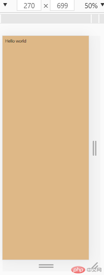
宽度 <400px时,
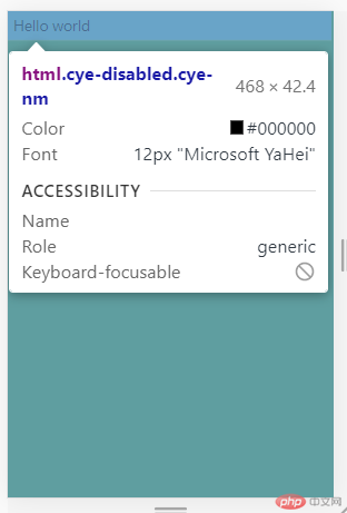
400px< 宽度 <600px时,
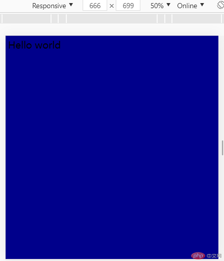
宽度 >600px时,
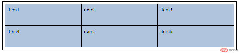
设置容器 display: grid
会把项目转为块元素(flex是转为行内)
/* 1. grid 容器 */.container {/* 转为网格容器 */display: grid;grid-template-columns: auto auto auto;border: 1px solid #000;padding: 0.5rem;}.container>.item {border: 1px solid;background-color: lightsteelblue;padding: 0.5rem;}
默认
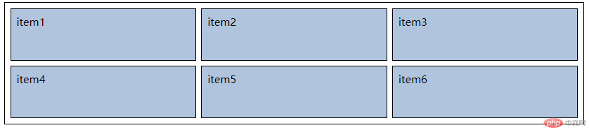
设置为grid布局,3列, 宽度自适应
设置行数,行高
/* 1. grid 容器 */.container {/* 转为网格容器 */display: grid;/* 3 columns */grid-template-columns: auto auto auto;/* 2 rows */grid-template-rows: 5em 5em;border: 1px solid #000;padding: 0.5rem;}
设置网格间隙
.container {border: 1px solid #000;padding: 0.5rem;/* 转为网格容器 */display: grid;/* 轨道列宽 3 columns */grid-template-columns: auto auto auto;/* 轨道行高 2 rows */grid-template-rows: 5em 5em;/* 轨道间隙 水平 垂直*/gap: 0.5em;}
(可与其他单位共同使用,总-固定值)
.container {border: 1px solid #000;padding: 0.5rem;/* 转为网格容器 */display: grid;/* 轨道列宽 3 columns *//* grid-template-columns: auto auto auto; */grid-template-columns: 1fr 2fr 1fr;/* 轨道行高 2 rows */grid-template-rows: 5em 5em;/* 轨道间隙 水平 垂直*/gap: 0.5em;}
注:repeat与()间不能有空格
repeat(列数,宽度)
repeat(3, 10em)
repeat(3, 10em 2em)
/* grid-template-columns: 10em 10em 10em; */grid-template-columns: repeat(3, 10em);
grid-template-columns: repeat(3, 10em 2em);
minmax(最小宽度,最大宽度)
设置前minmax前
grid-template-columns: 1fr 2fr 1fr;
设置minmax(30em, 2fr)后
grid-template-columns: 1fr minmax(30em, 2fr) 1fr;
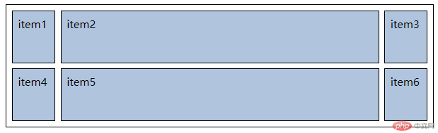
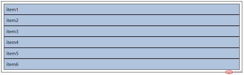
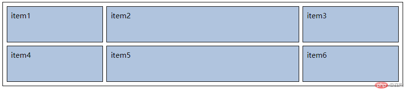
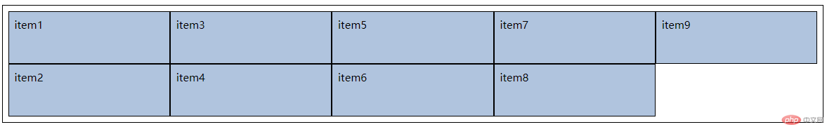
项目数量 > 行*列
grid-auto-flow: row;(默认)
默认行优先,即项目先水平排列,空间不够再换行
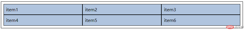
grid-auto-flow: column
列优先,即项目先垂直排列
例:
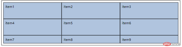
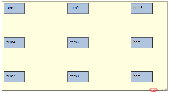
容器有9个item
<div class="container"><div class="item">item1</div><div class="item">item2</div><div class="item">item3</div><div class="item">item4</div><div class="item">item5</div><div class="item">item6</div><div class="item">item7</div><div class="item">item8</div><div class="item">item9</div></div>
设置grid 布局
.container {display: grid;border: 1px solid;padding: 0.5em;grid-template-columns: repeat(3, 1fr);grid-template-rows: 5em 5em;}.container>.item {background-color: lightsteelblue;border: 1px solid;padding: 0.5em;}
效果 (item7,8,9在隐式轨道上)
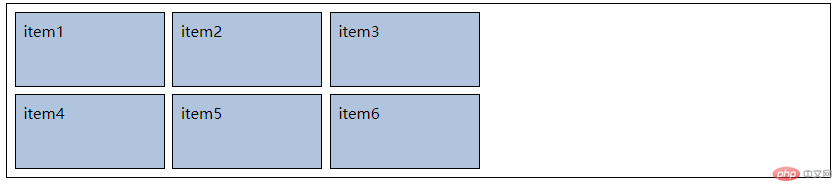
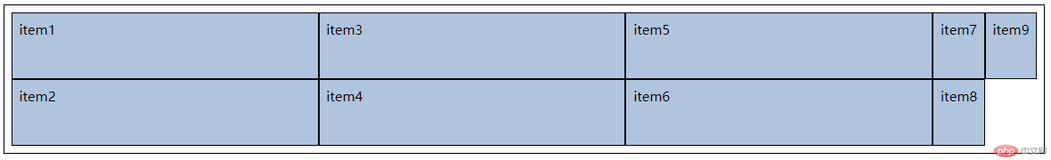
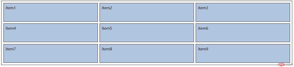
设置grid-auto-flow: column;
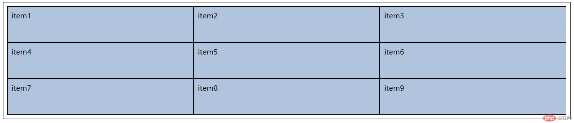
grid-auto-rows
设置隐式轨道行的高度
设置grid-auto-rows:5em 后,高度与前面的item相同
.container {display: grid;border: 1px solid;padding: 0.5em;grid-template-columns: repeat(3, 1fr);grid-template-rows: 5em 5em;/* grid-auto-flow: column; */grid-auto-rows: 5em;}
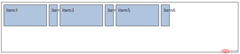
grid-auto-columns
设置隐式轨道列的宽度
设置grid-auto-columns:1fr 后,宽度与前面的item相同
.container {display: grid;border: 1px solid;padding: 0.5em;grid-template-columns: repeat(3, 1fr);grid-template-rows: 5em 5em;grid-auto-flow: column;grid-auto-columns: 1fr;}
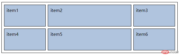
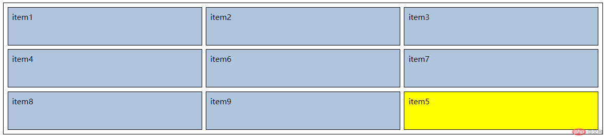
grid-area: 行起始编号/列起始编号/行结束编号/列结束编号
将下图中item5变色并放到item9的位置
.container>.item:nth-of-type(5) {background-color: yellow;grid-area: 2/2/3/3;grid-area: 3/3/4/4;}
.container>.item:nth-of-type(5) {background-color: yellow;/* grid-area: 2/2/3/3; */grid-area: 2/2;/* grid-area: 3/3/4/4; */grid-area: 3/3;}
.container>.item:nth-of-type(5) {background-color: yellow;/* grid-area: 2/2/3/3; */grid-area: 2/2;/* grid-area: 3/3/4/4; */grid-area: 3/3;grid-area: 2/2/4/4;}
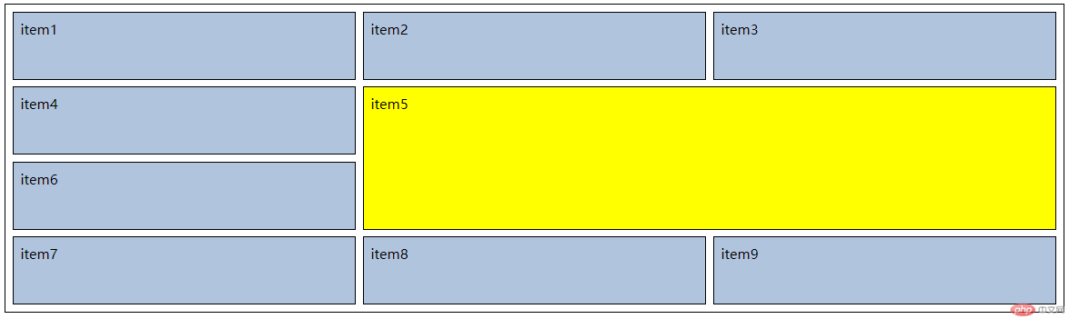
也可用:
span 跨越行数
(span 1 可用auto代替)
.container>.item:nth-of-type(5) {background-color: yellow;/* grid-area: 2/2/3/3; */grid-area: 2/2;/* grid-area: 3/3/4/4; */grid-area: 3/3;/* grid-area: 2/2/4/4; */grid-area: 2/2/span 2/span 2;/* 简写: *//* grid-area: span 2/span 2; */}
前提:设置了宽高,每个项目在其单元格中有剩余空间
place-items: 垂直对齐方式 水平对齐方式;
(默认值place-items:stretch; 不设置宽高有效)
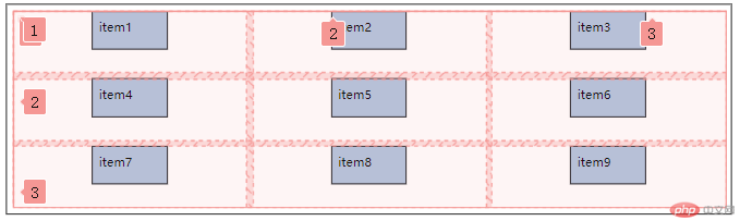
.container {/* place-items: 垂直对齐方式 水平对齐方式; */place-items: start center;}
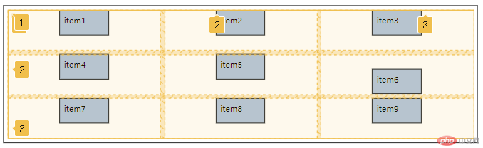
place-self: 垂直对齐方式 水平对齐方式;
.container>.item:nth-of-type(6) {place-self: end center;}
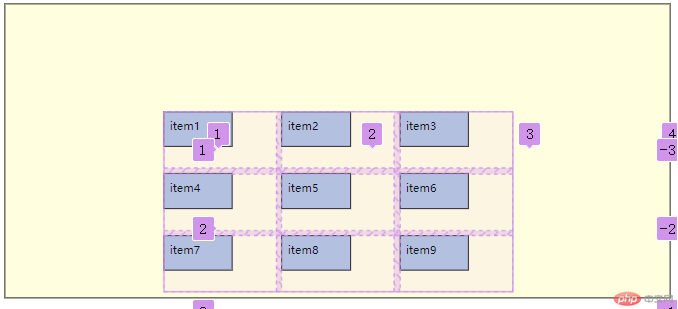
place-content: 垂直对齐方式 水平对齐方式;
.container {display: grid;background-color: lightyellow;height: 25em;border: 1px solid;padding: 0.5em;grid-template-columns: repeat(3, 10em);grid-template-rows: 5em 5em;gap: 0.5em;grid-auto-rows: 5em;/* grid-auto-flow: column; *//* grid-auto-columns: 1fr; */place-content: end center;}
place-content: space-between space-between
.container {place-content: space-between space-between;}
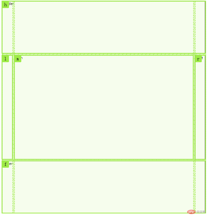
在容器中写出命名的布局:
body {height: 20em;display: grid;/* grid-template-rows: 15em 1fr 15em; */grid-template-rows: 15em minmax(50vw, auto) 15em;grid-template-columns: 3em minmax(50vh, auto) 3em;gap: 0.5em;grid-template-areas:"h h h""l m r""f f f";}header {grid-area: h;}footer {grid-area: f;}main {grid-area: m;}aside.left {grid-area: l;}aside.right {grid-area: r;}
以一行为起点,将其平分为12份,控制每个项目所占的列数(份)实现
例:
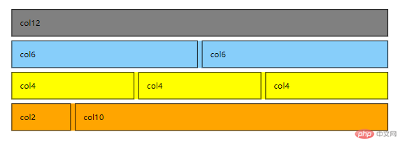
HTML
<body><div class="container"><!-- 先定义行 --><!-- 1 --><div class="row"><span class="item col-12">col12</span></div><!-- 2 --><div class="row"><span class="item col-6">col6</span><span class="item col-6">col6</span></div><!-- 3 --><div class="row"><span class="item col-4">col6</span><span class="item col-4">col6</span><span class="item col-4">col6</span></div><!-- 2:10 --><div class="row"><span class="item col-2">col6</span><span class="item col-10">col6</span></div></div></body>
CSS
* {margin: 0;padding: 0;box-sizing: border-box;}body {width: 100vw;height: 100vh;display: grid;place-content: center;}.container {min-width: 80vw;display: grid;gap: 0.5em;}.container > .row {display: grid;grid-template-columns: repeat(12, 1fr);min-height: 3em;gap: 0.5em;}.container > .row > .item {padding: 1em;border: 1px solid;}.col-12 {grid-area: auto / span 12;}.col-11 {grid-area: auto / span 11;}.col-10 {grid-area: auto / span 10;}.col-9 {grid-area: auto / span 9;}.col-8 {grid-area: auto / span 8;}.col-7 {grid-area: auto / span 7;}.col-6 {grid-area: auto / span 6;}.col-5 {grid-area: auto / span 5;}.col-4 {grid-area: auto / span 4;}.col-3 {grid-area: auto / span 3;}.col-2 {grid-area: auto / span 2;}.col-1 {grid-area: auto / span 1;}

Copyright 2014-2025 https://www.php.cn/ All Rights Reserved | php.cn | 湘ICP备2023035733号


