


 收藏
收藏


 天蓬老师
天蓬老师批改状态:合格
老师批语:
以上属性简写:
flex: 放大因子 收缩因子 大小;
例:flex: 2 2 10rem;
默认值:flex: 0 1 auto; (initial)
1 1 auto = auto
0 0 auto = none
默认效果
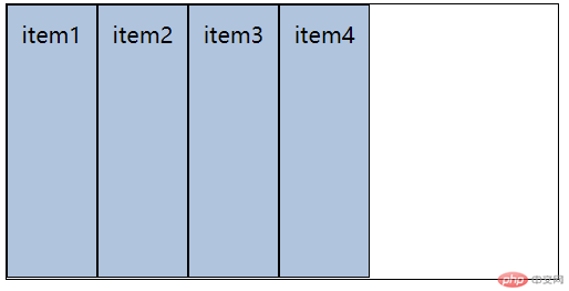
flex-grow
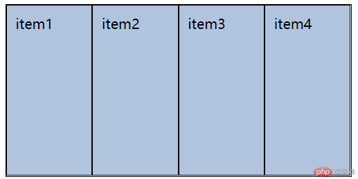
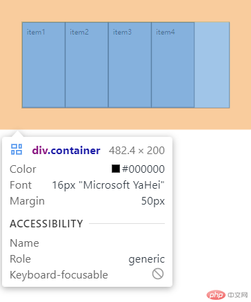
CSS
.container>.item {padding: 1rem;background-color: lightsteelblue;border: 1px solid black;flex-basis: 10rem;}.container>.item:first-of-type {flex-grow: 1;}.container>.item:nth-of-type(2) {flex-grow: 2;}.container>.item:nth-of-type(3) {flex-grow: 3;}.container>.item:last-of-type {flex-grow: 4;}
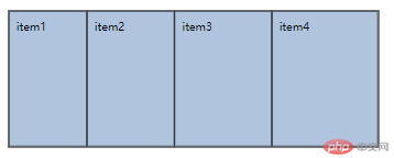
flex-shrink
CSS
.container>.item {padding: 1rem;background-color: lightsteelblue;border: 1px solid black;flex-basis: 10rem;}.container>.item:first-of-type {flex-shrink: 1;}.container>.item:nth-of-type(2) {flex-shrink: 2;}.container>.item:nth-of-type(3) {flex-shrink: 3;}.container>.item:last-of-type {flex-shrink: 4;}
当容器宽度足够容纳所有项目时:
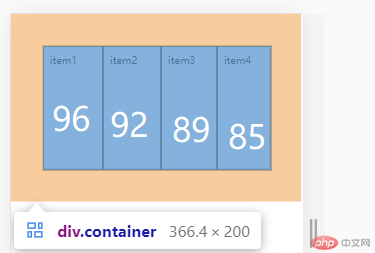
当容器宽度不够时开始收缩:
下图中,容器总width为 366 < 400, 此时子项目大概宽度:
item1-85, item2-89, item3-92, item4-96
注:容器宽度过小时,会从item3-item1开始逐渐妥协,即item3-item1宽度逐渐与item4相等,最后每个item宽度相等
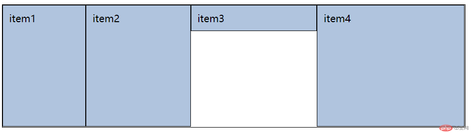
.container>.item:nth-of-type(3) {flex-grow: 3;align-self: flex-start;}
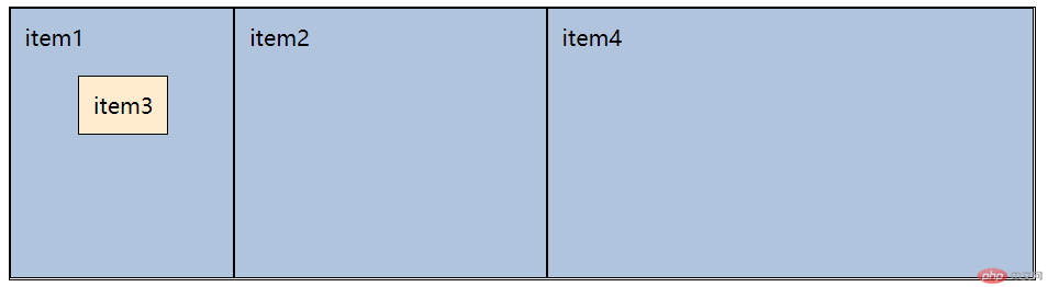
.container>.item:nth-of-type(3) {flex-grow: 3;align-self: flex-start;position: absolute;background-color: blanchedalmond;left: 5rem;top: 5rem;}
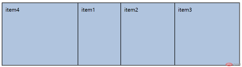
order: value;
数字大靠后排列,数字小靠前排列
.container>.item:nth-of-type(3) {flex-grow: 3;order: 20}.container>.item:last-of-type {flex-grow: 4;order: -1;}

Copyright 2014-2025 https://www.php.cn/ All Rights Reserved | php.cn | 湘ICP备2023035733号


