


 收藏
收藏


 天蓬老师
天蓬老师批改状态:合格
老师批语:

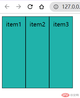
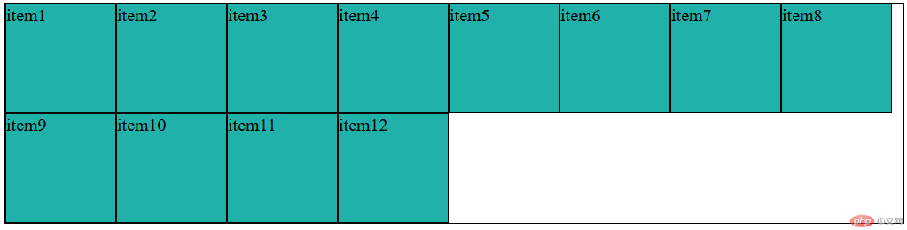
使用flex布局,先设置容器为flex容器,容器的子元素自动变为容器的项目,且为行内块级元素
<style>.container {/* 转为flex布局,该元素即为flex容器 */display: flex;height: 20rem;}</style>---------------------------------------------------------------<body><div class="container"><div class="item">item1</div><div class="item">item2</div><div class="item">item3</div><div class="item">item4</div><div class="item">item5</div><div class="item">item6</div><div class="item">item7</div><div class="item">item8</div></div></body>
.container {/* 主轴方向: 默认水平 *//* flex-direction: row; *//* 禁止换行 *//* flex-wrap: nowrap; *//* 简化写法 */flex-flow: row nowrap;}
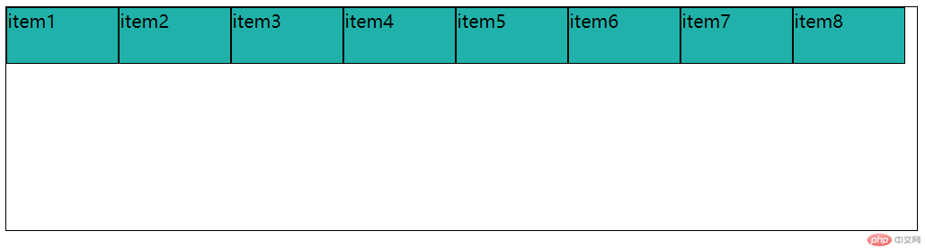
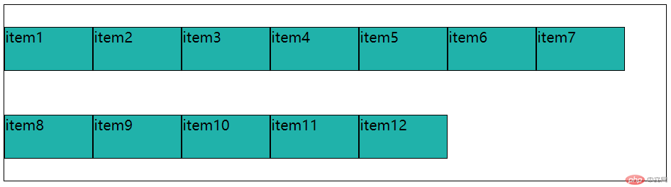
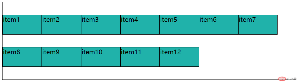
.container {/* 允许换行 *//* flex-flow: row wrap; *//* 垂直换行 */flex-flow: column wrap;}
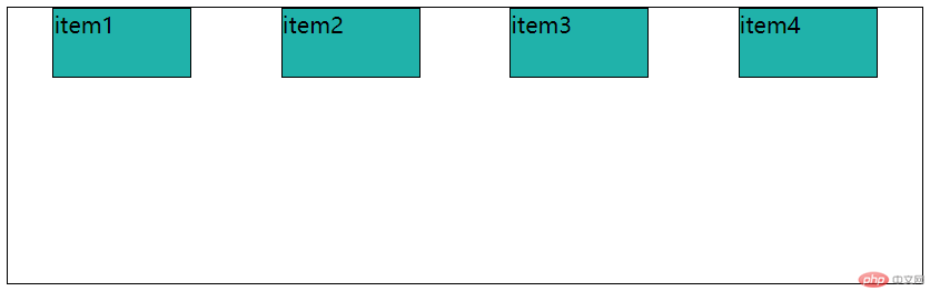
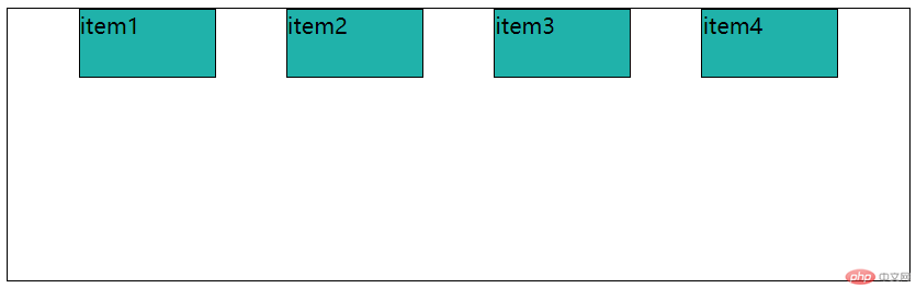
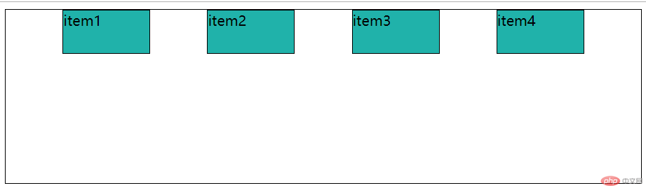
方式 1: 所有项目作为整体处理
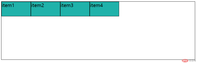
flex-start
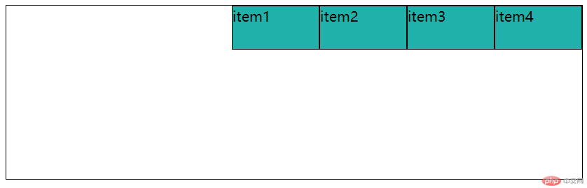
flex-end
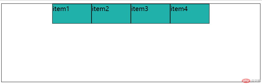
center
方式 2:项目作为个体处理
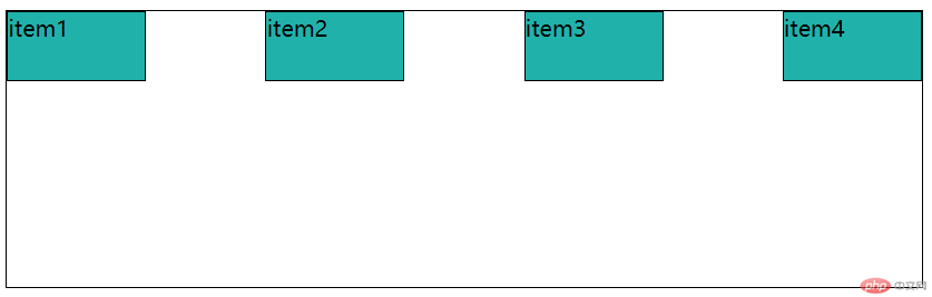
space-between
space-around
space-evenly
方式 1: align-items
设置flex子项在每个flex行的交叉轴上的默认对齐方式
align-items: stretch

align-items: flex-start
align-items: flex-end

align-items: center

方式 2:align-content
适用多行的flex容器(也就是flex容器中的子项不止一行时该属性才有效果),它的作用是当flex容器在交叉轴上有多余的空间时,将子项作为一个整体(属性值为:flex-start、flex-end、center时)进行对齐
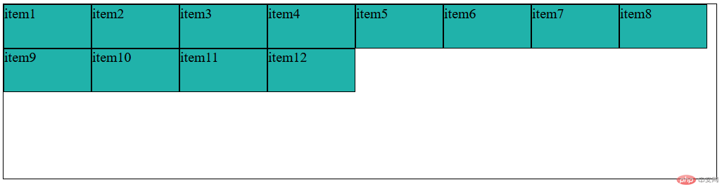
align-content: stretch
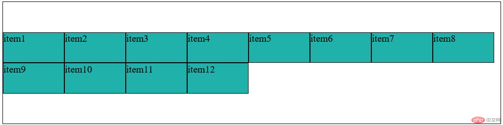
align-content: flex-start
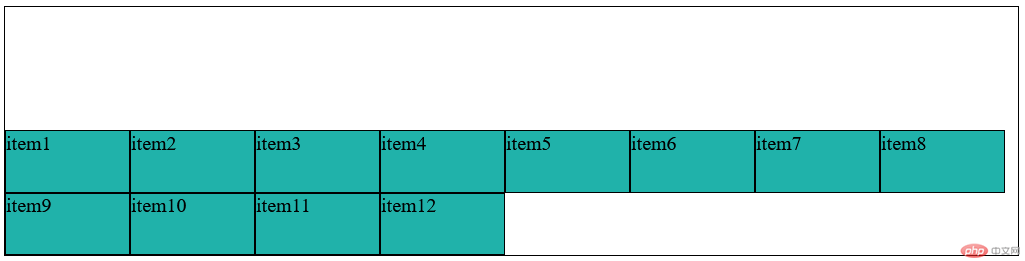
align-content: flex-end
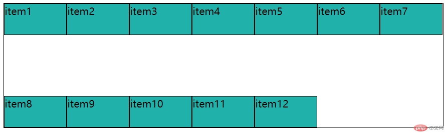
align-content: center
align-content: space-between
align-content: space-around
align-content: space-evenly

Copyright 2014-2025 https://www.php.cn/ All Rights Reserved | php.cn | 湘ICP备2023035733号


