
| 序号 | 属性 | 描述 |
|---|---|---|
| 1 | flex | 项目的缩放比例与基准宽度 |
| 2 | align-self | 单个项目在交叉轴上的对齐方式 |
| 3 | order | 项目在主轴上排列顺序 |
代码:
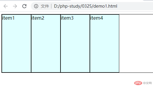
<!DOCTYPE html><html lang="en"><head><meta charset="UTF-8" /><meta http-equiv="X-UA-Compatible" content="IE=edge" /><meta name="viewport" content="width=device-width, initial-scale=1.0" /><title>项目上的flex属性</title><style>* {box-sizing: border-box;}:root {font-size: 10px;}body {font-size: 1.6rem;}/* flex容器 */.container {display: flex;height: 20rem;border: 1px solid #000;}/* flex项目样式 flex容器的子元素 */.container > .item {width: 10rem;background-color: lightcyan;border: 1px solid #000;}/* flex属性 */</style></head><body><div class="container"><div class="item">item1</div><div class="item">item2</div><div class="item">item3</div><div class="item">item4</div></div></body></html>
项目是否允许放大
/*允许放大*/flex-grow: 1;
项目是否允许收缩
页面缩小,项目也随之缩小
/*允许缩小*/flex-shrink:1;
设置当前项目在主轴上的大小
flex-basis: 15rem;
注意:max-width:优先级大于flex-basis
flex: 放大因子 收缩因子 计算大小
flex:0 0 15rem;等效于flex-grow:0;flex-shrink:0;flex-basis:15rem;
flex默认情况
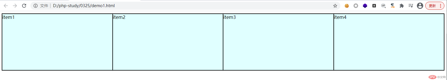
/*禁止放大 允许缩小 当前的固定宽度值*/flex:0 1 auto;等效于:flex:initial;完全的弹性:允许放大与收缩:flex:1 1 auto;等效于:flex:auto;完全失去弹性:禁止放大 收缩 适合pc端:flex:0 0 auto;等效于:flex:none;单值 仅表示是否允许放大flex:1;等效于:flex:auto;
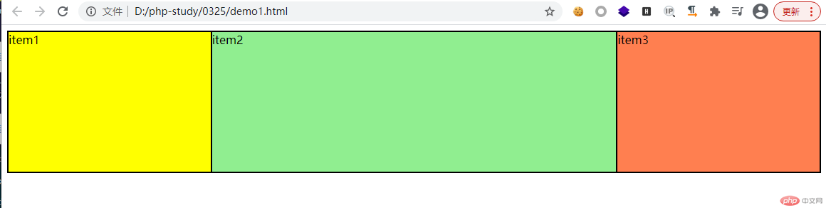
flex作用于多个元素的时候:
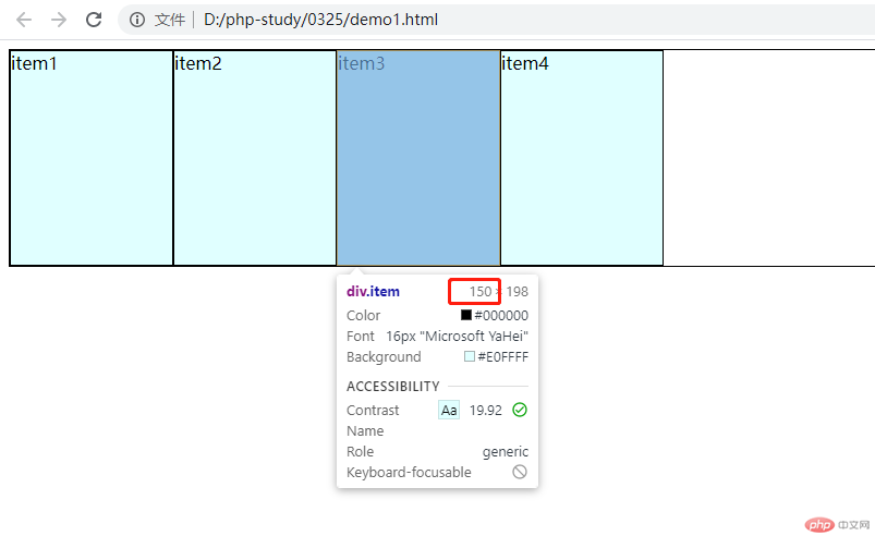
效果:item2是item1和item3盒子宽度的两倍
<!DOCTYPE html><html lang="en"><head><meta charset="UTF-8" /><meta http-equiv="X-UA-Compatible" content="IE=edge" /><meta name="viewport" content="width=device-width, initial-scale=1.0" /><title>项目上的flex属性</title><style>* {box-sizing: border-box;}:root {font-size: 10px;}body {font-size: 1.6rem;}/* flex容器 */.container {display: flex;height: 20rem;border: 1px solid #000;}/* flex项目样式 flex容器的子元素 */.container > .item {width: 10rem;background-color: lightcyan;border: 1px solid #000;}.container > .item:first-of-type {background-color: yellow;/* flex: 1 1 auto; */flex: 1;}.container > .item:first-of-type + * {background-color: lightgreen;flex: 2;}.container > .item:last-of-type {background-color: coral;flex: 1;}</style></head><body><div class="container"><div class="item">item1</div><div class="item">item2</div><div class="item">item3</div></div></body></html>
给某个项目设置对齐属性
/* 默认值 拉伸 stretch */align-self: stretch;align-self: flex-end;align-self: flex-start;align-self: center;
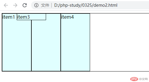
flex是支持定位的
.container {position: relative;}.container > .item:nth-of-type(3) {position: absolute;left: 5rem;}
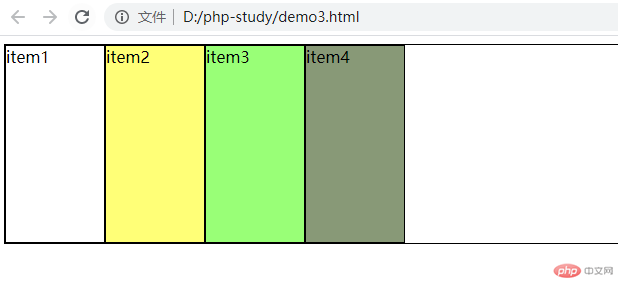
设置项目在主轴上的位置
order=0的情况:
<!DOCTYPE html><html lang="en"><head><meta charset="UTF-8" /><meta http-equiv="X-UA-Compatible" content="IE=edge" /><meta name="viewport" content="width=device-width, initial-scale=1.0" /><title>设置项目在主轴上的顺序</title><style>* {box-sizing: border-box;}:root {font-size: 10px;}body {font-size: 1.6rem;}.container {display: flex;height: 20rem;border: 1px solid #000;}.container > .item {width: 10rem;background-color: lightcyan;border: 1px solid #000;order: 0;}.item.one {background-color: #fff;}.item.two {background-color: #ff7;}.item.three {background-color: #9f7;}.item.four {background-color: #897;}</style></head><body><div class="container"><div class="item one">item1</div><div class="item two">item2</div><div class="item three">item3</div><div class="item four">item4</div></div></body></html>
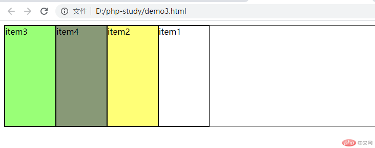
order是谁小谁靠前:
<!DOCTYPE html><html lang="en"><head><meta charset="UTF-8" /><meta http-equiv="X-UA-Compatible" content="IE=edge" /><meta name="viewport" content="width=device-width, initial-scale=1.0" /><title>设置项目在主轴上的顺序</title><style>* {box-sizing: border-box;}:root {font-size: 10px;}body {font-size: 1.6rem;}.container {display: flex;height: 20rem;border: 1px solid #000;}.container > .item {width: 10rem;background-color: lightcyan;border: 1px solid #000;order: 0;}.item.one {background-color: #fff;order: 4;}.item.two {background-color: #ff7;order: 3;}.item.three {background-color: #9f7;order: 1;}.item.four {background-color: #897;order: 2;}</style></head><body><div class="container"><div class="item one">item1</div><div class="item two">item2</div><div class="item three">item3</div><div class="item four">item4</div></div></body></html>
html:
<!DOCTYPE html><html lang="en"><head><meta charset="UTF-8" /><meta http-equiv="X-UA-Compatible" content="IE=edge" /><meta name="viewport" content="width=device-width, initial-scale=1.0" /><link rel="stylesheet" href="static/css/index.css" /><link rel="stylesheet" href="static/icon-font/iconfont.css" /><link rel="stylesheet" href="static/css/header.css" /><link rel="stylesheet" href="static/css/footer.css" /><title>页脚</title></head><body><div class="header"><!-- 菜单 --><div class="menu iconfont icon-menu"></div><!-- 搜索框 --><div class="search"><div class="logo">JD</div><div class="zoom iconfont icon-search"></div><input type="text" class="words" value="移动硬盘5000g" id="" /></div><!-- 登录按钮 --><a href="" class="login">登录</a></div><!-- 主体 --><div class="main">main</div><!-- 页脚 --><div class="footer"><div><div class="iconfont icon-home"></div><span>首页</span></div><div><div class="iconfont icon-home"></div><span>分类</span></div><div><div class="iconfont icon-home"></div><span>京喜</span></div><div><div class="iconfont icon-home"></div><span>购物车</span></div><div><div class="iconfont icon-home"></div><span>未登录</span></div></div></body></html>
reset.css
* {margin: 0px;padding: 0;box-sizing: border-box;}li {/* 去掉前面的点 */list-style: none;}a {/* 去掉下划线 */text-decoration: none;color: #7b7b7b;}body {background-color: #f6f6f6;}html {font-size: 10px;}body {font-size: 1.6rem;}@media screen and (min-width: 480px) {html {font-size: 12px;}}@media screen and (min-width: 640px) {html {font-size: 14px;}}@media screen and (min-width: 720px) {html {font-size: 16px;}}
index.css
/* @import url("reset.css"); */@import "reset.css";.header {background-color: #e43130;color: #fff;height: 4.4rem;/* 固定定位 */position: fixed;left: 0;top: 0;right: 0;/* 保证他始终在视口的最前面 */z-index: 100;}/* 主体绝对定位 */.main {position: absolute;top: 4.4rem;left: 0;right: 0;bottom: 4.4rem;}.footer {background-color: #666;color: #fff;height: 4.4rem;/* 固定定位 */position: fixed;left: 0;bottom: 0;right: 0;z-index: 100;}
header.css
/* 使用一个类作为入口,后面可以使用class或伪类来获取内部的每一个元素。 */.header {display: flex;flex-flow: row nowrap;align-items: center;}.header .menu {flex: 1;/* 行内元素 文本居中 */text-align: center;font-size: 2.5rem;}.header .login {flex: 1;color: white;text-align: center;}.header .search {flex: 6;padding: 0.5rem;background-color: #fff;/* 圆角 */border-radius: 3rem;display: flex;}.header .search .logo {color: #e43130;font-size: 2rem;flex: 0 1 4rem;text-align: center;line-height: 2rem;}.header .search .zoom {color: #ccc;flex: 0 1 4rem;text-align: center;/* 垂直居中 */line-height: 2rem;border-left: 1px solid;}.header .search .words {flex: auto;border: none;outline: none;color: #aaa;}
footer.css
.footer {display: flex;justify-content: space-around;align-items: center;color: #888;}/* flex支持嵌套布局 *//* flex的项目可以又是一个flex容器 */.footer > div {display: flex;flex-flow: column nowrap;/* 主轴垂直 交叉轴就是水平 */align-items: center;}.footer > div.iconfont {font-size: 2rem;}.footer > div > span {font-size: 1rem;}.footer > div:hover {cursor: pointer;}
效果图: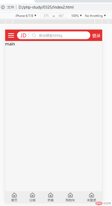

Copyright 2014-2025 https://www.php.cn/ All Rights Reserved | php.cn | 湘ICP备2023035733号


 收藏
收藏


