
作业内容:实例演示flex容器中的四个属性的功能,参数,以及作用
flex是flexible Box的缩写,意为“弹性布局”,用来为盒状模型提供最大的灵活性,任何一个容器都可以指定为flex布局。
采用flex布局的元素,成为flex容器,简称容器。
他的所有子元素自动成为容器成员,成为flex项目,简称项目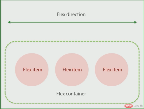
总结flex布局原理:就是通过给父盒子添加flex属性,来控制子盒子的位置和排列方式。
容器属性
|序号 | 属性 |描述 |
|——-|————————|——————|
|1 | flex-direction | 设置主轴方向|
|2 | justify-content| 设置主轴上的子元素排列方式|
|3 | flex-wrap | 设置子元素是否换行|
|4 | flex-flow | 复合属性,相当于同时设置了flex-direction和flex-wrap|
|5 | align-content |设置侧轴上的子元素的排列方式(多行)|
|6 | align-items| 设置侧轴上的子元素的排列方式(单行)|
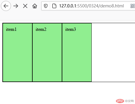
首先flex容器是默认主轴是x轴
代码:
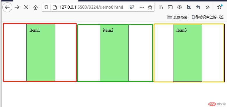
<!DOCTYPE html><html lang="en"><head><meta charset="UTF-8" /><meta http-equiv="X-UA-Compatible" content="IE=edge" /><meta name="viewport" content="width=device-width, initial-scale=1.0" /><title>flex容器与项目</title><style>* {box-sizing: border-box;}:root {font-size: 10px;}body {font-size: 1.6rem;}.container {/* 转为flex布局,这个元素就叫flex容器 */display: flex;height: 20rem;border: 1px solid #000;}</style></head><body><div class="container"><div class="item">item1</div><div class="item">item2</div><div class="item">item3</div></div></body></html>
效果图:
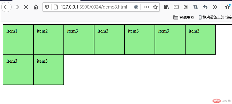
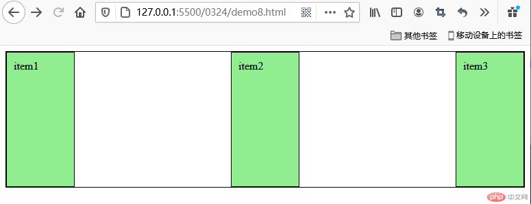
flex-wrap设置元素是否进行换行。
flex容器中的子元素自动成为flex容器的项目,并且是行内块显示
将flex-wrap改为flex-wrap:wrap; 会进行换行。
<!DOCTYPE html><html lang="en"><head><meta charset="UTF-8" /><meta http-equiv="X-UA-Compatible" content="IE=edge" /><meta name="viewport" content="width=device-width, initial-scale=1.0" /><title>flex项目的排列方式</title><style>* {box-sizing: border-box;}:root {font-size: 10px;}body {font-size: 1.6rem;}.container {display: flex;height: 20rem;border: 1px solid #000;}.container > .item {width: 10rem;padding: 1rem;border: solid 1px #000;background-color: lightgreen;}.container {flex-direction: row;flex-wrap: wrap;}</style></head><body><div class="container"><div class="item">item1</div><div class="item">item2</div><div class="item">item3</div><div class="item">item3</div><div class="item">item3</div><div class="item">item3</div><div class="item">item3</div><div class="item">item3</div><div class="item">item3</div></div></body></html>
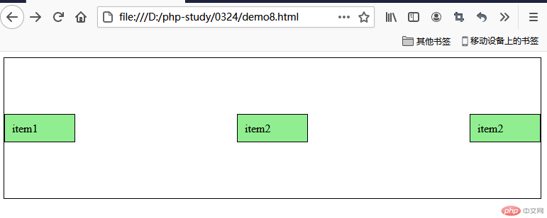
将flex-direction改为flex-direction:column 就是讲主轴改为y轴
部分代码:
.container {flex-direction: column;flex-wrap: wrap;}

flex-direction还有两个属性是row-reverse和column-reverse 同字义一样,一个是反向行排列,一个是反向列排列,不常用,不做演示。
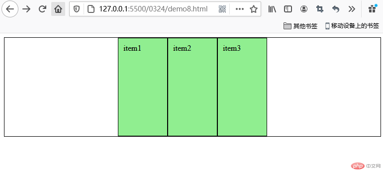
设置主轴上的子元素排列方式
设置为flex-start 默认从头部开始,如果主轴是x轴,则从左到右,如果主轴是y轴,则从上到下。
部分代码:
.container {flex-direction: row;flex-wrap: wrap;justify-content: flex-start;}
默认就是flex-start。
flex-end就是倒着排序。
.container {flex-direction: row;flex-wrap: wrap;justify-content: flex-end;}

justify-content:center 在主轴居中对齐
.container {flex-direction: row;flex-wrap: wrap;justify-content: center;}
justify-content:space-around 平分剩余空间
.container{flex-direction:row;flex-wrap:wrap;justify-content:space-around;}
justify-content:space-between 先两侧贴边,再平分空间
.container{flex-direction:row;flex-wrap:wrap;justify-content:space-between;}
控制子项在侧轴(默认是y轴)上的排列方式,在子项为单项时使用。
默认值是stretch (拉伸) 拉伸需要不给子盒子高度。
align-items: center; y轴排列居中。
代码:
.container {flex-direction: row;flex-wrap: nowrap;justify-content: space-between;align-items: center;}
flex-start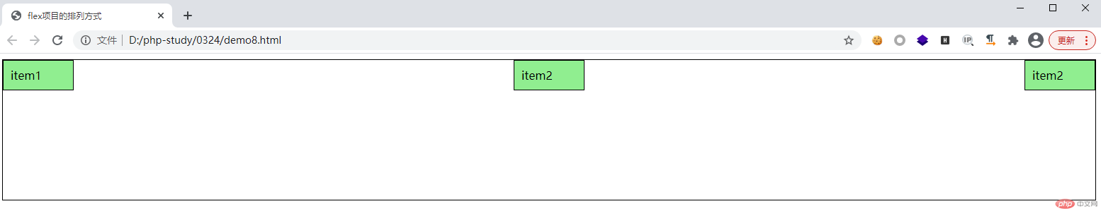
flex-end: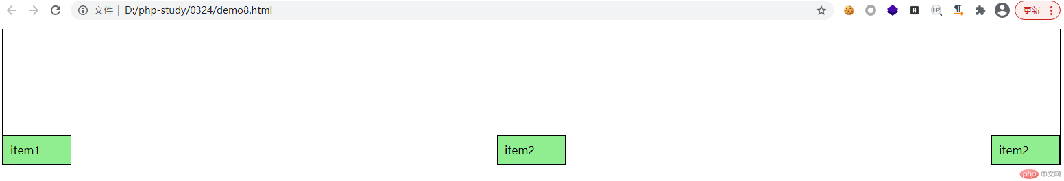
复合属性,相当于设置了flex-direction和flex-wrap
flex-flow:主轴方向 是否换行;
.container {/* flex-direction: column;flex-wrap: nowrap; */flex-flow: column nowrap;justify-content: space-between;align-items: flex-start;}


Copyright 2014-2025 https://www.php.cn/ All Rights Reserved | php.cn | 湘ICP备2023035733号


 收藏
收藏


