


 收藏
收藏


 PHPz
PHPz批改状态:合格
老师批语:整体效果可以,总结的也不错,继续加油
grid布局即网格布局是一种二维布局,可以同时控制行和列的排布和对齐方式,grid布局由水平线和垂直线构成,两条水平线之间的区域叫做行轨道,两条垂直线的区域叫做列轨道。
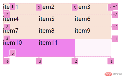
<div class="container"><div class="item">item1</div><div class="item">item2</div><div class="item">item3</div><div class="item">item4</div><div class="item">item5</div><div class="item">item6</div><div class="item">item7</div><div class="item">item8</div><div class="item">item9</div><div class="item other">item10</div><div class="item other">item11</div></div>
.container {width: 300px;height: 150px;display: grid;/*grid-template-columns:设置每一列的宽度,可以是具体值,也可以是百分比grid-template-rows:设置每一行的宽度,可以是具体值,也可以是百分比*/grid-template-columns: repeat(3, 1fr);grid-template-rows: repeat(3, 1fr);/* 1.项目排列规则 */grid-auto-flow: row;/* grid-auto-flow: column; *//* 2.隐式网格 *//* 多余的项目,出现在隐式网格中(自动生成) */grid-auto-rows: 50px;}.container .item {background-color: antiquewhite;}.container .item.other {background-color: violet;}/* 排列规则:gird-auto-flow:row/column 行优先/列优先隐式网格:grid-auto-row/column*/
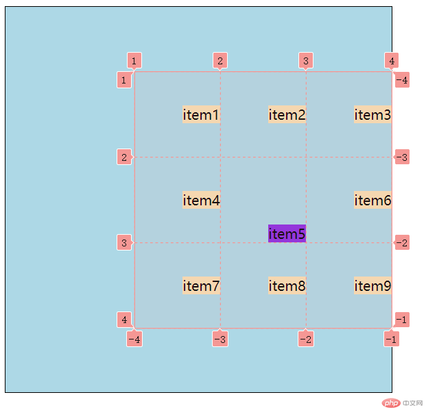
/*1.对齐前提:必须存在"剩余空间"2.对齐方案:"剩余空间"在"项目"之间的分配方式3.剩余空间:flex(主轴,交叉轴),Grid(容器,单元格)Grid:剩余空间存在于"容器"或"单元格"*/.container {display: grid;grid-template-columns: repeat(3, 100px);grid-template-rows: repeat(3, 100px);}.container .item {/* border: 1px solid #000; */background-color: wheat;/* width: 50px;height: 50px; */}/* 创建剩余空间 */.container {width: 450px;height: 450px;border: 1px solid #000;background-color: lightblue;/* 1.项目在"容器"中的对齐place-content:垂直方向 水平方向默认值:垂直居中 水平居左*/place-content: start start;/* 垂直居中,水平居右 */place-content: center end;/* 2.项目在"单元格"中的对齐 *//* 单元格中必须要有剩余空间,即:项目 < 单元格 *//* place-items: 垂直方向 水平方向; */place-items: start;place-items: center end;}/* 3.设置某个项目在单元格对齐方式(与众不同) */.container .item:nth-child(5) {background-color: blueviolet;place-self: end;}
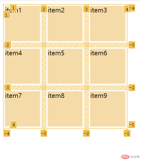
.container {display: grid;grid-template-columns: repeat(3, 100px);grid-template-rows: repeat(3, 100px);/* 行列间隙gap *//* gap: 垂直方向 水平方向; */gap: 5px 10px;gap: 10px;}.container .item {background-color: wheat;/* 行列间隙 *//* margin *//* 要求5px的margin */margin: 5px;}
grid 是一个 CSS 所有网格容器的简写属性,可以用来设置以下属性:显式网格属性: grid-template-rows、grid-template-columns 和 grid-template-areas。隐式网格属性: grid-auto-rows、grid-auto-columns 和 grid-auto-flow。间距属性: grid-column-gap 和 grid-row-gap。

Copyright 2014-2025 https://www.php.cn/ All Rights Reserved | php.cn | 湘ICP备2023035733号


