


 收藏
收藏


 天蓬老师
天蓬老师批改状态:合格
老师批语:布局的时候 , 对于写的每一个属性,都要心中有数, 不要靠蒙,靠猜, 但有时还就得这样做, 做得多了, 也就知道为什么了, 这就是前端的魅力所在

<!DOCTYPE html><html lang=""><head><meta charset="UTF-8"><meta name="viewport" content="width=device-width, initial-scale=1.0"><title>仿写京东页面布局</title><style>/* 公共样式 */* {margin: 0;padding: 0;box-sizing: border-box;/* 转为ie盒子 */}a {text-decoration: none;/* 去掉下划线 */color: #000;}/* 页面样式 *//* 顶部 */.box {display: flex;/* 将整个页面元素转为弹性布局 */flex-flow: column nowrap;/* 主轴方向为垂直,不换行 */min-width: 50em;/* 整体box设置最小宽度 */min-width: 40em;/* 设置最小宽度 */}.top {background-color: #cccccc;display: flex;/* 将top转为弹性布局 */}.top>a:first-of-type {margin-right: 10em;}.top>a:last-of-type {margin-left: auto;}.top>a {flex: 0 1 5em;/* 不放大,可以缩小,基准宽度5em */text-align: center;color: dimgray;}/* 主体 */.container {display: flex;/* 将主体区转为弹性布局 */height: 30em;/* 设置固定的高度 */justify-content: center;/* 将top中所有项目在主轴上进行居中分配 */}.container>.banner {flex: 0 0 30em;/* 不放大,不缩小,基准宽度30em */background-color: seagreen;}.container>aside {background-color: sandybrown;flex: 0 0 5em;/* 不放大,不缩小,基准宽度5em */}/* 底部 */footer {display: flex;/* 将底部转为弹性布局 */flex-flow: column nowrap;/* 主轴方向变为垂直方向,不换行 */height: 10em;background-color: #ccc;}footer>.foot-1 {height: 5em;display: flex;/* 将底部一转为弹性布局 */justify-content: space-evenly;/* 将每个项目在主轴上进行平均对齐 */align-items: center;/* 将每个项目在交叉轴上进行居中对齐 */}footer>.foot-1>a {flex: 0 1 4em;/* 不放大,可以缩小,基准宽度4em */}footer>.foot-2 {display: flex;/* 将底部二转为弹性布局 */height: 5em;justify-content: space-evenly;/* 将每个项目在主轴上进行平均对齐 */align-items: center;/* 将每个项目在交叉轴上进行居中对齐 */}footer>.foot-2>div {flex: 0 1 8em;/* 不放大,可以缩小,基准宽度8em */height: 3em;background-color: skyblue;margin: 0 0.5em;}/* 设置自适应 */@media screen and (max-width: 900px) {aside:last-of-type {display: none;}}/* 小于900时,右侧边栏消失 */@media screen and (max-width: 800px) {aside:first-of-type {display: none;}}/* 小于800时,左侧边栏也消失 */@media screen and (max-width: 700px) {footer>.foot-2,.top>a:not(:first-of-type):not(:last-of-type) {display: none;}}/* 小于700时,顶部除第一个最后一个之外的a也消失 *//* 小于700时,底部下边合作商家栏消失 */@media screen and (max-width: 600px) {footer {display: none;}}/* 小于600时,底部整个消失 */</style></head><body><div class="box"><!-- 顶部 --><div class="top"><a href="">陕西</a><a href="">登录</a><a href="">注册</a><a href="">订单</a><a href="">卖家</a><a href="">服务</a><a href="">手机端</a></div><!-- 主体 --><div class="container"><aside>左侧边栏</aside><div class="banner"></div><aside>右侧边栏</aside></div><!-- 页脚 --><footer><!-- 关于我们 --><div class="foot-1"><a href="">关于我们</a><a href="">联系我们</a><a href="">联系客服</a><a href="">合作招商</a><a href="">商家帮助</a><a href="">营销中心</a><a href="">友情链接</a></div><!-- 合作商家 --><div class="foot-2"><div class="img"> </div><div class="img"> </div><div class="img"> </div><div class="img"> </div><div class="img"> </div></div></footer></div></body></html>
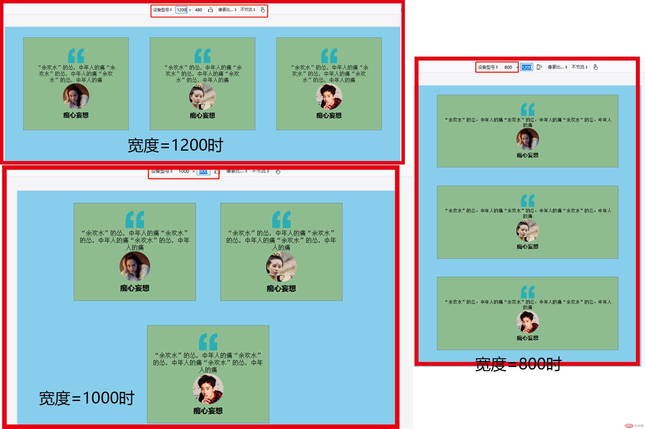
<!DOCTYPE html><html lang=""><head><meta charset="UTF-8"><meta name="viewport" content="width=device-width, initial-scale=1.0"><title>Document</title><style>* {margin: 0;padding: 0;box-sizing: border-box;/* 转为ie盒子 */}body {background-color: skyblue;/* 整体给个背景色 */}.container {display: flex;/* 转为弹性布局 */flex-flow: row wrap;/* 默认水平方向 换行 */justify-content: center;/* 全部项目在主轴上的对齐方式为居中 */}.box {border: 1px slategray solid;/* 边框 */background-color: darkseagreen;/* box给个背景色 */text-align: center;/* 字体居中 */padding: 2em;/* 内边距 */width: 20em;/* 盒子宽度 */margin: 2em;/* 外边距 */}.box>.comma {width: 3em;/* 逗号宽度 */}.box>.profile {width: 5em;/* 头像宽度 */border-radius: 50%;/* 圆角50%为正圆 */}.box>h5 {font-size: 1.2em;/* 名字字体大小 */font-family: sans-serif;/* 字体 */}@media screen and (max-width: 1000px) {.container .box {height: auto;padding: 20px 10px;}}/* 如果显示屏幕宽度小于1000px时,box高度自适应,内边距调整 */@media screen and (max-width: 800px) {.container .box {width: 80%;height: auto;padding: 30px 20px;}}/* 如果显示屏幕宽度小于800px时,宽度为整体的80%,box高度自适应,内边距调整 */</style></head><body><div class="container"><div class="box"><img src="static/images/quto.png" class="comma"><p>“余欢水”的怂,中年人的痛“余欢水”的怂,中年人的痛“余欢水”的怂,中年人的痛</p><img src="static/images/1.jpg" class="profile"><h5>痴心妄想</h5></div><div class="box"><img src="static/images/quto.png" class="comma"><p>“余欢水”的怂,中年人的痛“余欢水”的怂,中年人的痛“余欢水”的怂,中年人的痛</p><img src="static/images/2.jpg" class="profile"><h5>痴心妄想</h5></div><div class="box"><img src="static/images/quto.png" class="comma"><p>“余欢水”的怂,中年人的痛“余欢水”的怂,中年人的痛“余欢水”的怂,中年人的痛</p><img src="static/images/3.jpg" class="profile"><h5>痴心妄想</h5></div></div></body></html>

Copyright 2014-2025 https://www.php.cn/ All Rights Reserved | php.cn | 湘ICP备2023035733号


