


 收藏
收藏


 天蓬老师
天蓬老师批改状态:合格
老师批语:传统布局比较麻烦,只能用套路解决

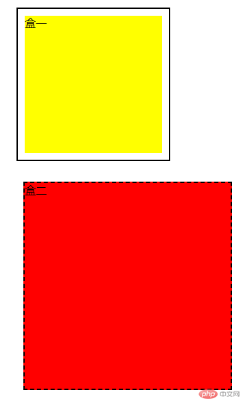
1.盒模型的大小与位置的设置与计算;
大小由width定义宽度、height定义高度;
位置的设置主要由外边距margin控制,依次顺序为上右下左顺时针方向;可切换成单一方向如margin-top:10px(距离上面增加十个像素点);
盒的计算为:内容区+内边距+边框;
<!DOCTYPE html><html lang="en"><head><meta charset="UTF-8" /><meta name="viewport" content="width=device-width, initial-scale=1.0" /><title>Document</title><style>.he1 {/*内容区*/width: 200px; /*宽度*/height: 200px; /*高度*/background: #ff0; /*背景*/padding: 10px; /*内边距*/background-clip: content-box; /*背景裁切*/margin: 20px; /*外边距*/border: 2px solid; /*边框,不加颜色代码为默认色*/}.he2 {width: 300px;height: 300px;background: #f00;margin: 30px; /*外边距*/border: 2px dashed; /*dashed:虚线;solid:实线;*/}/* 两个盒子外边距重叠时会出现折叠/塌陷 */</style></head><body><div class="he1">盒一</div><div class="he2">盒二</div></body></html>
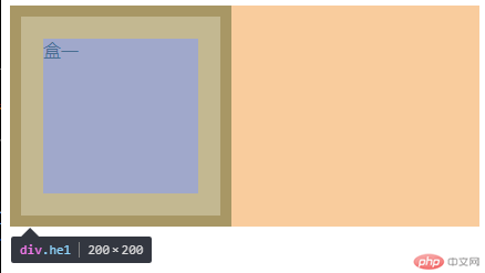
2.box-sizing解决了什么问题;
解决了盒子默认计算方式的修改,实现布局计算统一;
<!DOCTYPE html><html lang="en"><head><meta charset="UTF-8" /><meta name="viewport" content="width=device-width, initial-scale=1.0" /><title>Document</title><style>.he1 {width: 200px;height: 200px;background: #faa;border: 10px solid;padding: 20px;/* box-sizing: content-box; content-box:默认计算方式 ; */box-sizing: border-box; /* border-box:改变盒模型计算方式为width设置的值 */}</style></head><body><div class="he1">盒一</div></body></html>
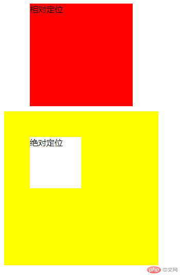
3.绝对定位与相对定位的区别与应用;
区别是两种定位的参照物不同,绝对定位是以父级元素为参照物、相对定位是以当前位置为参照物;
<!DOCTYPE html><html lang="en"><head><meta charset="UTF-8" /><meta name="viewport" content="width=device-width, initial-scale=1.0" /><title>Document</title><style>.he1 {width: 200px;height: 200px;/* position: static; 默认静态定位属性,可以不写 */position: relative; /*relative:设置当前位置为参照物*/background: #f00;left: 50px;}.he2 {width: 300px;height: 300px;position: relative;background: #ff0;top: 10px;}.he3 {width: 100px;height: 100px;position: absolute; /*absolute:以父级为参照物移动 */top: 50px;left: 50px;background: #fff;}</style></head><body><!-- 相对定位 --><div class="he1">相对定位</div><!-- 绝对定位 --><div class="he2"><div class="he3">绝对定位</div></div></body></html>
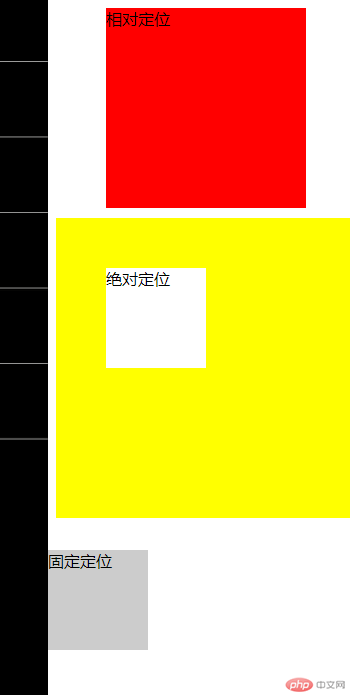
4.固定定位与绝对定位的区别;
固定定位是以当前窗口为父级作参照物移动、绝对定位上以设置盒子为父级作参照物移动;
<!DOCTYPE html><html lang="en"><head><meta charset="UTF-8" /><meta name="viewport" content="width=device-width, initial-scale=1.0" /><title>Document</title><style>.he1 {width: 200px;height: 200px;/* position: static; 默认静态定位属性,可以不写 */position: relative; /*relative:设置当前位置为参照物*/background: #f00;left: 50px;}.he2 {width: 300px;height: 300px;position: relative;background: #ff0;top: 10px;}.he3 {width: 100px;height: 100px;position: absolute; /*absolute:以父级为参照物移动 */top: 50px;left: 50px;background: #fff;}.he4 {width: 100px;height: 100px;position: fixed; /*fixed 固定为当前窗口定位移动 */top: 550px;left: 0;background: #ccc;}</style></head><body><!-- 相对定位 --><div class="he1">相对定位</div><!-- 绝对定位 --><div class="he2"><div class="he3">绝对定位</div></div><div class="he4">固定定位</div></body></html>
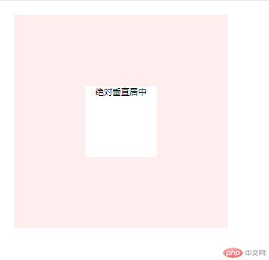
5.为什么垂直居中如此困难。使用绝对定位实现;
因为水平居中可以用margin: auto;来实现,但margin-top和margin-bottom使用auto是没有数值的0 ;
<!DOCTYPE html><html lang="en"><head><meta charset="UTF-8" /><meta name="viewport" content="width=device-width, initial-scale=1.0" /><title>Document</title><style>* {padding: 0;margin: 0;box-sizing: border-box;}.he1 {width: 300px;height: 300px;background: #fee;position: relative; /*设为父级定位*/top: 20px;left: 20px;}.he1 .he2 {width: 100px;height: 100px;background: #fff;position: absolute;top: 0;left: 0;right: 0;bottom: 0;margin: auto;font-size: 12px;text-align: center;}</style></head><body><div class="he1"><div class="he2">绝对垂直居中</div></div></body></html>
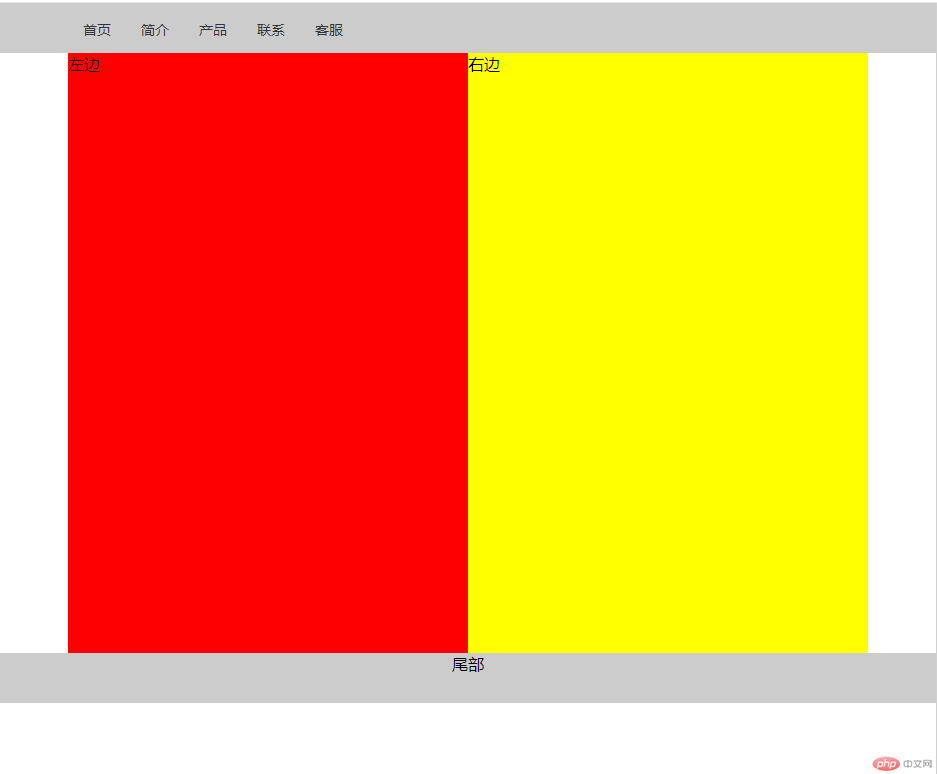
6.使用绝对定位实现二列布局;
<!DOCTYPE html><html lang="en"><head><meta charset="UTF-8" /><meta name="viewport" content="width=device-width, initial-scale=1.0" /><title>Document</title><style>@import url(0812_4.css);</style></head><body><div class="header"><div class="nav"><ul><li><a href="">首页</a></li><li><a href="">简介</a></li><li><a href="">产品</a></li><li><a href="">联系</a></li><li><a href="">客服</a></li></ul></div></div><div class="main"><div class="left">左边</div><div class="right">右边</div></div><div class="footer"><div class="foot"><p>尾部</p></div></div></body></html>
* {padding: 0;margin: 0;box-sizing: border-box;}a {text-decoration: none;color: #333;font-size: 14px;}li {list-style: none;}a:hover {color: blue;}.header {width: 100%;height: 50px;background: #ccc;}.header .nav {width: 800px;margin: auto;}.header .nav li {float: left;padding: 15px;}.main {width: 800px;position: relative;min-height: 600px;margin: auto;}.main .left {width: 400px;height: 600px;background: #f00;position: absolute;top: 0;left: 0;}.main .right {width: 400px;height: 600px;background: #ff0;position: absolute;top: 0;right: 0;}.footer {width: 100%;height: 50px;margin: auto;text-align: center;background: #ccc;}
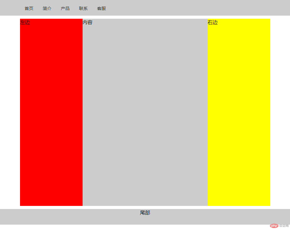
7.使用浮动实现三列布局;
<!DOCTYPE html><html lang="en"><head><meta charset="UTF-8" /><meta name="viewport" content="width=device-width, initial-scale=1.0" /><title>Document</title><style>@import url(0812_5.css);</style></head><body><div class="header"><div class="nav"><ul><li><a href="">首页</a></li><li><a href="">简介</a></li><li><a href="">产品</a></li><li><a href="">联系</a></li><li><a href="">客服</a></li></ul></div></div><div class="container"><div class="left">左边</div><div class="main">内容</div><div class="right">右边</div></div><div class="footer"><div class="foot"><p>尾部</p></div></div></body></html>
* {padding: 0;margin: 0;box-sizing: border-box;}a {text-decoration: none;color: #333;font-size: 14px;}li {list-style: none;}a:hover {color: blue;}.header {width: 100%;height: 50px;background: #ccc;}.header .nav {width: 800px;margin: auto;}.nav:first-of-type li {float: left;padding: 15px;}.container {width: 800px;min-height: 600px;margin: 10px auto;}.container .left {width: 200px;min-height: 600px;background: #f00;float: left;}.container .main {width: 400px;min-height: 600px;background: #ccc;float: left;}.container .right {width: 200px;min-height: 600px;background: #ff0;float: right;}.footer {width: 100%;height: 50px;margin: auto;text-align: center;background: #ccc;}
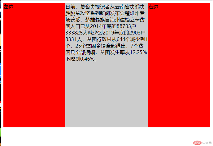
8.默写出圣杯布局的思想。并用圣杯布局实现三列布局;
一、内容区必须优先渲染,DOM结构中将主体内容写到前面;
二、主体区域必须自适应,占据整个容器的全部空间;
三、内容区,左边,右边必须全部浮动;
四、通过设置左右两侧外边距打负值使它回到容器中;
五、给容器设置左右的内边距,宽度与左、右二侧宽度相等,将左右区域挤出来;
六、给左右两侧添加相对定位。将它们最终放到正确的位置上;
<!DOCTYPE html><html lang="en"><head><meta charset="UTF-8" /><meta name="viewport" content="width=device-width, initial-scale=1.0" /><title>Document</title><style>@import url(0812_6.css);</style></head><body><div class="container"><div class="main">日前,总台央视记者从云南省决战决胜脱贫攻坚系列新闻发布会楚雄州专场获悉,楚雄彝族自治州建档立卡贫困人口已从2014年底的88733户333825人减少到2019年底的2903户8331人,贫困行政村从644个减少到1个,25个贫困乡镇全部退出,7个贫困县全部摘帽,贫困发生率从12.25%下降到0.46%。</div><div class="left">左边</div><div class="right">右边</div></div></body></html>
.container > * {min-height: 400px;float: left;}.container .left,.container .right {width: 200px;background: #f00;}.container .main {width: 100%;background: #ccc;}.container {overflow: hidden;padding: 0 200px;}.container .left {margin-left: -100%;position: relative;right: 200px;}.container .right {margin-left: -200px;position: relative;left: 200px;}

Copyright 2014-2025 https://www.php.cn/ All Rights Reserved | php.cn | 湘ICP备2023035733号


