


 收藏
收藏


 天蓬老师
天蓬老师批改状态:合格
老师批语:非常棒

盒子模型:
宽度Width:150pk
高度height:150px
盒子边框border: 5px solid
盒子内边距padding: 10px
盒子背景色background-color
盒模型的计算方式:
宽度Width 150+边框border(左5+右5) 如果你盒模型加了内边距Padding那么它的计算方式是:宽度Width 150+内边距padding(左10+右10)+边框border(左5+右5)
<!DOCTYPE html><html lang="en"><head><meta charset="UTF-8" /><meta name="viewport" content="width=device-width, initial-scale=1.0" /><title>盒模型的大小与位置的设置与计算</title></head><style>.box {/* 盒子大小 */width: 150px;height: 150px;/* 盒子边框 */border: 5px solid;/* 盒子背景色 */background-color: lightseagreen;/* 内边距 */padding: 10px;/* 绝对定位,盒子的位置 */position: absolute;top: 50px;left: 100px;}</style><body><div class="box">盒子</div></body></html>
box-sizing:允许您以特定的方式定义匹配某个区域的特定元素
box-sizing: content-box;默认值
box-sizing: border-box; 那么这个值它就解决防止破坏页面中许多盒子的大小。
<!DOCTYPE html><html lang="en"><head><meta charset="UTF-8" /><meta name="viewport" content="width=device-width, initial-scale=1.0" /><title>自定义盒子</title></head><style>/* 自定义盒子 */* {margin: 0;padding: 0;box-sizing: border-box;}.box {width: 200px;height: 200px;background-color: lightseagreen;border: 5px solid;/* 默认值 */box-sizing: content-box;box-sizing: border-box;}</style><body><div class="box">盒子</div></body></html>
绝对定位:如果他父节点有定位,那么他就相当于父节点定位,如父节点没有定位就看父节点的父节点有没有定位,依次类推,如祖先节点都没有定位,那就相对于body定位。
相对定位:相对于父节点的地位
<!DOCTYPE html><html lang="en"><head><meta charset="UTF-8" /><meta name="viewport" content="width=device-width, initial-scale=1.0" /><title>绝对定位与相对定位</title></head><style>.box.one {width: 200px;height: 200px;border: 1px solid;background-color: palevioletred;/* 绝对定位 */position: absolute;top: 50px;left: 50px;}.box.two {width: 100px;height: 100px;border: 1px solid;background-color: orangered;/* 相对定位 */position: relative;top: 50px;left: 50px;}</style><body><div class="box one">盒子1<div class="box two">盒子2</div></div></body></html>

固定定位和绝对定位的区别是:固定定位是指相对于窗口的定位,绝对定位是指相对于有定位的祖先节点来定位
<!DOCTYPE html><html lang="en"><head><meta charset="UTF-8" /><meta name="viewport" content="width=device-width, initial-scale=1.0" /><title>绝对定位和固定定位的区别</title><link rel="stylesheet" href="/0801/iconfont/iconfont.css" /><style>/* 绝对定位:把盒子用绝对定位,定位到左上角 */.box {width: 200px;height: 200px;background-color: pink;position: absolute;top: 50px;left: 50px;}/* 固定定位:把购物车小图标用固定定位,定位到窗口的右下角 */.iconfont {font-size: 3rem;color: red;position: fixed;right: 10px;bottom: 10px;}</style></head><body><div class="iconfont icon-gouwuche"></div><div class="box">盒子</div></body></html>

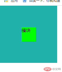
首先垂直居中为什么会这么的困难,因为任何一个页面都是宽度受限而高度无限的。
那么可以用绝对定位position: absolute;来实现垂直居中。
如你需要水平居中只需要在绝对定位position: absolute;中添加(margin-left: auto;)(margin-right: auto;)两属性就可实现。
具体代码如下:
<!DOCTYPE html><html lang="en"><head><meta charset="UTF-8" /><meta name="viewport" content="width=device-width, initial-scale=1.0" /><title>使用绝对定位实现垂直居中</title><style>* {margin: 0;padding: 0;box-sizing: border-box;}.box {width: 200px;height: 200px;background-color: lightseagreen;/* 定位元素 */position: relative;}.box > .module {width: 50px;```cssheight: 50px;background-color: lime;/* 绝对定位 */position: absolute;/* 定位起点 */top: 0;left: 0;/* 定位终点 */right: 0;bottom: 0;/* 垂直居中 */margin: auto;/* 水平居中的代码如下 *//* margin-left: auto; *//* margin-right: auto; */}</style></head><body><div class="box"><div class="module">模块</div></div></body></html>
浮动:是只允许水平浮动,没有垂直浮动
具体代码如下:
<!DOCTYPE html><html lang="en"><head><meta charset="UTF-8" /><meta name="viewport" content="width=device-width, initial-scale=1.0" /><title>使用浮动实现三列布局</title></head><style>.content {background-color: #cccccc;width: 600px;min-height: 400px;margin: auto;}.module1 {width: 100px;background-color: tan;min-height: 400px;float: left;}.module2 {width: 100px;background-color: turquoise;min-height: 400px;float: right;}.module3 {width: 400px;background-color: yellow;min-height: 400px;float: left;}</style><body><div class="content"><div class="module1">第一模块</div><div class="module2">第二模块</div><div class="module3">第三模块</div></div></body></html>

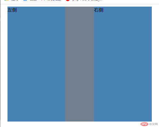
使用绝对定位布局的时候你的定位父节点和参考点很重要。
<!DOCTYPE html><html lang="en"><head><meta charset="UTF-8" /><meta name="viewport" content="width=device-width, initial-scale=1.0" /><title>使用绝对定位实现二列布局</title></head><style>.content {width: 500px;background-color: slategray;margin: auto;min-height: 400px;/* 转为子元素的定位父节点 */position: relative;}.left {width: 200px;background-color: steelblue;min-height: 400px;/* 绝对定位,注意这里是定位左边节点 */position: absolute;top: 0;left: 0;}.right {width: 200px;background-color: steelblue;min-height: 400px;/* 绝对定位,注意这里是定位右边节点 */position: absolute;top: 0;right: 0;}</style><body><div class="content"><div class="left">左侧</div><div class="right">右侧</div></div></body></html>
圣杯布局主要细节:
1.主题区(内容)优先显示以及默认高度是自适应。
2.圣杯布局中的所有快元素实行浮动
3.给左右区域添加相对定位
<!DOCTYPE html><html lang="en"><head><meta charset="UTF-8" /><meta name="viewport" content="width=device-width, initial-scale=1.0" /><title>使用圣杯布局实现三列布局</title></head><style>.container {overflow: hidden;padding: 0 100px;}.container > * {min-height: 200px;float: left;}.container > .left {width: 100px;background-color: lightskyblue;margin-left: -100%;position: relative;right: 100px;}.container > .right {width: 100px;background-color: lightskyblue;margin-left: -100px;position: relative;left: 100px;}.container > .main {width: 100%;background-color: lightsalmon;}</style><body><div class="container"><div class="main">内容模块</div><div class="left">左边模块</div><div class="right">右边模块</div></div></body></html>


Copyright 2014-2025 https://www.php.cn/ All Rights Reserved | php.cn | 湘ICP备2023035733号


